Eleanor Lewis, grade 12 Design and Architecture Senior High, Miami, FL Teacher: Eric Hankin I am visualizing the effects of climate change on plant life in South Florida. I designed the Plant Resilient Project’s website. It uses satellite data tracking heat islands and saltwater intrusion. Users can map where non-heat tolerant or saltwater tolerant plants...

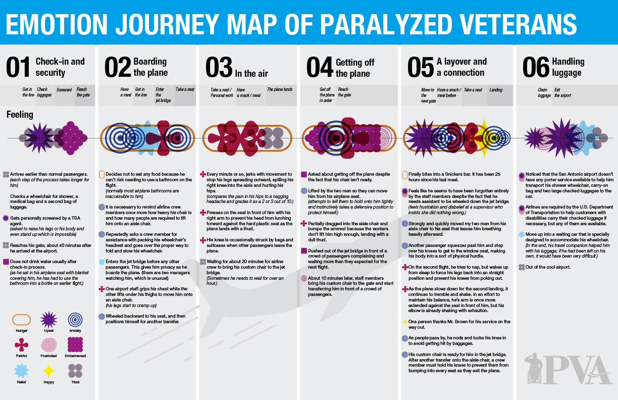
Yoona Lee, grade 11, St. Paul’s School, Concord, NH, and Yoojung Shin, grade 10, Phillips Academy Andover, Andover, MA Our design visualizes the experiences of disabled veterans boarding airplanes. We used data from a New York Times article showing the hardships of Charles Brown, a paralyzed veteran. We created a customer journey map showing emotions...
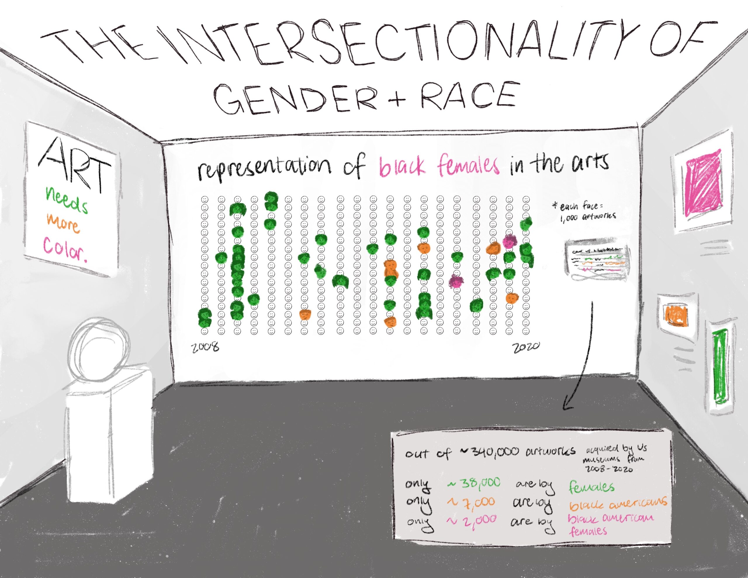
Rori Stanford, grade 12 Bergen County Academies, Hackensack, NJ Teacher: Scott Lang My data visualization covers the intersectionality of gender and race and specifically the lack of representation of Black women in the arts. I used data from the 2022 Burns Halperin Report. Racism and sexism still exist and individuals who experience both are hindered...
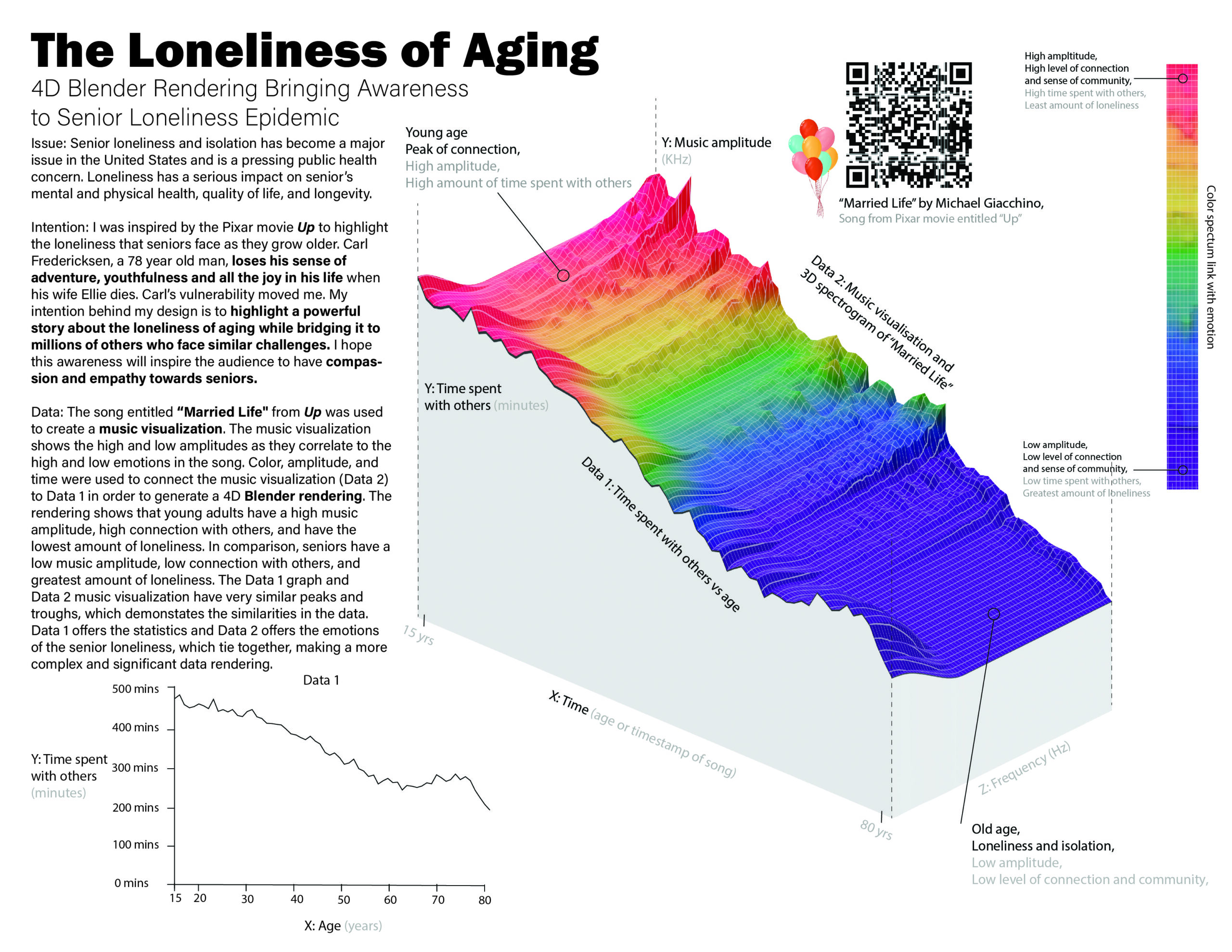
Aviya Afra, grade 11 Grauer School, Encinitas, CA My design brings awareness to the loneliness and isolation epidemic that seniors face. It highlights a story that represents millions of seniors who lack friendship and companionship. The 4D rendering is comprised of two data sets. Data 1 shows the amount of time one spends with others...
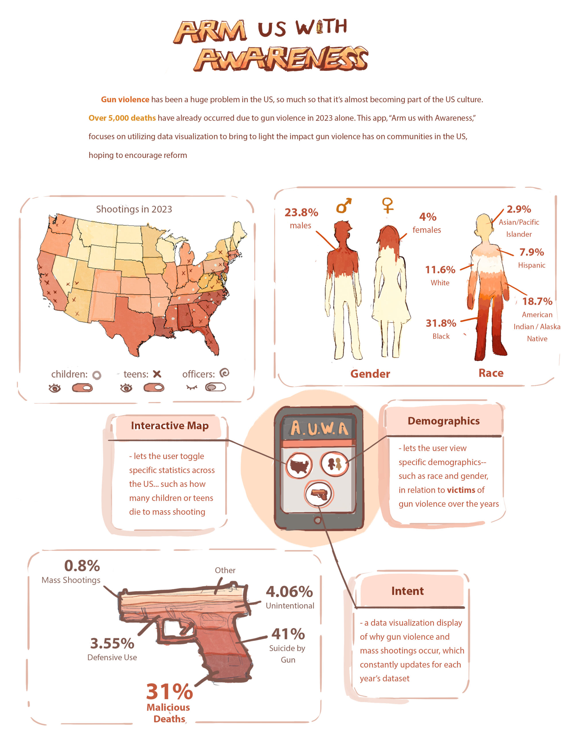
Sarah Basil, grade 12 Bergen County Academies, Hackensack, NJ Teacher: Scott Lang Gun violence is becoming more common. Anyone could fall victim to having their lives cut short by these tragic incidents. My design is an app called “Arm Us With Awareness” that addresses gun violence in the United States. It highlights important statistics, such...
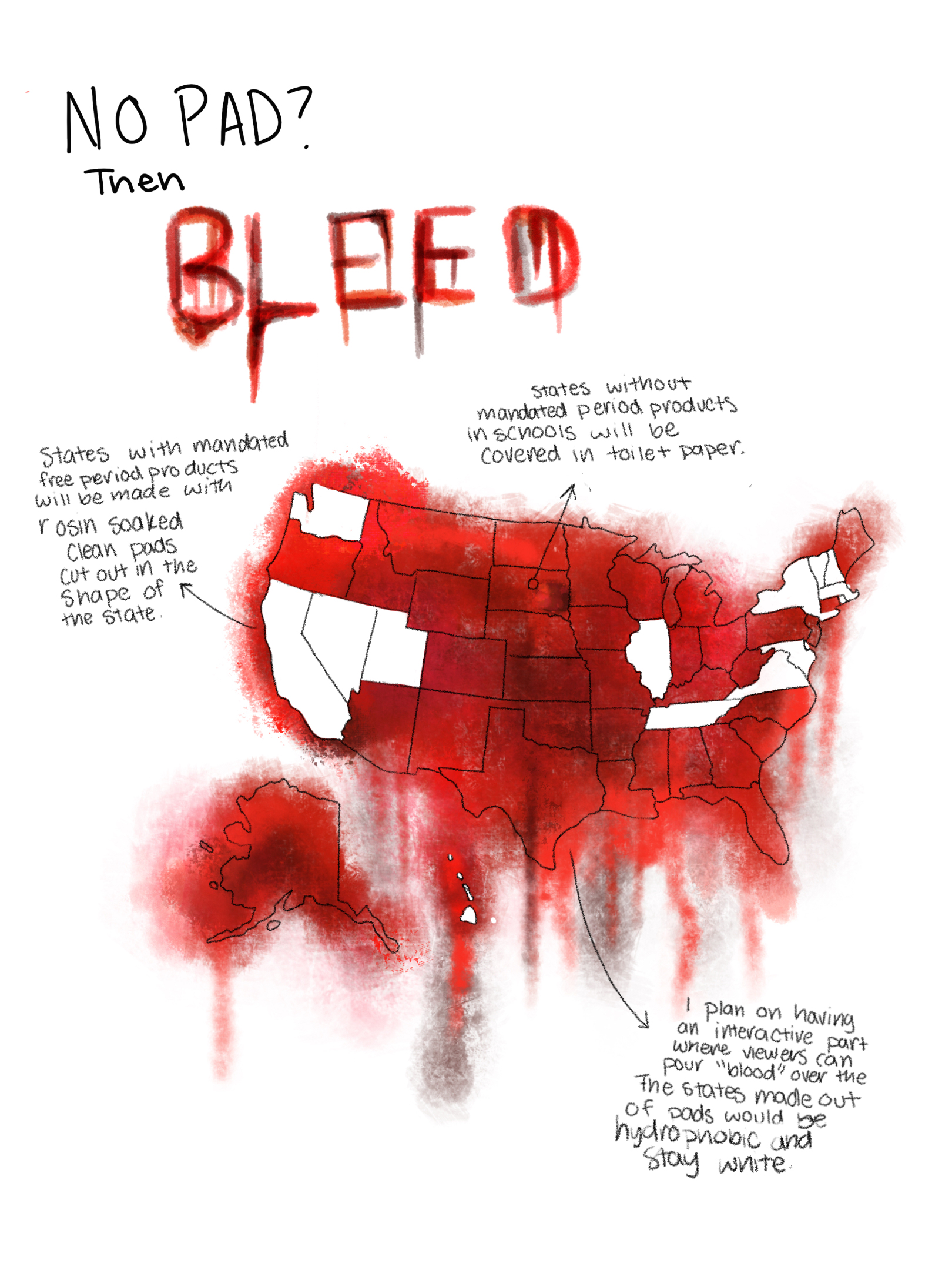
Vera Giraudo, grade 10 Avenues The World School, New York, NY Teacher: Gretel Schwartzott My design shows which states have mandated free menstrual products in schools. A study found that 80% of menstruating teens said they have missed class time because they did not have access to period products. One’s education should not be interrupted...
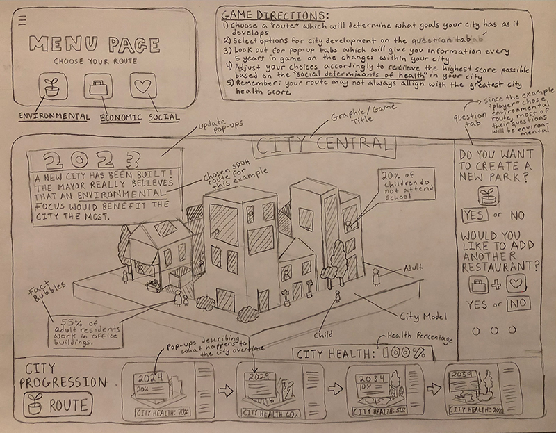
Grace Guo, grade 11, and Jane Martens, grade 11 Carmel High School, Carmel, IN We are presenting data on social determinants of health (SDOH)— economic stability, physical environment, education, food access, community, and health care—in the context of a single city, over five decades. We will show audiences the impact of SDOH in a community....
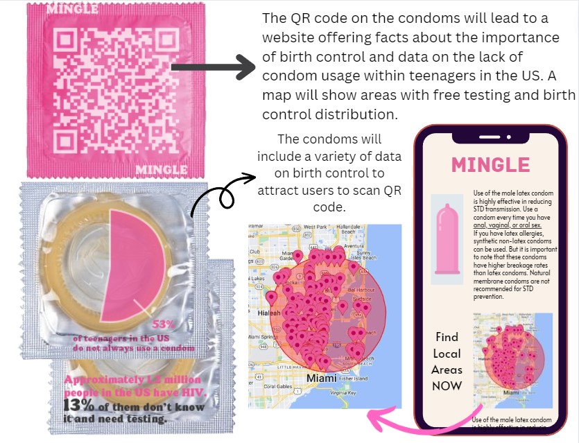
Amelia Kiefer, grade 12 Design and Architecture Senior High, Miami, FL Teacher: Eric Hankin I am presenting data on the lack of condom usage and other birth control by students. I want to show students why birth control is so important by discussing the impacts of not using condoms, regardless of sexual orientation. This will...
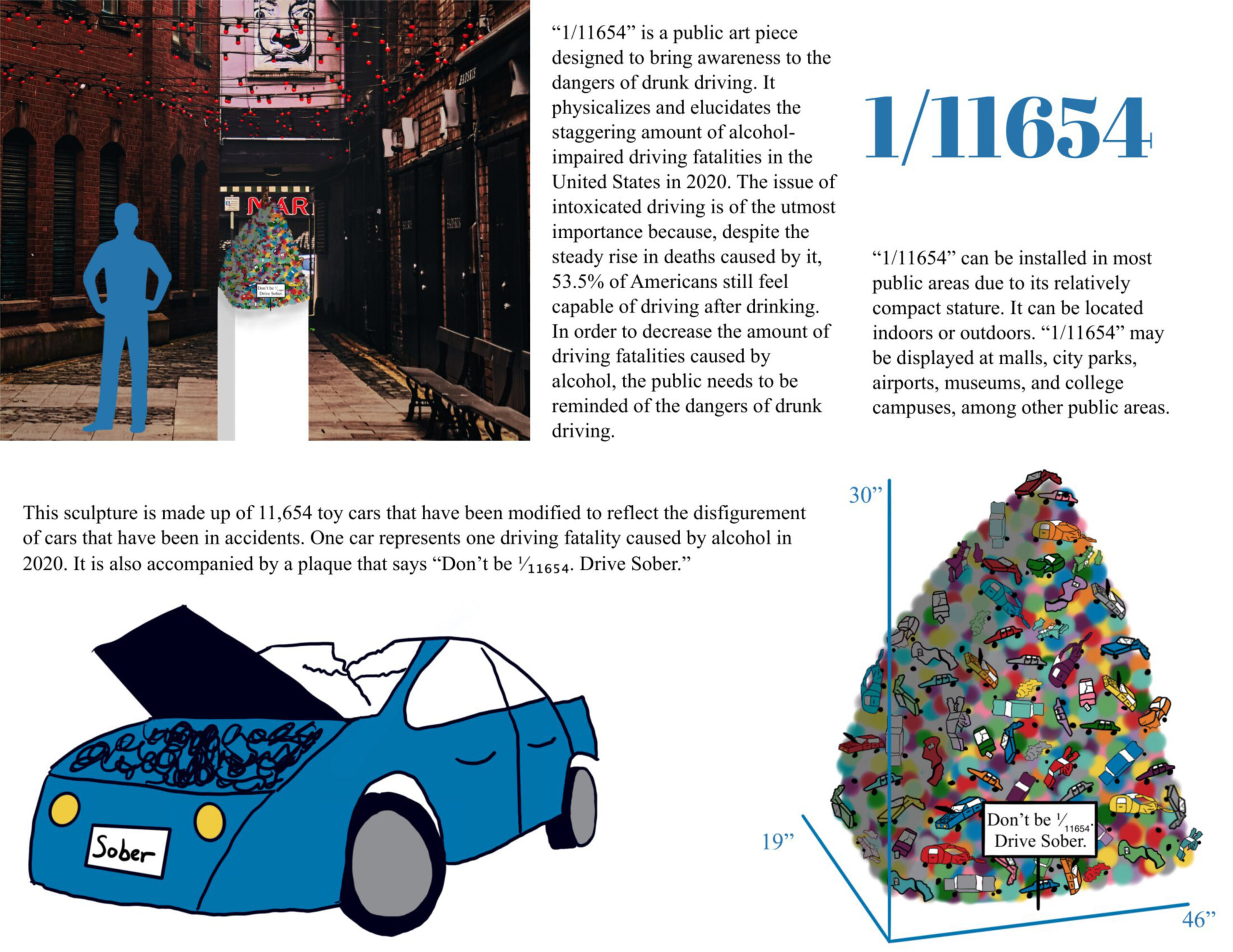
Tiffany Kurniawan, grade 9 Granada Hills Charter High School, Granada Hills, CA Teacher: Jackie Ying In 2020, 11,654 Americans died in alcohol-related driving accidents, which makes up 30% of all driving fatalities. Despite this problematic statistic, 53.5% of people believe that they are capable of driving after drinking. To decrease alcohol-impaired driving fatalities, people must...
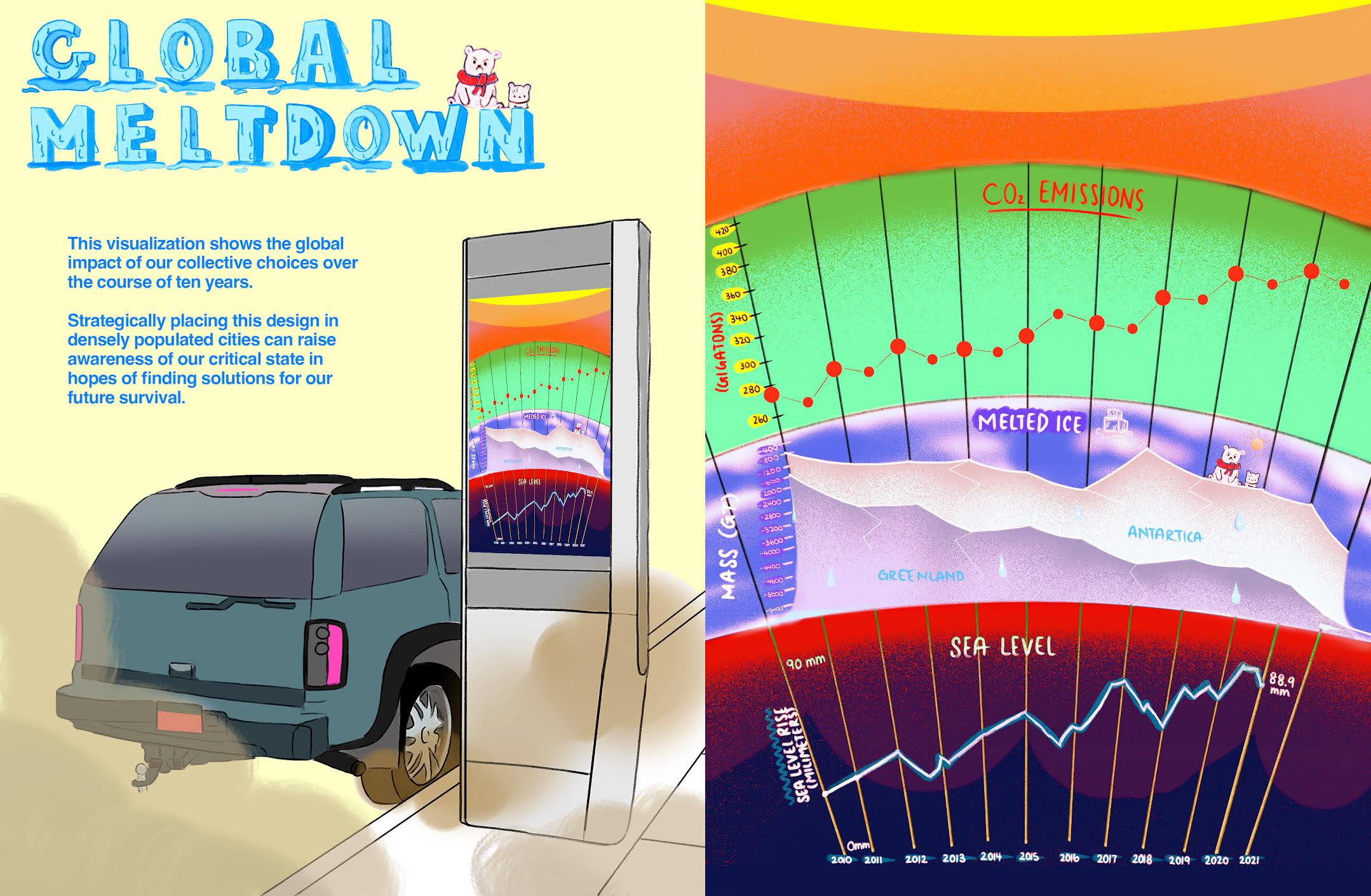
Jaime Lai, grade 11 Dwight-Englewood School, Englewood, NJ My data visualization shows the amount of CO2 emissions, glacier mass loss, and sea level changes over the past ten years. This shows the severity of climate change which affects so many forms of wildlife and our human population. My visualization can help raise urgency in reversing...
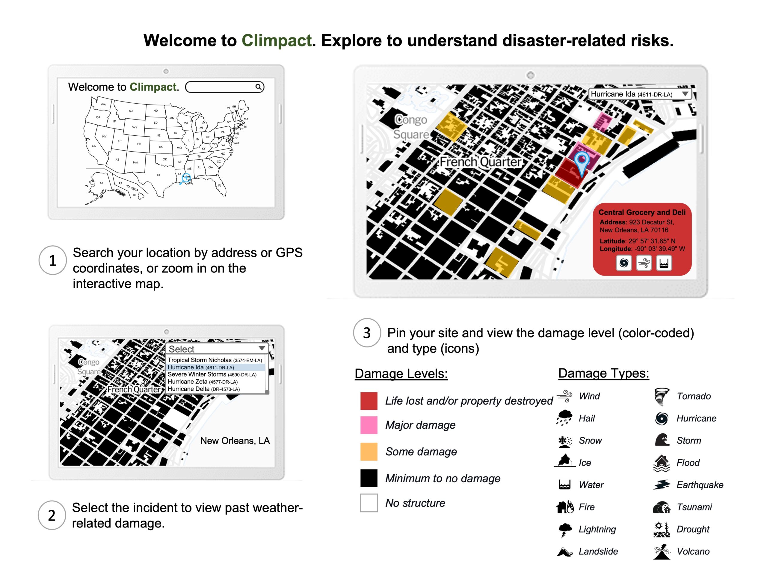
Miller Roberts, grade 10 Westlake High School, Austin, TX Climpact is an interactive mapping system that allows users to view locations and determine the impact of damage from past major weather-related disasters. I used data from open building footprints datasets in the United States. I looked at FEMA for data on natural disasters from 1953...
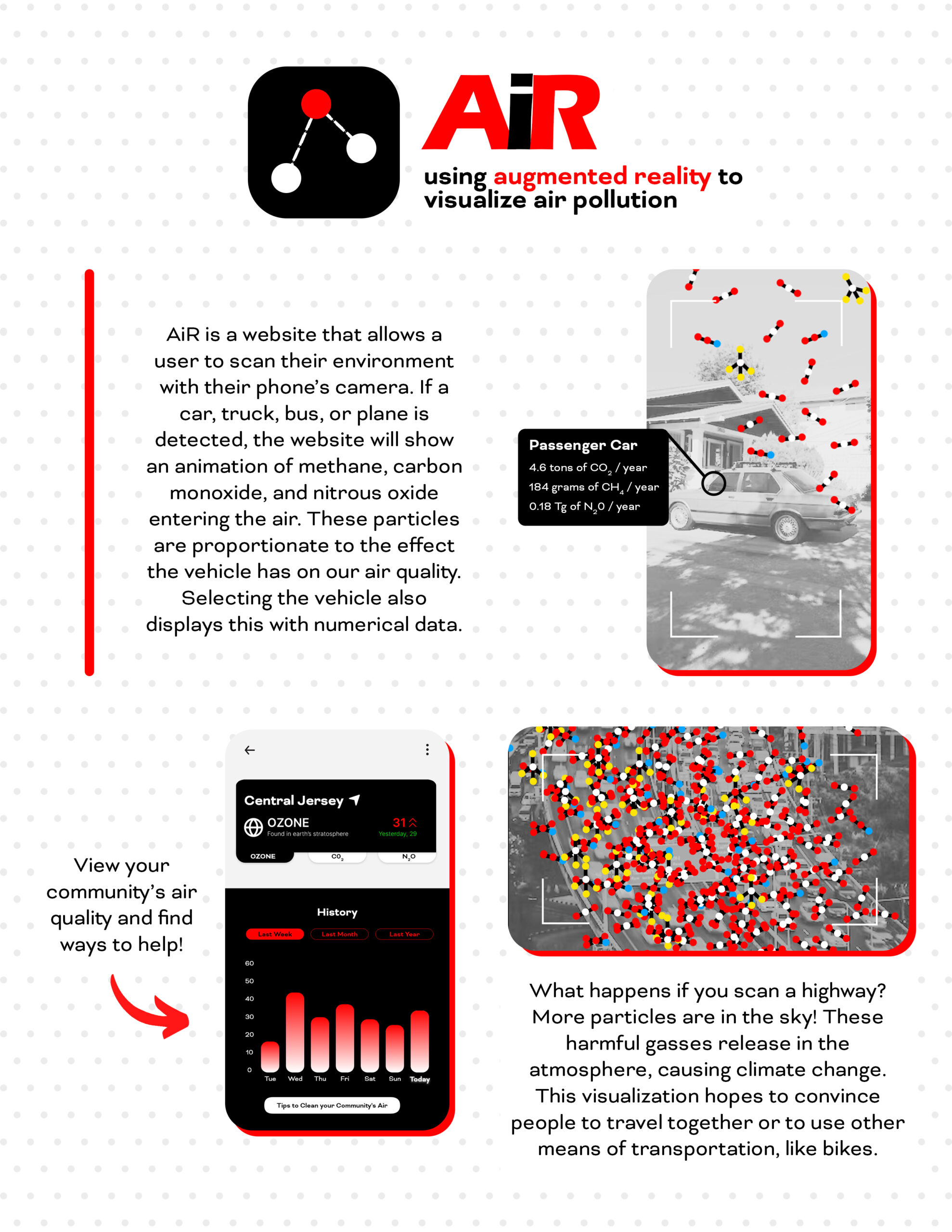
Eiliyah Sarowar, grade 11 Bergen County Academies, Hackensack, NJ AiR presents data on vehicle emissions and their impact on the environment and climate change. My design calls attention to the harmful particles that enter our air. It aims to educate people on the negative effects common vehicles have on our planet. This is a problem...
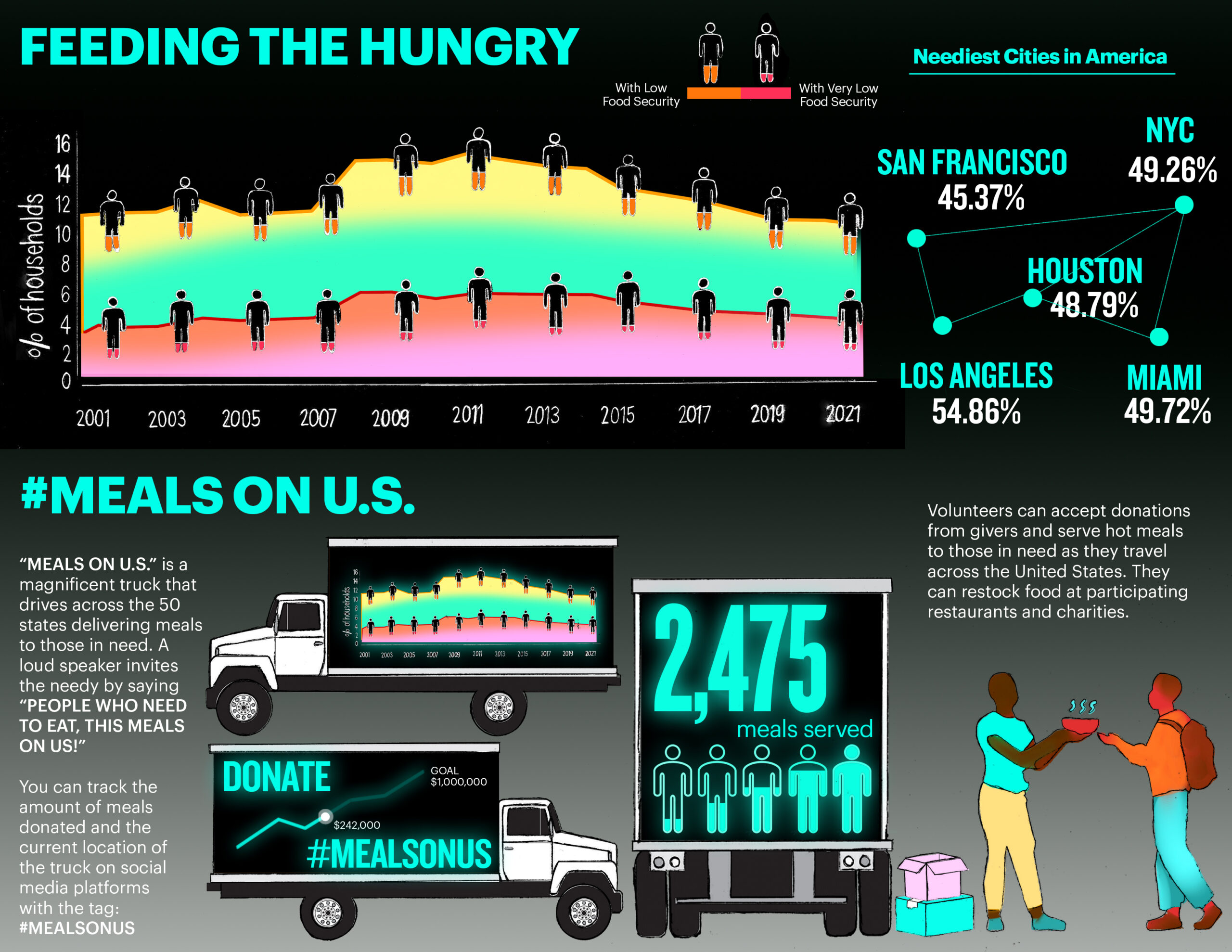
Robin Suh, grade 9 Tenafly High School, Tenafly, NJ My data shows the percentage of households with low food security in the United States. This can help us understand the needs of others and provide a way to donate through a trackable food truck. I want to impact donors and recipients by providing awareness and...
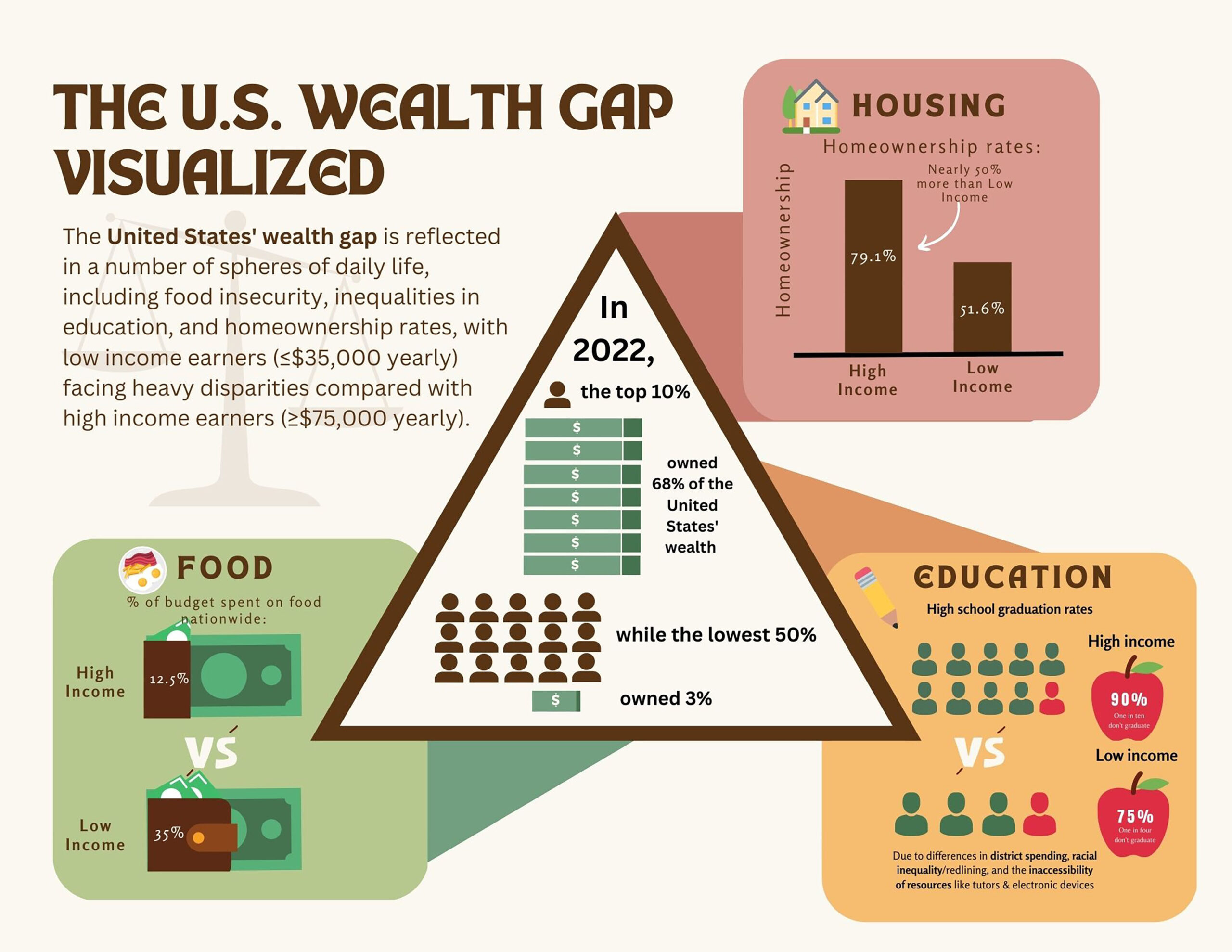
Emma Wong, grade 10, and Alice Zhou, grade 10 Miramonte High School, Orinda, CA We visualized the large wealth gap in the United States. We compared low- and high-income populations’ food budgets, graduation rates, and homeownership. These elements of daily life are often taken for granted. We gathered our data from the National Center for...
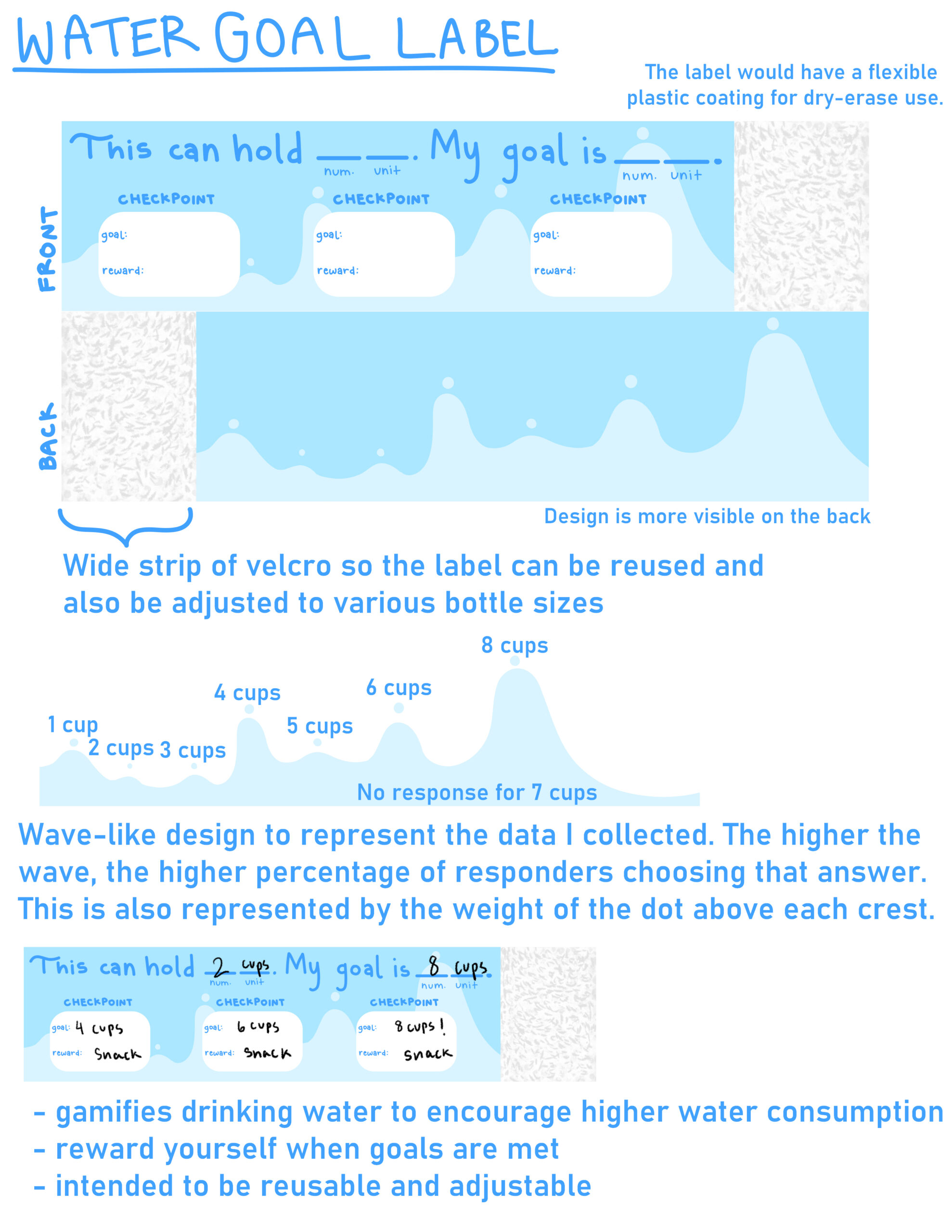
Katie Yang, grade 12 Paul Laurence Dunbar High School, Lexington, KY I am presenting data on the amount of water that teenagers in my community drink daily, from one to eight cups. The majority (66.6%) of survey responders drank less than eight cups daily. Maintaining your physical and mental health is important, especially during adolescence....