Honorable Mention
Jaime Lai, grade 11
Dwight-Englewood School, Englewood, NJ
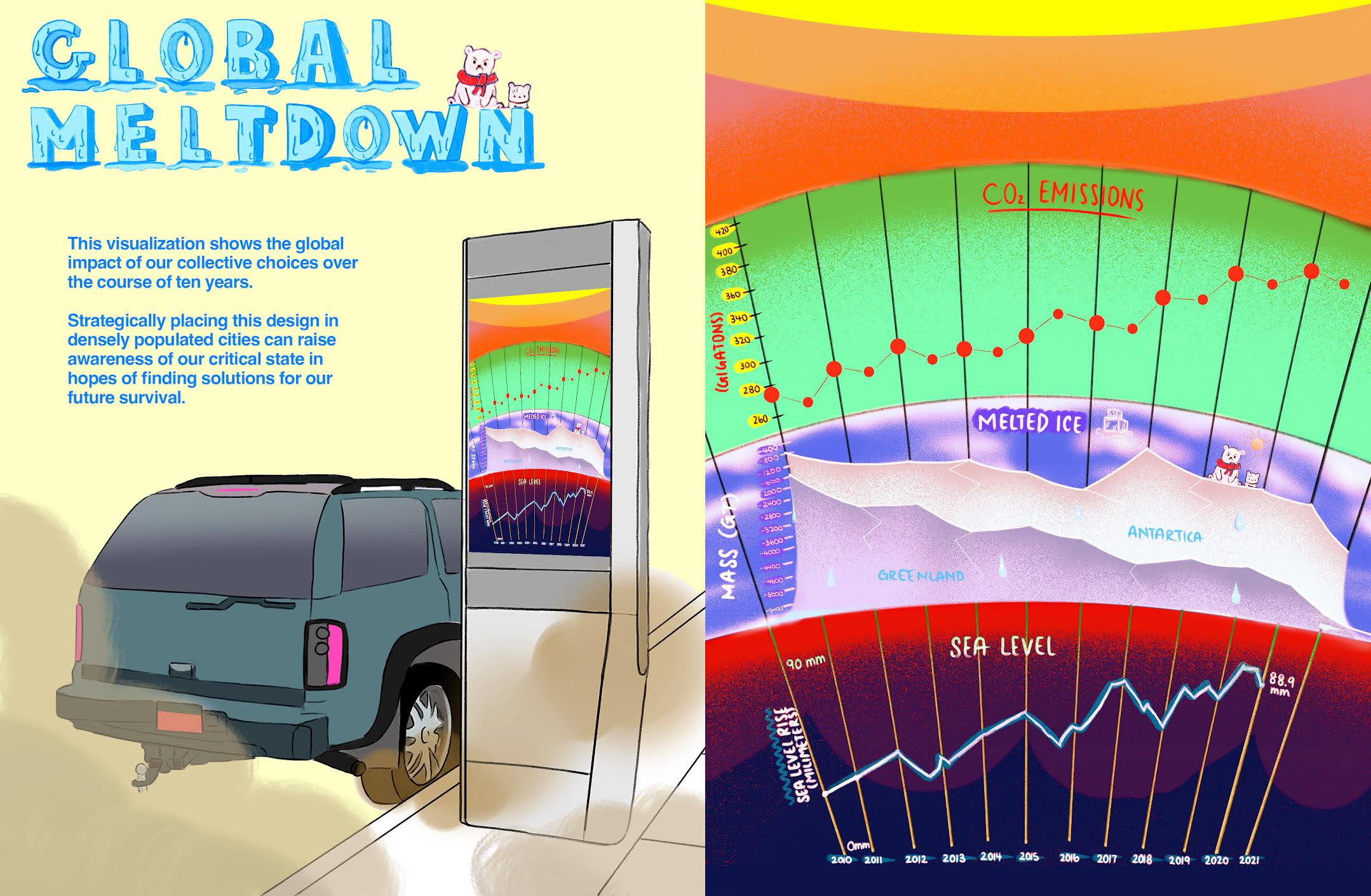
My data visualization shows the amount of CO2 emissions, glacier mass loss, and sea level changes over the past ten years. This shows the severity of climate change which affects so many forms of wildlife and our human population. My visualization can help raise urgency in reversing our collective mistakes. I researched various data sets from sources tracking CO2 emissions, glacier mass loss, and sea level changes from resources provided by NASA. My design consists of three parts: CO2 emissions, melted ice, and sea level. CO2 levels are measured in gigatons, ice mass in tons, and sea level changes in millimeters. All graphs are split into the years symbolizing the planetary scale changes over time. This design will be displayed on parking kiosks in busy cities where air pollution is severe. The visualization will make people more aware of the global impact of our choices and inspire them to find alternative energy sources and solutions.