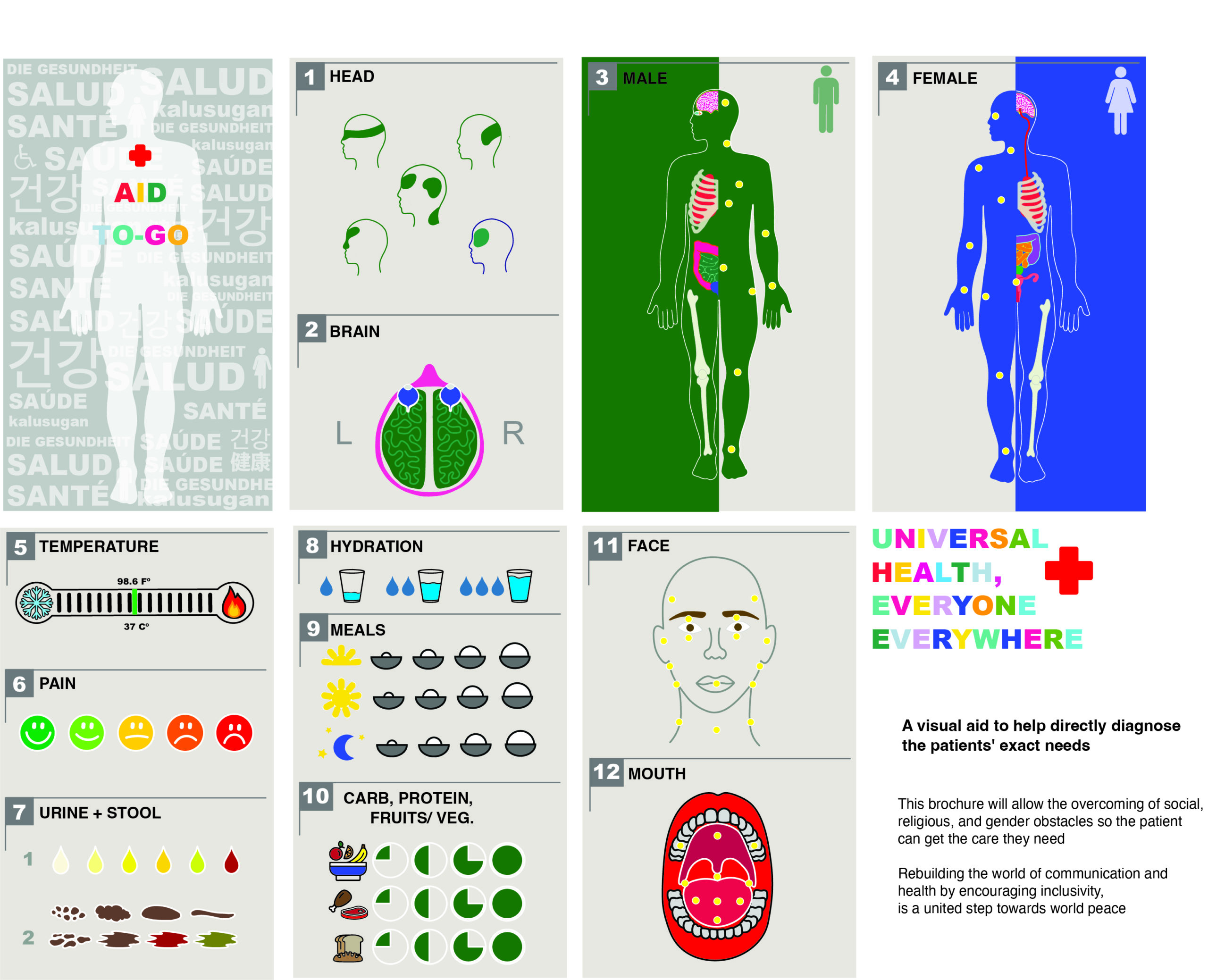
Erin Saya Ahn, grade 10 Roosevelt High School, Seattle, WA Communication is incredibly fluid—we can share culture, art, and ideas using our languages and dialects. I want to reimagine the world of communication and healthcare by encouraging inclusivity as a step toward health equity and world peace. I want people to look past barriers and...
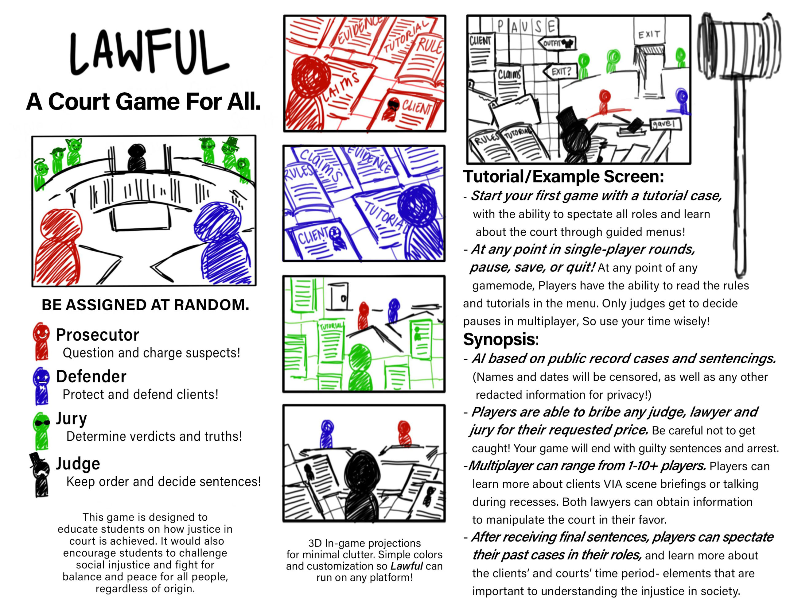
Bianca Arcayena, grade 12 Bergen County Academies, Hackensack, NJ Teacher: Scott Lang Lawful: A Court Game for All examines the balance of justice through law, how justice is decided, and how corruption can spread. The simplified game format helps students learn about how laws are used to create equity in society. It can also show...
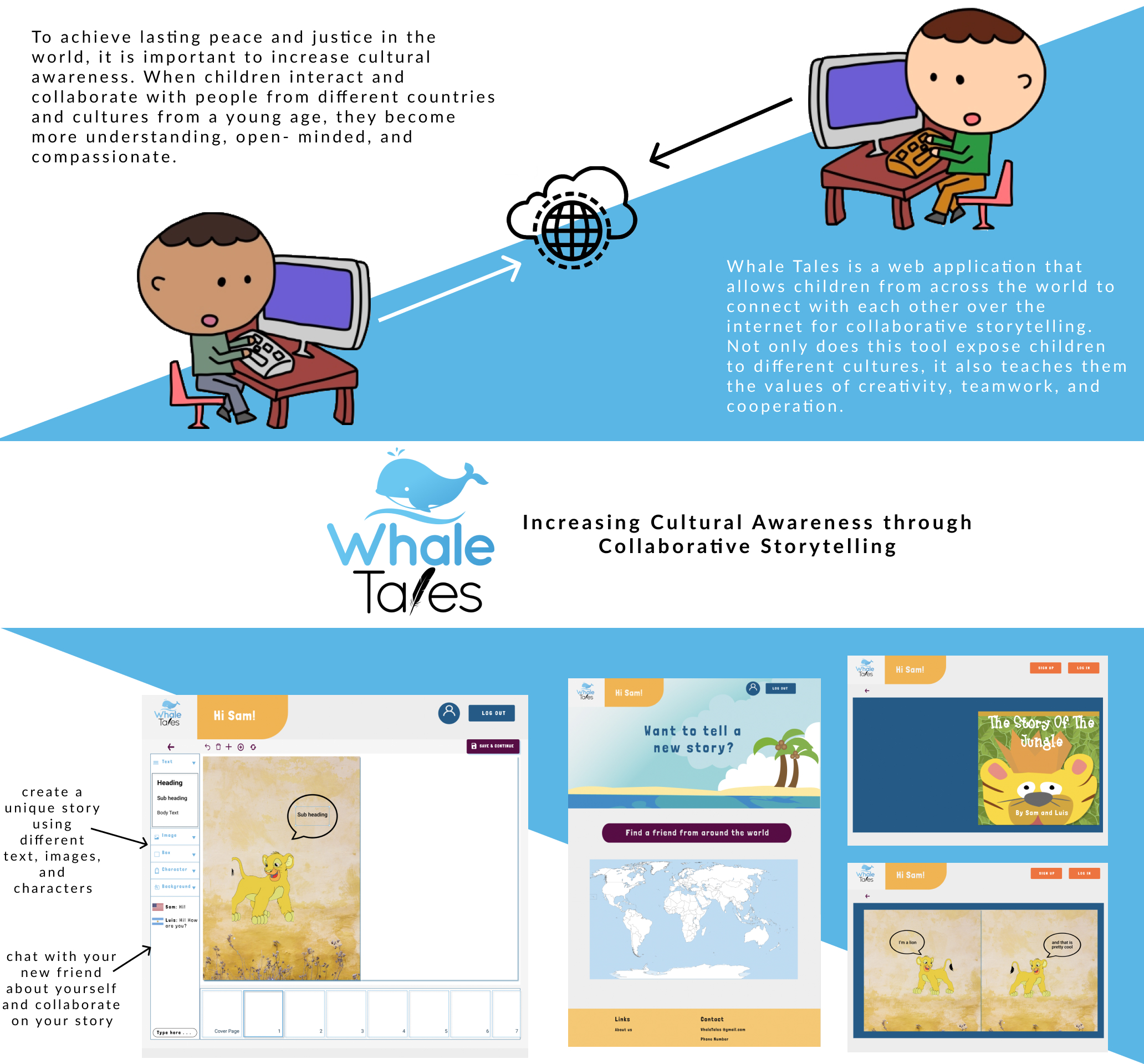
Sohan Chunduru, grade 12 La Jolla Country Day School, La Jolla, CA Teacher: Dan Lenzen The world is witnessing growing discord among people of different cultures, religions, and beliefs. This distrust is rooted in fear of the “other” and suspicions of the unknown. Enabling children to interact with peers from other countries increases cultural awareness...
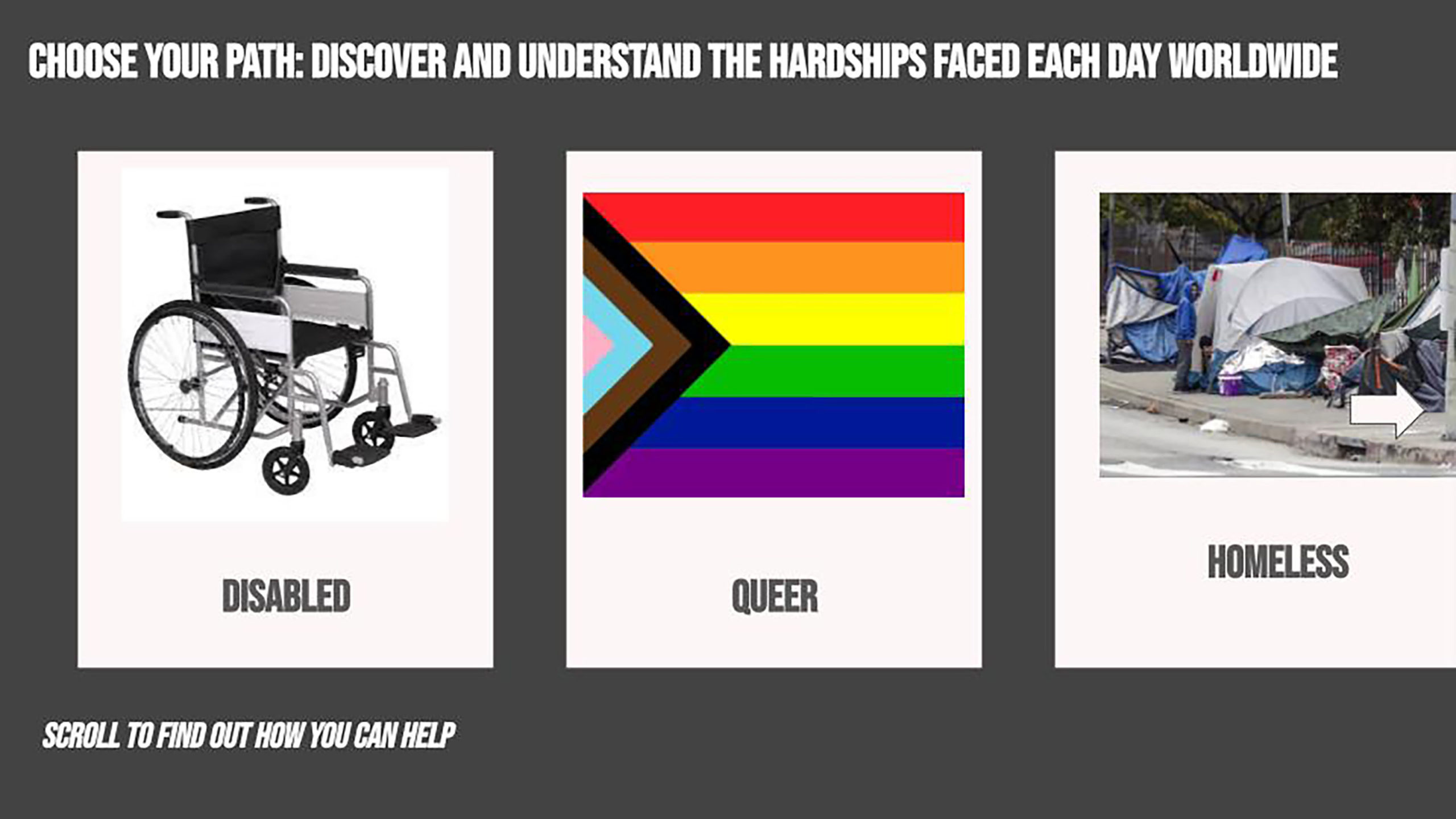
Breanna Avalos-Villatoro, grade 10 Granada Hills Charter High School, Granada Hills, CA Teacher: Narae Kim Discrimination is a major issue in our world. Everyone is affected by it, especially indigenous, queer, and disabled people. It causes wars, racism, and, in some cases, murder. I imagine a world where people take a chance to view the...
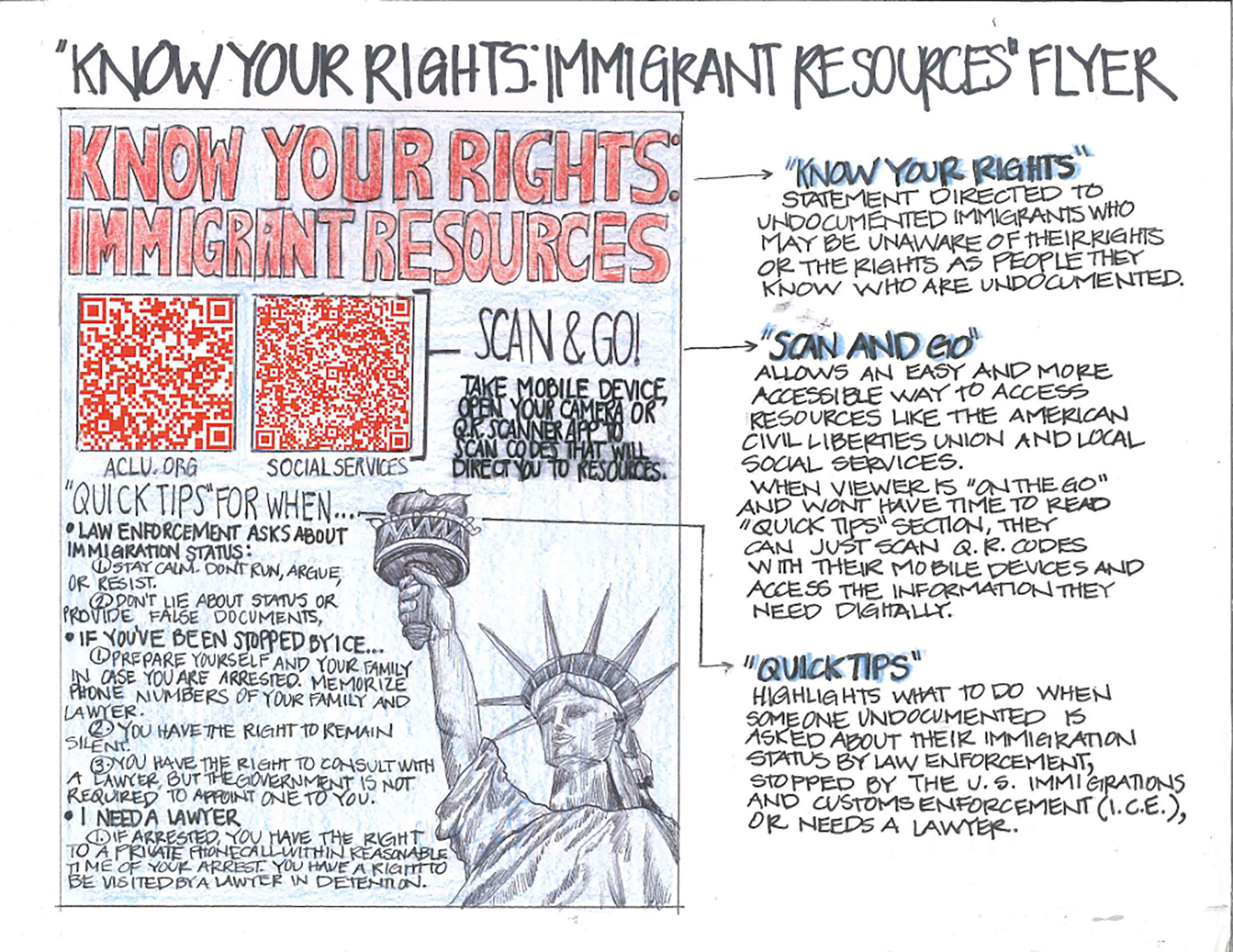
Caroline Berthin, grade 12 Design and Architecture Senior High, Miami, FL Teacher: Eric Hankin There is a need to disseminate credible information and resources regarding immigration policies in the United States to unauthorized immigrants who are unfamiliar with their rights and those who know of unauthorized immigrants. The “Know Your Rights: Immigrant Resources” poster serves...

Isabel Bozdogan, grade 12, and Camila Montero, grade 12 Design and Architecture Senior High, Miami, FL Teacher: Eric Hankin We have designed modules for a community-built art and design education center by adapting the South American indigenous tradition of “Minga,” which stands for collective labor done to promote social utility. The design would be implemented...
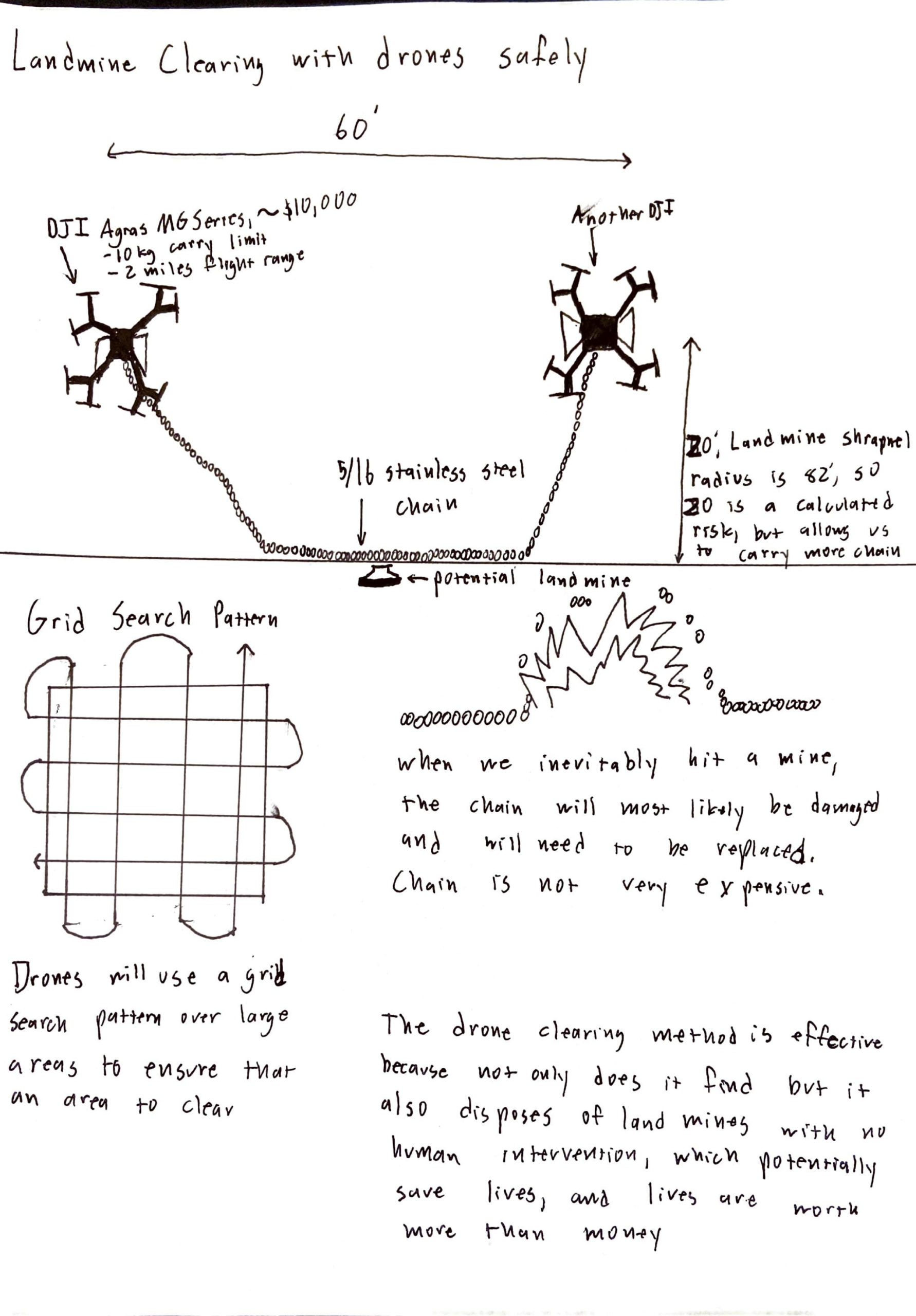
Cristina Cruz, grade 11, and Conrad Parsons, grade 11 Granada Hills Charter High School, Granada Hills, CA Teacher: Kani Kim Our design is a simple yet effective method to dispose of landmines and clear landmine fields. It benefits the user because it allows them to clear the land around them of invisible death traps. We...
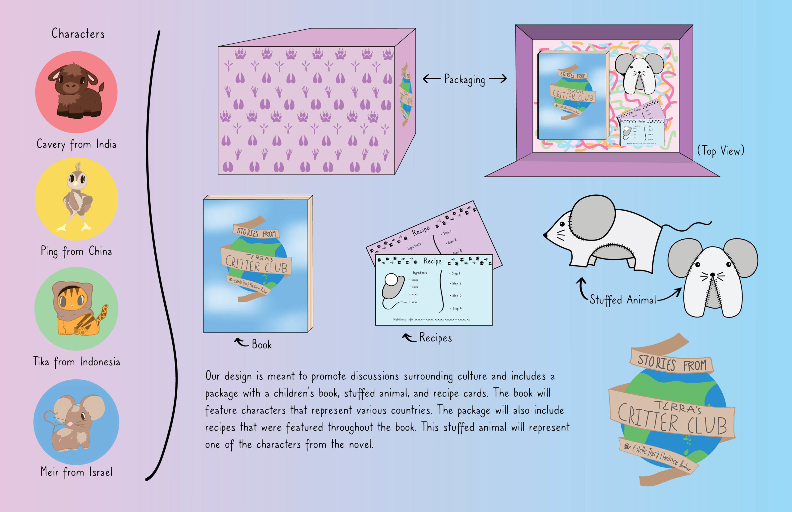
Maile Gaines, grade 11, and Mindy Preston, grade 11 Communications High School, Wall Township, NJ Teacher: Shelley Ortner Religious and cultural intolerance are a widespread problem that only serve to create tension among communities. Our group observed this within our neighborhoods and identified the problem as a lack of education. Those that face this issue...
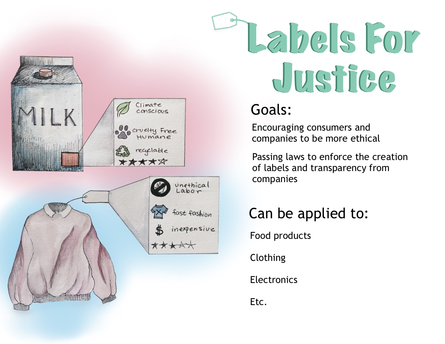
Krystal Jiang, grade 10 Bergen County Academies, Hackensack, NJ Teacher: Scott Lang Improvement is necessary in corporate responsibility and the ethical decisions that consumers make. With this in mind, “shifting the markets” and pushing for a more ethical and sustainable economy is one of the best ways to work toward corporate justice. My design idea...
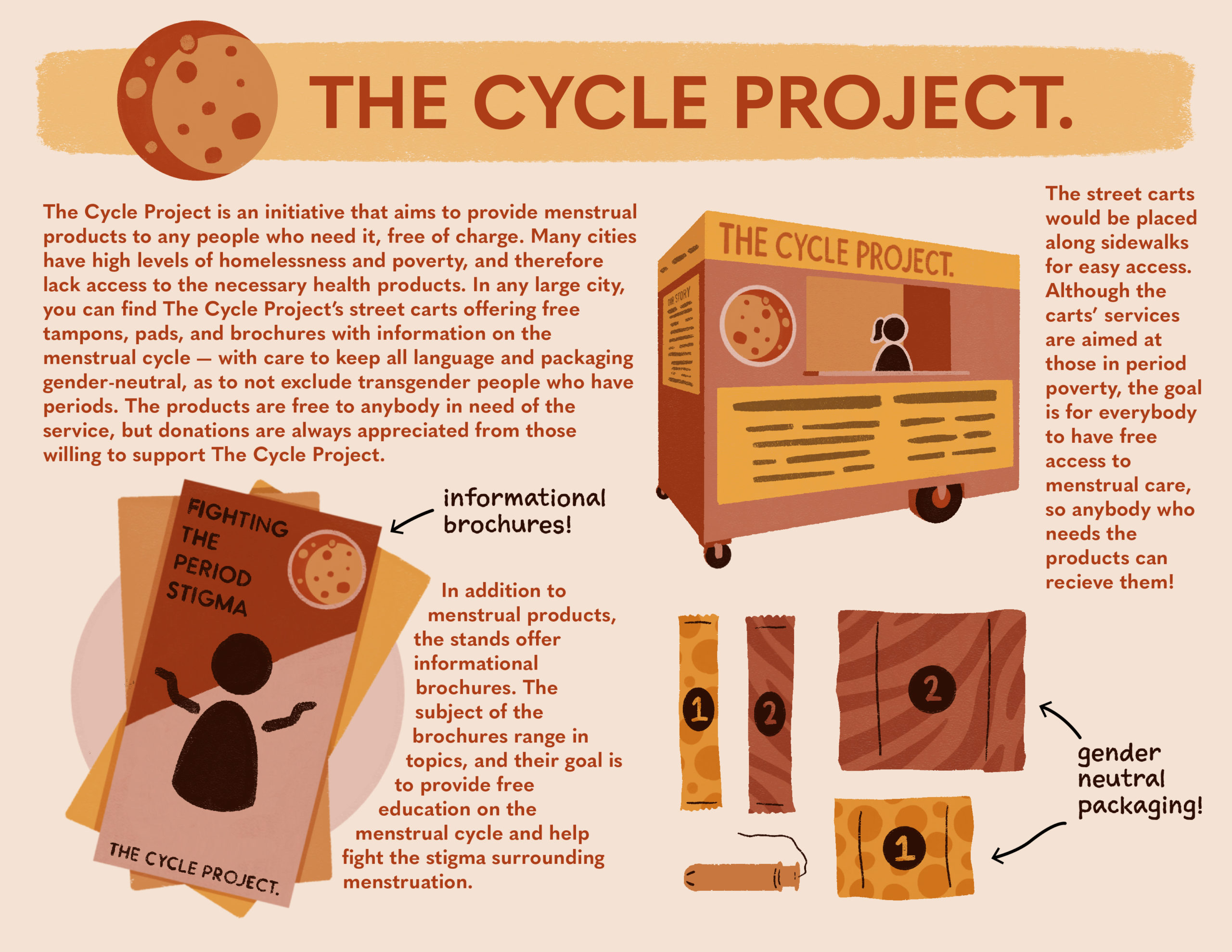
Lucy Montalti, grade 10 Bergen County Academies, Hackensack, NJ Teacher: Scott Lang Currently, period products are viewed as commercial products and even taxed as a luxury item in some regions, despite being a necessary health product. The Cycle Project aims to redefine menstrual products as health products and ensure that all people with periods have...
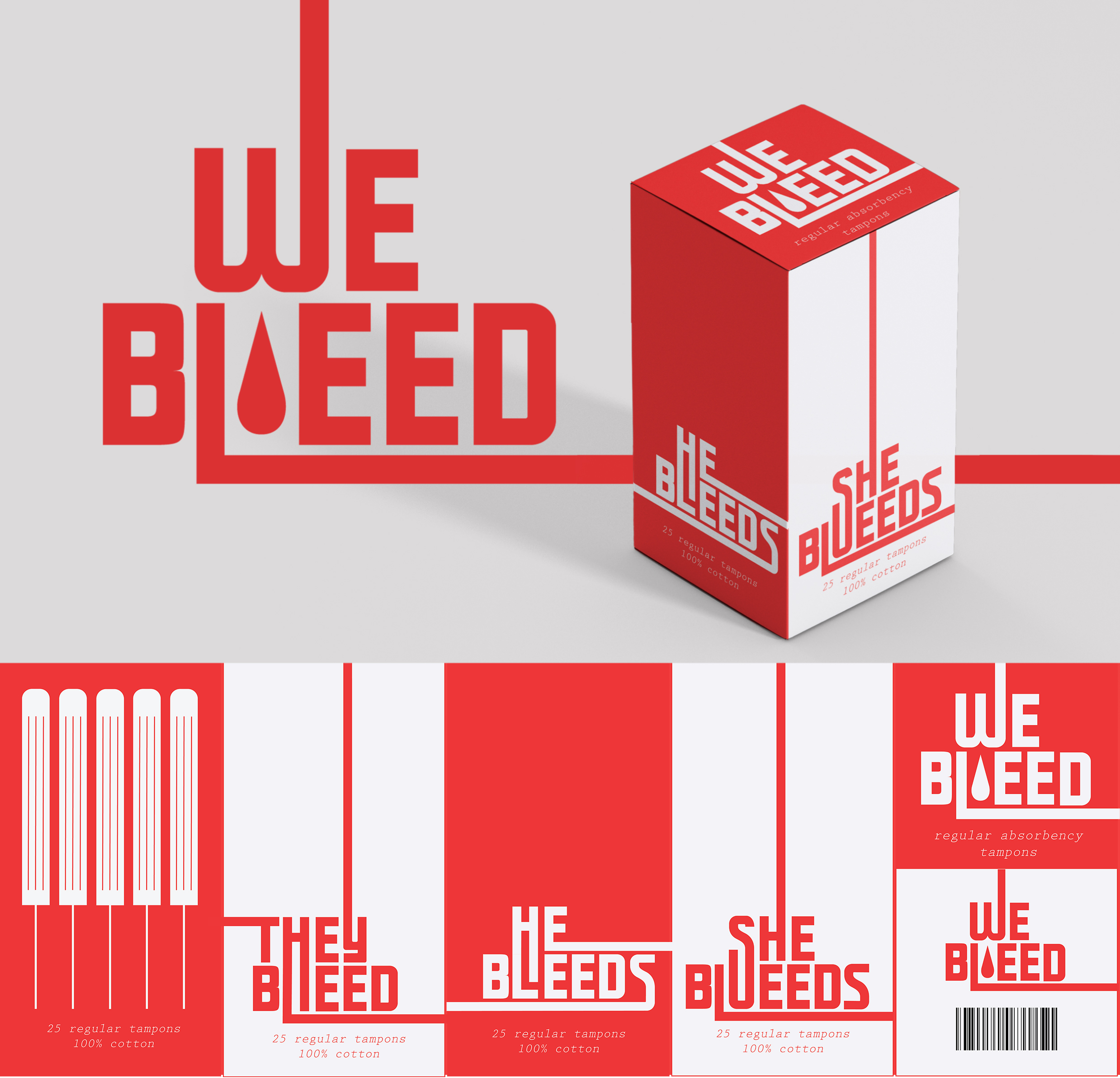
Eleanor Pimentel, grade 12 Moscow Senior High School, Moscow, ID Periods are heavily gendered in our culture. For transgender and nonbinary people who are assigned female at birth, taking care of their reproductive health means being misgendered by doctors, bathroom signs, and even product packaging. Gender nonconforming people’s mental and physical health suffers because of...
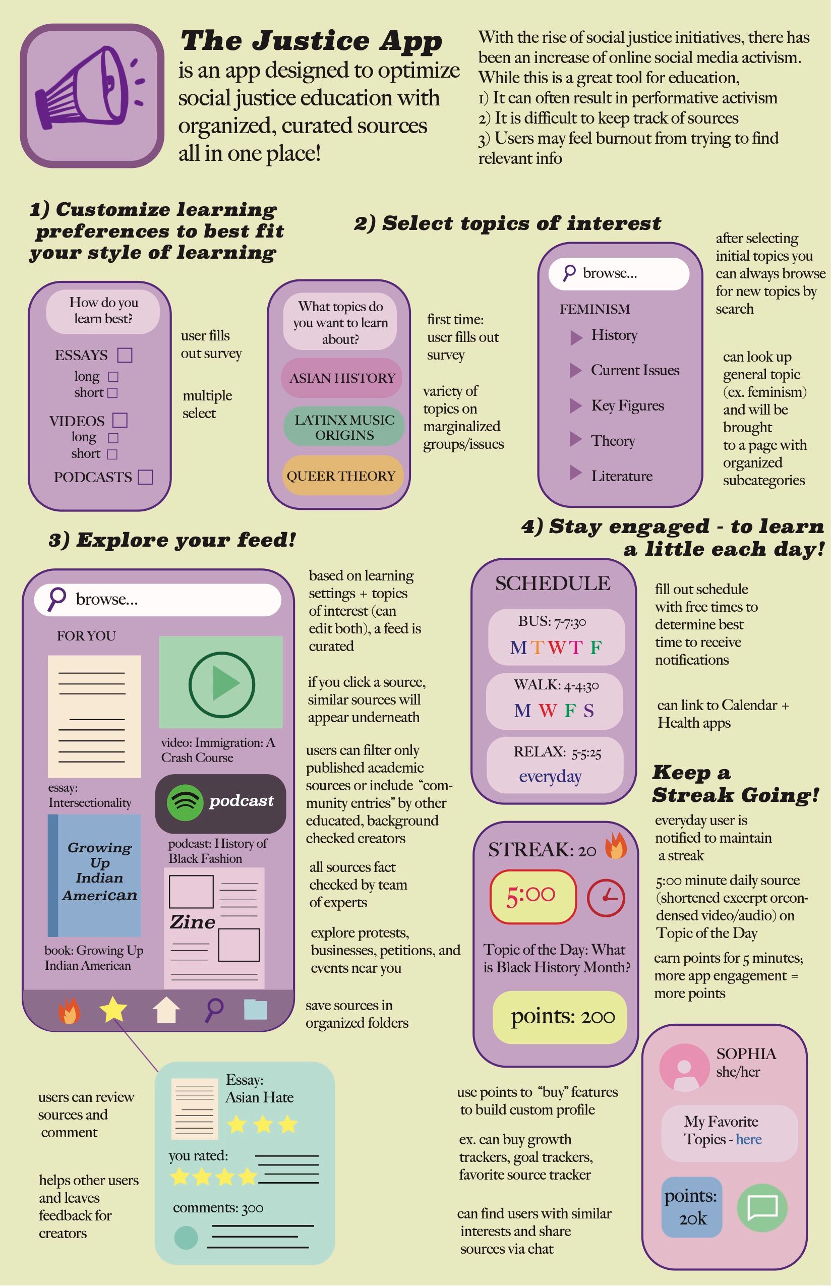
Sophia Shin, grade 11 Bergen County Academies, Hackensack, NJ Teacher: Scott Lang I am reimagining a world where social justice education is made easier and awareness is taken more seriously. This concept affects all people but specifically targets young social media users, allowing youth to learn and create change through technology in a more effective...
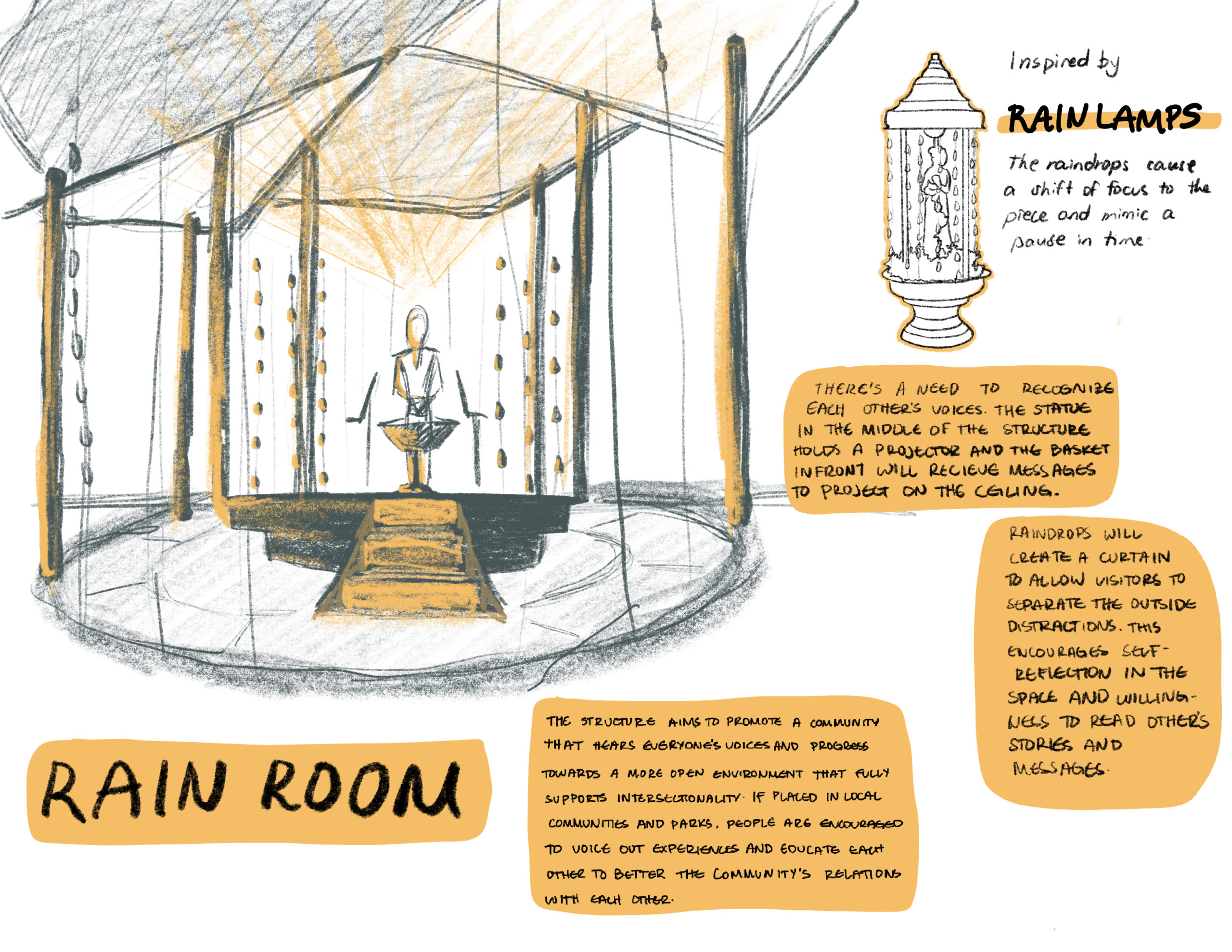
Thea Angella Tenorio, grade 12 Redwood High School, Larkspur, CA My design addresses the struggle of amplifying the voices of marginalized communities. The lack of these voices perpetuates a society built to benefit those who are privileged, without making room for other people. I’ve experienced this marginalization and hope to create a better environment for...
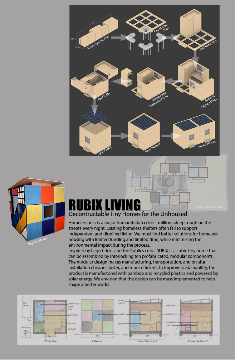
Renee Wang, grade 10 The Bishop’s School, La Jolla, CA Millions of people worldwide are denied the basic human right to a home. The typical homeless shelter fails to cater to individuals’ needs because they do not support independent and private living. However, tiny homes offer comfortable living, permanent housing, a sense of community, and...
Lake Wiesmayr-Cheuk, grade 11 Fiorello H. LaGuardia High School, New York, NY Living in New York’s Chinatown, I’ve learned from personal experience that ignorance creates prejudice. I took the idiom, “Before you judge someone, walk a mile in their shoes,” as inspiration for my design. In order to empathize with another person it is helpful...