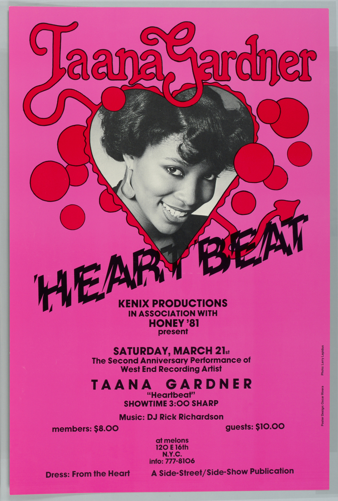
Although some may claim that disco died a messy media “death” in 1979, in the early ’80s, its “Heartbeat” could still be heard reverberating on radio airwaves and in dance clubs across the United States.[1] Fame first found Taana Gardner in 1978, when she became an overnight sensation after recording the vocals for West End...
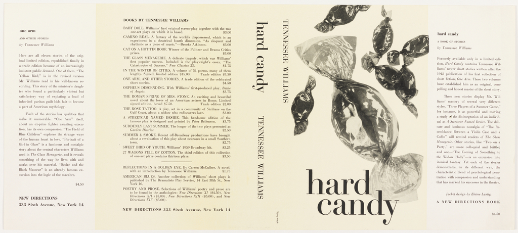
Although Elaine Lustig Cohen left behind a significant body of work, she did not really begin her own graphic design career until the death of her husband, Alvin Lustig, in 1955. Lustig, one of the most influential graphic designers, relied on his wife to serve as his secretary, draftsperson, and production assistant, becoming increasingly dependent...
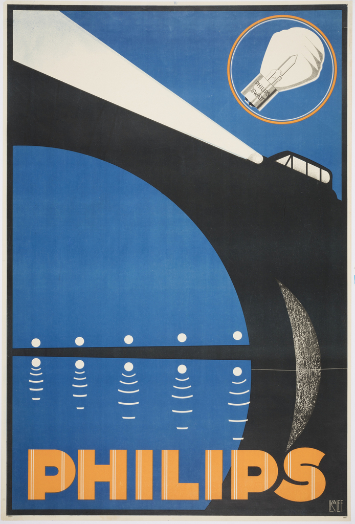
When Louis C. Kalff was hired by Philips in 1925, the company was one of the largest producers of lightbulbs in the world. Kalff created a brand identity for the company, including the iconic logo. For this poster, Kalff illustrated a car whose piercing bright headlights illuminate the scene. The stylized arcs and angles reflect...
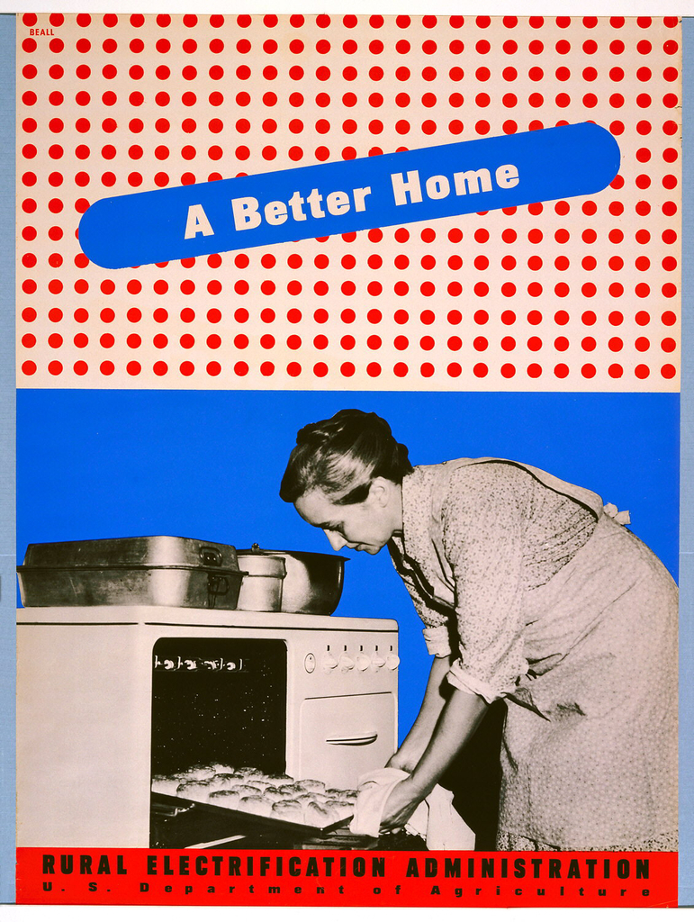
This blog post was originally published on January 8, 2014. By the 1930s, the vast majority of American urban dwellers had access to electricity in their homes and businesses. But those in impoverished rural areas were often not serviced by private electric companies, who believed that it was not cost-effective for them to invest in...
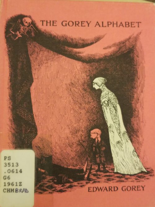
In the spirit of Halloween, a fun and spooky object in our library collection is a copy of The Gorey Alphabet by Edward Gorey. Edward Gorey (1925-2000), American writer and artist, child prodigy and high achiever has nestled his way into the hearts of those fond of dark themes, Victorian and Edwardian settings, and pen-and-ink drawings. The...
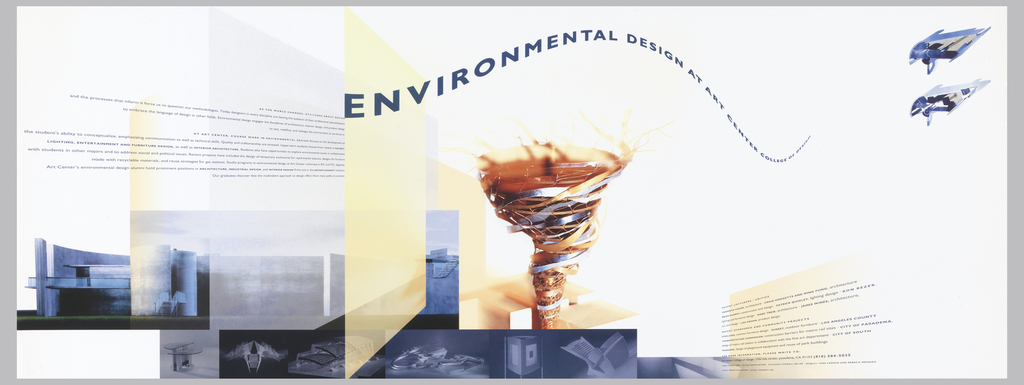
Today’s Object of the Day celebrates the winners of Cooper Hewitt’s National Design Awards. Honoring lasting achievement in American design, the Awards take place annually during National Design Week, with festivities for all ages celebrating design creativity and innovation. Today’s blog post was originally published on March 29, 2018. As design director for her alma mater, Art Center...
I have always loved looking at old advertisements in magazines; many of the people that come and use the Cooper Hewitt Library come for that specific reason. Advertisements are designed to establish a connection between the person seeing it, and the product or idea the ad is selling. Typefaces, colors, styles of portraying an object-...
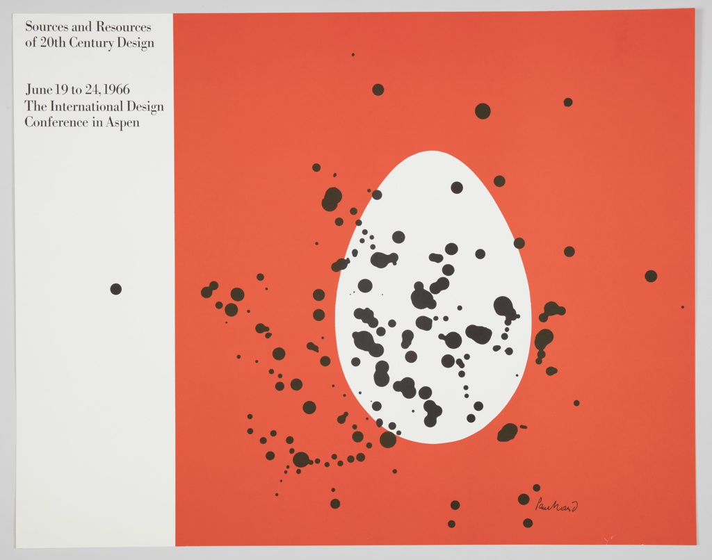
Today’s Object of the Day is on view in Rebeca Méndez Selects (October 5, 2018–June 16, 2019) Produced by renowned American graphic designer Paul Rand, this poster announces the 1966 International Design Conference in Aspen (IDCA). Rand is known for his influential contributions to the advertising industry, including his logos for IBM, Westinghouse, ABC, and...
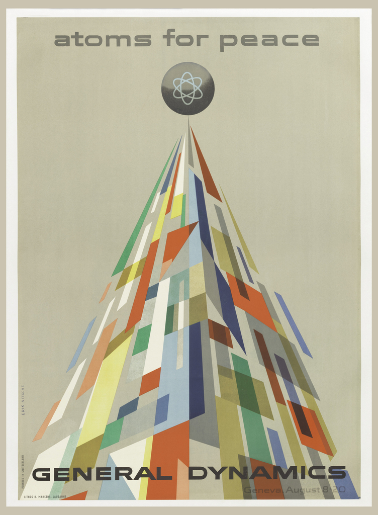
This blog post was originally published on August 4, 2014. The year is 1955, and Cold War tensions have begun to escalate. General Dynamics is a newly formed parent company overseeing eleven manufacturers, producing cutting edge technology for the defense of the United States. The company is capitalizing on the American policy of nuclear deterrence,...
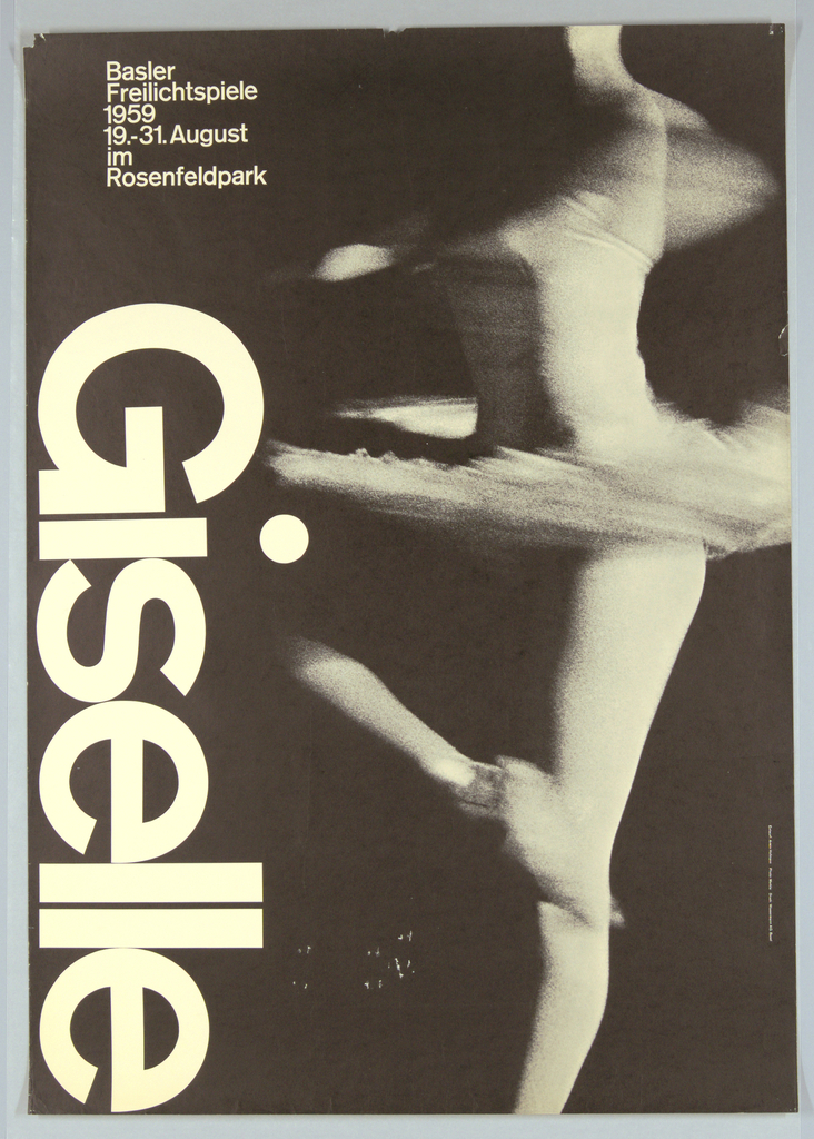
Armin Hofmann (Swiss, b. 1920) is associated with a graphic design movement known as the Swiss Style, which originated in Switzerland in the 1940s and 50s. Also referred to as the International Typographic Style, the Swiss Style is characterized by a recognition of the importance of typography—especially sans-serif fonts—as an essential element of design. The...
Today’s blog post was originally published on July 10, 2013. There are many ways to celebrate an anniversary. To commemorate a decade of working together as the design duo Non-Format, Kjell Ekhorn and Jon Forss did not opt for the traditional gifting of tin, pewter, or aluminum. Instead, they pooled their creative energies towards a personal...
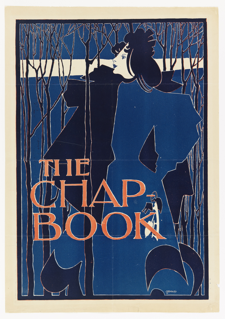
With the temperature outside at record highs this week, I can’t help but think of William Henry Bradley’s The Blue Lady. Clutching her ice skates in her left hand, she makes a cold winter’s stroll through the thin, bare trees look elegant and placid. The Blue Lady was Bradley’s second poster for The Chap-Book, America’s...
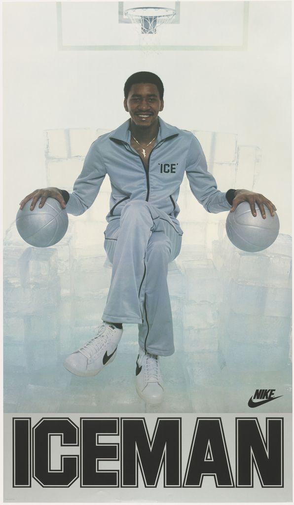
Basketball star George Gervin never broke a sweat because he stayed cool under pressure. At least that’s what his teammates Julius Erving and Fatty Taylor thought when they nicknamed him “Iceman” in the early 1970s. But according to Gervin, his ability to remain dry throughout a game had nothing to do with a calm demeanor....
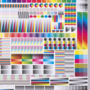
To celebrate the opening of Saturated: The Allure and Science of Color (May 11, 2018-January 13, 2019), Object of the Day this month will feature colorful objects from the exhibition. Graphic designer Fanette Mellier (French, b. 1977) has a contemporary practice that frequently highlights process in the printed medium. Her stunning poster, Specimen, initially appears abstract. Dominated by...
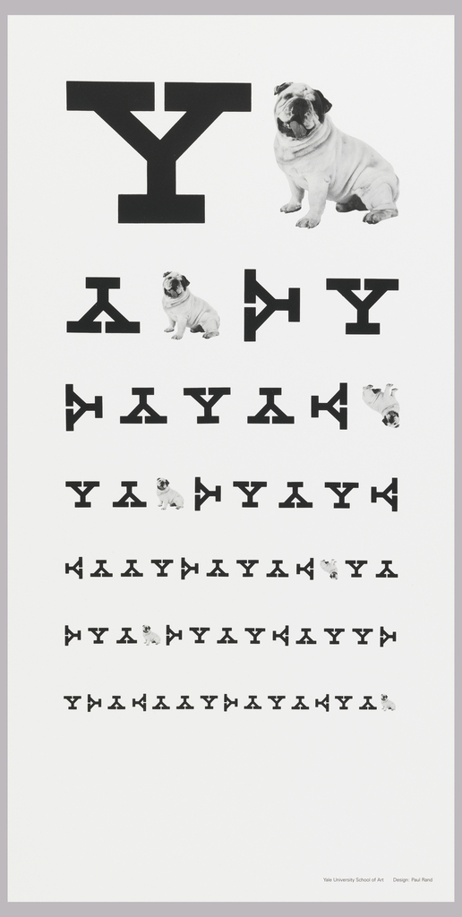
In celebration of our new exhibition, The Senses: Design Beyond Vision, this Object of the Day post explores the multi-sensory experience of an object in Cooper Hewitt’s permanent collection. In this poster, graphic designer Paul Rand plays with the iconography of eye charts to create a clever advertisement for Yale University. He incorporates the school’s mascot, an...