
In celebration of our new exhibition, The Senses: Design Beyond Vision, this Object of the Day post explores the multi-sensory experience of an object in Cooper Hewitt’s permanent collection.
In this poster, graphic designer Paul Rand plays with the iconography of eye charts to create a clever advertisement for Yale University. He incorporates the school’s mascot, an English bulldog, into an eye chart composed exclusively of “Y” letter-forms arranged on various axes.
When one visits the eye doctor for a checkup, one may be asked to begin by reading an eye chart, typically hung or projected on an opposing wall. The chart measures visual acuity, or sharpness of vision. Eye doctor Herman Snellen (Dutch, 1834-1908) developed the most commonly used eye chart in the 1860s. The now iconic Snellen chart contains 11 rows of capital letters decreasing in size as the eye follows the rows down. The smallest row that a patient can read accurately indicates visual acuity. Before Snellen’s standardized eye chart, people diagnosed their vision problems by themselves and picked the corrective lenses they judged appropriate for their vision. Snellen also created the “Tumbling E” chart for illiterate patients, or those unfamiliar with the Roman alphabet. Rather than identifying letter-forms, patients can indicate which way the “E” is facing.
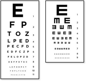
Image courtesy of: http://trappopticians.org/eye-exams/bronxville/
Snellen’s graphic ingenuity inspired this “Tumbling Y” poster by Paul Rand, who taught Graphic Design at Yale University from 1956 to 1985. Rand was an American art director and graphic designer, best known for revolutionizing the advertising profession with his corporate logo designs, including the logos for IBM, UPS, Enron, Morningstar, Inc., Westinghouse, ABC, and NeXT. His work merges beauty and functionality in order to effectively convey messages to the public.
In this poster, Rand relies on strong visual ideas and dynamic typography to engage the eye and attention of the reader. He juxtaposes bold lettering with a photo of Yale’s bulldog mascot, whose body subtly echoes the form of the “Y” letters. No matter how sharp your vision is, the poster’s intention is clear: it is a celebration of Yale University. By contrasting type and image, Rand creates a new graphic relationship between Yale’s logo and iconic eye chart design.
This post was written by Adèle Bourbonne, curatorial capstone fellow for The Senses: Design Beyond Vision. She is an MA candidate in the History of Design and Curatorial Studies program offered at Parsons The New School of Design jointly with Cooper Hewitt, Smithsonian Design Museum.