I have always loved looking at old advertisements in magazines; many of the people that come and use the Cooper Hewitt Library come for that specific reason. Advertisements are designed to establish a connection between the person seeing it, and the product or idea the ad is selling. Typefaces, colors, styles of portraying an object- with various styles of illustration, – woodblock printing, engravings, painting, watercolor, photography and other techniques create a mood and time. The use of older styles of advertising is popular because they evoke nostalgia for a time and place, a desire for something not in the immediate present.
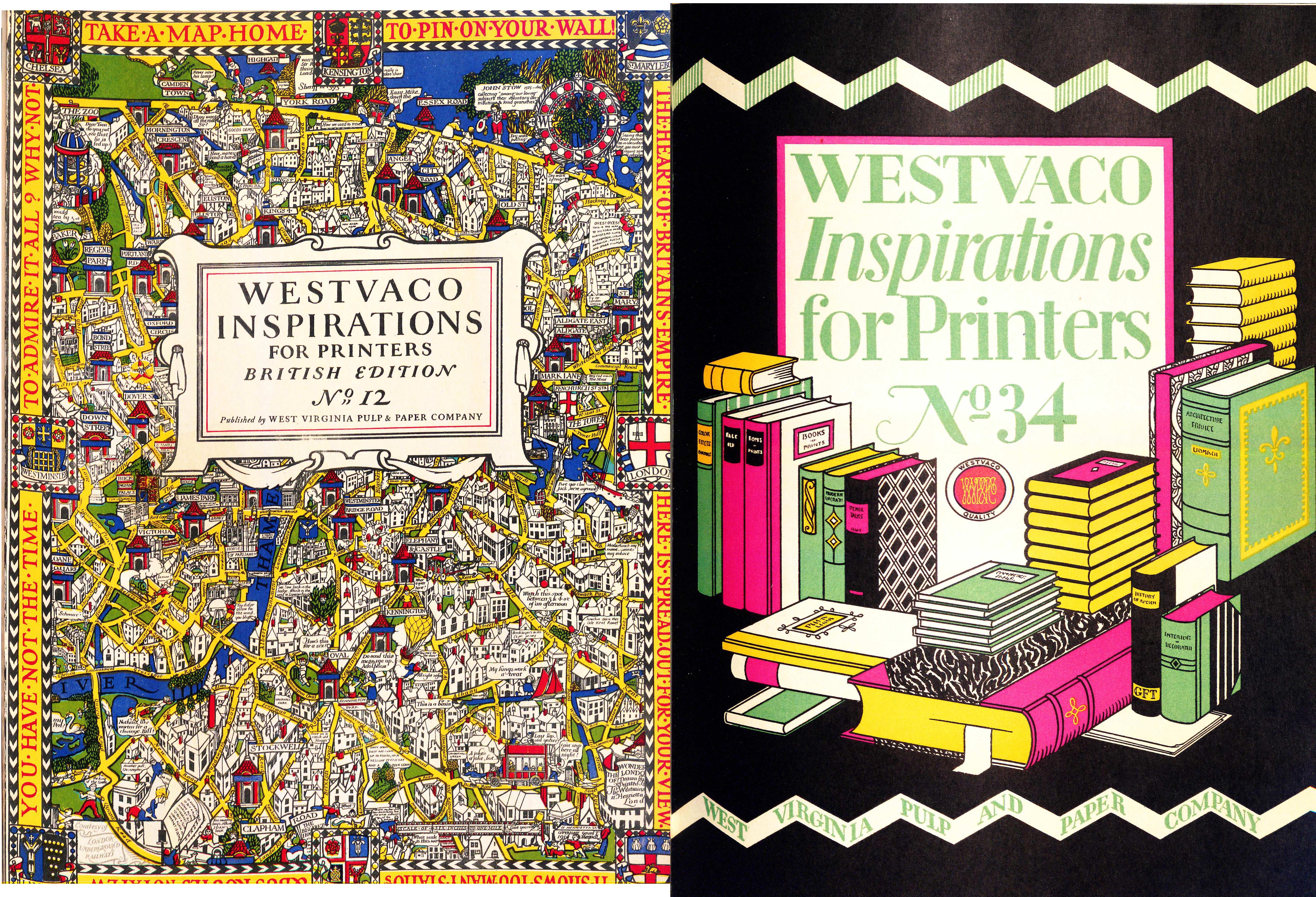
Inspirations for Printers (1925-62) offers examples of every kind of advertisement; the reproductions of the ads come with a small essay or paragraph explaining why it is effective- it details the type of printing process used, the typeface, and the type of Westvaco paper the ad was printed on. Westvaco (West Virginia Pulp and Paper Company), started manufacturing paper in 1884 and began this publication in 1925 to promote and highlight the best in advertising arts by showing typography, photography, art work and other graphic inventiveness on papers manufactured at its mills. Because Westvaco Inspirations was intended to demonstrate printing processes and papers, its primary audience consisted of 35,000 designers, printers, teachers and students. Editorial features included short essays on history of art and printing. Short essays on the advantages of using certain techniques for effective advertising examined humor or historical anecdotes to set a tone.
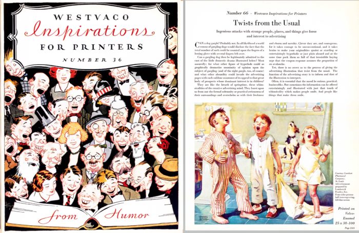
Cover featuring humor, (L) no. 36, 1928. (R) Ad using the unusual, funny. no. 66, 1931.
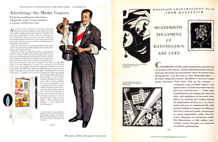
Suggestions for the use of silhouettes, nature, old fashioned looks, colors or modernism for example, helped advertising professionals on all levels decide on graphic design styles. The 1925 publication debut coincided with the art deco and modernist movements, which in the field of graphic design, this title embraced from the beginning. In 1939, Bradbury Thompson became the art director/designer of Inspirations and transformed it onto a vehicle for experimental and innovative layouts and design.
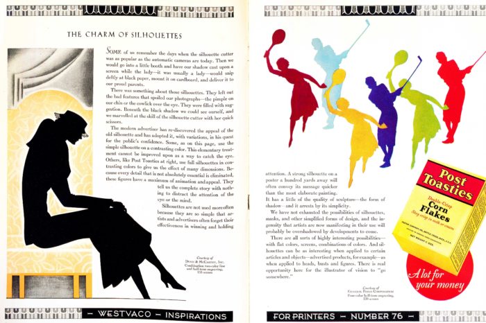
Advertisement for Post Toasties cereal, The charm of silhouettes. no 76, 1933.
Elizabeth Broman is a Reference Librarian at the Cooper Hewitt, Smithsonian Design Library.