Announcing the Winner
ANNOUNCING THE 2025 WINNER!
Finalists Jazmin Abasto-Ruggeri, Erin Hong, and Advika Kalla attended a virtual Judging Weekend on June 7-8, 2025, where they learned more about design and presented their ideas to an esteemed panel of judges: Liz Danzico, Vice President of Design, Microsoft AI and Founding Chair, MFA Interaction Design, School of Visual Arts; Maria Nicanor, Director, Cooper Hewitt, Smithsonian Design Museum; Omar Nobil, Senior Vice President of Design and Brand Creative, Design Within Reach; Ainsley Romero, Brand Designer, Pinterest; and Jules Sherman, 2025 National Design Award Winner, Biodesign Program Director, Children’s National Hospital, and Principal, JS Design Group, LLC.
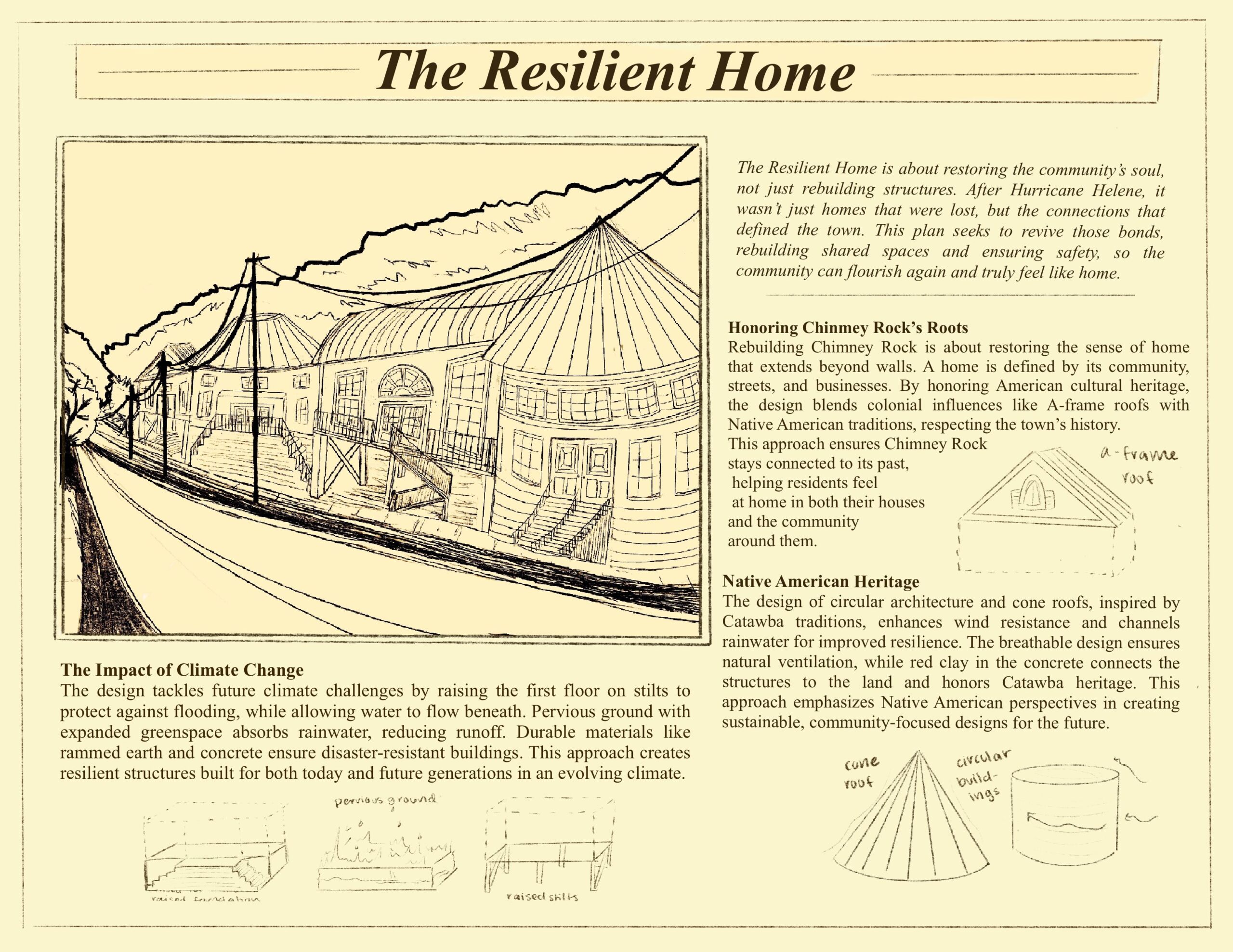
 Congratulations to Advika Kalla, rising senior at North Carolina School of Science and Mathematics (NCSSM) in Durham, North Carolina for being named the 2025 National High School Design Competition winner! Her project, The Resilient Home, proposes to rebuild the town of Chimney Rock, North Carolina after devastation wrought by Hurricane Helene in 2024 with a design that pays homage to the indigenous and colonial history of the region. The design restores Chimney Rock’s sense of home by honoring its cultural history while adapting to climate challenges. The Resilient Home is a design framework that blends tradition with sustainability and sets a model for disaster impacted mountain communities. Watch the presentations of the finalists and explore the projects of all the finalists and honorable mentions below.
MEET THE 2025 FINALISTS AND HONORABLE MENTIONS!
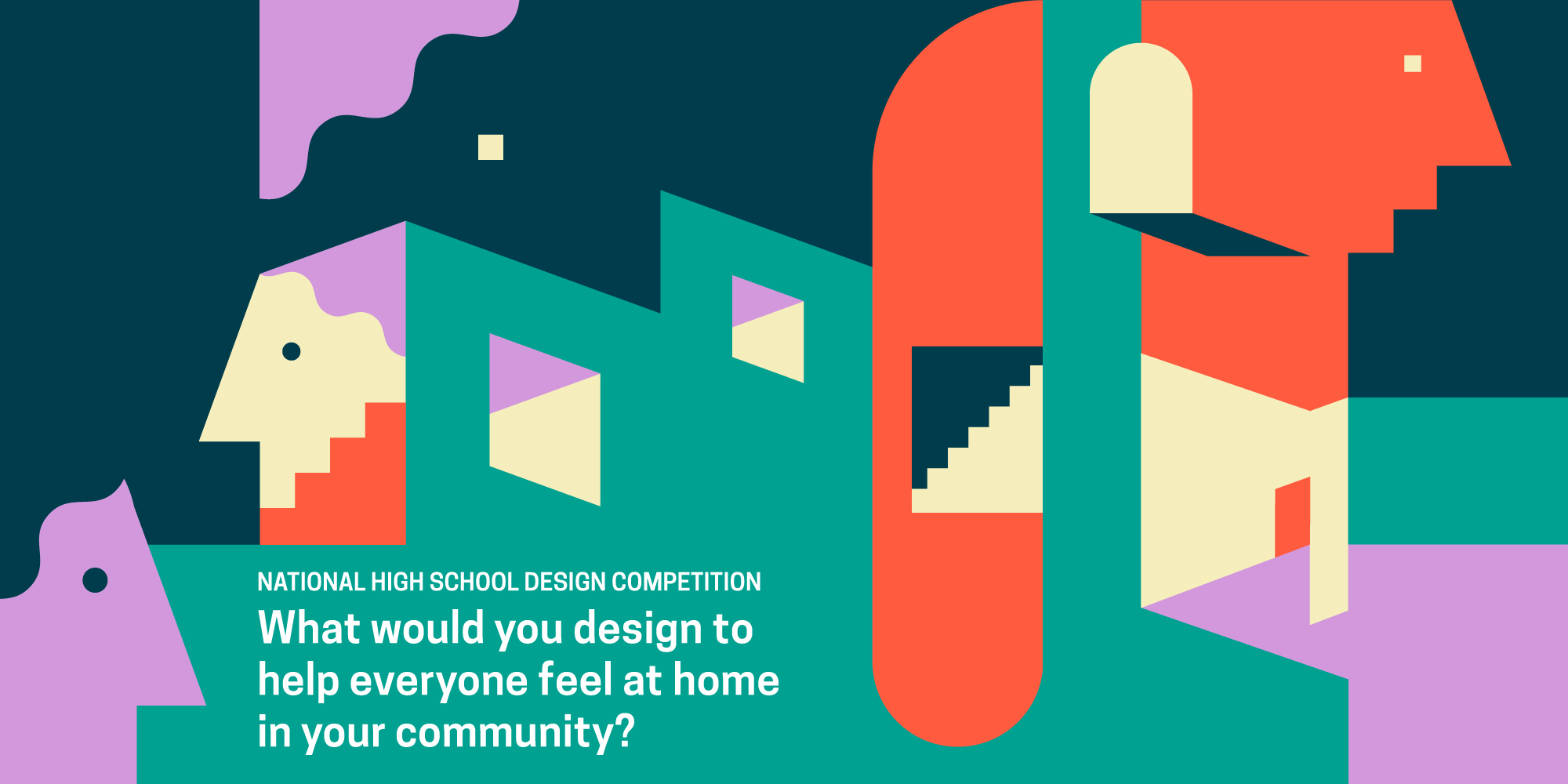
After reviewing 633 thoughtful entries from across the country, Cooper Hewitt is pleased to announce the finalists and honorable mentions for the 2025 National High School Design Competition. The 2025 competition invited teens to use design to help everyone in their community feel at home. Finalists will move on to the next stage of the competition full of inspiring mentoring activities. Finalists will attend an in-person Mentor Weekend at Cooper Hewitt, Smithsonian Design Museum in New York City. Finalists will then join a virtual Judging Weekend, where they’ll present their final designs to a panel of judges. Congratulations to the finalists and honorable mentions!
Jazmin Abasto-Ruggeri, grade 11
Cuthbertson High School, Waxhaw, NC
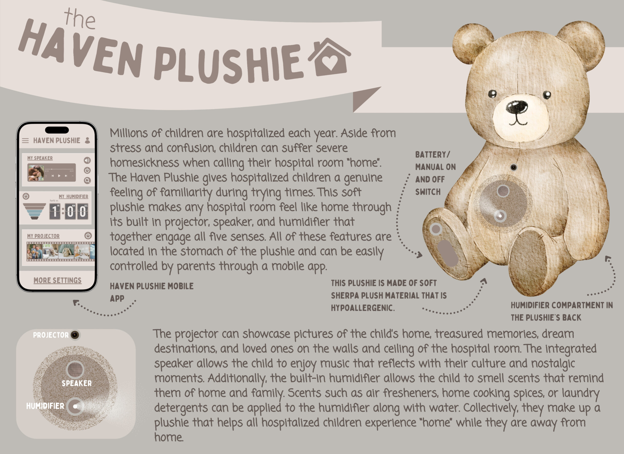
My product provides hospitalized children with a comforting plushie that reminds them of home. I created this plushie to help these courageous kids feel at home despite being away from it. My design features ultra-soft fabric and a built-in nebulizer, projector, and speaker; these features are all controllable via a mobile app or directly on the plushie. Each feature can be completely tailored to what each child considers “home,” from playing special music to encapsulating the child in a familiar scent. My design can help millions of hospitalized children across the globe so they don’t have to worry about when they might see home again. This plushie will make hospitalized children feel comforted and their parents grateful for seeing their children relieved from the heartbreaking homesickness while they continue their fight.
Erin Hong, grade 10
Sunny Hills High School, Fullerton, CA
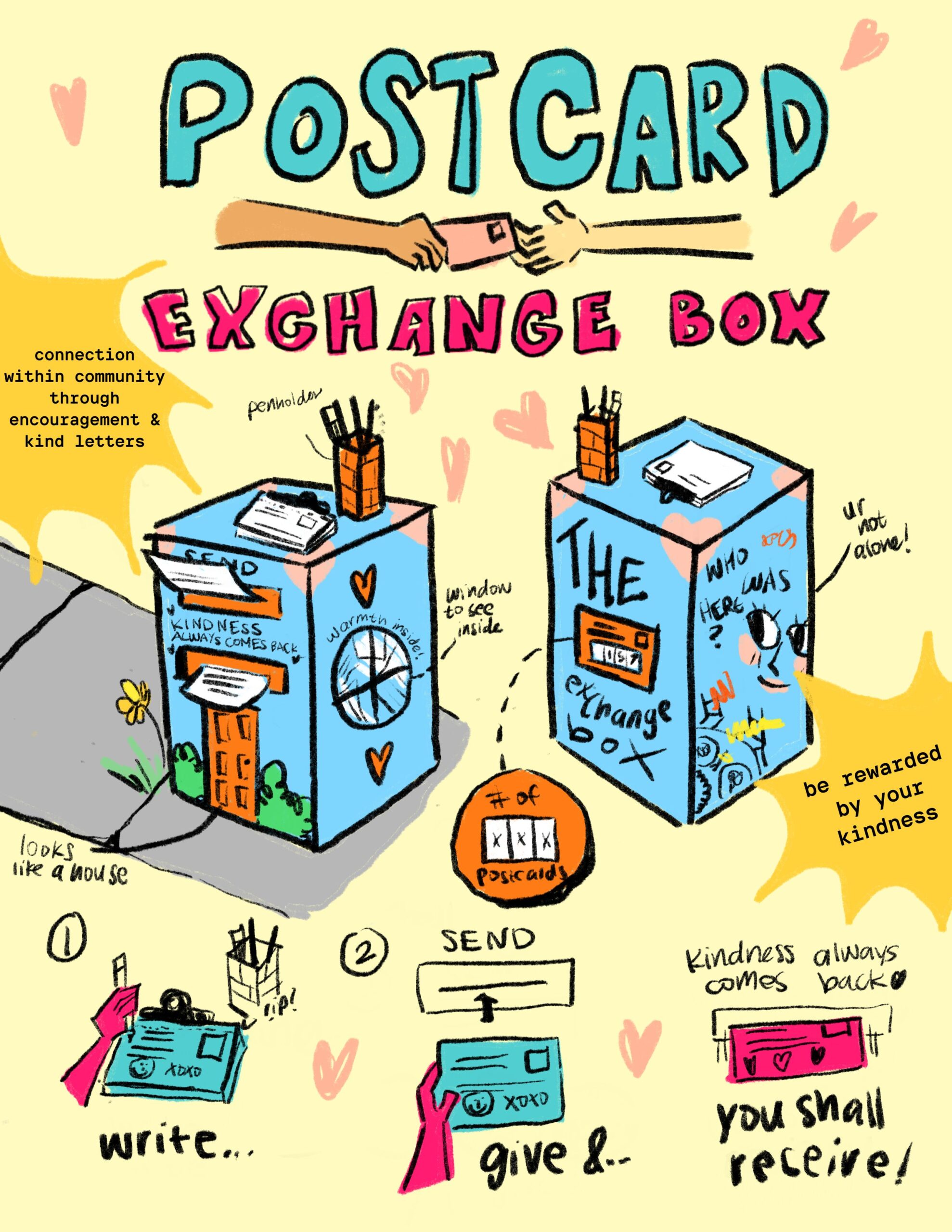
In suburban areas like the one I live in, I feel it is harder to connect. When I knock on my neighbors’ doors, they don’t open them because we lack community. Despite the fact that we are farther apart figuratively and literally, I believe my design can knit our hearts closer together. The user writes their kind note and inserts it into the machine. Then they receive a postcard that was written by a previous user. It is like an ATM machine, except you do not get rich with money, but instead, a postcard rich with love. This not only allows the community to feel at home but improves mental health through compassion and affirmations. The mailbox can be placed in neighborhoods, markets, and airports. This allows everyone to know they belong and are not alone, regardless of who they are and where they have come from.
Advika Kalla, grade 11
North Carolina School of Science and Mathematics (NCSSM), Durham, NC
When Hurricane Helene hit picturesque Chimney Rock, North Carolina, it destroyed 73,000 properties and took over 100 lives. It disrupted the sense of home in the town, which had been lived in for generations. I aim to help rebuild this town that is resilient and restore its Indigenous heritage. My design honors Catawba Indigenous architecture and ensures resilience. It features circular structures with curved roofs for smoother wind flow and ventilation that increases downward force. Sites follow the mountain slopes and wind patterns; they use North Carolina’s red clay for thermal protection. The lofted foundation protects against floods. This design restores Chimney Rock’s sense of home by honoring its cultural history while adapting to climate challenges. It reinvigorates the town’s identity by creating resilient spaces for businesses and gatherings. Blending tradition with sustainability, it sets a model for mountain communities to rebuild for heritage and the future.
Maithili Chaudhari, grade 12
McNair Academic High School, Jersey City, NJ
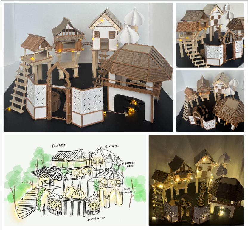
This design was inspired by my hometown of Jersey City, where 40+ languages are spoken and almost 1/2 of the population is born outside the USA. In such an ethnically and culturally diverse city, many specific cultural neighborhoods have formed, allowing for connection over common roots but also creating clear separations. This Multicultural Pavilion is a mixed-use community space that can be used for art exhibits, social events, and performances. It includes an amphitheater-style stage, as well as various separated spaces connected by stairs and bridges. Its design blends Middle Eastern, Asian, European, and Latin American architectural elements. The Multicultural Pavilion allows for interaction between different cultures and creates a space for a variety of artists to showcase their work. It allows for year-round celebration of cultural differences and traditional practices side by side in a way that lets people find similarities between their heritages and creates a space where everyone is welcome.
Kevin Chen, grade 12 and Lance Lim, grade 12
Glen A. Wilson High School, Hacienda Heights, CA
Teacher: Justin Ro
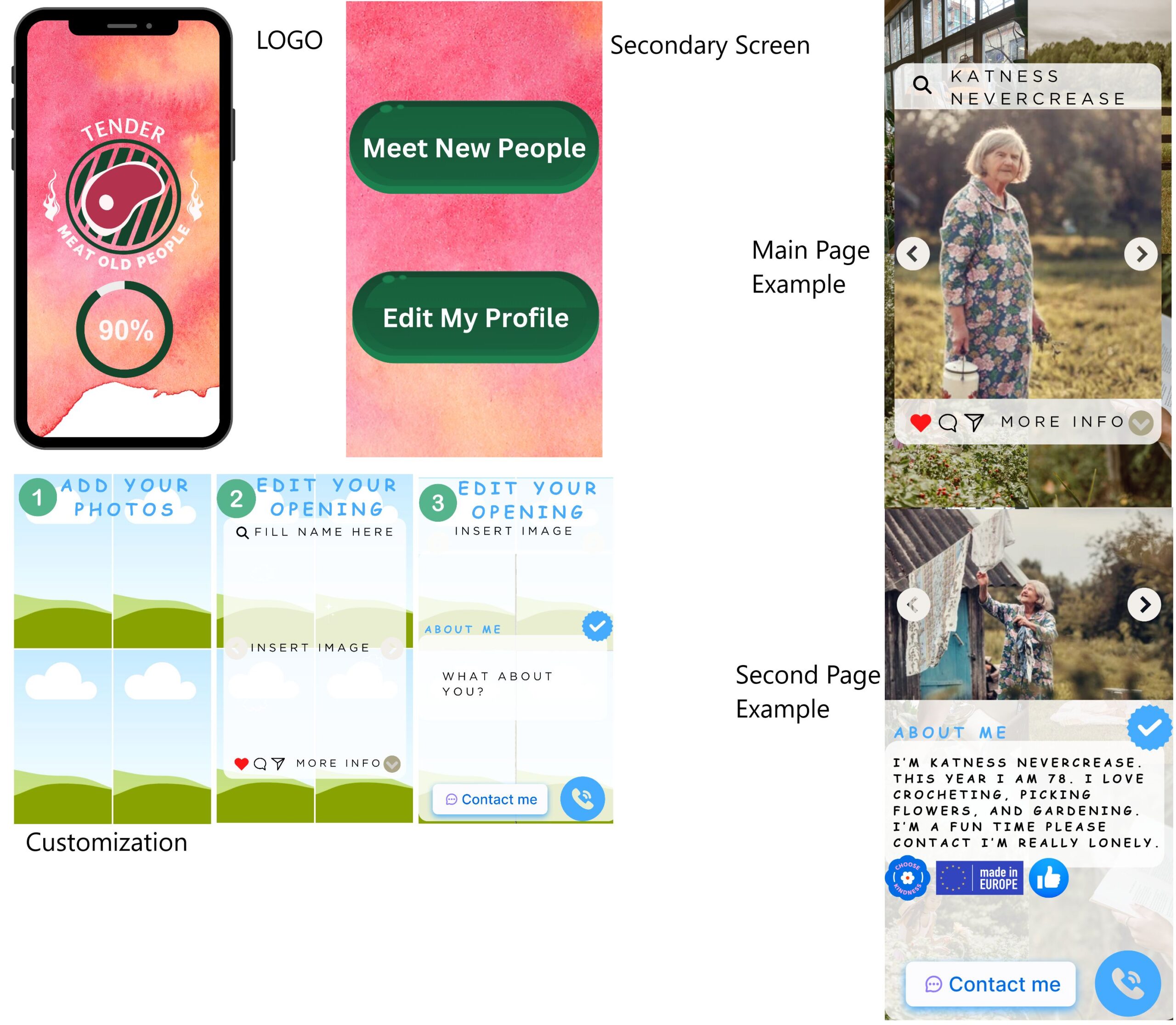
Our online meet-and-greet app, called Tender, focuses on intuitive design curated for seniors. Booting up, you’ll see a profile creation screen (after registering) where you can customize your appeal to peers. After the 10-minute setup time, you can reach the seniors around you! Bridging the generation gap between seniors and young people is an ongoing challenge no matter the era, and isolation is a persistent issue faced by the older generation. We developed Tender in hopes of reaching out globally to lonely seniors so that they may find connections in their community.
Brendan Li, grade 11
Thomas Jefferson High School for Science and Technology, Alexandria, VA
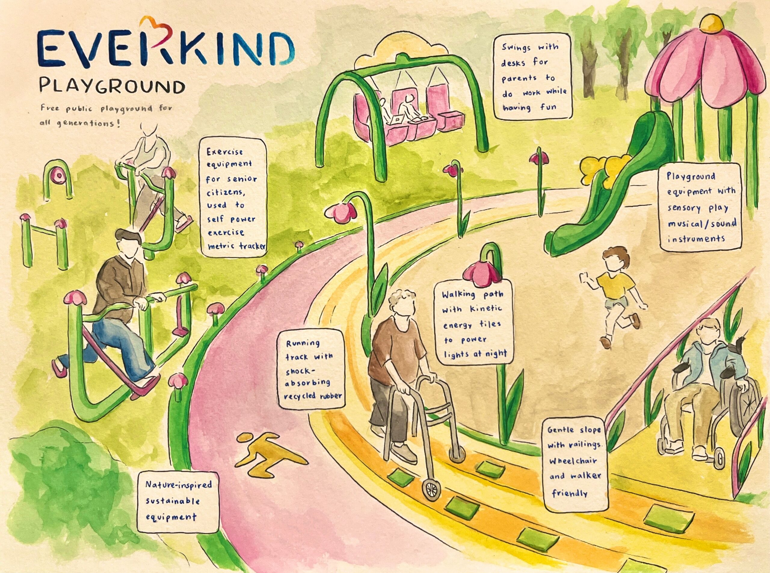
Social media has divided our generations by reducing connection to keeping up with trends, but connection goes beyond shared slang or humor. For children who are growing up in the suburbs during the digital age, few physical spaces exist for real connection. We need public spaces that unite old and young. Everkind Playground, a fusion of “every kind” and “forever kindness,” is a free public playground open to all ages. I designed the park to be climate aware and people first. Its centerpiece is a dual track with kinetic tiles to power lights. The wide paths have gentle slopes that are wheelchair and walker friendly. Seniors exercise on self-powering equipment, adults work on table swings, and children play on slides—all in one place. Everkind Playground isn’t just a park; it’s a model for inclusive, sustainable public spaces. Though it starts with one city, my design can inspire communities everywhere to rethink accessibility and human connection.
Angelina Lu, grade 11
Lower Merion High School, Ardmore, PA
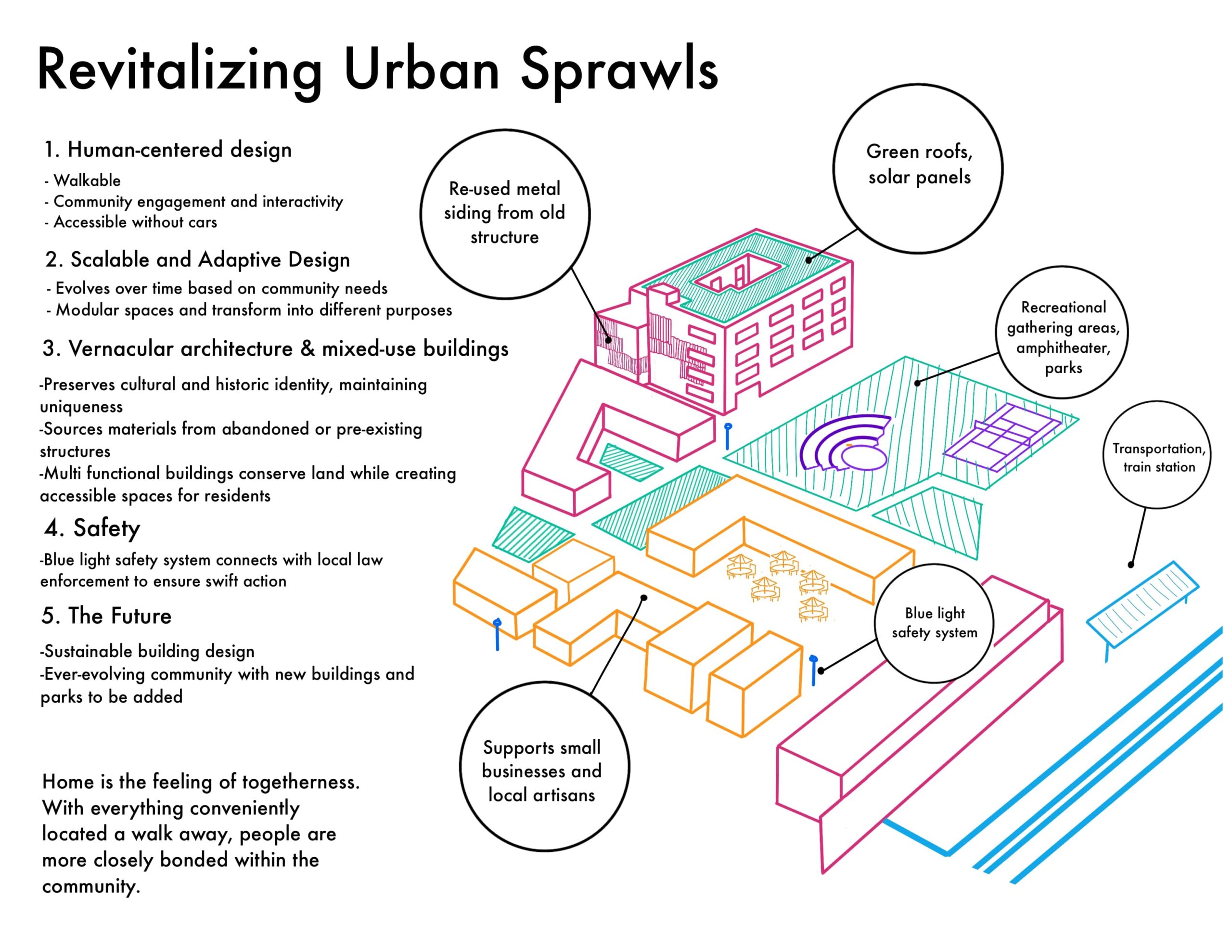
Many new developments in America prioritize cars over people, creating disconnected suburbs, poor walkability, and underutilized spaces. This isolates residents and weakens community bonds. Improving accessibility, integrating communal areas, and utilizing adaptive reuse architecture builds human connections to create vibrant, inclusive environments. My design repurposes pre-existing structures into pedestrian-friendly, multipurpose spaces. Using adaptive reuse and vernacular architecture, parks and pavilions would intertwine with buildings. Walkable pathways would connect markets, workspaces, businesses, religious buildings, and housing units. Residents would thrive in a dynamic, ever-evolving neighborhood where their needs are located walking distance away. Tight-knit communities with gathering spaces encourage social connectivity for all ages by incorporating accessible infrastructure that promotes walking and biking. Urban sprawls across the country could benefit from this human-centric approach, which sets up residents for a sustainable, lively future by providing opportunities to connect with each other and with nature.
Moira Malhotra, grade 11, and Skyla Willems, grade 11
Academy of Allied Health and Sciences, Neptune, NJ
Teacher: Melissa Pitman
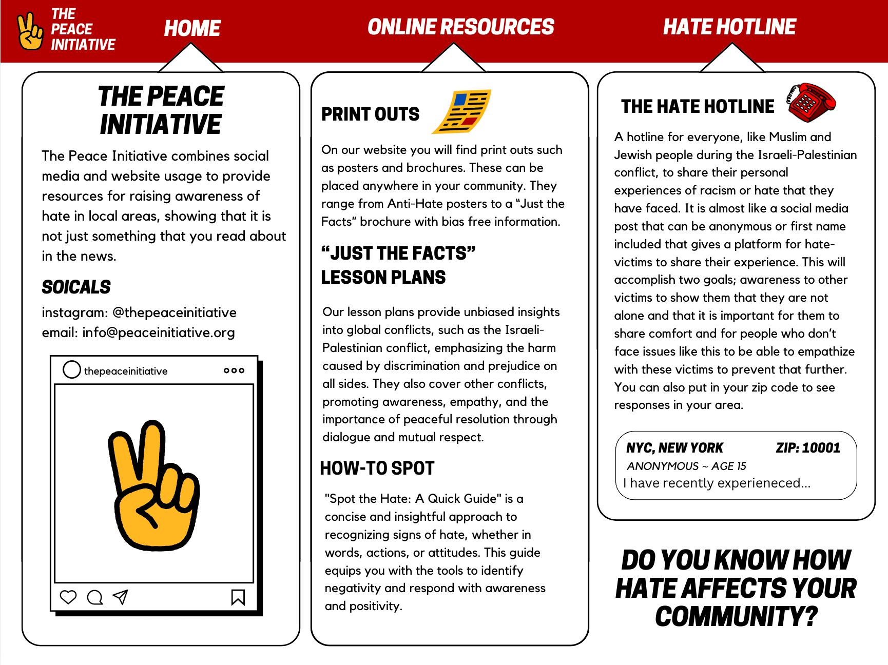
Our design is for everyone and is in response to ongoing conflicts. Our website, The Peace Initiative, features three components: a hotline for students to share experiences of racial hate, fostering empathy among victims; mandatory lesson plans for teachers to offer unbiased insights into global conflicts; and a “Spot the Hate” guide that helps identify signs of hate. Our design will positively impact victims of hate. Students will feel more united in their communities because they can come together with others. This design can be used across the United States to help bring awareness of racial hate.
Mina Mori, grade 11
Hunter College High School, New York, NY
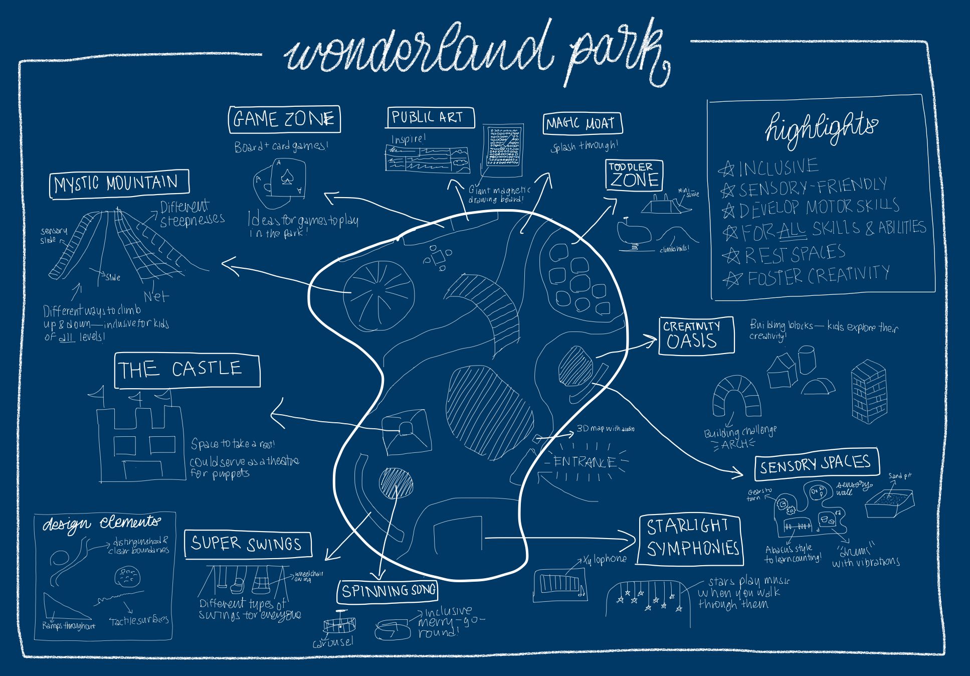
Growing up with neurodiverse friends/family, I realized that many NYC playgrounds lack sensory spaces for neurodiverse children, or activities for individuals with “invisible” disabilities not covered by the ADA. This deficiency limits children’s ability to engage and play. Wonderland Park is an inclusive and sensory-friendly playground for all; key features are the Sensory Space, especially beneficial to autistic children; the Starlight Symphonies for music exploration; and the Mystic Mountain with various climbing routes for all activity levels. Its core concepts are creativity, community/kindness, and development of motor skills. My universal design fosters a sense of community by including activities for everyone, regardless of their activity levels or disabilities, with sensory-friendly spaces that help kids socialize and have fun. My approach can inspire communities nationwide to create welcoming and accessible spaces that cultivate a genuine feeling of belonging.
Mehr Poddar, grade 11
Redmond High School, Redmond, WA
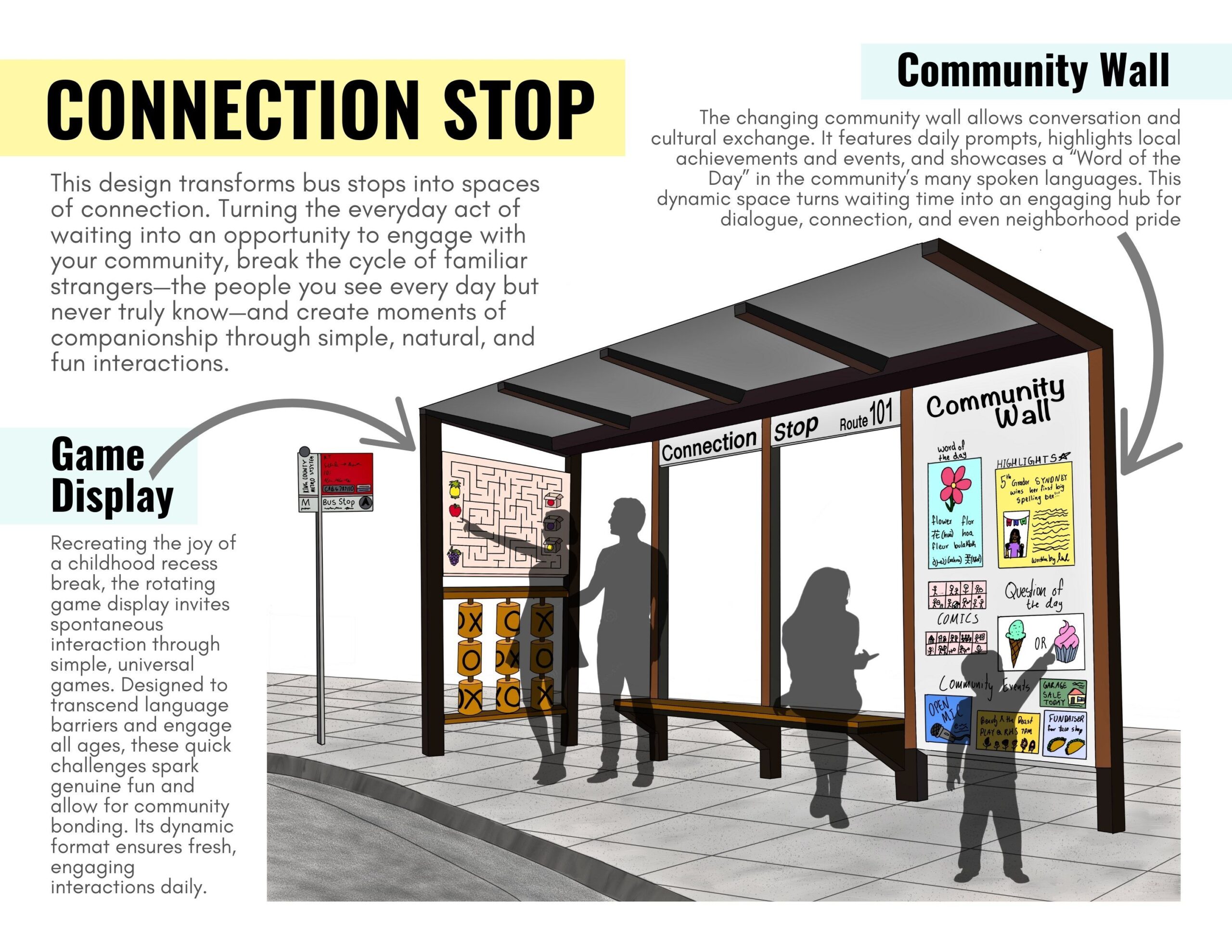
I designed this project to address the isolation felt at bus stops, where familiar faces often remain strangers. I experienced how commuters, despite shared routines, waited alone around others. These spaces could be transformed into hubs for genuine interactions, promoting understanding and belonging within our communities. This interactive bus stop creates an environment for natural conversations and interactions by featuring a rotating games wall with universally understood quick games, as well as a community wall offering conversation starters, multilingual word display, and community highlights/events. Users are prompted to turn their waiting time into moments of connection. Transforming bus stops into interactive hubs allows for genuine connections to be formed in the community, leading users to feel closer to their community. It benefits diverse users by breaking barriers of isolation, language, and background. This scalable concept can transform transit spaces worldwide, making public environments feel like welcoming homes.
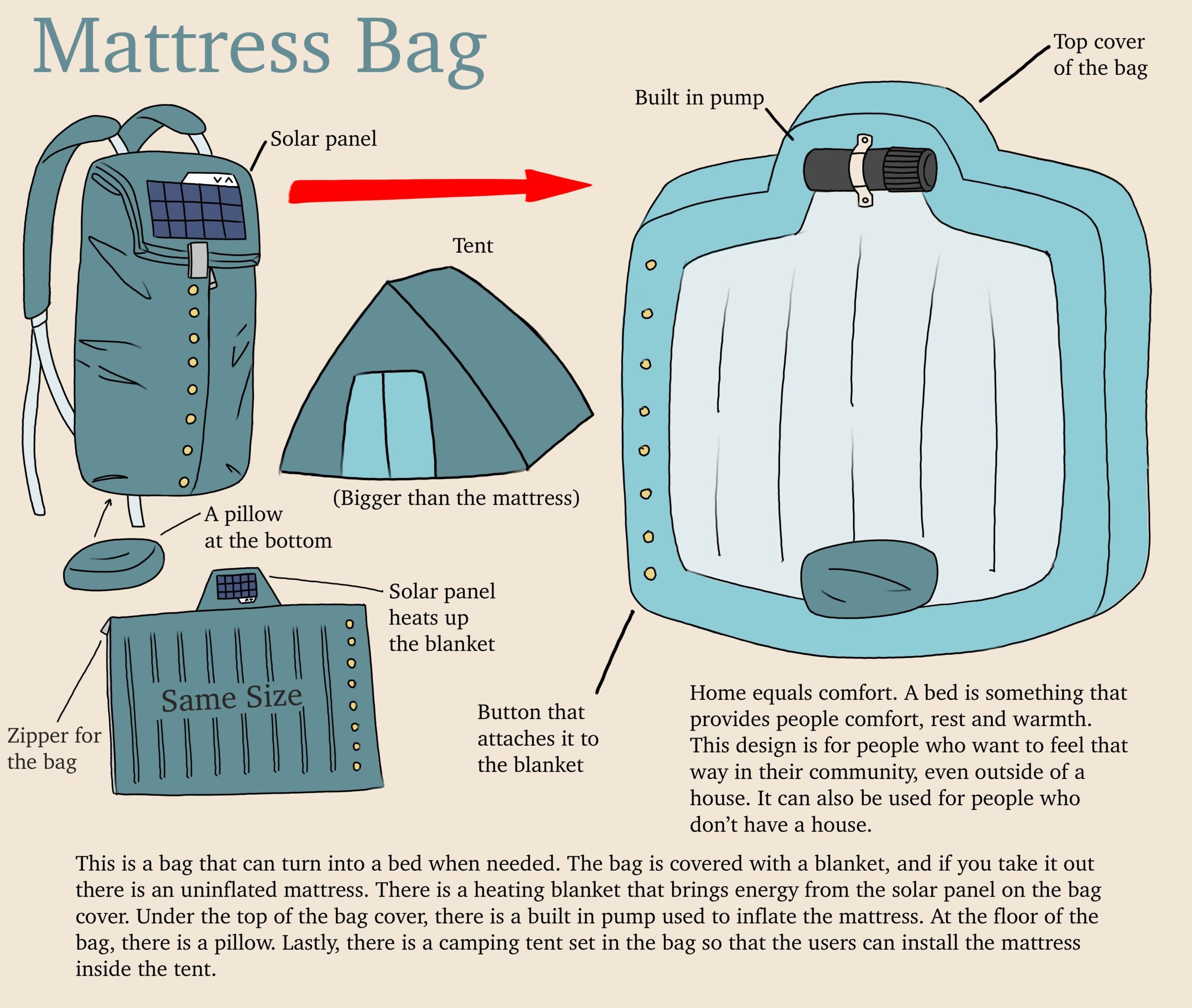
Hyunseo Ryu, grade 10
Bergen County Academies, Hackensack, NJ
Teacher: Scott Lang
This design is for people who don’t have a house and for people who want to feel comfortable outside of their houses. Beds are deeply associated with the concept of home and comfort. This design is a bag that can turn into a mattress. When the bag is disassembled, it can be inflated into an air mattress using the built-in pump attached to the bag. The bag is covered with a blanket, and there is a camping tent set included inside the bag. Many people feel lonely and anxious outside of their homes. This design can help those people who want comfort and relief. This can make people less tired, nervous, and anxious. People can connect with others in a comfortable situation thanks to this design that has a bed and a tent.
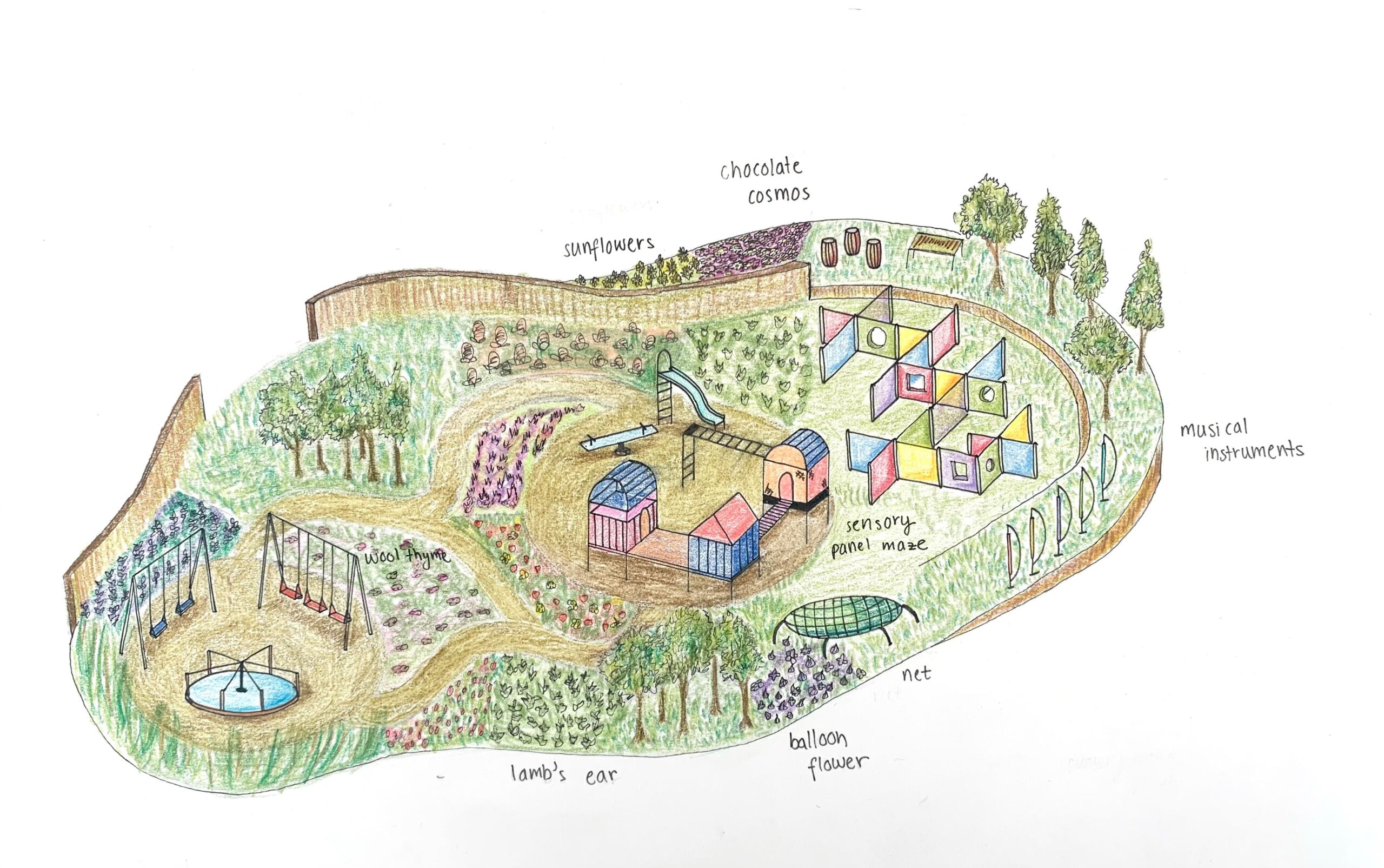
Sophie Takano, grade 12 and Kavita Amin, grade 12
Princeton Day School, Princeton, NJ
Sensory-related disorders, including hearing loss, ADHD, and autism, are becoming increasingly prevalent among children. Sensory playgrounds not only provide a safe and inclusive environment but also support all children in developing an understanding of the world through play. Our design provides children with an engaging sensory experience by blending traditional equipment with nature to offer tactile, auditory, olfactory, and visual stimulation. Kids can interact with plants like the balloon flower, which pops when squeezed, and chocolate cosmos, which smell like chocolate, while a sensory panel maze encourages problem-solving and audiovisual engagement. Our sensory playground can benefit communities globally, as it creates an inclusive space for kids to feel more at home than in conventional parks. By stimulating all senses, our design supports children’s interaction with the world in a unique way while enhancing fine motor skills, mood regulation, coordination, and spatial cognition.
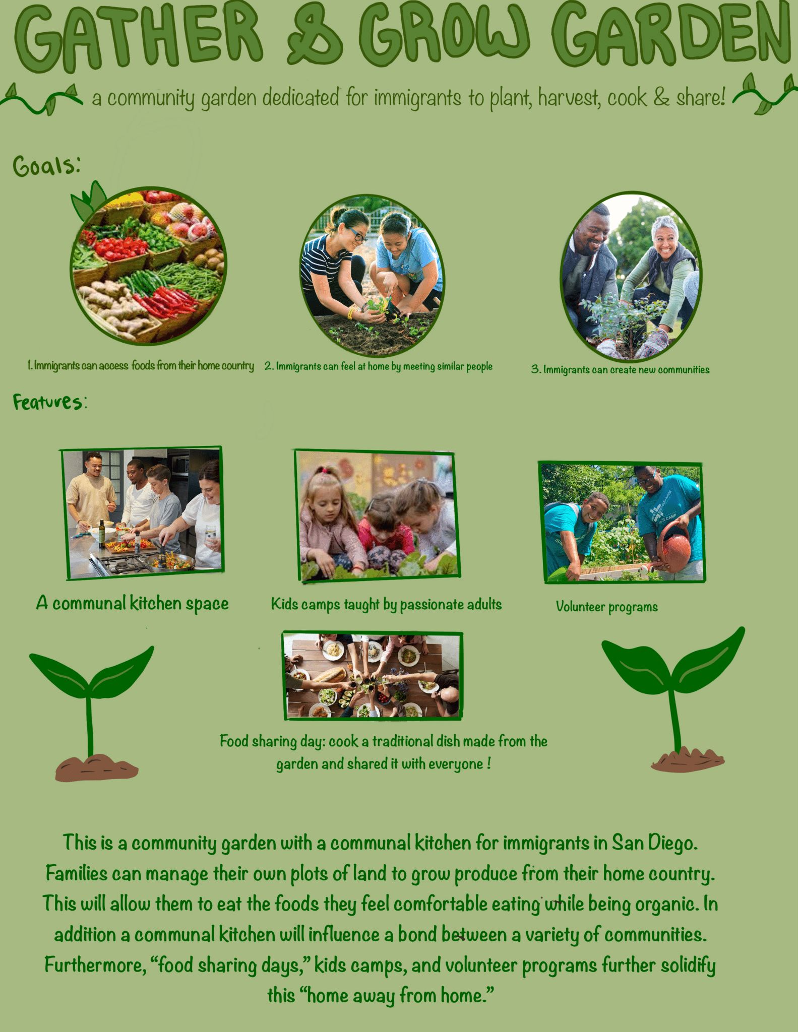
Anqi Xie, grade 12
La Jolla Country Day High School, La Jolla, CA
Teacher: Casey Walker
For immigrants, moving across the world to the United States is a tremendous change. The language, culture, and cuisine are different. A community garden for immigrant families offers a space to grow culturally significant, organic produce. Located in an accessible area, it fosters cross-cultural connections. The garden hosts farming classes for kids and “Feast Days,” where families cook and share their harvests. It’s more than a garden—it’s a community within a community. Food evokes nostalgia and a sense of belonging. This garden provides immigrants with a safe space to grow familiar, organic produce while building connections. It fosters a welcoming environment, strengthening cultural identity and integration. Similar gardens could be implemented nationwide to help diverse communities feel more at home.
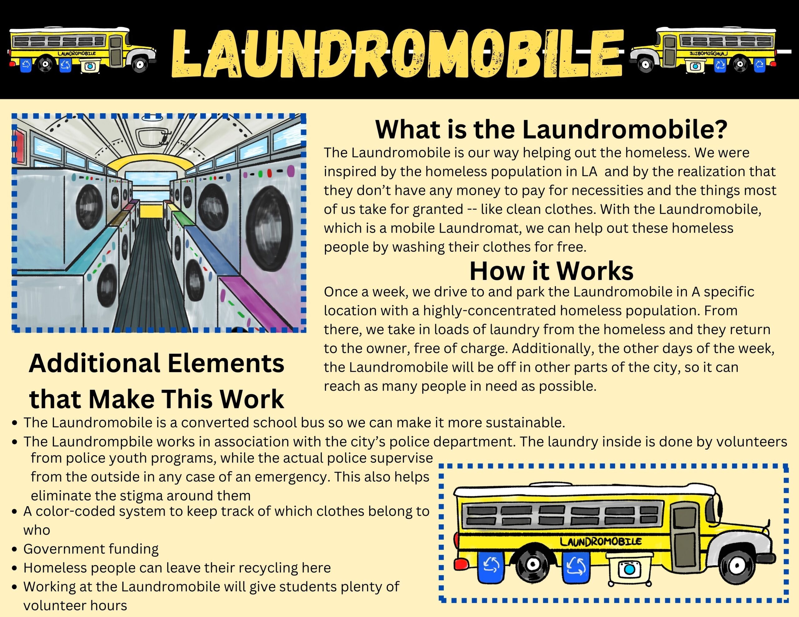
Charlotte Yeung, grade 10 and Marco Mas, grade 10
Granada Hills Charter High School, Granada Hills, CA
Teacher: Narae Kim
California is experiencing a homelessness crisis. Our design is a mobile laundromat that is strategically moved to areas with high concentrations of people experiencing homelessness so they can wash their clothes without charge. In doing so, they will have the opportunity to freshen up while also being able to converse with others in similar circumstances. It will make people feel more at home and connected through its promotion of community among those who are unhoused. This design has the capability to make an international impact since homelessness is a worldwide epidemic, affecting millions of people.
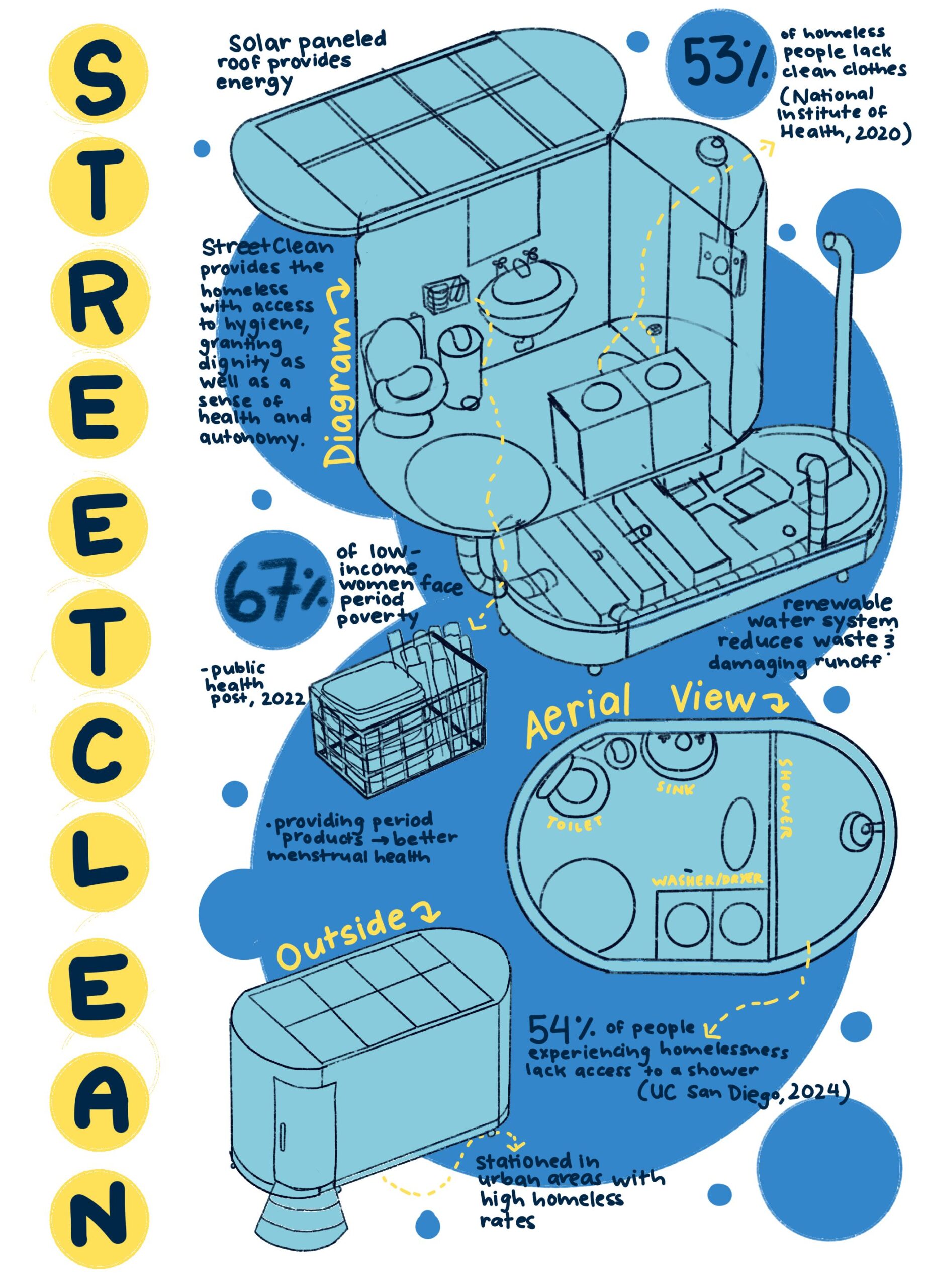
Mia Zhou, grade 11
Millburn High School, Millburn, NJ
StreetClean is a compact, portable, and sustainable restroom designed to assist urban homeless populations. After volunteering with homeless communities, I learned that many adults feel a loss of autonomy because they lack access to hygiene. StreetClean could improve not only the health but also the dignity of homeless individuals. StreetClean targets many issues: access to hygiene, sustainability, and period poverty. The design provides a shower, toilet, and sink, all using a renewable water-conserving system concealed at the bottom of the structure and powered by solar energy. It also provides period products to support the menstrual health of women experiencing homelessness. StreetClean alleviates both the physical and emotional struggles of homelessness. Over half of unhoused individuals do not have access to hygiene, resulting in poor health. Lack of dignity due to inaccessibility causes poor mental health. StreetClean challenges these issues by improving conditions for those who are homeless.