For nearly twenty years between the two world wars, E. McKnight Kauffer, an American, was the most celebrated graphic designer in England. He was best known for his eye-catching posters, but his book covers and illustrations, graphic identities, carpets, stage sets, costumes, and ephemera were also among the most arresting of his era. Kauffer believed fervently that modern art should move beyond the walls of museums and galleries to infiltrate all elements of daily life.

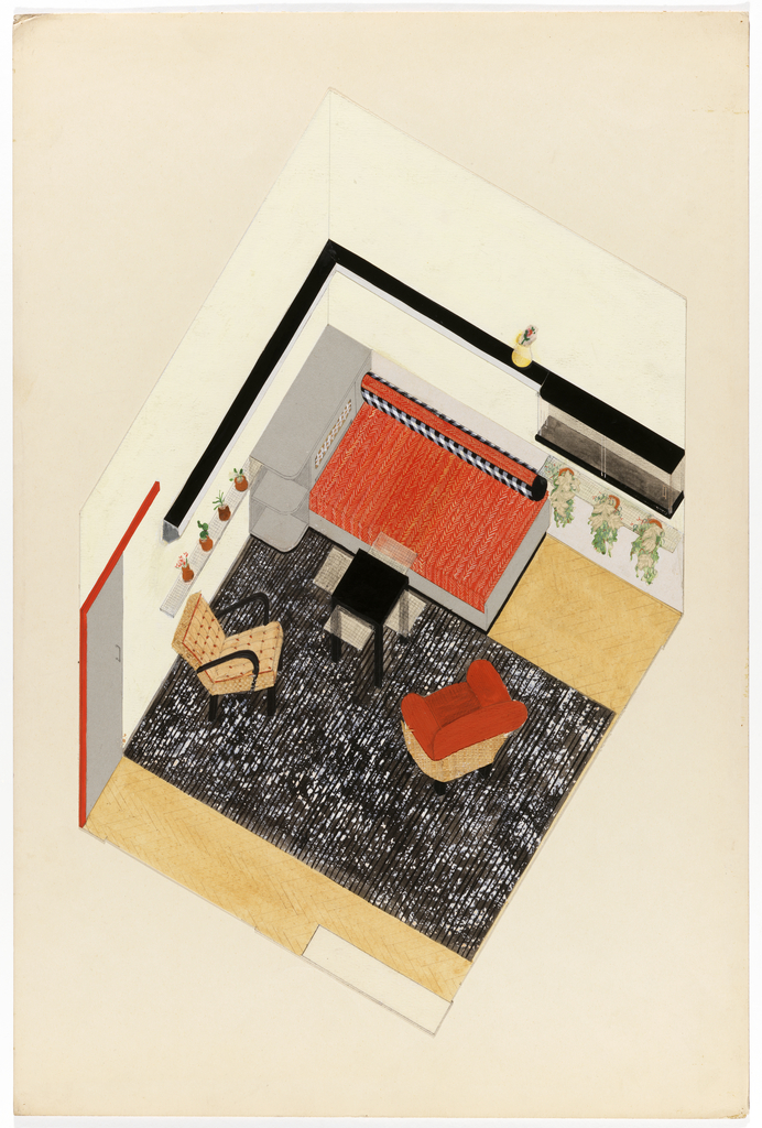
In celebration of National Design Month, October’s Object of The Week posts honor past National Design Award winners. This post was originally published on November 10, 2016. In the late 1990s, the Tacoma Art Museum (TAM) in Tacoma, Washington announced its plan to relocate from the bank building that it had occupied since 1935 to...
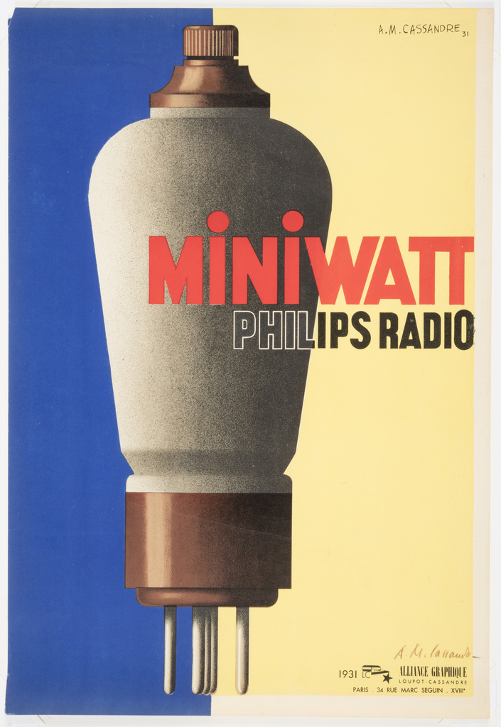
When legendary French graphic designer A.M. Cassandre was hired in 1931 to produce this poster for the Dutch light bulb and radio tube manufacturer Philips, he was at the high point of his career. Together with fellow poster designer Charles Lupton, Cassandre had founded the printing and publishing collective Alliance Graphique in Paris, France.[1] Cassandre...
In celebration of the milestone 20th anniversary of the National Design Awards, this week’s Object of The Day posts honor National Design Award winners. Completed in 2013, Monk’s Garden is a small garden on the grounds of the Isabella Stewart Gardner Museum in Boston, Massachusetts. Michael Van Valkenburgh Associates took their inspiration for the garden’s...
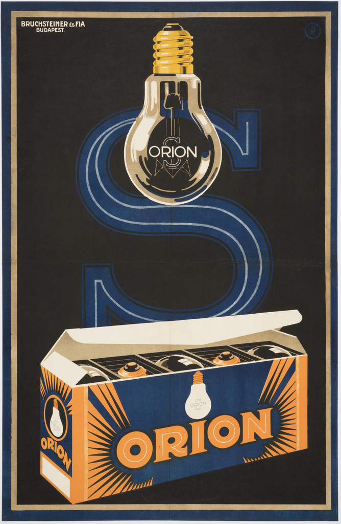
Apart from several months spent at Iparművészeti Iskola, Budapest’s school of applied arts, József Bottlik[1] was a self-taught graphic designer. Bottlik began his career in 1919 and quickly established himself as a designer of eye-catching commercial product and film posters, including a celebrated 1927 design for Universal Film AG (UFA) for the film Metropolis.[2] Bottlik...
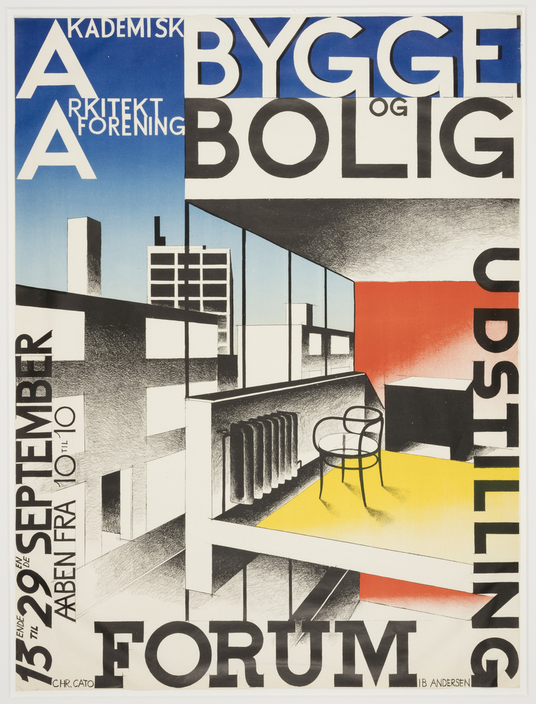
IB Andersen (Danish, 1907-1969) was barely out of school when he designed this poster to promote the 1929 exhibition of Buildings and Homes in Copenhagen, Denmark. The exhibition was a significant one, as it featured a built model of the “House of the Future,” as designed by Arne Jacobsen (Danish, 1902-71) and Flemming Lassen (Danish,...
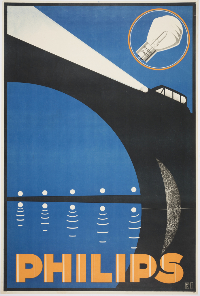
When Louis C. Kalff was hired by Philips in 1925, the company was one of the largest producers of lightbulbs in the world. Kalff created a brand identity for the company, including the iconic logo. For this poster, Kalff illustrated a car whose piercing bright headlights illuminate the scene. The stylized arcs and angles reflect...
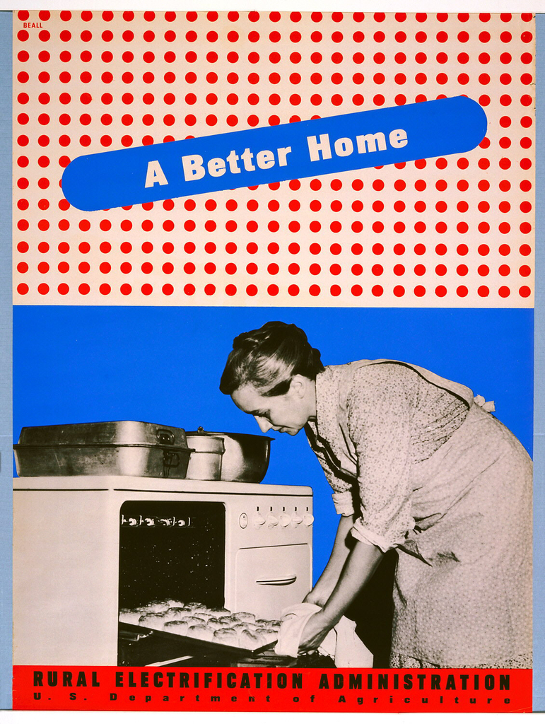
This blog post was originally published on January 8, 2014. By the 1930s, the vast majority of American urban dwellers had access to electricity in their homes and businesses. But those in impoverished rural areas were often not serviced by private electric companies, who believed that it was not cost-effective for them to invest in...
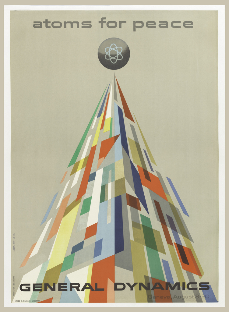
This blog post was originally published on August 4, 2014. The year is 1955, and Cold War tensions have begun to escalate. General Dynamics is a newly formed parent company overseeing eleven manufacturers, producing cutting edge technology for the defense of the United States. The company is capitalizing on the American policy of nuclear deterrence,...
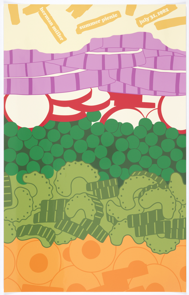
Today’s blog post was originally published on June 18, 2013. In 1970, Steven Frykholm was working as the in-house graphic designer for the furniture manufacturer Herman Miller, Inc., when a company vice-president stopped by his desk. Every summer, the VP said, Herman Miller hosted a company picnic. Perhaps Frykholm would make up a poster for the...
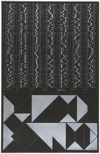
Today’s blog post was originally published on July 10, 2013. There are many ways to celebrate an anniversary. To commemorate a decade of working together as the design duo Non-Format, Kjell Ekhorn and Jon Forss did not opt for the traditional gifting of tin, pewter, or aluminum. Instead, they pooled their creative energies towards a personal...
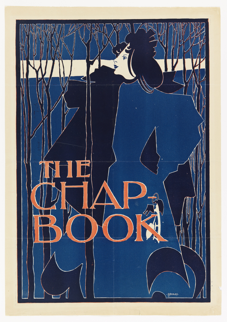
With the temperature outside at record highs this week, I can’t help but think of William Henry Bradley’s The Blue Lady. Clutching her ice skates in her left hand, she makes a cold winter’s stroll through the thin, bare trees look elegant and placid. The Blue Lady was Bradley’s second poster for The Chap-Book, America’s...
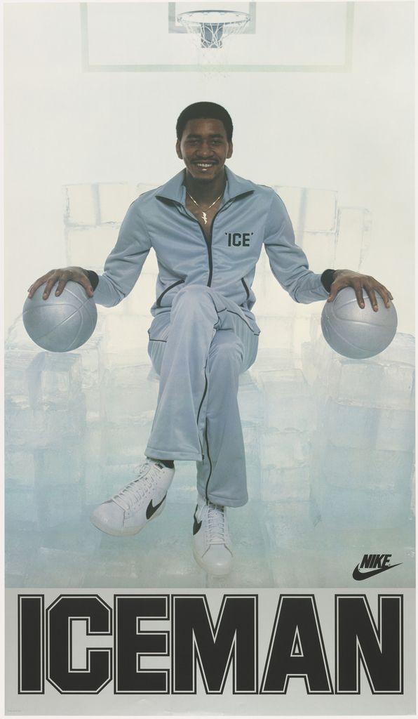
Basketball star George Gervin never broke a sweat because he stayed cool under pressure. At least that’s what his teammates Julius Erving and Fatty Taylor thought when they nicknamed him “Iceman” in the early 1970s. But according to Gervin, his ability to remain dry throughout a game had nothing to do with a calm demeanor....
In celebration of Women’s History Month, March Object of the Day posts highlight women designers in the collection. Today’s blog post was written by Caitlin Condell and originally published September 30, 2015. German-born Margarethe (Grete) Fröhlich was a young artist when she moved to Frankfurt, Germany in 1929. In the early 1920s Frankfurt had experienced a...
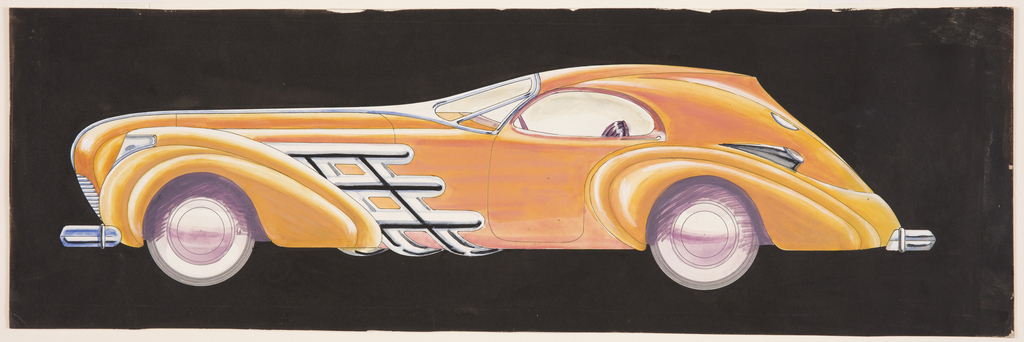
In the early 1930s, the General Motors Art and Colour division was emerging as the most innovative hub of automotive stylists. William McBride was a young man living in Chicago’s South Side, dreaming of fanciful and futuristic cars. As a boy, he “spent sixteen years learning how to design automobiles, to make them real. Cars...