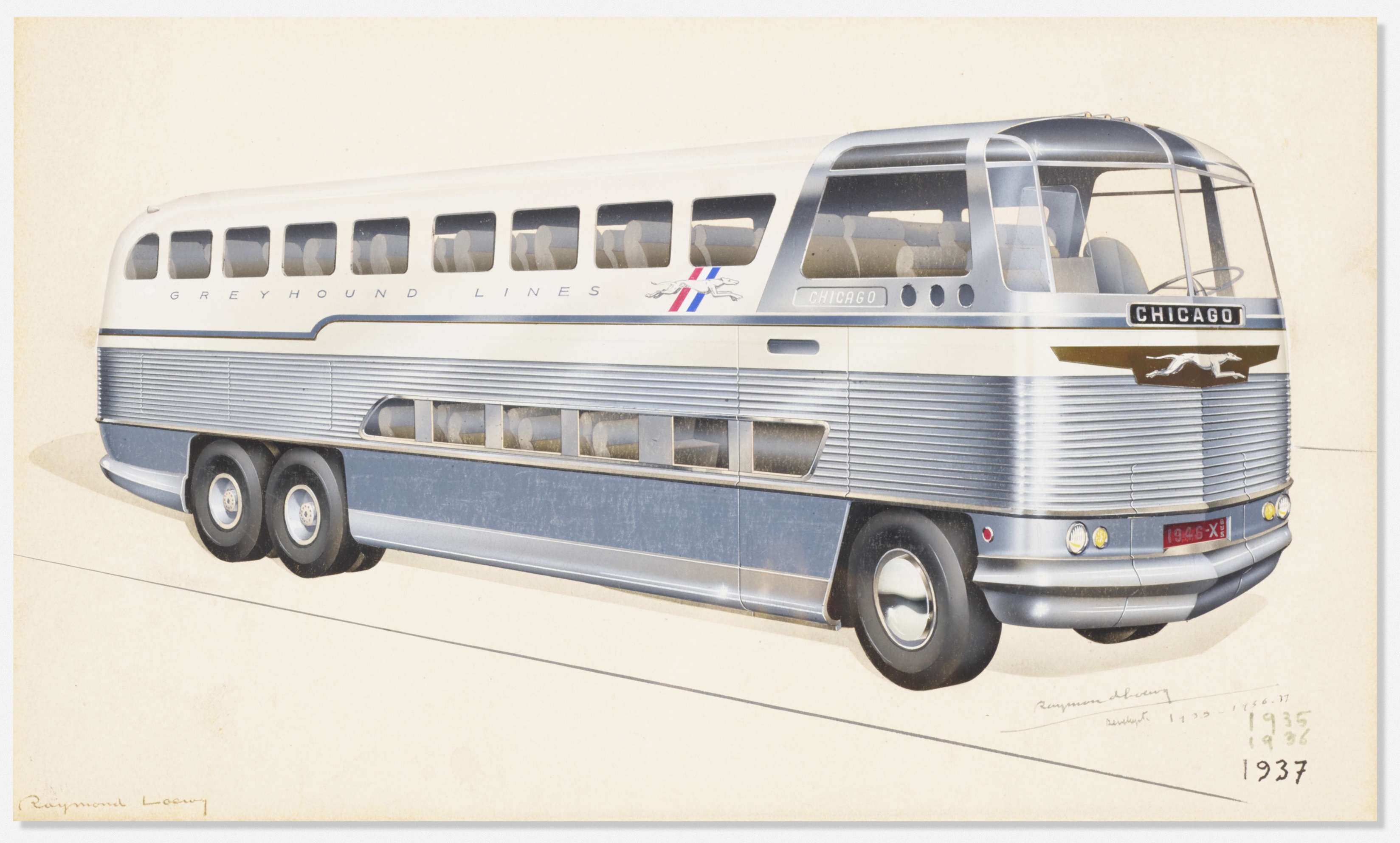
On July 9, 1947, Look magazine ran a feature article on the fastest growing form of transportation in America: intercity buses. “Bus travel, according to the sworn word of many highway fans,” the author wrote, “is the best way to make a sightseeing holiday trip.”[1] The post-war boom in bus travel was indebted, in part,...
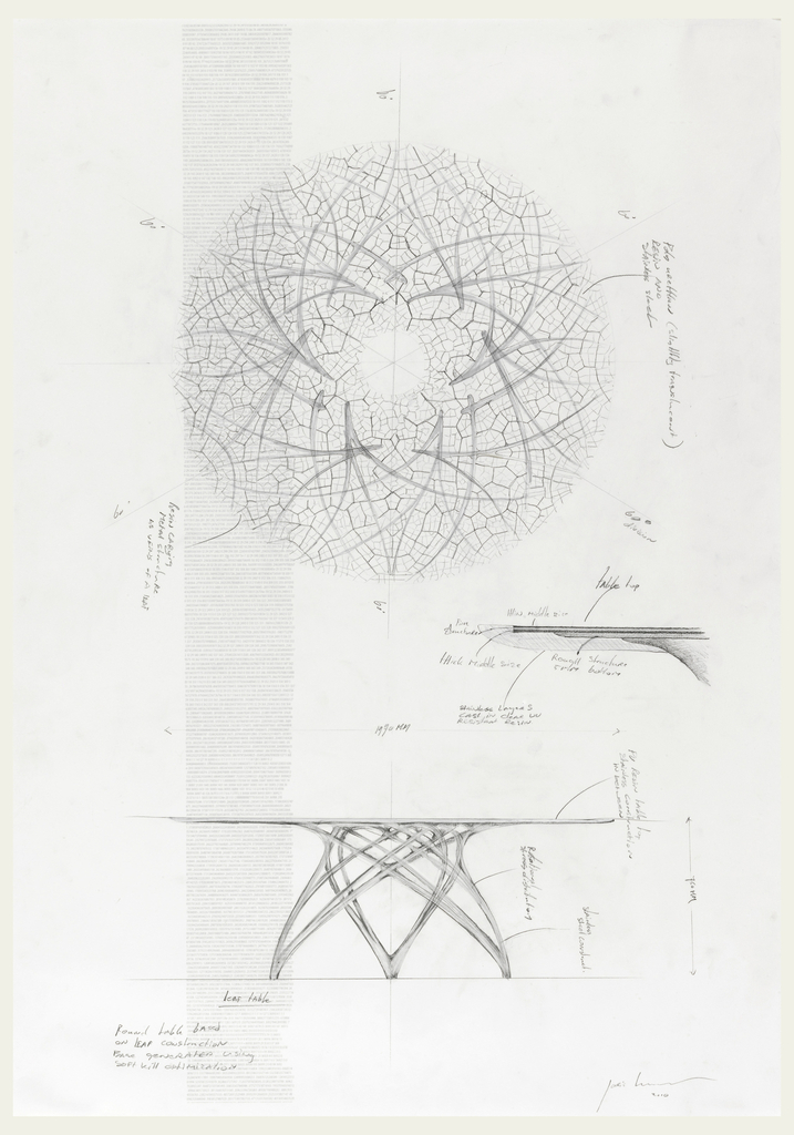
For more than a decade, Dutch designer Joris Laarman and his team at Joris Laarman Lab have been looking to nature for information and inspiration. As he writes in the newly published book Joris Laarman Lab, “our digital age makes it possible to not just use nature as a stylistic reference, but to actually use the...
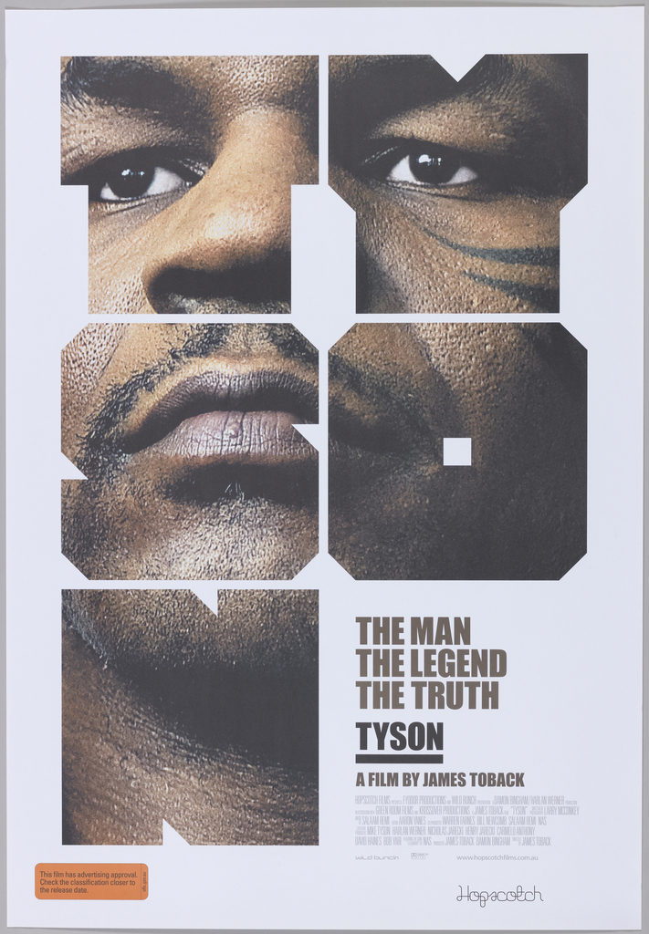
Australian graphic designer Mark Gowing designed this poster to advertise the film Tyson, a documentary about the controversial and legendary boxer Mike Tyson. The critically-acclaimed film was directed by James Toback, and closely follows Tyson’s career and personal life through lengthy interviews and archival footage. For his poster design, Gowing adapted elements from the graphic...
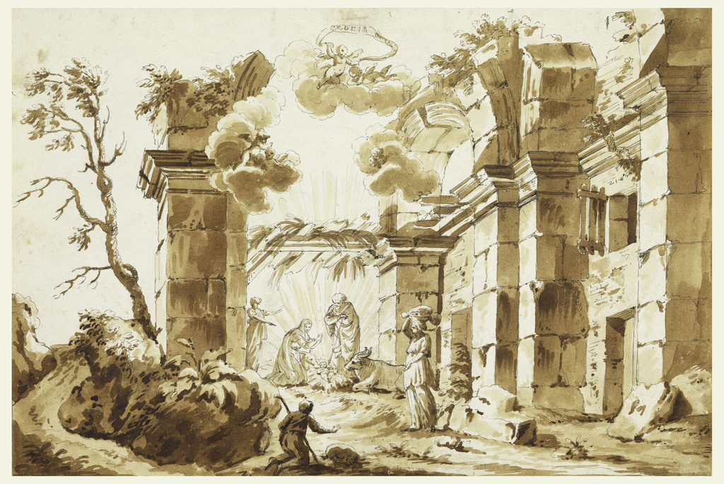
This month in Cooper Hewitt Short Stories, Caitlin Condell, Associate Curator and Head of Drawings, Prints & Graphic Design at Cooper Hewitt, takes us to Italy to discuss one of the most significant contributions of European drawings in the early days of Cooper Hewitt's collection: the addition of the Giovanni Piancastelli collection.
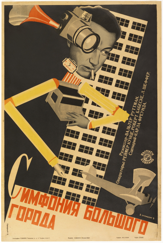
Caitlin Condell discusses this Russian movie poster that utilizes themes of modernity, Constructivism, urban imagery, and the avant-garde found in The Jazz Age: American Style in the 1920s.
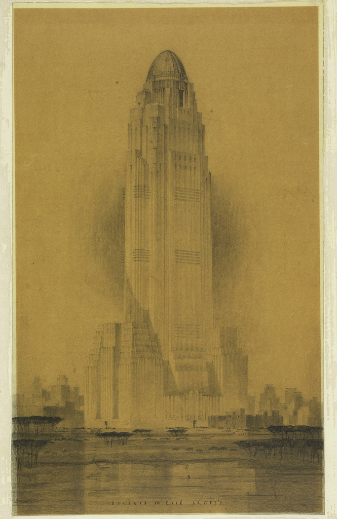
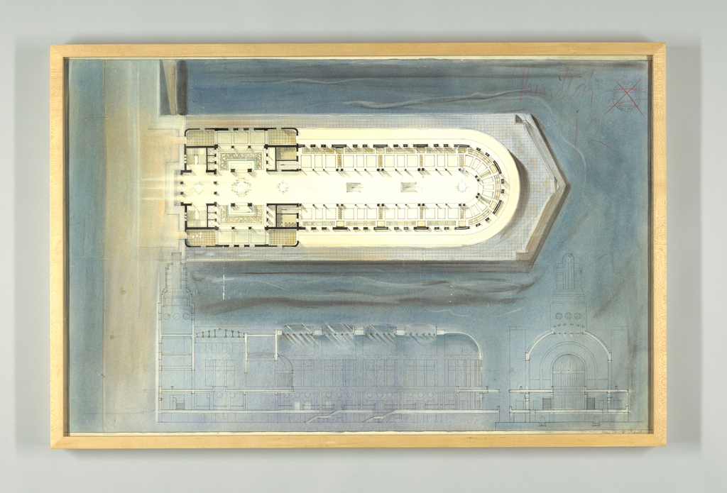
Ely Jacques Kahn's design for a skyscraper, now on view in The Jazz Age: American Style in the 1920s, demonstrates the power of the architectural drawing as an advertising tool.
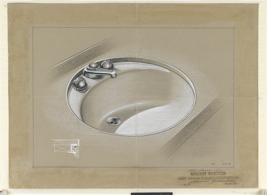
The 1940s after World War II (1939-1945) marked a phase of industrial design that centered on the consumer. Coined by prolific industrial designer Henry Dreyfuss (1904-1972) as the “Decisive decade”, manufacturers began acquiring prestige by redesigning products that met the needs of a changing society.[1] Populations had grown extensively from incoming immigrants; housing for returning...
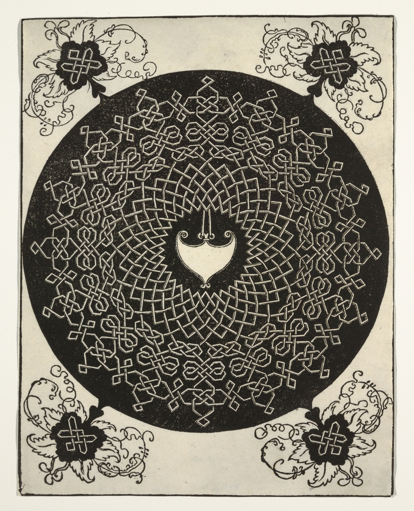
For centuries, this intricately wrought interlace design—one of six similar motifs produced by Albrecht Dürer—has entranced and perplexed those who have encountered it. The intended purpose of the Knots, as Dürer referred to the series, as well as the precise date of their execution, remains unknown. Some scholars have postulated that the designs are patterns...
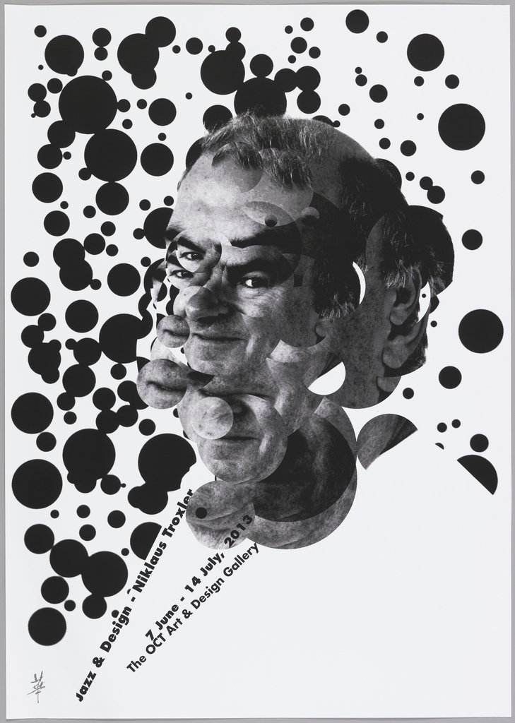
In 2002, Chinese graphic designer Jianping He founded Hesign, a Berlin-based design studio. He studied both in China and in Germany, and his designs reflect the experiences of his training in both countries. In restrained color palettes, he executes bold poster designs with exacting precision, often incorporating both Chinese characters and Roman letters. To promote an exhibition...
For her first assignment as an architecture student at the Massachusetts Institute of Technology (MIT), Mary Ann Crawford was given a sheet of paper, twelve hours, and a problem: design an entrance to an architectural school. Crawford’s submission was well-received by her professor, but he gave her a cautionary warning. “You want to be careful...
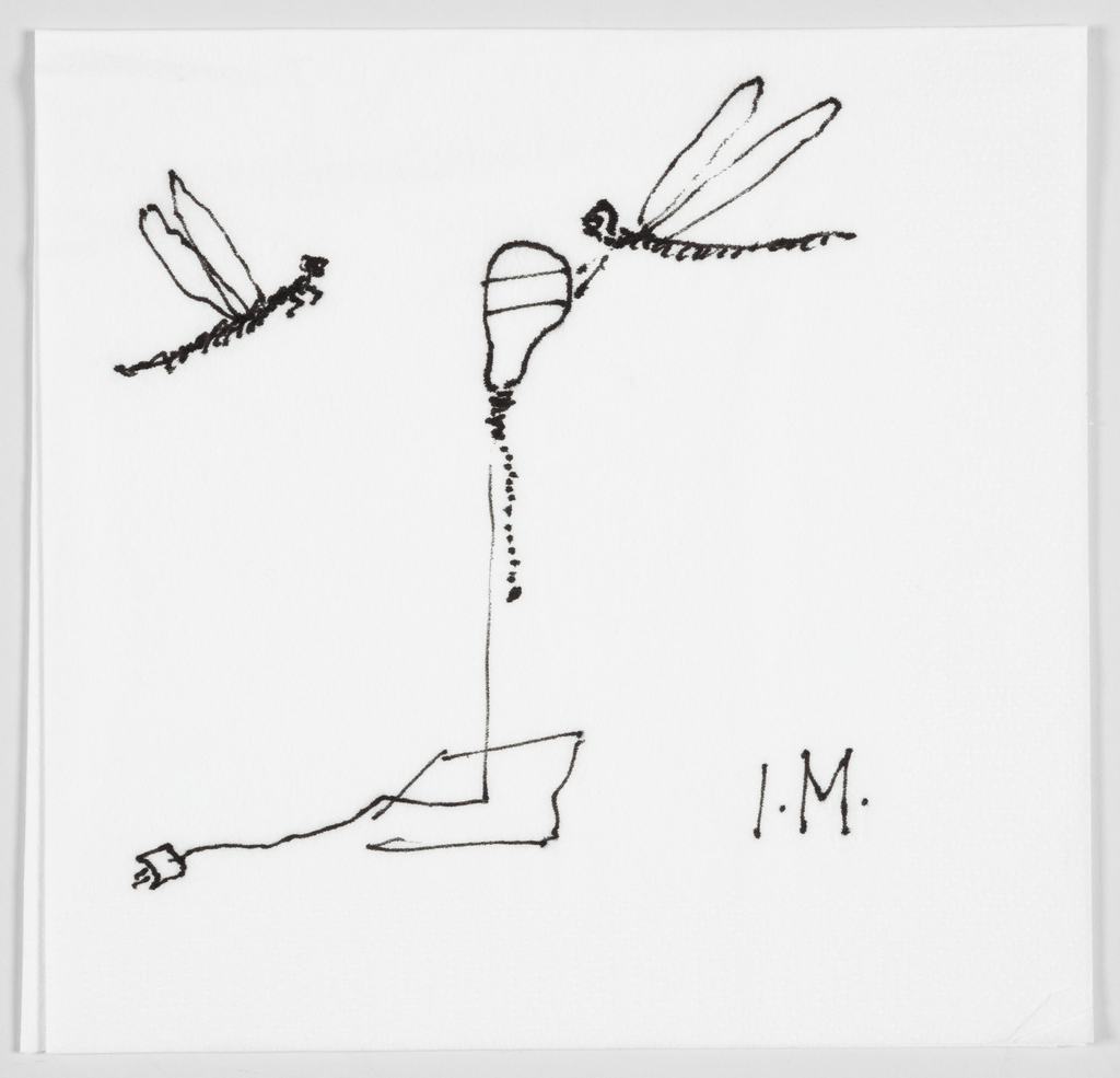
This is an early concept sketch for the lamp “I Ricchi Poveri – Silver Bzzzz” by the “poet of light” Ingo Maurer. The lamp is part of a small series through which Maurer has sought to play on the natural attraction to light in nature. In the design for “I Ricchi Poveri – Silver Bzzzz,”...
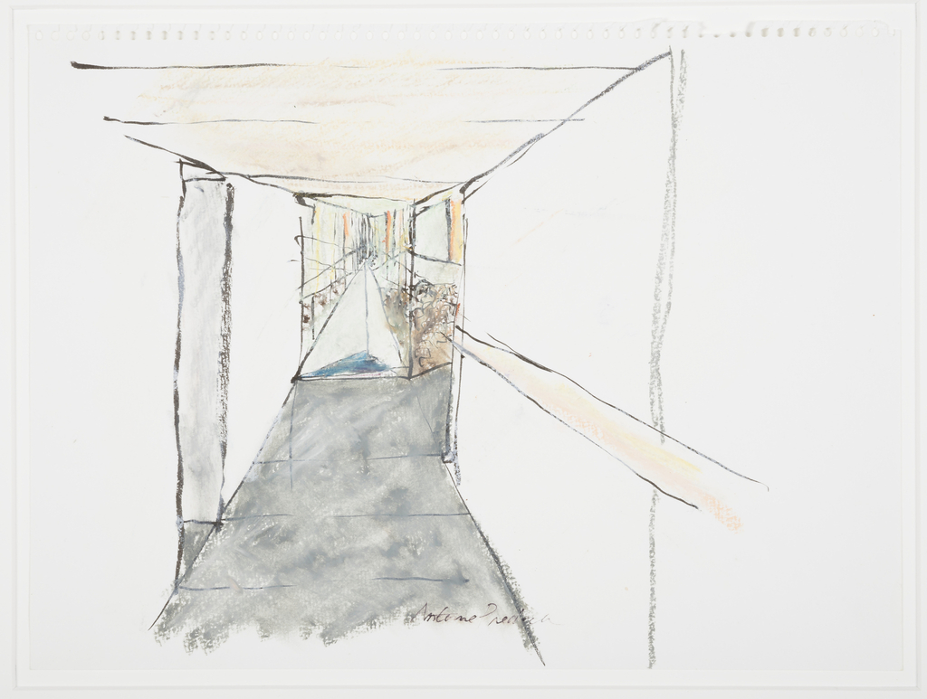
In the late 1990s, the Tacoma Art Museum (TAM) in Tacoma, Washington announced its plan to relocate from the bank building that it had occupied since 1935 to a new site on the waterfront with views of Mt. Rainier. National Design Award-winning architect Antoine Predock was selected to design a building that more than doubled...
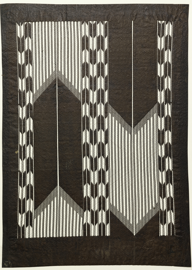
The word katagami, the Japanese term for the paper stencil used to print patterns on fabric, translates literally as “pattern paper.” Featuring designs and motifs drawn from nature, traditional folklore, and literature, katagami are crafted as tools to be used in the resist-dyeing process that is used to produce printed textiles in Japan. The patterns...
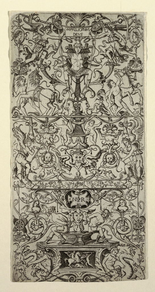
Have you ever wondered where you could find a spotted, two-legged creature with the body of a lizard, the ears of a goat, the wings of a bird and the claws of a chicken? How about a monster with the head of a dolphin, ears of acanthus leaves, the body of a snake, and a tail...
Jianping He was among forty Asian designers invited by the Taiwanese calligrapher Tong Yang-Tze to collaborate on a group of twenty-four works of calligraphy focusing on the subject of “imitating nature.” The theme, which had long been a driving influence in the tradition of Chinese painting and calligraphy, also reminded He of a quote by Albert Einstein: “Look...