Brooklyn-based graphic design studio Other Means discusses designing the book that accompanies the exhibition and their approach to "American" design.

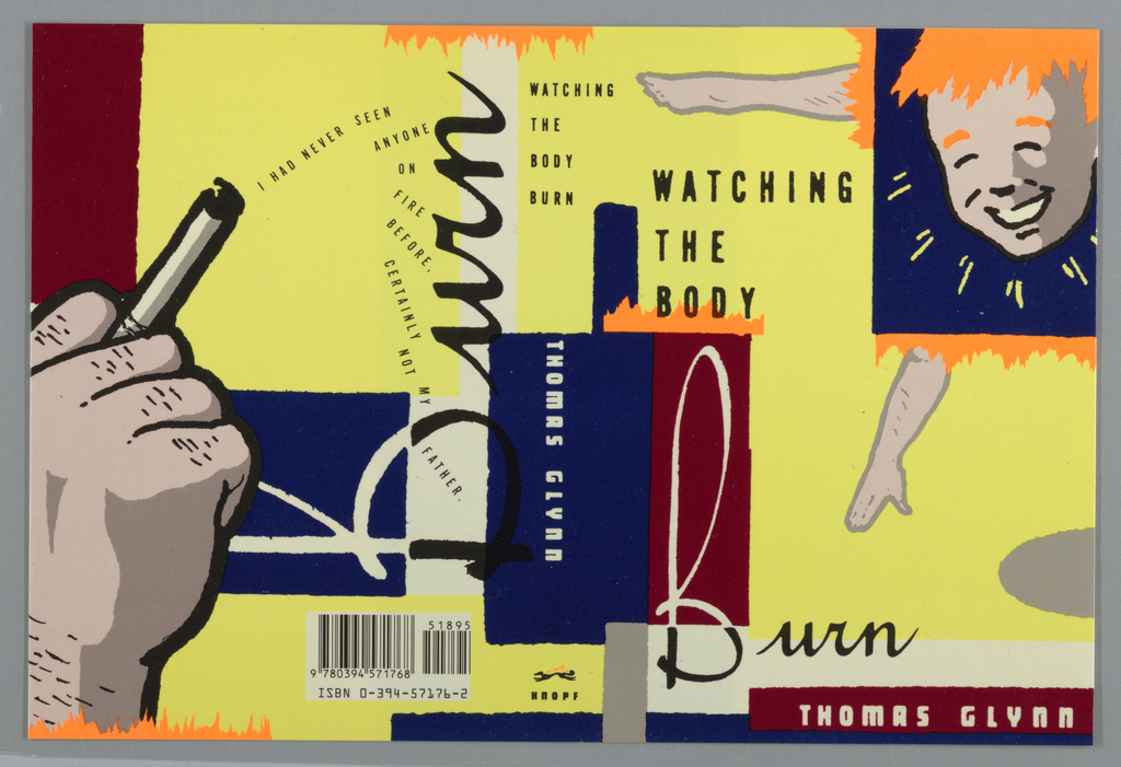
If you’re judging this book by its cover, Chip Kidd’s 1989 design for Watching the Body Burn by Thomas Glynn might encourage you to wonder what crazy contents lie within. The disjointed imagery, text, and loud colors certainly draw consumer attention, but Kidd’s design is more than a sales tactic—the frenetic cover design complements the...
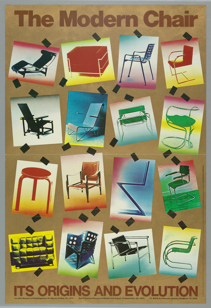
This poster for the La Jolla Museum of Contemporary Art’s exhibition The Modern Chair: Its Origins and Evolution was designed by John van Hamersveld in 1977. Van Hamersveld, a California born and bred graphic designer, is most widely known as the artist behind the iconic 1964 Endless Summer movie poster. Incorporating fluorescent paints and striking graphic language, van Hamersveld brought...
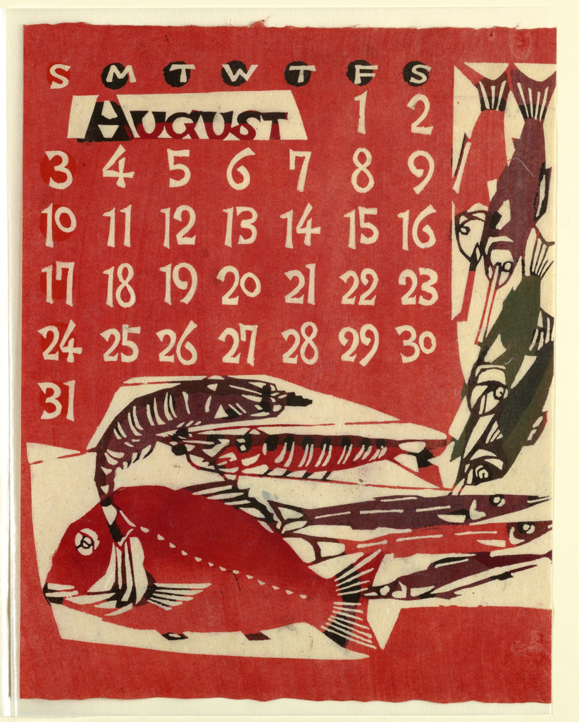
The brightly saturated colors of this August calendar page seem like a perfect salute to summer. To create the designs for this 1969 calendar, Takeshi Nishijima applied a paper-dyeing technique based on the traditional resist-dyeing process of katazome. Katazome relies on the use of katagami (stencils) to create hand-patterned textiles, most of which were used...
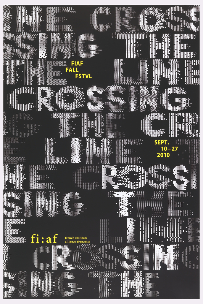
This 2010 poster, designed by the French graphic designer Philippe Apeloig, advertises the annual interdisciplinary fall festival of the French Institute Alliance Française (FIAF) in New York City. Apeloig’s design employs the same fundamental typographic approach that he used in his 2006 poster, Vivo in Typo, whereby he manipulates the spacing of computer-generated punctuation to...
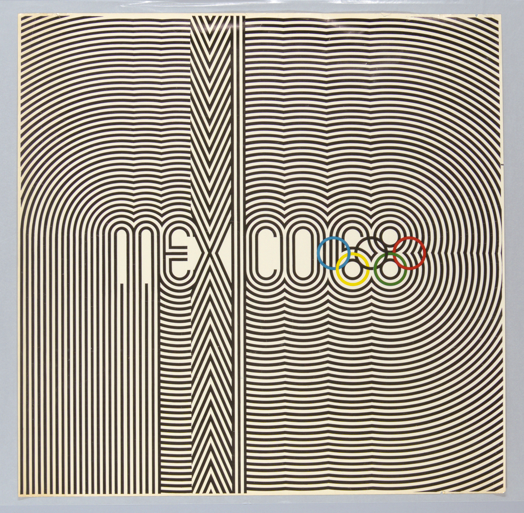
While the world’s best athletes are the obvious stars of the modern Olympic Games, countries hosting the games also have a unique opportunity to demonstrate their strengths on an international stage. The bold graphic identity of the 1968 Mexico City Olympics in this poster designed by Lance Wyman and Eduardo Terrazas intended to broadcast a...
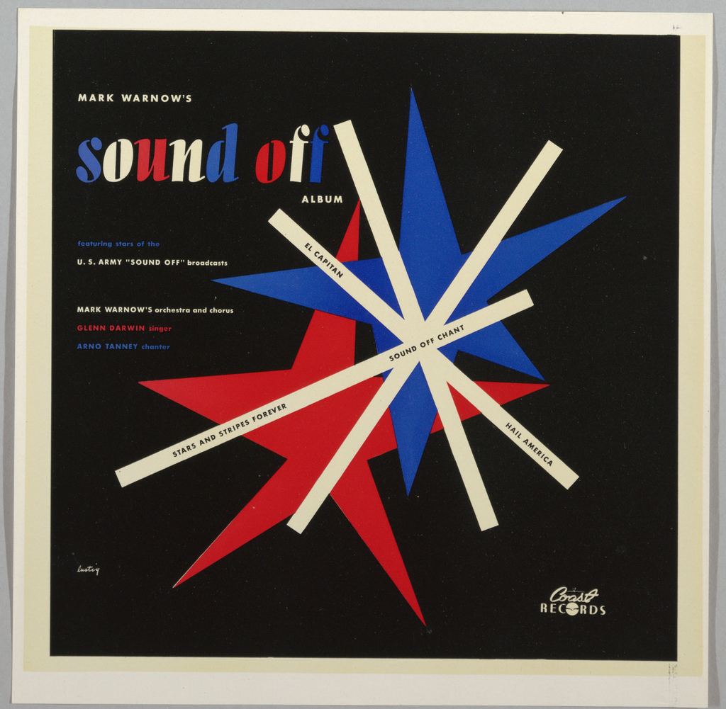
Alvin Lustig was one of the most influential graphic designers of mid-20th century America, despite the unfortunate brevity of his career. Well-known for his designs of books, book jackets, and magazines, Lustig also designed several record jackets for albums of classical and concert band music. Four such albums bearing Lustig’s design are featured in Cooper Hewitt’s...
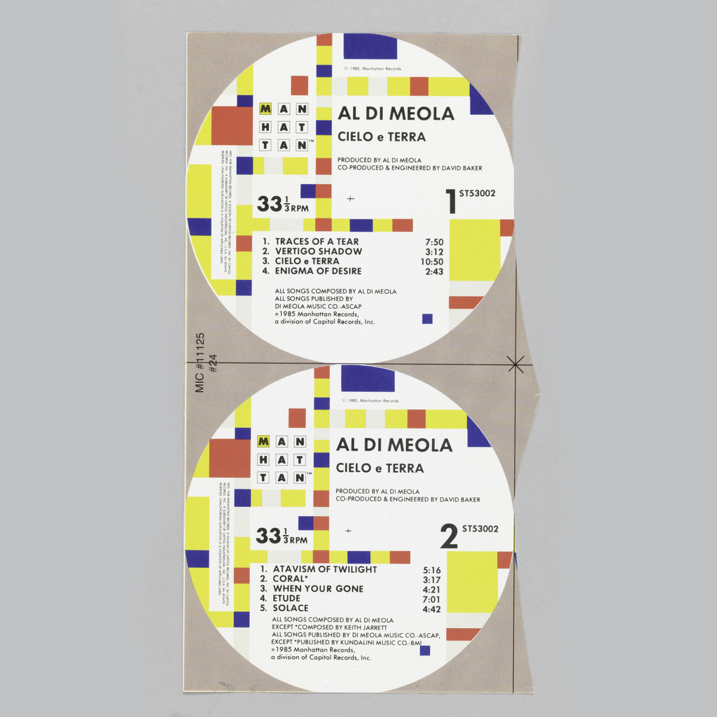
Graphic designer Paula Scher adapted Piet Mondrian’s 1943 painting Broadway Boogie-Woogie when she created the graphic identity for Manhattan Records in 1984. On each LP that Manhattan Records released, the design is printed on the center label of sides A and B. When reflecting on her decision to turn to Mondrian, Scher explained “the strongest...
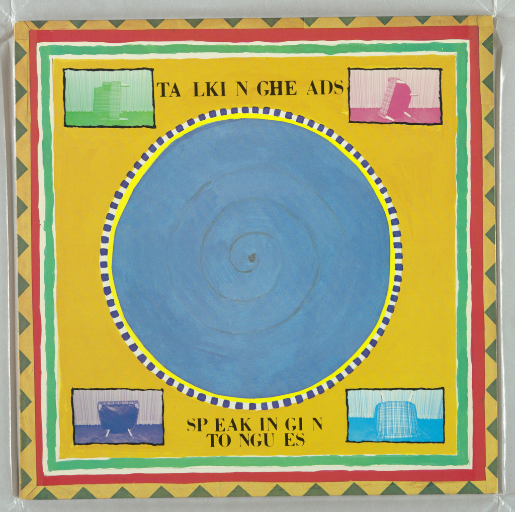
Graphic designer Tibor Kalman made a circle of blue the visual centerpiece of Talking Heads’ 1983 release Speaking in Tongues. The circle is seven inches in diameter, just like a 45 record. But while the graphic might evoke the standard format of singles from the ‘50s, ‘60s and ‘70s, it was actually inspired by the...
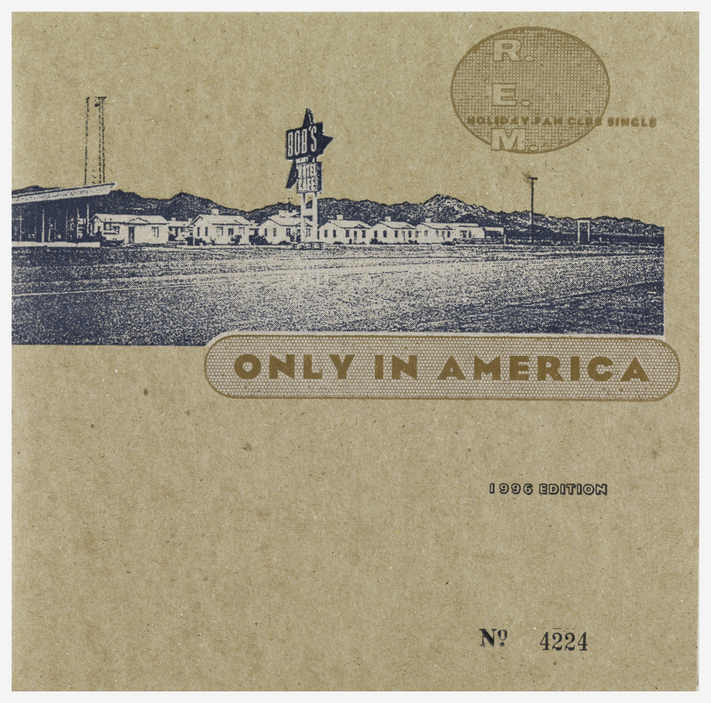
An altered photograph of a roadside motel is printed on a cardboard sleeve for R.E.M.’s 7-inch single “Only in America,” designed by Bruce and Karen Licher. The image of the motel is grainy, which complements the speckled cardboard on which it was printed. Although the grain makes it harder to read the motel sign, the...
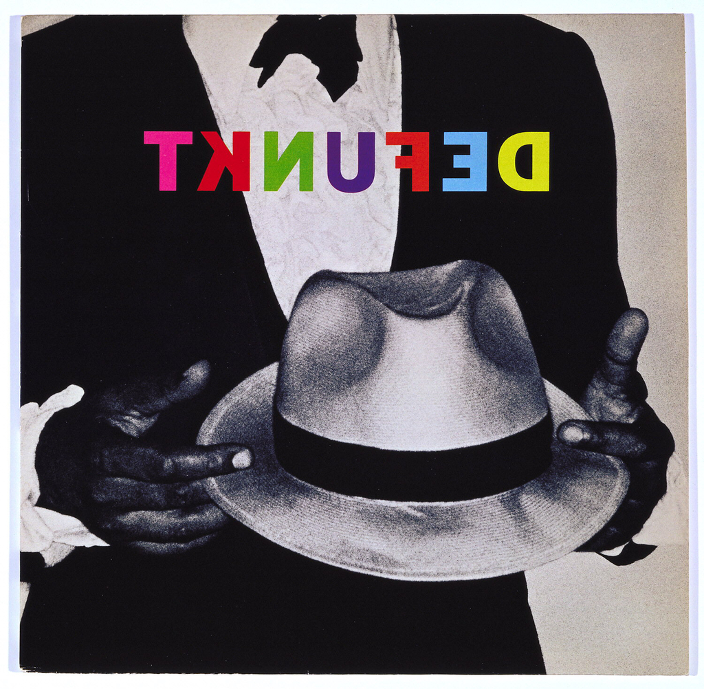
A man in a tuxedo holds a white fedora hat in this Defunkt album cover designed by Tibor Kalman. As in some of his other album designs, Kalman chose to alter the band’s name through reverse lettering. Printed in multicolor, the text is especially striking printed atop the black and white photograph. When reflecting on...
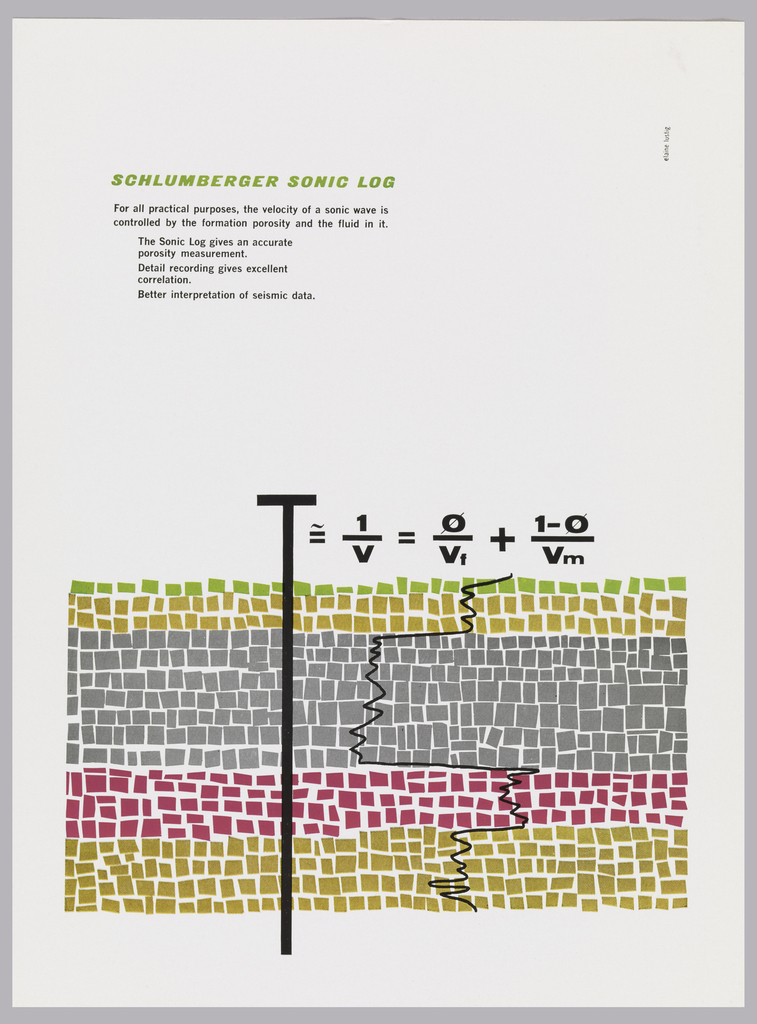
At first glance, this graphic field of squares looks almost like an abstract painting. Although this advertisement targeted scientists, designer Elaine Lustig Cohen captures the attention of laypeople and experts alike. Created in 1958 for the oilfield services company Schulberger, the ad promotes the company’s Sonic Log, a device for the identification of soil properties....
Transcending the boundaries of art and design, Rebeca Méndez’s graphics explore delicate relationships between the organic and the digital.[1] Throughout her career, the Los Angeles-based Mexico native has maintained a fascination with the physical structures, forces and matter of nature. Today, her work is identified with the use of strong symbolism and bespoke typography.[2] Such...
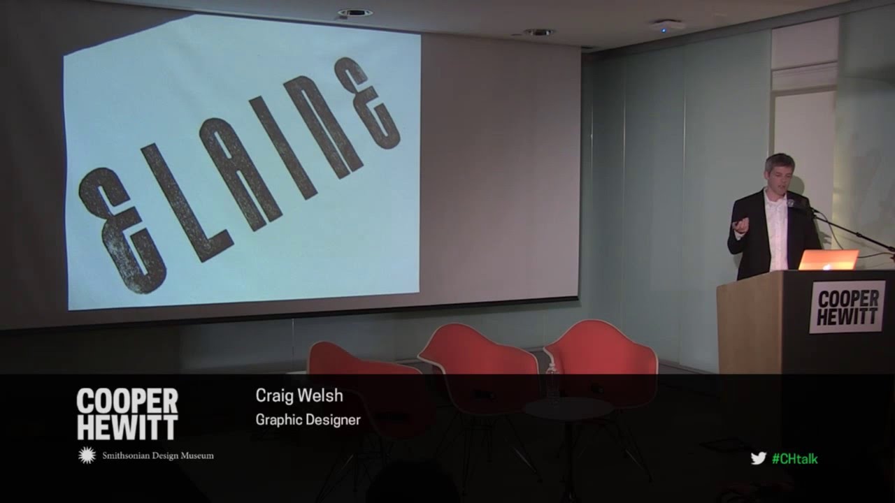
Two short talks and a moderated conversation featuring graphic designers Richard Niessen and Craig Welsh explore themes of ornament, type, and history in contemporary graphic design. Niessen’s poster series—Palace of Typographic Masonry—create intricate arrangements of text and pattern, and is now on view in Beauty—Cooper Hewitt Design Triennial. Welsh collaborated with AIGA Gold Medalist Elaine Lustig Cohen...
When it comes to Japanese graphic design, a certain set of visual elements are conjured in one’s mind. Simplified forms; a minimal color palette, the generous use of negative space; an effective use of black; and unique lettering, are all characteristic elements that draw on the aesthetics of Zen culture, Japanese Buddhism, calligraphy, ukiyo-e woodblock...