For nearly twenty years between the two world wars, E. McKnight Kauffer, an American, was the most celebrated graphic designer in England. He was best known for his eye-catching posters, but his book covers and illustrations, graphic identities, carpets, stage sets, costumes, and ephemera were also among the most arresting of his era. Kauffer believed fervently that modern art should move beyond the walls of museums and galleries to infiltrate all elements of daily life.

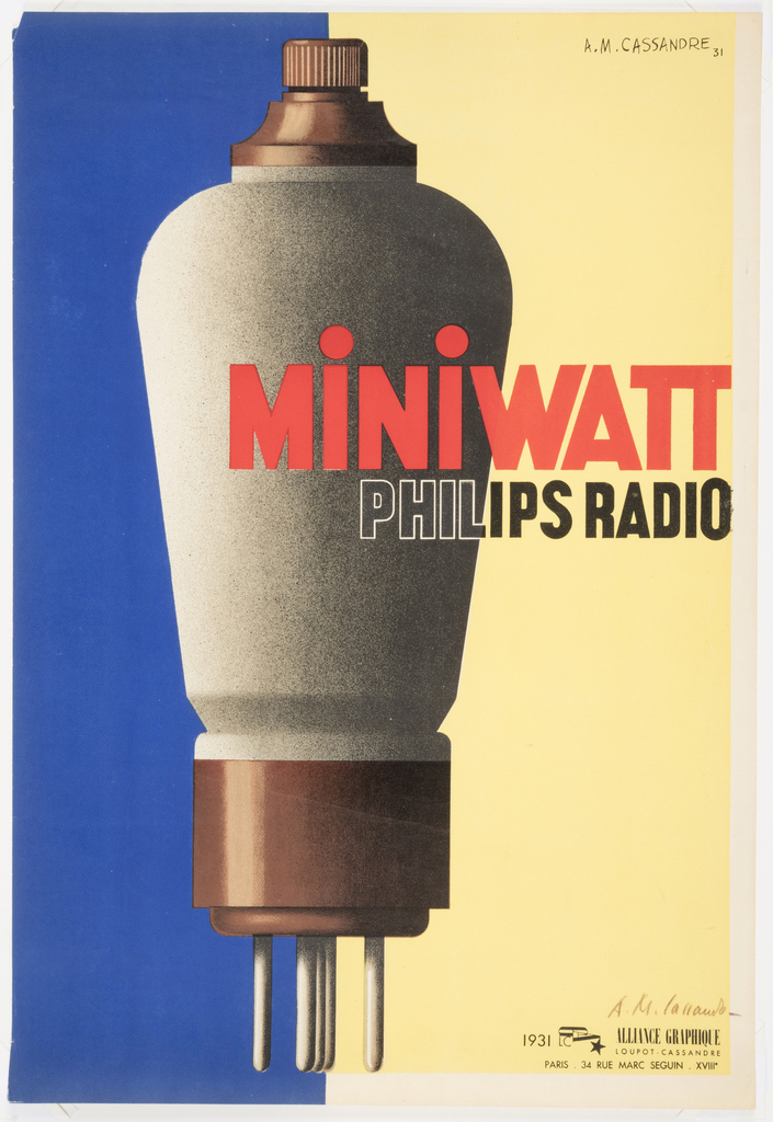
When legendary French graphic designer A.M. Cassandre was hired in 1931 to produce this poster for the Dutch light bulb and radio tube manufacturer Philips, he was at the high point of his career. Together with fellow poster designer Charles Lupton, Cassandre had founded the printing and publishing collective Alliance Graphique in Paris, France.[1] Cassandre...
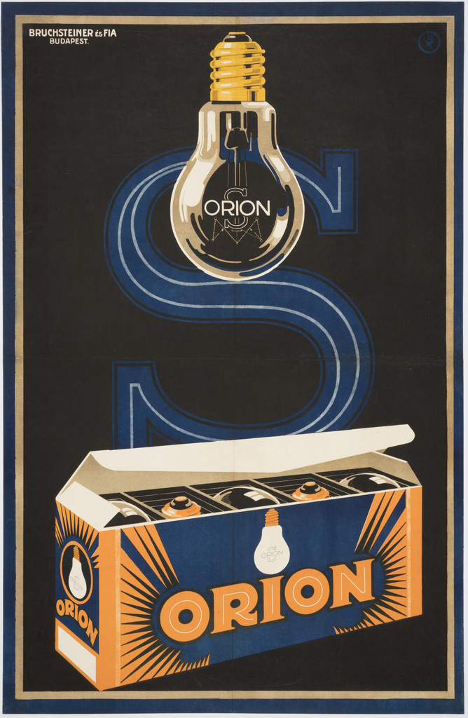
Apart from several months spent at Iparművészeti Iskola, Budapest’s school of applied arts, József Bottlik[1] was a self-taught graphic designer. Bottlik began his career in 1919 and quickly established himself as a designer of eye-catching commercial product and film posters, including a celebrated 1927 design for Universal Film AG (UFA) for the film Metropolis.[2] Bottlik...
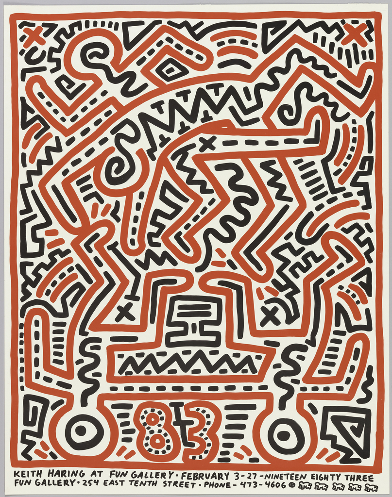
In celebration of World Pride, June Object of the Day posts highlight LGBTQ+ designers and design in the collection. Today’s blog post was originally published February 8th, 2015. A favored hangout among the early 1980s East Village art scene, the Fun Gallery became home to some of the New York City’s most notable artists, including...
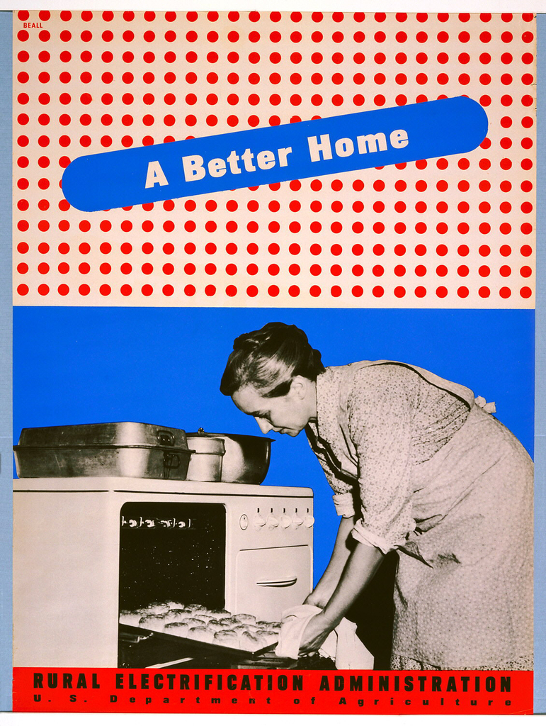
This blog post was originally published on January 8, 2014. By the 1930s, the vast majority of American urban dwellers had access to electricity in their homes and businesses. But those in impoverished rural areas were often not serviced by private electric companies, who believed that it was not cost-effective for them to invest in...
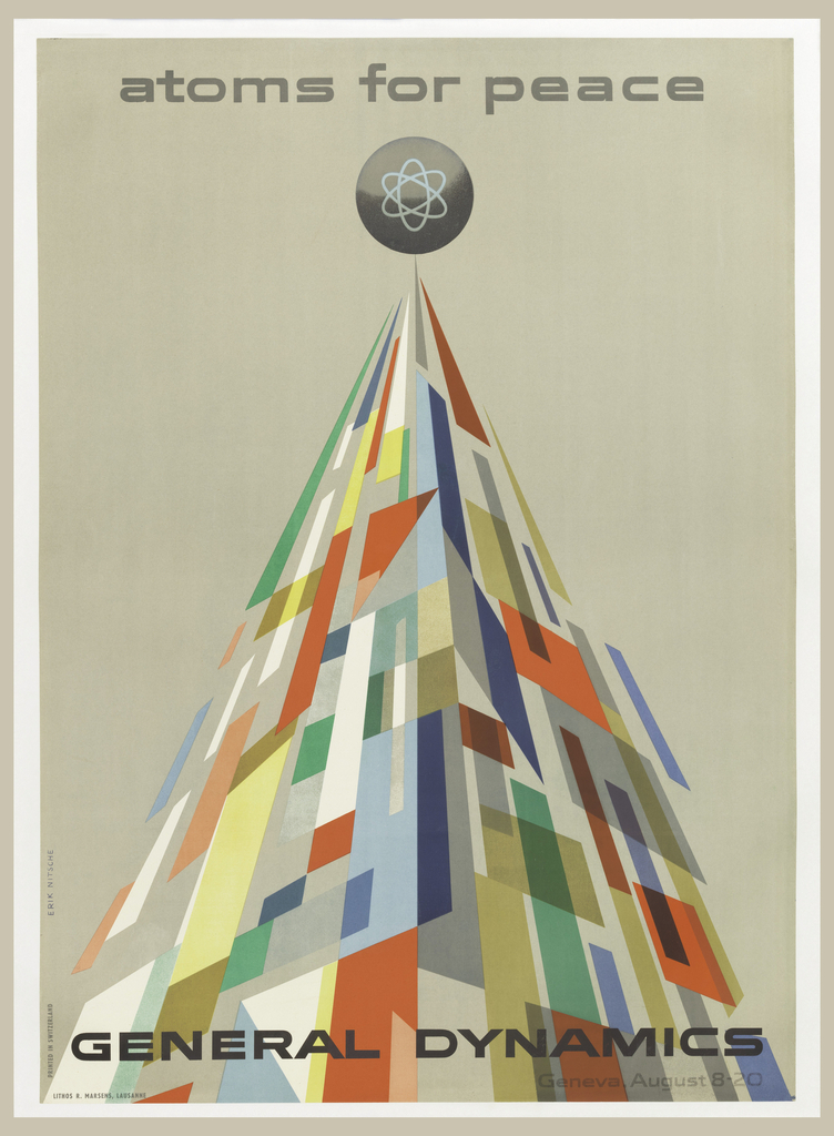
This blog post was originally published on August 4, 2014. The year is 1955, and Cold War tensions have begun to escalate. General Dynamics is a newly formed parent company overseeing eleven manufacturers, producing cutting edge technology for the defense of the United States. The company is capitalizing on the American policy of nuclear deterrence,...
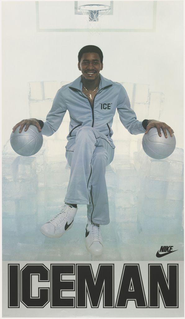
Basketball star George Gervin never broke a sweat because he stayed cool under pressure. At least that’s what his teammates Julius Erving and Fatty Taylor thought when they nicknamed him “Iceman” in the early 1970s. But according to Gervin, his ability to remain dry throughout a game had nothing to do with a calm demeanor....
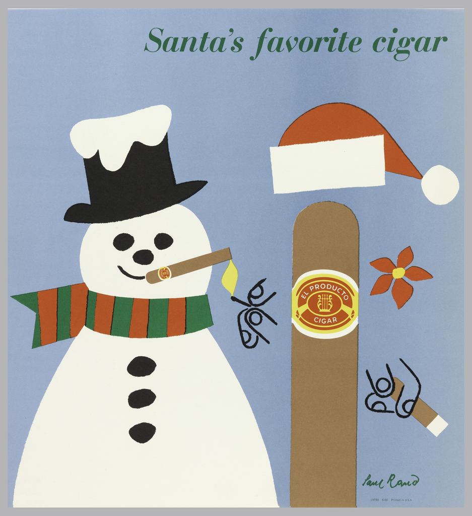
The characteristic wit and whimsy of graphic designer Paul Rand dominates a long-running series of ads designed for El Producto in the 1950s. Already wildly successful by the 1940s, Rand was hired in 1952 to revamp the American-made cigar company’s advertising efforts after production shifted from hand-rolled to machine-rolled cigars. To enliven these factory-made products,...
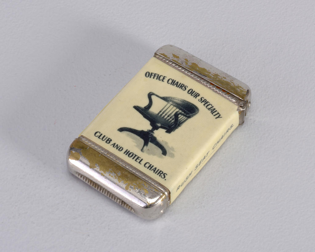
Cooper Hewitt holds a large number of matchsafes: small, metal boxes that emerged around 1830 to house recently invented friction matches. Vital for lighting lanterns, kitchen stoves and smoking accessories, people from all walks of life carried matchsafes, or vesta cases. The air-tight containers kept matches dry and reduced the risk of spontaneous ignition, a...
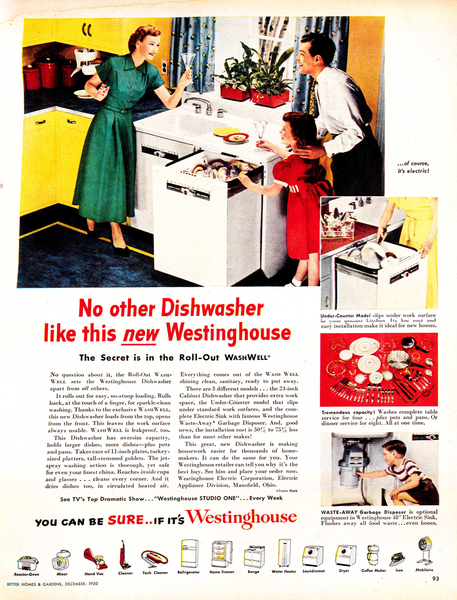
“The Battle of the Centuries” was a dish washing contest between Mrs. Drudge and Mrs. Modern, between hand washing vs. electric dishwashers at the 1939/40 New York World’s Fair. This contest promoted all the benefits of modern appliances and is part of the history of new and improved technology in the modern age. The Cooper Hewitt Library...
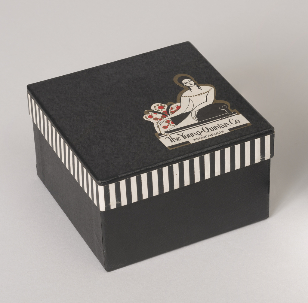
On February 19, 1927, the film “It,” starring Clara Bow, was publicly released in the United States, instantly becoming a box office success and making Clara Bow Hollywood’s first “It girl.” Later that year, Elizabeth C. Quinlan, co-founder of the Young-Quinlan Co., a prestigious Minneapolis department store, visited Paris in search of her own “It...
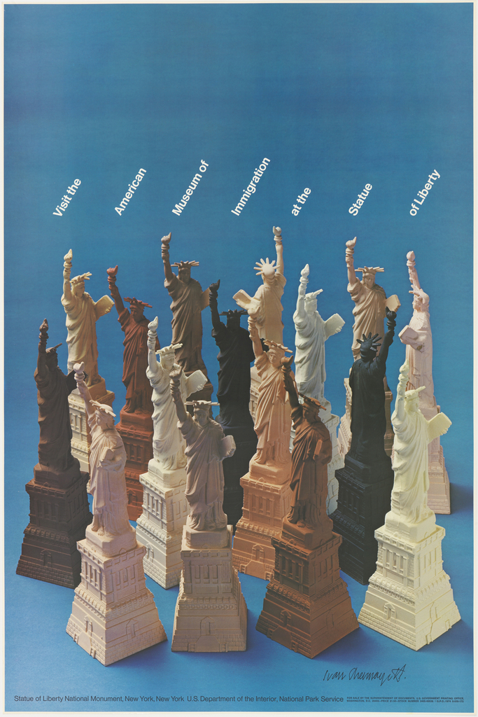
Liberty and immigration: here are values so intimately tied with the history of the United States and New York in particular, that they seem to permeate one another. The year 1974 was a strenuous one for the US. The recent end of the Vietnam War left open wounds still seething in the minds of millions,...
“The best political graphics today exist on the cusp of art and graphic design. The people responsible often see themselves as both artists and designers. The posters don’t look like they were done to express the views of a client, but rather to express the viewpoint of the creator. The work doesn’t exhibit the sort...
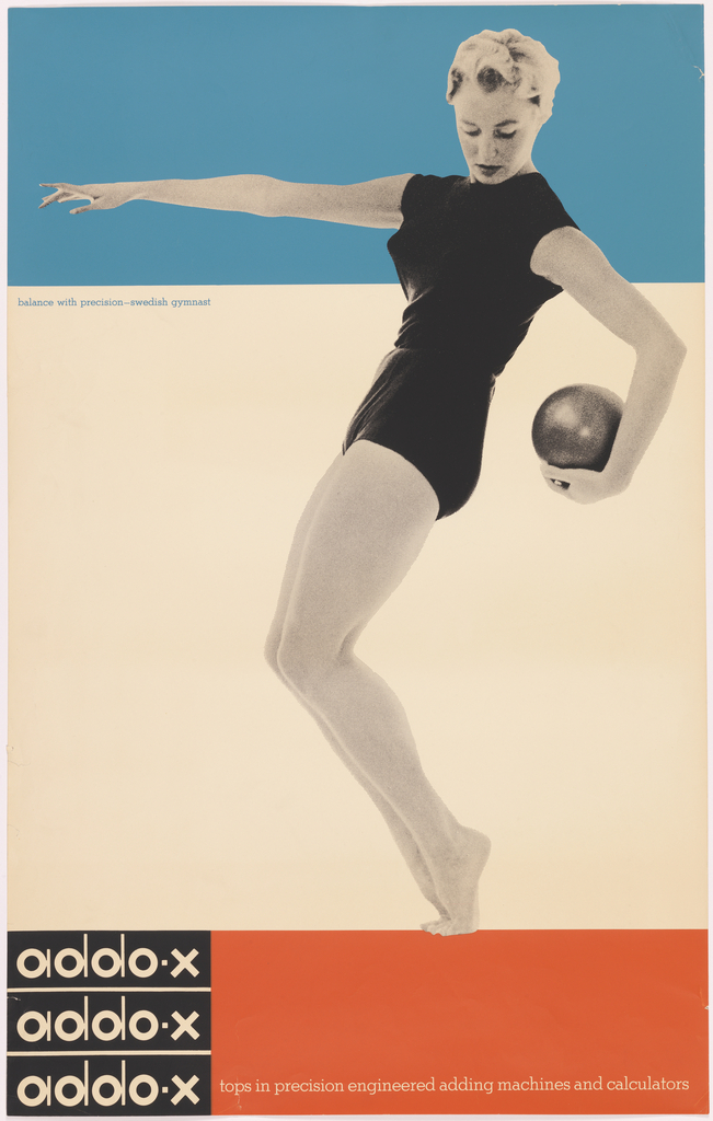
We see posters not only with our eyes but with our bodies. In this sense, we respond physically to the taut pose of the elegant athlete in Ladislav Sutnar’s 1958 poster for Addo-X. Sutnar created a bold new logotype for the Swedish office machine brand in 1956; he also designed numerous posters and advertisements for...
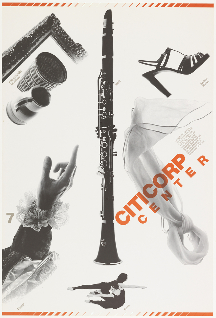
American designer Dan Friedman was a student of Swiss master Armin Hofmann in the late 1960s. Friedman was working at Anspach, Grossman, Portugal, Inc., when the firm secured the account for the new Citicorp identity. He designed Citicorp’s logo and other key elements of the brand campaign. His poster for Citicorp Center, advertising Citicorp as...