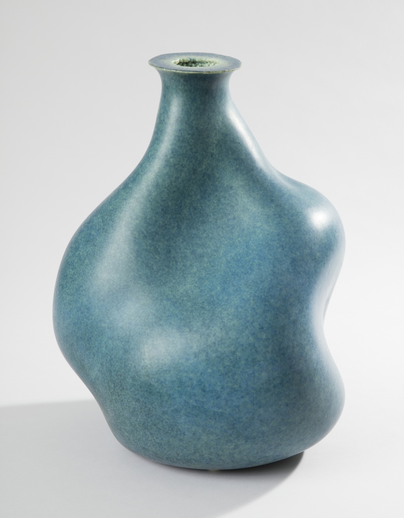
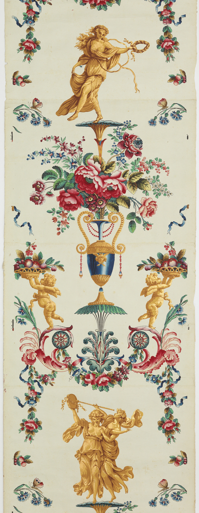
about

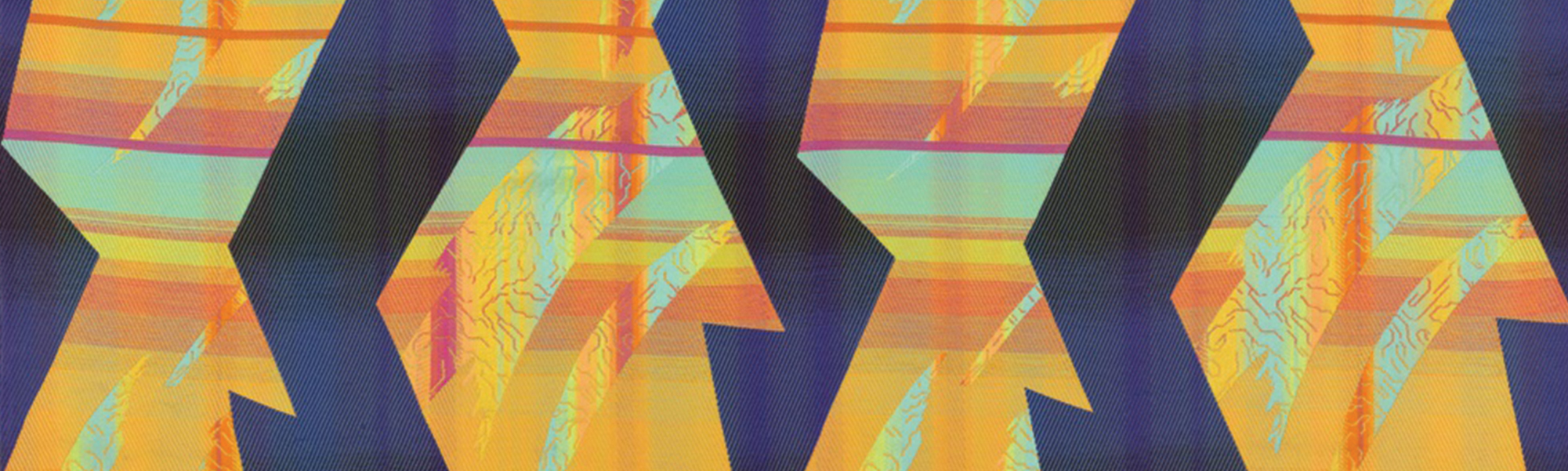
The Object of the Week blog is written by Cooper Hewitt’s curators, graduate fellows, and contributing researchers and scholars. Posts are published every week and present research on an object from the museum’s collection. With over 210,000 objects spanning thirty centuries of decorative arts and design, Object of the Week explores the material culture of textiles, graphic design, furniture, products, architectural drawings, wallcoverings, and much more.

Image features a length of wool canvas with an irregular grid of embroidered floral and geometric borders. In gray, ochre, orange and white on a dark brown ground. Please scroll down to read the blog post about this object.
Borders
In 2005, Hella Jongerius was invited to curate a Selects exhibition at Cooper Hewitt. She became fascinated by the museum’s collection of over 1,000 embroidered samplers. For the exhibition, she made her own “Sampler Blankets,” which combined motifs drawn from the historic examples with industrial techniques like machine embroidery and needle-punch felting. These explorations were...
This image features Arctic inspired water service that includes a serving tray, water pitcher, cups, ice bowl. Reed & Barton, artistic workers in silver & gold plate. 1884.
On a Hot Summer’s Night….Icy Cold Silver
Does the frozen scenery on this Reed & Barton beverage set make you feel like the ice water is really icy?   More refreshing? Are you transported to frostier climes in faraway places? Icebergs “startle, frighten, awe; they astonish, excite, amuse, delight and fascinate”[1].   Depending on where you live, icebergs and polar bears can be as...
Image features a double-sided wastebasket in the shape of an inverted triangle with two triangular feet and a red interior. One side shows a black background with silver-toned rays emanating from top right corner and a 'cityscape' of colorful overlapping rectangles at the base. Please scroll down to read the blog post about this object.
Trashy Modernism
Tucked underneath a desk or in a corner of a room a wastebasket sits waiting to collect trash. While an often overlooked item of everyday life, it received the full attention of Donald Deskey. The designer, who established his career in New York in the 1920s, dedicated himself to reimagining the look of the American...
Image shows a mid-century wallpaper with cocktail and kitchen motifs. Please scroll down for additional information on this object.
Dig that Paper!
Author: Anne Regan This pop-culture inspired cocktail paper from the post-World War II era immediately evokes images of the model 1950s suburban home. Its imagery—mostly items used within the kitchen like fruits, coffee, cocktail drinks, and even poultry—reference a variety of trends in 1950s America. The chickens and roosters are representative of fertile animals, a...
Image features a poster for the New York Subway Advertising Company, encouraging businesses to purchase advertising space in subway stations or on trains. In the foreground, at bottom left, a single train's rail, rendered in perspective extends into a black, spiraling tunnel. At the vanishing point of the tunnel, a cluster of colorful, overlapping rectangles, meant to represent posters. Across the bottom, in black text: [New York Subway Advertising Company logo] RAILS TO SALES / SUBWAY POSTERS [a red line cuts through the center of "subway posters"]. Please scroll down to read the blog post about this object.
Rails to Sales on the New York City Subway
This poster, designed for the New York Subway Advertising Company, exemplifies the signature approach of American graphic designers Otis (Shep) Shepard and Dorothy Van Gorder—the poster prioritizes the image as text becomes peripheral to the overall message. It combines reductive, abstracted forms with ample airbrushing to create a dynamic arrangement. The pair met in 1927...
Image features a length of patterned knit with technical and molecular references is a structured knit and engineered a net of ovals which interlock to form large vertical stripes. Evenly stacked lengthwise in size order, the staggered arrangement of three scales of ovals has a sense of ascension. Please scroll down to read the blog post about this object.
Lift
Lift is part of an ongoing series of innovative textiles designed by German designer, Konstantin Grcic in collaboration with Maharam. A sporty, patterned knit, Lift continues Grcic’s exploration of nontraditional textile manufacturing techniques. When Grcic designed his first four nonwoven textiles for Maharam in 2015 he toured production facilities throughout Europe to gain a deeper...
Image features a wallpaper with a rather random pattern of scrolls, printed in muted blue and tan. Please scroll down to read the blog posts about this object.
Washable Watercolor Effects
Here is a wallpaper that is quite beautiful though difficult to describe. Rather atmospheric in effect, kind of a blend of crashing waves and tie-dye. If you start looking at the details there appears to be a scrolling acanthus motif which can be seen in the lower right, with a mirror image of this in...
Image features a side chair composed of black tubular steel rods, some diagonally set, bent to form the chair's outline and volume. Please scroll down to read the blog about this object.
Is There a Chair There?
Not every chair immediately presents itself as a chair. Pared down to its basic components, this chair is a study in outline and form. It was part of design firm nendo’s first solo exhibition in England, at the Saatchi Gallery in 2010. Responding to the exhibition theme, “Outlines”, nendo created the Thin Black Lines series of...
Poster for the 1968 exhibition at the Museum of Modern Art, “Word and Image: Posters and Typography from the Graphic Design Collection of the Museum of Modern Art, 1879–1967.” Across top margin in white text: WORD IMAGE WORD IMAGE WORD IMAGE [sic]. Below, on a black ground, four open mouths with pink lips, white teeth, and a red tongue arranged in a 2x2 grid. At bottom, red and blue rays emanate from a large, blue eye with a pink lid. Across bottom margin: THE MUSEUM OF MODERN ART, NEW YORK, JANUARY 24–MARCH 10 / DESIGNER TADANORI YOKOO COPYRIGHT © 1968 THE MUSEUM OF MODERN ART POSTER ORIGINALS LTD., NO. 89.
Fluorescent Word and Image
Before turning his attention to graphic design in the mid-1960s, Tadanori Yokoo (b. 1936) first trained as a painter and worked as a stage designer for avant-garde theater productions in Tokyo.  By the late 1960s, however, he was best known as a graphic designer. His work drew international acclaim when it was included in the...