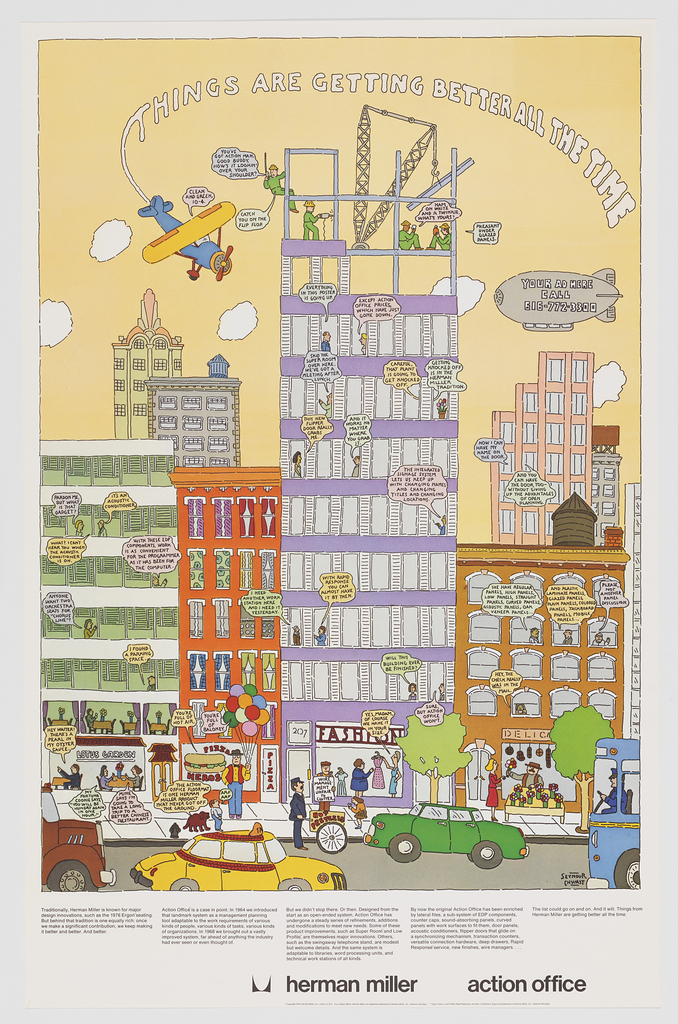
This poster designed by Seymour Chwast for Herman Miller Furniture Company is all about the details. Chwast skillfully packed a bustling city scene overflowing with conversation into the poster’s vertical format, requiring the viewer to look closely and engage with the design’s dialogue as though reading a comic or storybook animated by the designer’s careful...
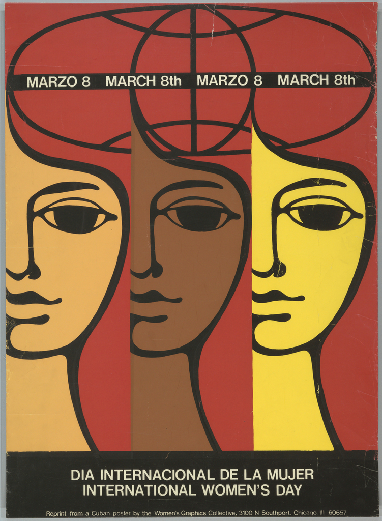
This bold poster was printed by the Chicago Women’s Graphics Collective to celebrate International Women’s Day on March 8, 1975. The elegant design uses direct, straightforward symbols to clearly communicate a message of unity, a popular design approach amongst political and activist posters from the 1960s and 1970s. In this example, the simple repeat of...
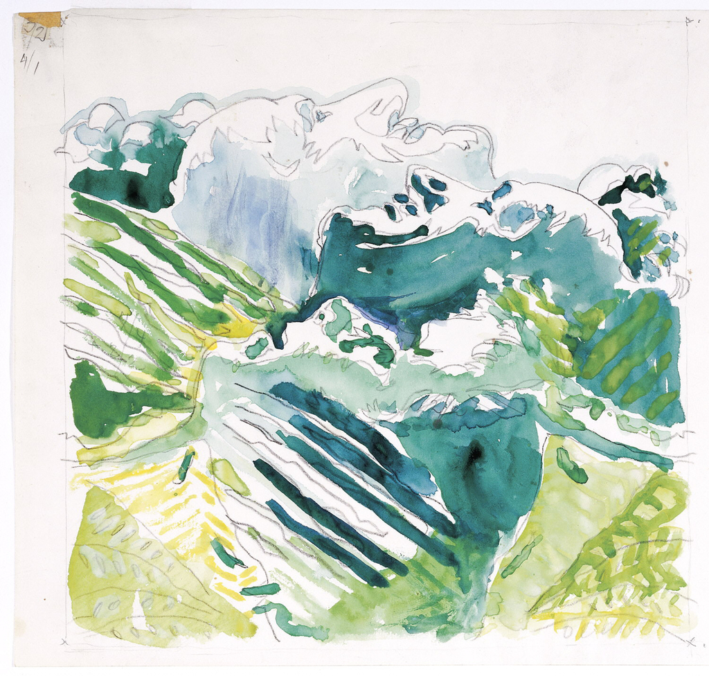
At first glance, this design drawing for the tapestry Our Mountains by Trude Guermonprez (American, b. Germany, 1910–1976) may appear to be a simple mountain landscape. A closer look reveals that the cool blue-green peaks and valleys are actually formed by three reclining faces in profile. In the background, the face of Guermonprez’s husband John...
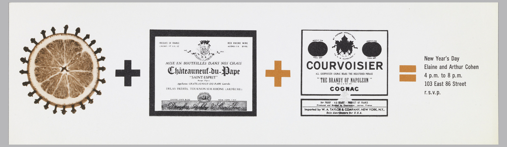
You don’t have to be a mathematician to appreciate this visual recipe designed by Elaine Lustig Cohen (American, 1927–2016). An orange pomander studded with cloves, a French red wine from the Rhone valley, and Courvoisier cognac add up to produce the mulled wine served by Elaine and Arthur Cohen at their New Year’s Day parties....
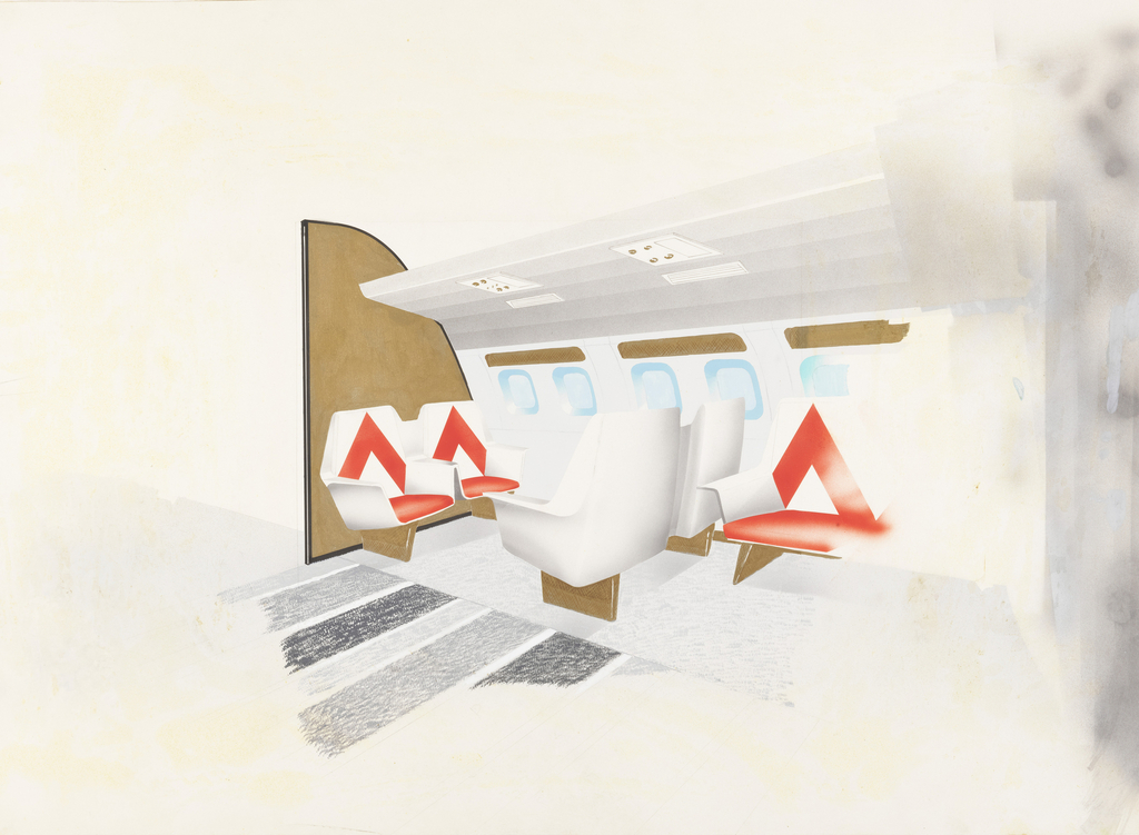
While interior designer Dorothy Draper is most well-known for baroque interiors featuring hallmarks of large floral patterns, plants, and vibrant colors, she adapted her vision to a range of spaces, including automobile and airplane interiors. This 1957 design for an airplane club area still evokes elements of the Draper fantasy but in a style more...
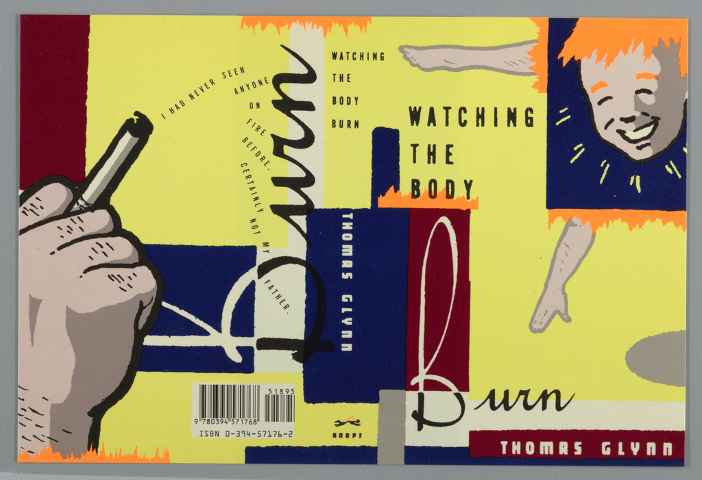
If you’re judging this book by its cover, Chip Kidd’s 1989 design for Watching the Body Burn by Thomas Glynn might encourage you to wonder what crazy contents lie within. The disjointed imagery, text, and loud colors certainly draw consumer attention, but Kidd’s design is more than a sales tactic—the frenetic cover design complements the...
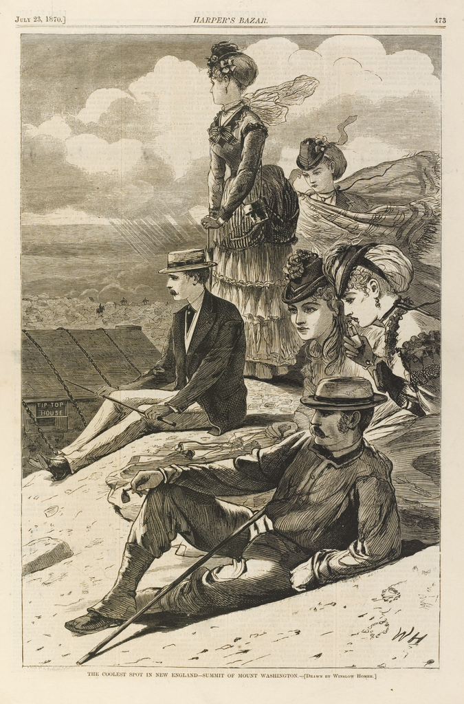
Seeking a way to beat the heat of summer while still looking cool? This 1870 print after a drawing by Winslow Homer suggests that more comfortable climes may require a bit of a climb. In this scene, a group of well-dressed urban men and women take in the views at the summit of Mount Washington,...
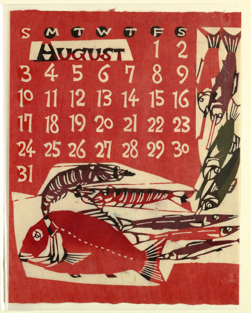
The brightly saturated colors of this August calendar page seem like a perfect salute to summer. To create the designs for this 1969 calendar, Takeshi Nishijima applied a paper-dyeing technique based on the traditional resist-dyeing process of katazome. Katazome relies on the use of katagami (stencils) to create hand-patterned textiles, most of which were used...
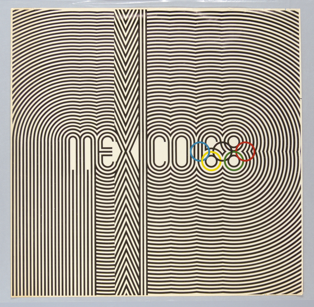
While the world’s best athletes are the obvious stars of the modern Olympic Games, countries hosting the games also have a unique opportunity to demonstrate their strengths on an international stage. The bold graphic identity of the 1968 Mexico City Olympics in this poster designed by Lance Wyman and Eduardo Terrazas intended to broadcast a...