Art of Noise In-Gallery Resources

The following resources have been designed to support your visit to the exhibition.
Resources for the Art of Noise exhibition include a sensory map, large print labels, and object descriptions.
Visit Accessibility at Cooper Hewitt to learn more about general accessibility at the museum.
What to Expect
Art of Noise consists of five galleries on the third floor of Cooper Hewitt. This exhibition includes historic music media devices, as well as iconic album covers and concert posters. There is a listening gallery with interactive seating, and a sound installation by teenage engineering. At the beginning of the exhibition, there is a projected title graphic that flashes.
There is seating in select galleries throughout the exhibition. Refer to the Visitor Guide for specific locations of the seating. Portable gallery stools are available on the third floor by the elevator. The exhibition is wheelchair accessible.
View the Sensory Map to find the areas of the exhibition where video sounds might overlap.
Large Print Labels
A screen-reader accessible Large Print version of the exhibition labels is available digitally. Click this link to access.
You can borrow a printed version of the Large Print labels at the museum. The Large Print label booklet is available to the right of the exhibition’s introductory text.
Hear More from the Curator
Hear more from the curator. Listen to a playlist of recordings by Joseph Becker, Curator of Architecture and Design at SFMOMA. The recordings are organized by exhibition section below. You can also download the Bloomberg Connects app or visit BloombergConnects.org to access the recordings.
Exhibition Sections
How we experience recorded music has changed dramatically over the past century. During this time, design has played a crucial role in how we listen to music. Art of Noise shows how products and inventions have evolved, helping us tune in to radio broadcasts or play our own selections at home. On view here are early phonographs and tube amp radios, turntables and reel-to-reel magnetic tape decks, laser-read compact disc stereos and digital music players. Each of these objects shows how design has helped improve sound quality, made music more portable, and given us more choices about what we listen to. Many of them reflect the aesthetics or look of their era or announce the dawn of a new one. Although products like the Regency TR-1 radio, the Sony Walkman, and the Apple iPod were not necessarily the first to offer a specific type of listening, each device reshaped the consumer landscape and ushered in a new way to carry our music with us.
Interaction is a key aspect of product design and experiencing how these objects work; yet exhibitions tend to display these objects and electronic devices turned off or static, meaning they tell only part of the story. To better explain how these pieces actually work, some of them are displayed here with an in-use video, which shows how the design was intended to be used and how it functions. For listeners, simple interactions like the clicking of a button or the feel of a device’s material can result in relationships with these design objects and the way that they function; those interactions then become intertwined with our personal experience of music.
Hear More from the Curator
Transcript:
How we experience recorded music has evolved dramatically over the past century, and design has played a crucial role in how we listen. Art of Noise, this exhibition tracks the progression of groundbreaking products that we have used either to receive radio transmissions or to facilitate audio playback. Among them here are wax cylinder phonographs, and tube amp radios, turntables, and reel-to-reel magnetic tape decks, laser read Compact Disc stereos, and digital music players.
These objects point to how ingenuity in both form and function have merged to transform the listening experience towards fidelity, affordability and the means to choose our own soundtracks. They often reflect the aesthetics of their era or announce the dawn of a new one. Although products like the Regency TR-1 radio, on the table in the first room, the Sony Walkman and the Apple iPod were not necessarily the first to offer a specific type of listening. Each reshaped the consumer landscape and ushered in a new way to bring our music with us.
As listeners, we form relationships with these design objects and their functions, which become intertwined with our experience of music. As you move through these galleries and look at these objects, we see an evolution of form and materiality. We also see how these relationships unfold over time. The earliest work in the exhibition dates to 1912. Some of these objects were made on mass consumer scales, and some of them were made in very small batches.
There are objects like the Ron Arad designed concrete stereo from 1983, which is a more experimental kind of listening device, and works that hit a massive scale of production, such as the JVC RC-M90 Boombox. In the exhibition we’ve also brought to life eight of these objects. The in-use videos embedded in the display furniture help showcase the interactive components of these objects. You hear the clicks of the buttons, the turn of the jog dials, and the sounds that each of these objects made, coupled with music contemporaneous to the time of the object’s launch.
In-Gallery Videos
Some objects are displayed in the exhibition with an in-use video, which shows how the design was intended to be used and how it functions. To gain access to these videos on your own device, email CHAccess@si.edu.
teenage engineering’s Choir is a set of eight sonic sculptures programmed to “sing” together as a group, in a reimagination of choral chamber music for the synthesizer era. Each figure performs in a different vocal range, and as a group the installation sings classic compositions, complete with solos and a cappella harmonies like a real choir. Choir sings songs in a range of genres from baroque to barbershop, including the traditional folk song “I’ve Been Working on the Railroad,” Ludwig Van Beethoven’s “Ode to Joy,” and Shelton Brooks’s “The Darktown Strutters’ Ball.” The figures also generate music on the fly, one bar at a time, improvising automatically in the tradition of eighteenth-century counterpoint, a Baroque and early Classical composing technique in which two or more melodies overlap and harmonize.
Choir represents a global chorus of different cultures, eras, and backgrounds, and each figure has its own name and personality. Carlo sings baritone, Gisela and Hatshepsut sing mezzo-soprano, Bogdan sings bass, Ivana sings alto, Miki sings tenor, Olga sings contralto, and Leila sings soprano.
Hear More from the Curator
Transcript:
teenage engineering’s Choir is a set of eight sonic sculptures programmed to sing together as a group in a reimagination of choral chamber music for the synthesizer era. Each figure performs in a different vocal range, and as a group, the installation sings classic compositions complete with solos and a cappella harmonies like a real choir. Choir sings songs in a range of genres from baroque to barbershop, including the traditional folk song, I’ve Been Working on the Railroad, Ludwig van Beethoven’s Ode to Joy and Shelton Brooks’ the Darktown Strutters Ball.
The figures also generate music on the fly, one bar at a time, improvising automatically in the tradition of 18th century counterpoint, a baroque and early classical composing technique in which two or more melodies overlap and harmonize. Choir represents a global chorus of different cultures, eras and backgrounds, and each figure has its own name and personality. Carlo sings baritone. Gisela and Hatshepsut sing mezzo-soprano. Bogdan sings bass. Ivana sings alto. Miki sings tenor. Olga sings contralto. And Leila sings soprano.
Installation Description
As you enter the gallery, there are two pathways to enter the main space: to the left or to the right. The gallery is dimly lit.
As you come around either pathway, there is a seat along the wall dividing the installation from the main route. Please sit, if you would like.
On pedestals are anthropomorphic wooden figurines. Each figurine is a mix of stacked geometric and organic shapes that create vaguely person-like structures. Each is a speaker that openly emits a different voice. The voices come together like a choir and sing a range of music styles.
Sound dampening over-ear headphones and earplugs are available by-request at the Visitor Experience Desk.
Art of Noise is designed in collaboration with Stockholm-based teenage engineering, whose designs for audio devices have earned a devoted global following. The speakers, synthesizers, and recording equipment of this media station combine high-design tactile interfaces with advanced digital audio output. The studio focuses on creating objects that are collectible as well as functional—its products are as much handheld sculptures as they are musical tools and instruments.
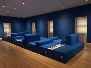
The seating area in this gallery was created specifically for this exhibition and features a custom-built device for audio playback that allows visitors to gather, sit or lie down, and interact while discovering new music. The devices contain playlists spanning genres and eras; the songs are focused on New York and the incredible range of music created or augmented here.
Use the headphones to listen to music while relaxing in the seating area. Each device can skip, rewind, fast-forward, and loop. You can also use this link for more information on the content of the playlists.
Hear More from the Curator
Transcript:
Art of Noise is designed in collaboration with Stockholm-based teenage engineering whose designs for audio devices have earned a devoted global following. The speakers, synthesizers and recording equipment of this media station combine high-design tactile interfaces with advanced digital audio output. The studio focuses on creating objects that are collectible as well as functional. Its products are as much handheld sculptures as they are musical tools and instruments.
The seating area in this gallery was created specifically for this exhibition, and features a custom-built device for audio playback that allows visitors to gather, sit or lie down, and interact while discovering new music. The devices contain playlists that focus on New York stories, including playlists by teenage engineering and the beginning of their studio practice, Rocky Bucano, the co-founder and CEO of The Hip Hop Museum assembling tracks that point to the origins and foundation of New York hip hop, Deborah Gordon, proprietor of the Village Vanguard, New York’s oldest continuously operating jazz club with a playlist of early jazz sessions recorded live at the Village Vanguard.
Vince Aletti, New York’s chronicler of the Disco Era, an esteemed ephemera collector with a playlist of critical early disco songs that pulsed through the scene. Pablo E. Iglesias, renowned DJ and salsa music historian, created a playlist of salsa songs pulled from the album covers on view in the exhibition that were designed by Izzy Sanabria. And David Byrne, New York City-based musician, author, artist, and Talking Heads co-founder has selected a wide range of tracks that accompany his book, How Music Works.
Installation Know-Before-You-Go
The Sound Station is available for you to rest and relax along your visit. The blue seating is available for you to sit and lay down on.
Use the headphones attached at various points on the seating to listen to curated music. Each headphone plays a different playlist. No music plays out loud in this area.
The Visitor Experience Desk has sanitizing wipes available upon request.
Listening to music is an experience that is often enriched by the color, typography, and layouts of the graphic design that accompanies the songs. This gallery brings together over a hundred works that demonstrate how iconic imagery can go beyond the music it presents. It contains music posters by famed artists and designers, including Milton Glaser, Bonnie MacLean, and Takenobu Igarashi, alongside album covers from the 1950s mid-century modern style to the 1980s postmodern era. Also on view are music advertisements that have become fixed in the collective memory of countless listeners, in addition to flyers and handbills that announce significant musical events or concert venues from New York’s folk, rock, disco, salsa, punk, new wave, and hip-hop scenes.
Graphic design plays a large role in how we share and remember music by offering a visual way for us to connect to the sounds we hear. The intersection of these two creative forms can lead us to associate certain genres of music with formal approaches, like the bold and modern typography of a jazz album cover, the rawness of the photocopying used for a punk flyer, or the electric colors that vibrate a rock concert poster toward being a psychedelic experience.
Unless otherwise noted, all posters are collection of Cooper Hewitt, Smithsonian Design Museum.
Hear More from the Curator
Transcript:
Listening to music is an experience that is often enriched by the color, typography, and layouts of the graphic design that accompanies the songs. This gallery brings together over a hundred works that demonstrate how iconic imagery can go beyond the music it presents. It contains music posters by famed artists and designers, including Milton Glaser, Bonnie MacLean, and Takenobu Igarashi alongside album covers from the 1950s mid-century modern style to the 1980s postmodern era. Also on view are music advertisements that have become fixed in the collective memory of countless listeners.
In addition to flyers and handbills that announce significant musical events or concert venues from New York’s folk, rock, disco, salsa, punk, new wave, and hip hop scenes. Graphic design plays a large role in how we share and remember music by offering a visual way for us to connect to the sounds that we hear. The intersection of these two creative forms can lead us to associate certain genres of music with formal approaches like the bold and modern typography of a jazz album cover, the rawness of the photocopying used for a punk flyer, or the electric colors that vibrate a rock concert poster towards being a psychedelic experience.
View the object-placement label graphics for this section.
Graphic Design
Graphic Design 1_Label GraphicsGraphic Design_Label Graphics_2
Graphic Design_Label Graphics_Jazz Posters
Genre Flyers
Hip-Hop Flyers_Label Graphics_PDFPunk and New Wave Flyers_Labels Graphics_PDF
Salsa Flyers_Label Graphics_PDF
Disco Flyers_Label Graphics_PDF
Folk and Rock Flyers_Label Graphics_PDF
The commercial introduction of the twelve-inch LP (long-playing) vinyl record in 1948 created a new canvas for album art. Early LP covers often featured simple title blocks and artist photos, but by the 1950s designers had embraced bold typography, innovative photography, and abstraction to visually express the essence of the music. Record labels for jazz and other emerging genres gave creative license to designers and artists whose styles became synonymous with the sounds of the record companies.
Presented here are 45 album covers that capture the energy and emotion of three distinct New York designers and genres: Reid Miles for Blue Note Records, whose bold graphic style defined 1950s and ’60s jazz album art; Izzy Sanabria, whose vibrant designs visually shaped the sound of salsa, including for the musicians Willie Colón and Ray Barretto; and Tibor Kalman and Maira Kalman of the design firm M&Co, who created striking covers for new wave artists such as the Talking Heads and David Byrne.
Hear More from the Curator
Transcript:
The commercial introduction of the 12-inch LP vinyl record in 1948 created a new canvas for album art. Early LP covers often featured simple title blocks and artists’ photos. But by the 1950s, designers had embraced bold typography, innovative photography, and abstraction, to visually express the essence of the music. Record labels for jazz and other emerging genres gave creative license to designers and artists whose style became synonymous with the sounds of the record companies.
Presented here are 45 album covers that capture the energy and emotion of three distinct New York designers and genres. Reid Miles for Blue Note Records, whose bold graphics style defined 1950s and 1960s jazz album art, Izzy Sanabria, whose vibrant designs visually shaped the sound of salsa, including for the musicians Willie Colón and Ray Barretto, and Tibor Kalman and Maira Kalman of the design firm M & Co., who created striking covers for New Wave artists such as the Talking Heads and David Byrne.
View the object-placement label graphics for this section.
Album Covers Section Label Graphic
Album Covers_Label Graphic_PDFDisplayed here are dozens of psychedelic rock posters that illuminate concerts put on by the famed San Francisco promoters Bill Graham and Chet Helms between 1966 and 1971 for landmark San Francisco venues like The Matrix, The Fillmore, and the Avalon Ballroom.
These posters became iconic symbols of their time and reflect the music and ideas of San Francisco’s counterculture—a movement that spread coast-to-coast and beyond. Their design is a window into the transition from the cool Beat era to the unrestrained hippie generation. The acid colors, eye-bending lettering, and trippy vibrating images chart a pioneering moment in the history of music and graphic design. Artists often pushed these posters to the edge of legibility, and occasionally beyond it. The designs make us take a closer look by providing visuals that connected with the sounds of the age.
Unless otherwise noted, all posters are collection of Cooper Hewitt, Smithsonian Design Museum. Gifts of Mr. and Mrs. Leslie J. Schreyer are denoted by a circle.
Hear More from the Curator
Transcript:
Displayed here are dozens of psychedelic rock posters that illuminate concerts put on by famed San Francisco promoter, Bill Graham and Chet Helms between 1966 and 1971 for landmark San Francisco venues like The Matrix, The Fillmore, and the Avalon Ballroom. These posters became iconic symbols of their time and reflect the music and ideas of San Francisco’s counterculture. A movement that spread coast to coast and beyond.
Their design is a window into the transition from the cool beat era to the unrestrained hippie generation. The acid colors, eye-bending lettering, and trippy vibrating images, chart a pioneering moment in the history of music and graphic design. Artists often push these posters to the edge of legibility and occasionally beyond it. The designs make us take a closer look by providing visuals that connected with the sounds of the age.
View the object-placement label graphics for this section.
Psychedelic Rock Posters Label Graphic 1
Psychedelic Rock Posters_Label Graphics_3
Psychedelic Rock Posters Label Graphic 2
Graphic Design_Label Graphics_Rock Posters