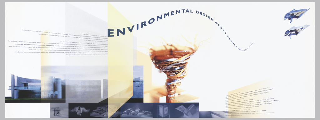
In celebration of Women’s History Month, March Object of the Day posts highlight women designers in the collection. As design director for her alma mater, Art Center College of Design in Pasadena, California, from 1991 to 1996, designer and artist Rebeca Méndez (b. 1962, Mexico City; active Los Angeles) played a key role in re-envisioning...
In celebration of Women’s History Month, March Object of the Day posts highlight women designers in the collection. Today’s blog post was written by Kristina Parsons and originally published on March 17, 2014. Eiko Ishioka was a prolific and revolutionary designer. She contributed enormously to the fields of art direction, graphic design, production, as well as costume...
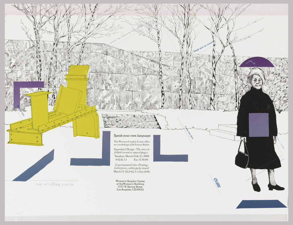
In celebration of Women’s History Month, March Object of the Day posts highlight women designers in the collection. “Images and words that reflect the authentic and varied life experiences of women are seldom valued or visible in public, printed communications, undermining our connection to the dominant culture. Lacking the graphic skills valued by that culture...
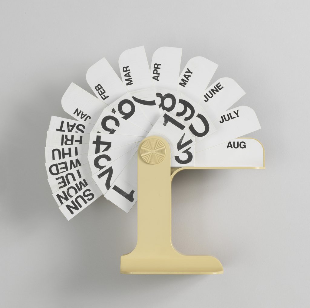
Danese, the Milanese manufacturer of this calendar, often collaborated with the Italian designer Enzo Mari. Together they created a range of products—from domestic tools to office supplies. Their products strove to underscore “the dimension of play as a cognitive tool.”[1] The Timor calendar reflects this philosophy as it requires the user to flip around the...

In celebration of the museum’s inaugural Cooper Hewitt Lab: Design Access taking place in the Barbara and Morton Mandel Design Gallery through February 15, we are highlighting innovative accessible design from the permanent collection. The Clearview typeface is a beautiful example of the way design helps to improve people’s daily lives. A product of the...
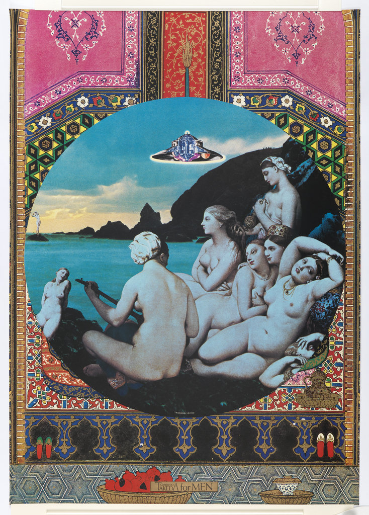
“One of my motives for becoming a graphic designer,” said the Japanese designer, Tadanori Yokoo, “was to make tourist posters. As a result, all my pieces end up looking like tourist posters. The only thing is that these posters are about places that don’t exist on earth. They may be about a lost paradise.”[1] Tadanori...
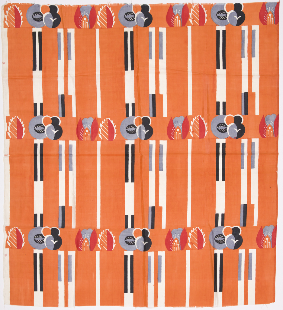
Mathilde Flögl was a prolific and multi-disiplinary designer at the Wiener Werkstätte. Her experience as a graphic designer translated well for much of the surface design she executed in wallcoverings, glass, ceramics and textiles. She created ceramic figurines, assisted Josef Hoffmann with the ornamental elements in his metal work and interiors, and designed lace patterns...
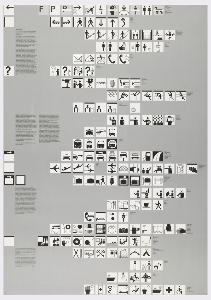
In 1966, the influential German designer, Otl Aicher (1922–1991), was hired to design the 1972 Munich Olympic Games’ iconography, language, and overall graphic scheme. By this time, Aicher had worked to modernize brands like Braun (1956–66) and Lufthansa (1962–64) and was a co-founder of the Ulm College of Design, a school established upon a post-war...
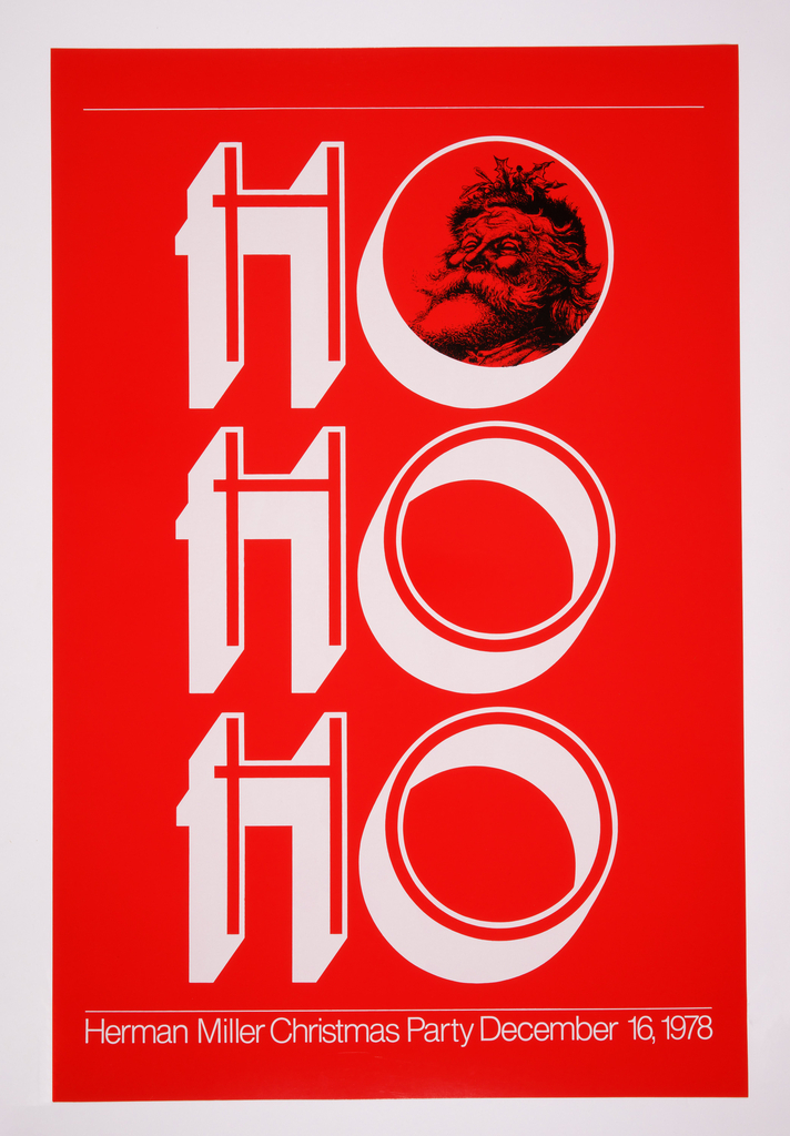
Good cheer abounds in this festive poster designed by graphic designer and educator Linda Powell. The poster is part of a set of four created to promote the 1978 Herman Miller Christmas Party. The beloved Zeeland, Michigan furniture company has a hearty tradition of exceptionally made products and innovative communication design, geared both outwardly, for...
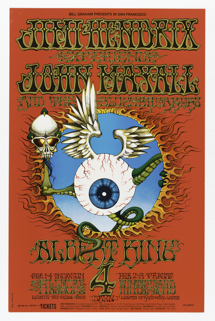
The 1967 “Summer of Love” in San Francisco ushered in a wave of music lovers, rock bands, and graphic artists. Psychedelia drifted through the air and inspired the creation of free-form, vibrant compositions in all creative fields. Concert posters became the relics of the San Francisco music scene, created to promote music and dance venues...
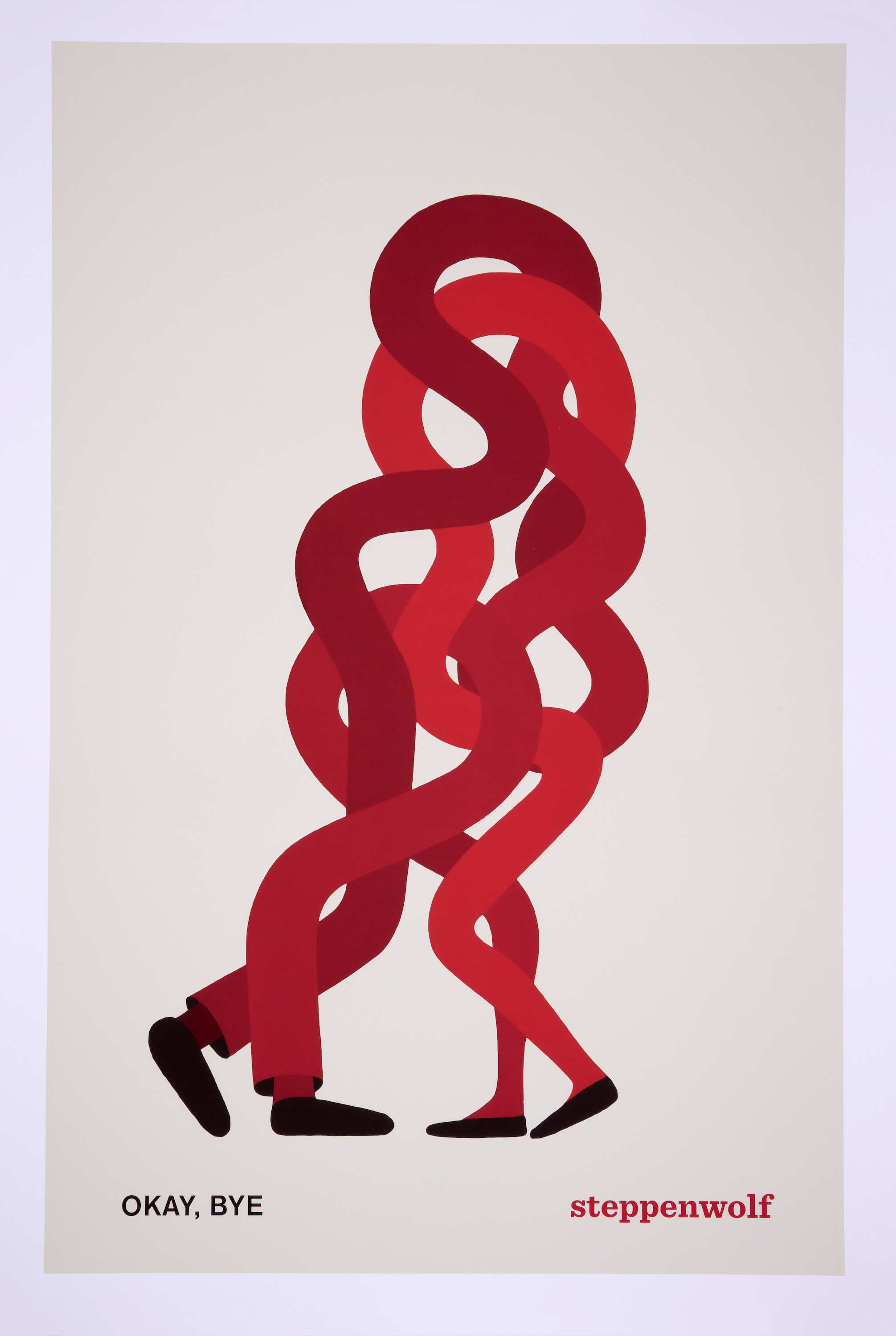
Graphic designer and visual artist Geoff McFetridge created this striking poster in 2015 to advertise the play “Okay, Bye” performed by the Steppenwolf Theatre Company in Chicago, Illinois. As with many of McFetridge’s designs, the poster uses bold colors and simple forms to communicate a visual riddle. Two pairs of black shoes distinguish the owners...
In 1972, The International Design Conference in Aspen (IDCA) appointed the architect Richard Saul Wurman as the program chairman for its annual symposium. As chairman, Wurman was responsible for choosing the conference’s theme and proposing the various programs, exhibitions, and discussion sessions. Wurman decided to depart from the IDCA’s standard exploration of practical design issues...
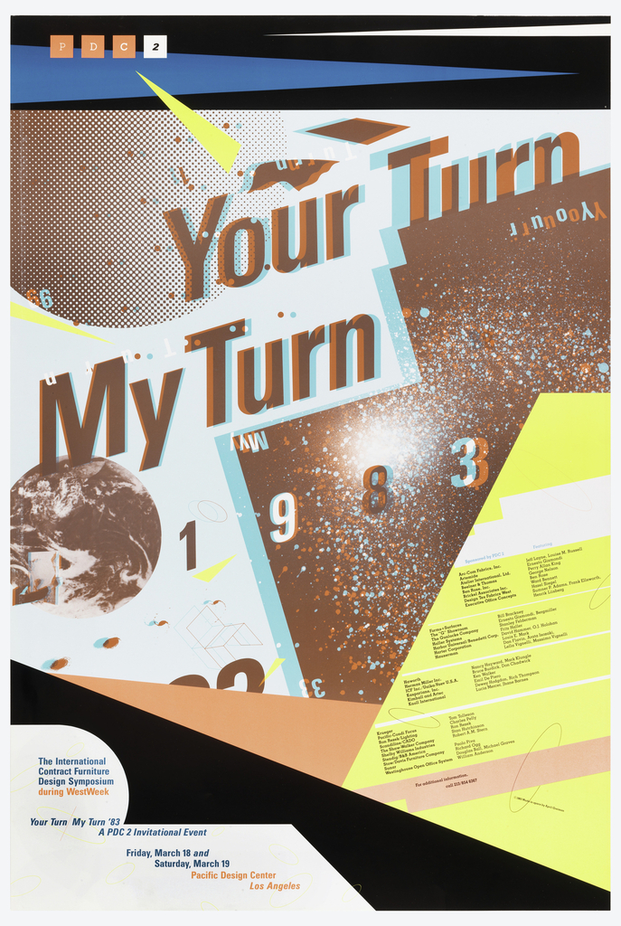
The idiosyncratic graphic designer April Greiman designed the poster Your Turn, My Turn for a 1983 symposium in Los Angeles, California. The conference aimed to discuss the roles of artists, designers, and architects within the field of design and possibilities for multidisciplinary collaboration.[1] In deference to the conference’s ambitions, Greiman embraces innovation and freedom in...

This 1947 book cover for The Great Gatsby was designed by Alvin Lustig (American 1915–1955) as part of the New Classics project. Initiated in 1939 by New Directions Publishing, the New Classics project created a series of cutting edge reprints of classic novels. When F. Scott Fitzgerald’s novel was first published in 1925, it garnered...
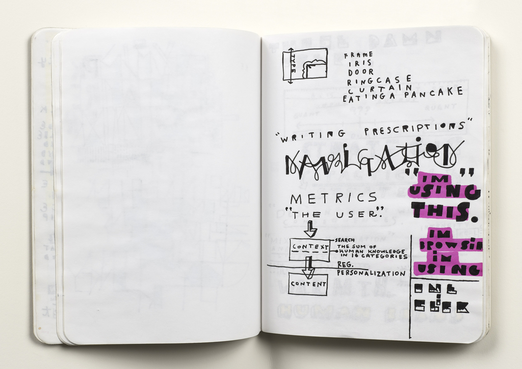
Designers of all varieties—architects, graphic designers, painters—are aware of the importance and utility of sketchbooks in the creative process. The blank canvas of a sketchbook page allows the design process to occur in real time and encourages documentation of ideas that might otherwise be fleeting. The significance of sketchbooks as part of the creative process...