In celebration of the museum’s inaugural Cooper Hewitt Lab: Design Access taking place in the Barbara and Morton Mandel Design Gallery through February 15, we are highlighting innovative accessible design from the permanent collection.
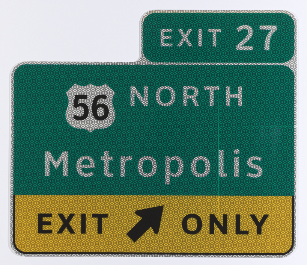
The Clearview typeface is a beautiful example of the way design helps to improve people’s daily lives. A product of the design team of Donald Meeker and Chris O’Hara from Meeker Associates and type designer James Montalbano of Terminal Design, the Clearview project seeks to improve the readability of highway signage for drivers, especially those over sixty five, who constitute roughly one sixth of the driving public. Working with researchers from the Pennsylvania Transportation Institute and the Texas Transportation Institute, the team showed that the traditional Federally mandated expressway signage incorporating a font known as Highway Gothic (in use since 1949) did not meet the needs of older drivers, many of whom have reduced contrast sensitivity, especially with highly reflective road sign materials, and slower reactions to changing road conditions. To meet this challenge, Meeker and Montalbano created a new font of graceful, elegant letterforms that increased visibility at night and from a distance. They achieved their goal by adopting several strategies, the most important of which were: using mixed case letters as opposed to the original all capital letter Gothic font; opening up the interstices of problematic lowercase letters (a, e, s); and increasing the height of the lowercase letters with respect to the capital letters. Most importantly, they achieved greater clarity without enlarging the size of the signs and adding visual clutter to the roadways.
Clearview received provisional approval from the Federal Highway Administration in 2004, giving states the choice of adopting the font for their expressway signage. As of 2011, it is used in more than twenty states and also has been adapted for road signs in Cyrillic and Greek.
Dr. Gail S. Davidson was formerly Curator and Head of Prints, Drawings & Graphic Design at Cooper Hewitt, Smithsonian Design Museum.
One thought on “Highway Reads”
Patrick on February 13, 2018 at 3:23 pm
I was under the impression the FHA has revoked the provisional approval, based on new research showing the same improvements in legibility are able to be achieved with updated production materials. Is that not the case?
I don’t ask to diminish the value of the work Meeker and O’Hara have done, and I’ve been a supporter of the typeface. Only asking to clarify it is not going to be in use for future signage updates.