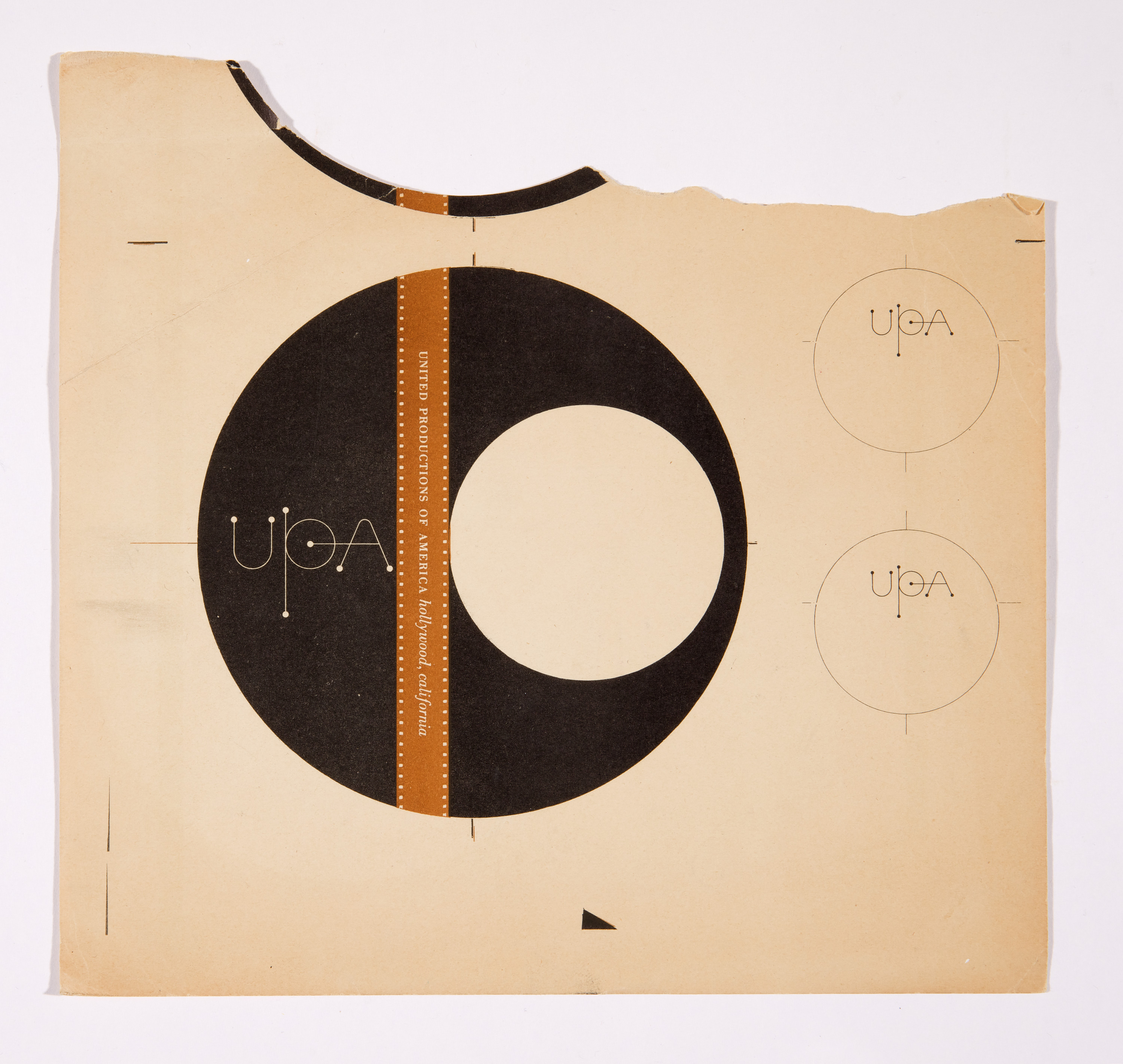
This 1947 print by graphic designer Alvin Lustig presents an early logo design for the Hollywood animation production studio United Productions of America (UPA), founded in 1943 and primarily active through 1960. The graphic identity’s bold black circle with its vertical brown band embraces a simple and modern approach to portraying a classic film reel,...
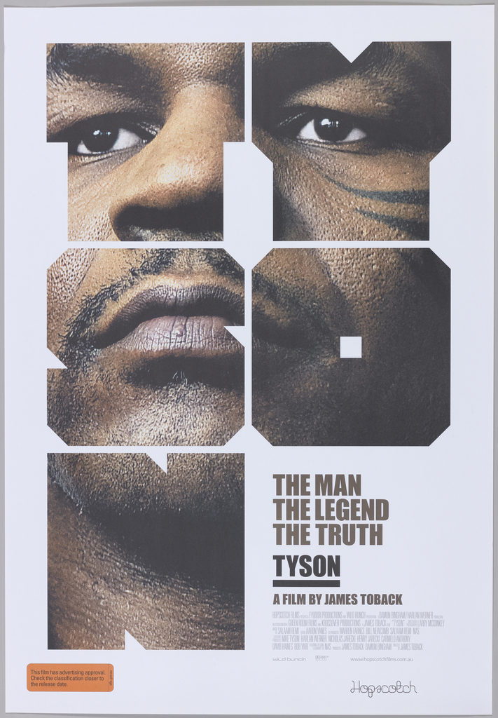
Australian graphic designer Mark Gowing designed this poster to advertise the film Tyson, a documentary about the controversial and legendary boxer Mike Tyson. The critically-acclaimed film was directed by James Toback, and closely follows Tyson’s career and personal life through lengthy interviews and archival footage. For his poster design, Gowing adapted elements from the graphic...
A major proponent of “New Typography” in the United States, Dan Friedman received his formal education in Basel, Switzerland under Armin Hofmann, an influential educator and designer whose students disseminated the Swiss Style of graphic design in the late 1960s. Though Friedman’s portfolio had earned him teaching positions at Yale University and SUNY Purchase upon...
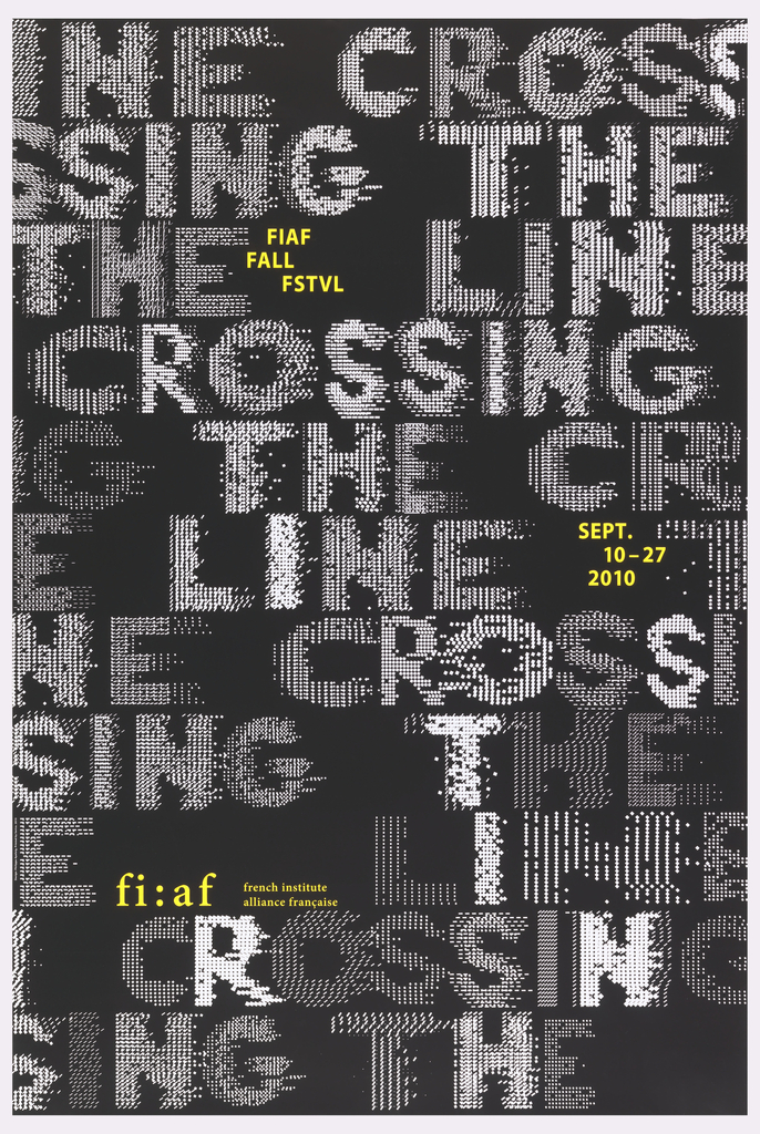
This 2010 poster, designed by the French graphic designer Philippe Apeloig, advertises the annual interdisciplinary fall festival of the French Institute Alliance Française (FIAF) in New York City. Apeloig’s design employs the same fundamental typographic approach that he used in his 2006 poster, Vivo in Typo, whereby he manipulates the spacing of computer-generated punctuation to...
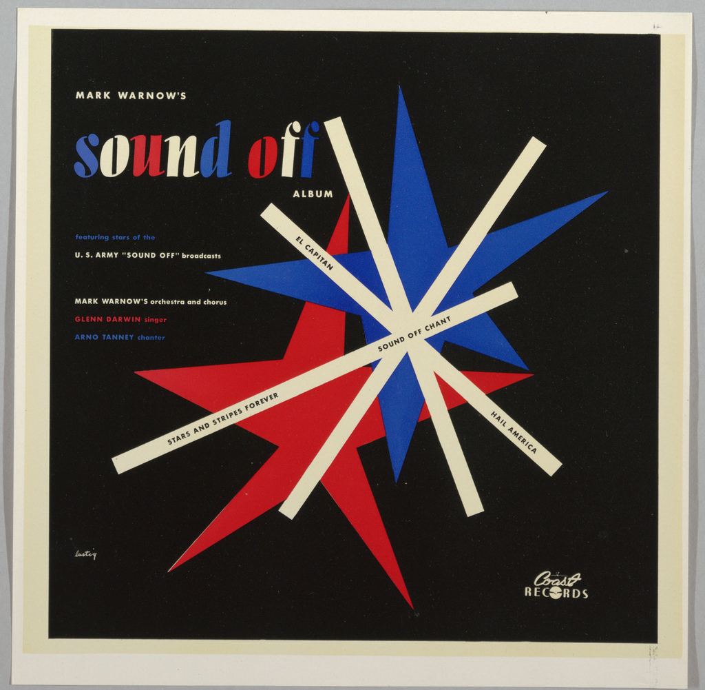
Alvin Lustig was one of the most influential graphic designers of mid-20th century America, despite the unfortunate brevity of his career. Well-known for his designs of books, book jackets, and magazines, Lustig also designed several record jackets for albums of classical and concert band music. Four such albums bearing Lustig’s design are featured in Cooper Hewitt’s...
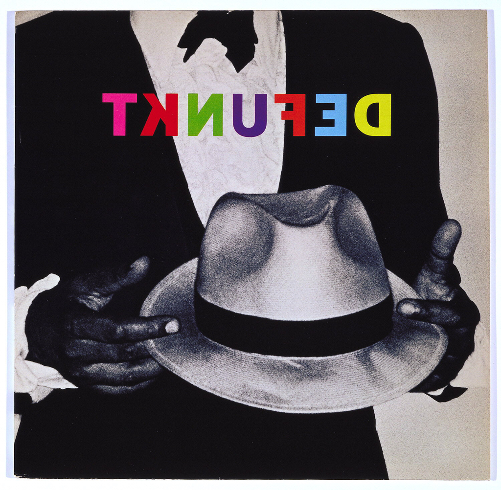
A man in a tuxedo holds a white fedora hat in this Defunkt album cover designed by Tibor Kalman. As in some of his other album designs, Kalman chose to alter the band’s name through reverse lettering. Printed in multicolor, the text is especially striking printed atop the black and white photograph. When reflecting on...
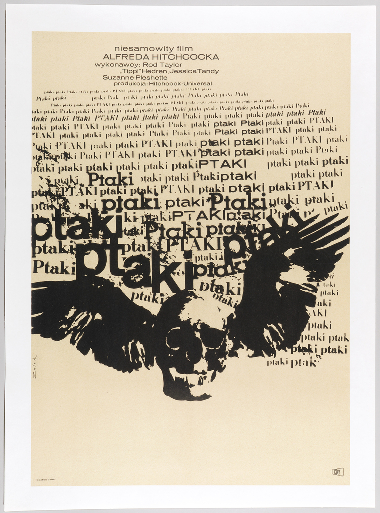
Constraints are often said to offer the best conditions for creativity. During the communist era, Polish graphics flourished. Due to the lack of external influences, poster designers needed to create their own isolated yet diverse visual language.[1] Cut off from Western iconography, these creatives were tasked with advertising the few American films that penetrated the...
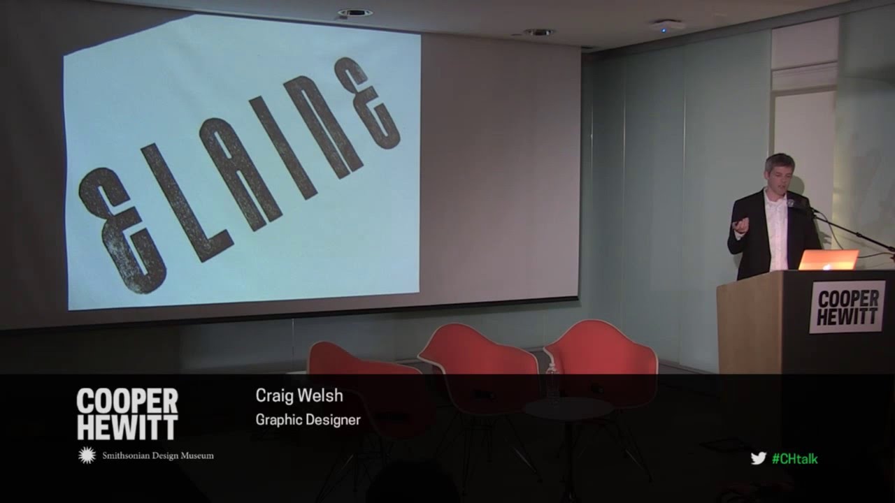
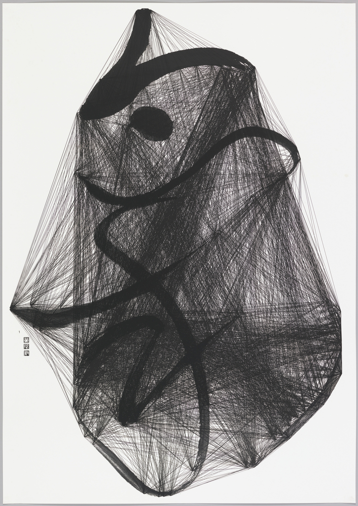
Two short talks and a moderated conversation featuring graphic designers Richard Niessen and Craig Welsh explore themes of ornament, type, and history in contemporary graphic design. Niessen’s poster series—Palace of Typographic Masonry—create intricate arrangements of text and pattern, and is now on view in Beauty—Cooper Hewitt Design Triennial. Welsh collaborated with AIGA Gold Medalist Elaine Lustig Cohen...
Jianping He was among forty Asian designers invited by the Taiwanese calligrapher Tong Yang-Tze to collaborate on a group of twenty-four works of calligraphy focusing on the subject of “imitating nature.” The theme, which had long been a driving influence in the tradition of Chinese painting and calligraphy, also reminded He of a quote by Albert Einstein: “Look...
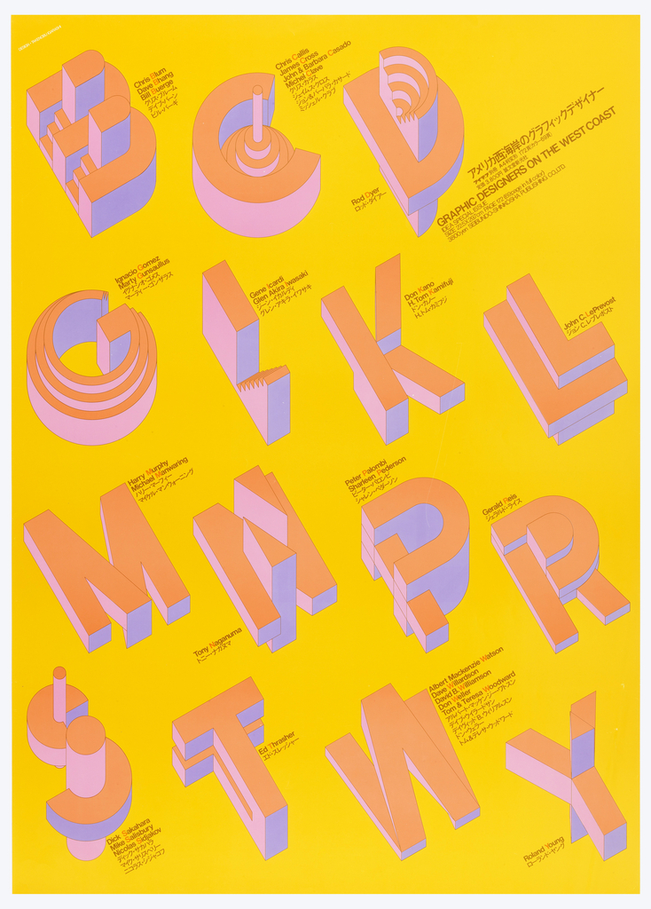
In 1975, Takenobu Igarashi created the poster “Graphic Designers on the West Coast” to promote a publication that introduced American graphic designers from the West Coast to Japanese audiences. Igarashi’s simple composition is enhanced by the sculptural, three dimensional quality of letterforms that playfully refer the initials of the designers’ names featured in the book....
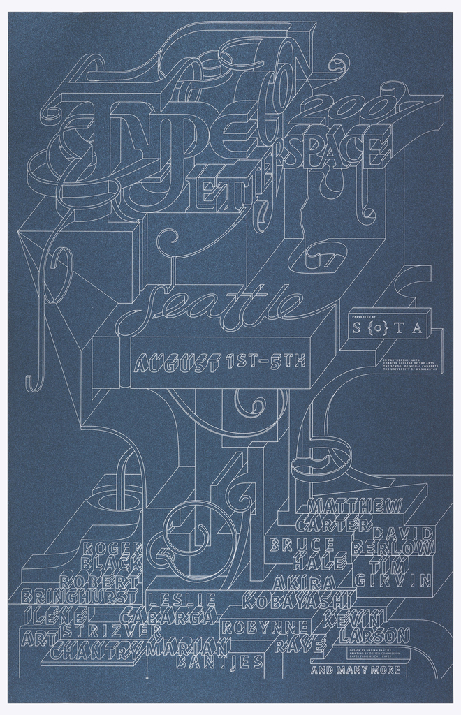
Canadian designer Marian Bantjes began her career as a typesetter before creating a personal style that combines type and ornament. This distinctive aesthetic has allowed her to cross boundaries between fine arts and design, illustration and typography. This poster was produced to advertise the annual conference of the Society of Typographic Aficionados (SOTA). It was printed in...
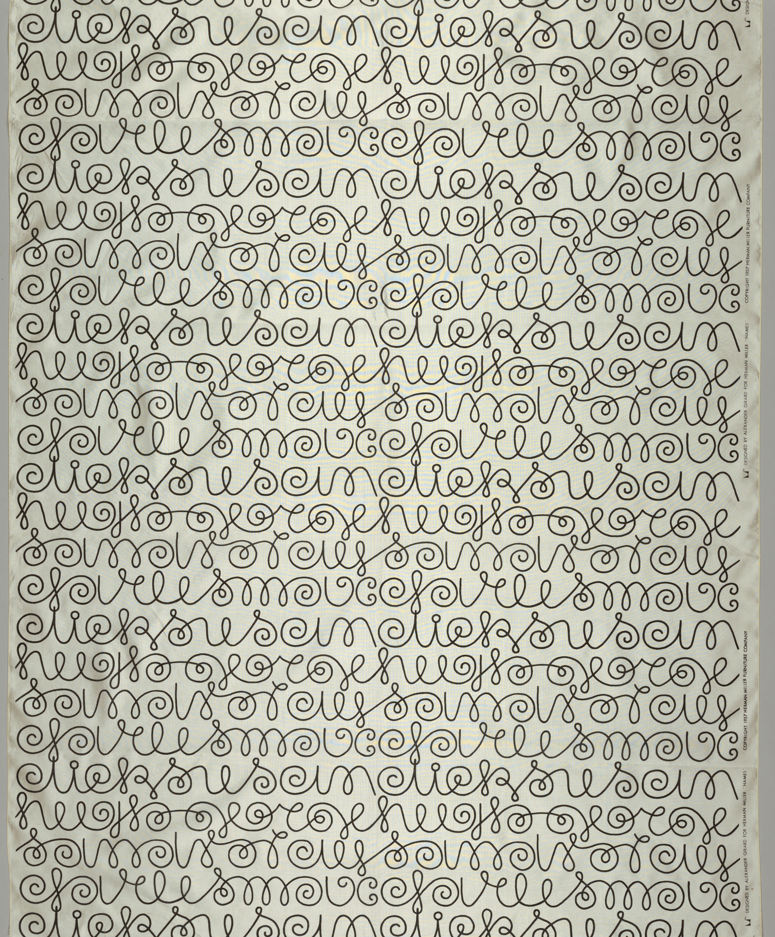
Names was designed by Alexander Girard for Herman Miller in 1957. He used typography as pattern in many of his works – from textiles and wall coverings to signs, logos, and even menu layouts — by playfully mixing, transforming, and inventing fonts for whatever the project required. Sometimes he created entire alphabets while other times...
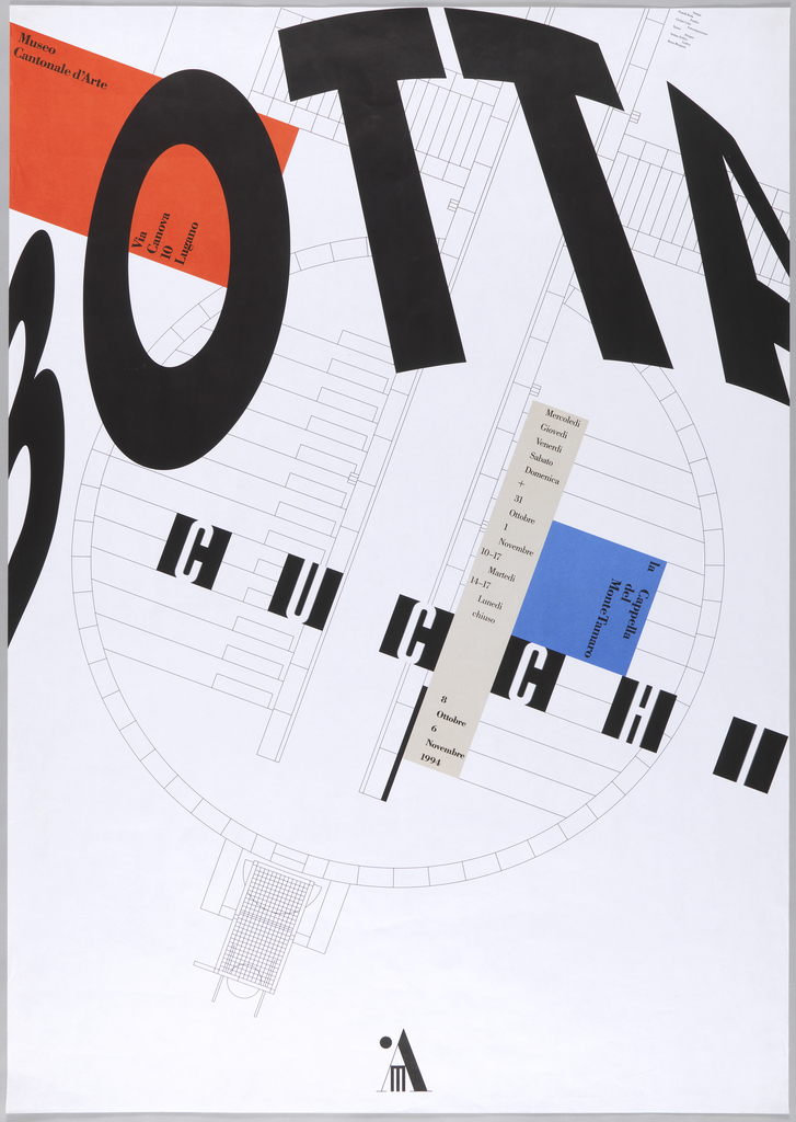
Botta/Cucchi is a poster for an exhibition at the Museo Cantonale d’Arte in Lugano, Switzerland, about the collaborative project for the Santa Maria degli Angeli chapel by the architect Mario Botta and the painter Enzo Cucchi. The chapel, commissioned by Egidio Cattaneo and dedicated to his late wife, is on Mount Tamaro and is only...
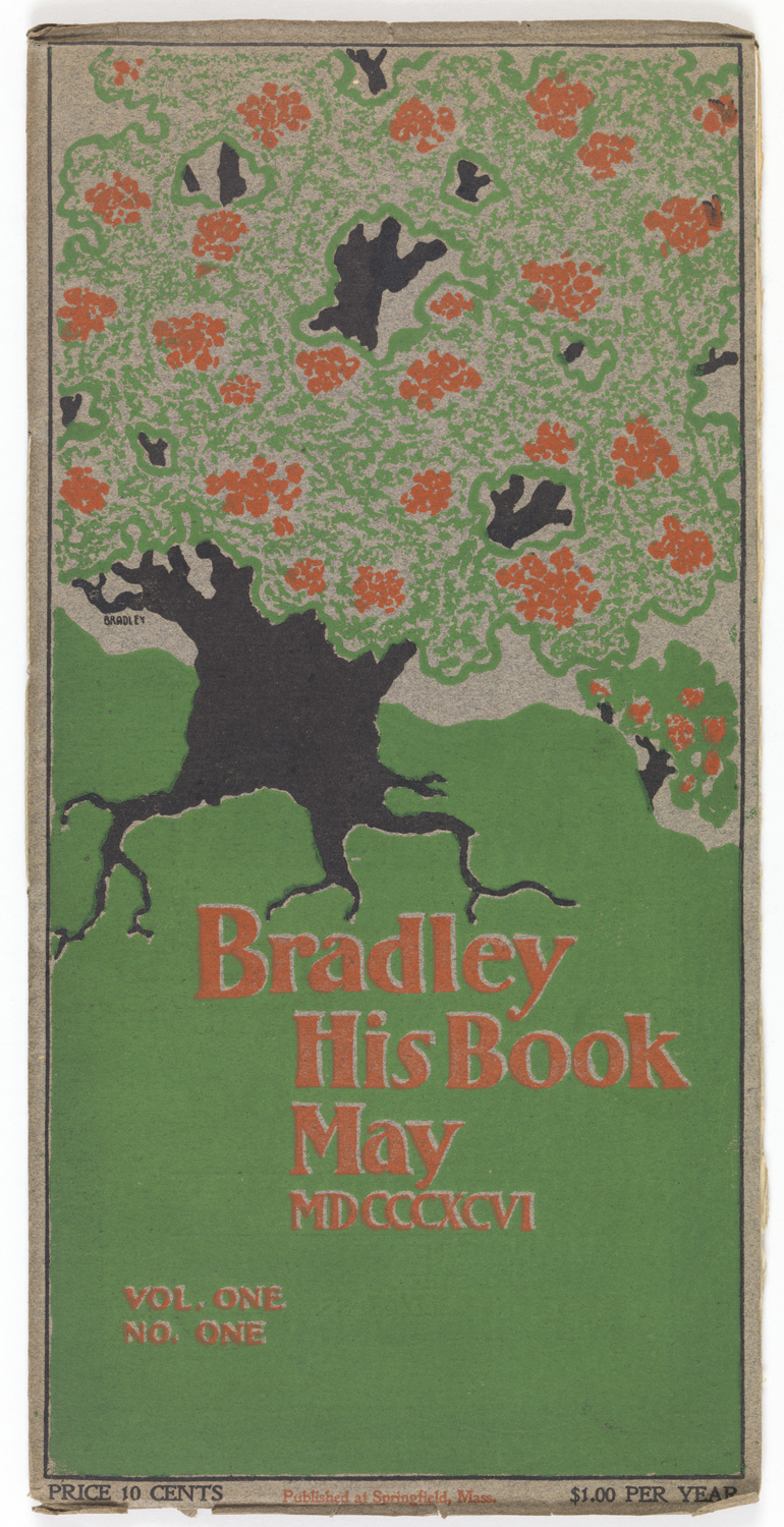
Bradley: His Book only had nine issues, but both it and its author made a lasting impact on American typography and graphic design. Will Bradley was a charter member of the Boston Arts and Crafts society, making him a key player in shaping the arts and crafts movement in America. Dedicated to handcrafting his printed...

Streamed live on September 26, 2015. Graphic designer Philippe Apeloig speaks about his work and methodologies in today’s rapidly changing world of graphic design. A fascinating conversation about design, typography, branding, digital media, and global practice.