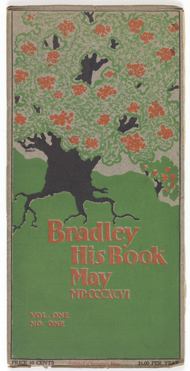
Bradley: His Book only had nine issues, but both it and its author made a lasting impact on American typography and graphic design. Will Bradley was a charter member of the Boston Arts and Crafts society, making him a key player in shaping the arts and crafts movement in America. Dedicated to handcrafting his printed objects, he opened up his own publishing house, The Wayside Press, in 1895. Bradley won highly favorable press for his use of colonial typefaces on his first commission, a book of Strathmore Papers, which reinforced his commitment to maintaining personality and individuality of his printing house. However, as the commercial side of his business grew, Bradley: His Book – for which he opened Wayside – became infeasible and the strain of trying to print both his personal projects and his commissioned works drove Bradley to a mental breakdown.
Bradley began his printing career setting the letters for the Iron Agitator in Ishpeming, Michigan trying to save up to see his father in Boston. Because of the itinerant nature of printers in the midwest – at the time the operated more or less like circuit preachers – a boy who remained in one printing house stood to make many different connections to men who worked all over the midwest. These connections eventually brought Bradley to designing covers for each issue of The Inland Printer – a uniquely American practice as contemporary european magazines tended to maintain their brand image by maintaining the same or very similar covers for all their issues – and to Chicago where he began designing signed posters for the theater. These posters were both art pieces and advertisements for the shows; Bradley’s theater posters were among the first signed posters created in America. Though not designed for theater, one of his posters can be found in the museum collection. As he gained notoriety, and money, he started making trips back East more frequently, eventually relocating to Boston. While on the East coast, Bradley encountered the Barton collection at the Boston Public Library of New England colonial books. Bradley immensely admired their cover pages and their typeface, called Caslon, of which he noted: “this colonial typography, void of beauty-destroying mechanical precision, is the most direct, honest, vigorous and imaginative America has ever known”. These impressions had a lasting impact on his design choices, as you can see above.
Lauren Eames was an intern with the Library at the Cooper Hewitt, Smithsonian Design Musuem. She is working on her B.A. in Religious Studies at the University of Chicago
