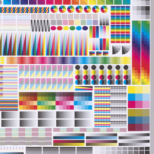
To celebrate the opening of Saturated: The Allure and Science of Color (May 11, 2018-January 13, 2019), Object of the Day this month will feature colorful objects from the exhibition. Graphic designer Fanette Mellier (French, b. 1977) has a contemporary practice that frequently highlights process in the printed medium. Her stunning poster, Specimen, initially appears abstract. Dominated by...
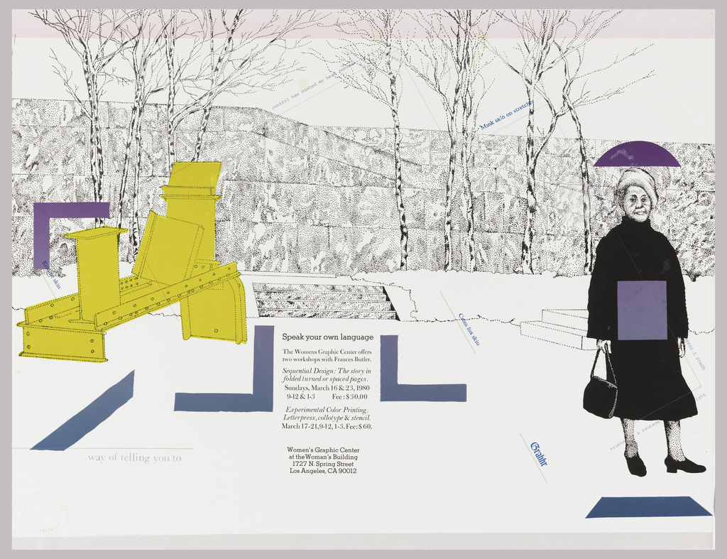
In celebration of Women’s History Month, March Object of the Day posts highlight women designers in the collection. “Images and words that reflect the authentic and varied life experiences of women are seldom valued or visible in public, printed communications, undermining our connection to the dominant culture. Lacking the graphic skills valued by that culture...
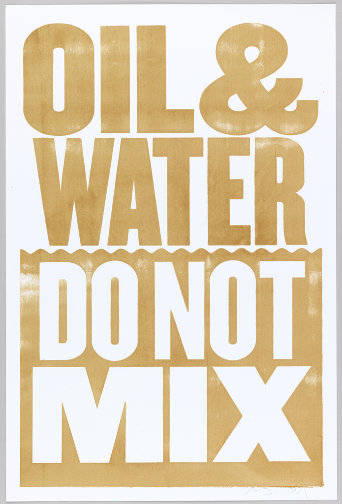
Paul Rand was an influential American graphic designer well known for the logos he created for IBM, UPS, ABC and other corporations. His 1947 book Thoughts on Design is considered a seminal text on graphic design. The poster above shows something different from Paul Rand’s oeuvre. It’s not a neat and compact corporate logo; instead...
Fearing the Nazis were secretly producing atomic weapons, President Roosevelt collaborated with Canada and Britain to launch the Manhattan Project in 1942, an experimental nuclear weapon initiative.[1] The Manhattan Project was, by morbid standards, “successful”; the only two nuclear attacks in the history of the world were executed by the United States in August of...
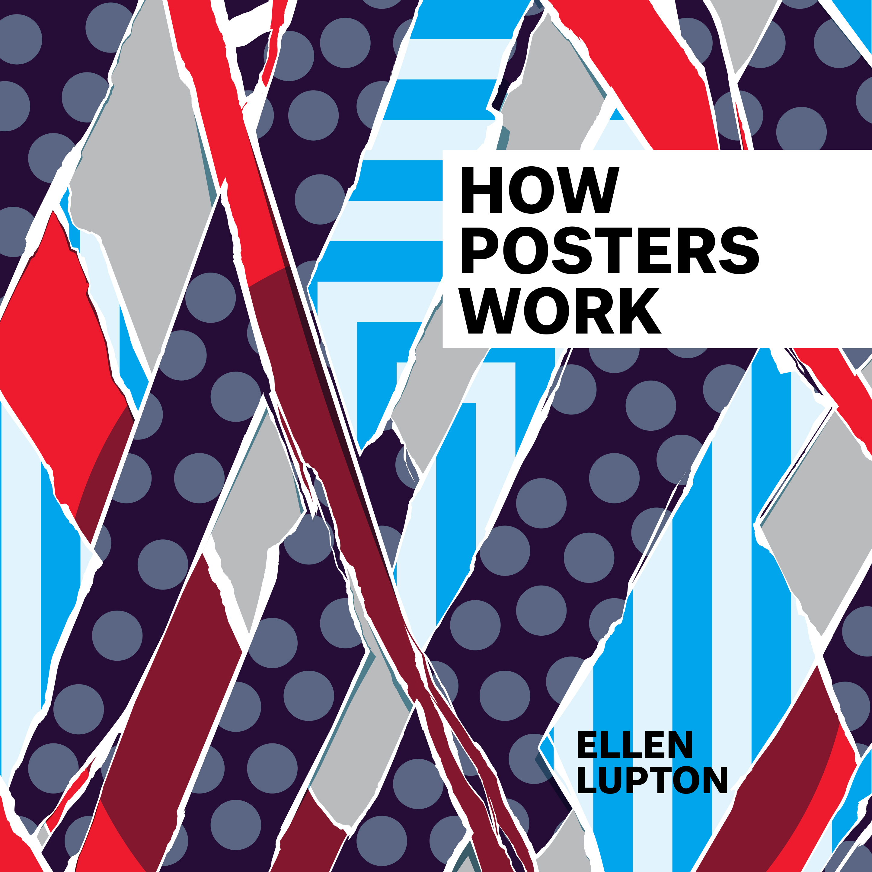
Whether an advertisement or call to action, posters have long been used to grab a viewer’s attention. Spanning over a century of graphic design from the collection, How Posters Work, an exhibition here at the Cooper Hewitt (May 8 – November 29, 2015), celebrates the form by considering how designers turn a creative idea into...
Cooper Hewitt curator Ellen Lupton and guests talk about how to look at posters as visual language. What does it mean to take graphic design out of context and put it in a museum? How Posters Work uses posters to explore principles of visual thinking and storytelling. Dutch designers Rianne Petter and René Put talk...
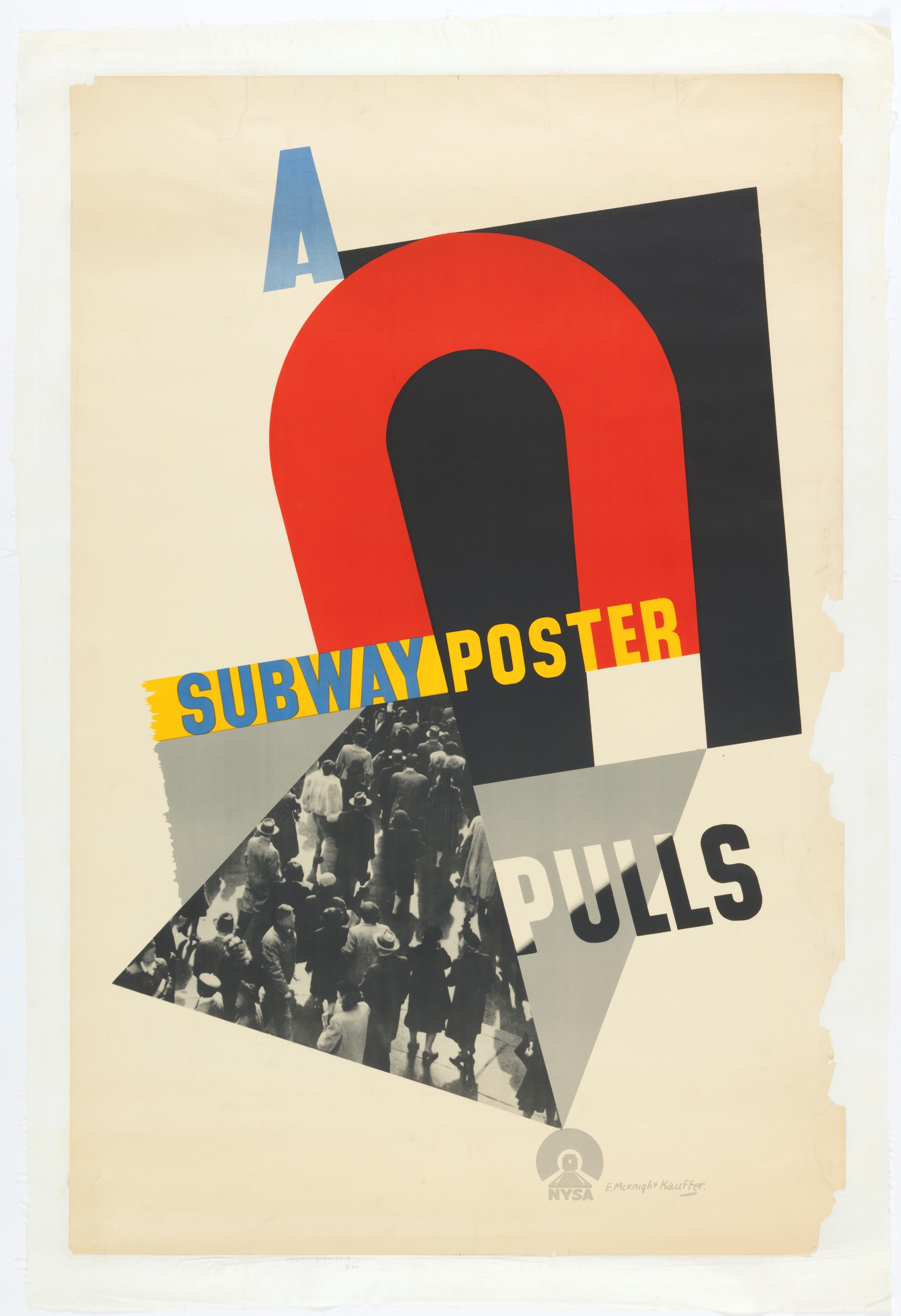
American-born E. McKnight Kauffer is perhaps best known for his series of ground-breaking poster designs produced for the London Underground in the 1920s and 1930s. Widely recognized as one of the greatest graphic designers of early twentieth century Europe, Kauffer, who lived for much of his career in London, was influenced heavily by the work...
![Image features a color photo of two brides holding hands, and mouths open as though yelling. One woman with a thought bubble that reads: “Not what I had / in mind!†They are standing on a table covered with silver and china. Across the poster, in pink: “Is it worth being / Boring / for a Blender?†Lower margin: “GAY MARRIAGE / You might as well be straight.†Upper left: “Poster sponsored / in part by / HX FOR HER / NEW YORK CITYâ€. Upper right: “ANOTHER PUBLIC ART PROJECT BROUGHT TO YOU BY / DAM! [DYKE ACTION MACHINE] / dam@echonyc.com.](https://www.cooperhewitt.org/wp-content/uploads/2015/03/18666957.jpg)
This provocative poster was designed in 1997, one year after the US Congress passed the Defense of Marriage Act. Known simply as “DOMA,” the Act barred same-sex married couples from being recognized by federal law. The poster is the work of Dyke Action Machine!, a New York activist duo consisting of photographer Sue Schaffner and...
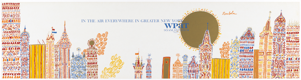
John Rombola (b. 1933 ), a Brooklyn-born artist, has always marched to the beat of his own whimsical rhythm. And fittingly so, when radio station WPaT, which also moved to its own rhythm, commissioned Rombola to provide illustrations for its 1963 advertising campaign “In the Air Everywhere,” to be displayed in subway cars across New...
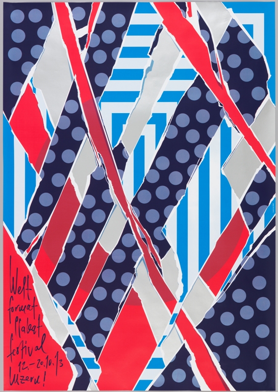
When Swiss graphic designer Felix Pfäffli was asked to design a poster for the 2013 Weltformat Poster Festival held in Lucerne, he grappled with the “strange duplication” of creating a poster to promote a poster exhibition. He turned to the many posters hung on steel poster walls in the streets for his inspiration. As posters...
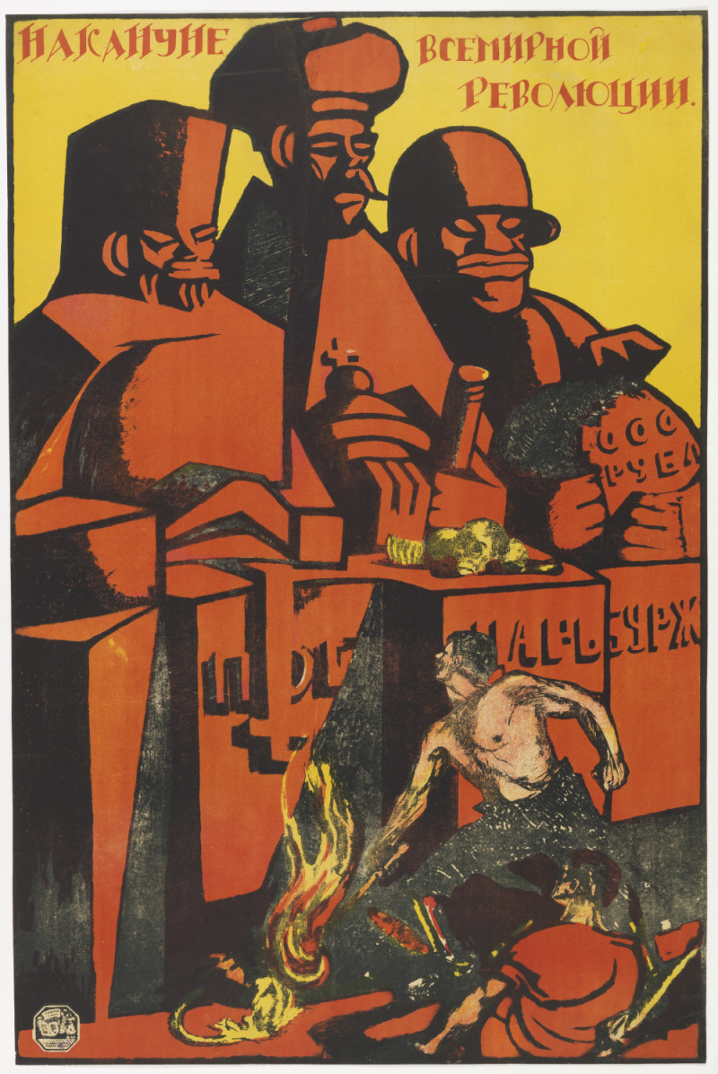
The huge figures dominating the composition of this Soviet poster stand as grotesque monuments to Russia’s imperial past. Labeled pedestals identify them as priest, tsar, and bourgeoisie—all cruel oppressors in the eyes of the new regime. Their rough-hewn faces crudely caricature the elegant, ostentatious sculptures of past tsars, and they tower over two naturalistically rendered...

Inspired by Paula Scher’s work for The Public Theater, the choreographer and dancer Eliot Feld first approached her about designing an identity for his dance company in 1997, when he decided to rename the company Ballet Tech. Scher designed an identity using a typographic family of slab serifs, overlaying the typography on top of photographs...
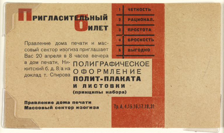
Arresting typography and geometric precision distinguish these Soviet-era tickets, and illustrate the permeation of fine art into daily life in the USSR. The tickets reflect the influence of constructivism, an avant-garde movement characterized by the same angular abstraction evident in these designs. Here, bold blocks of color are poised in asymmetrical balance. As in a...
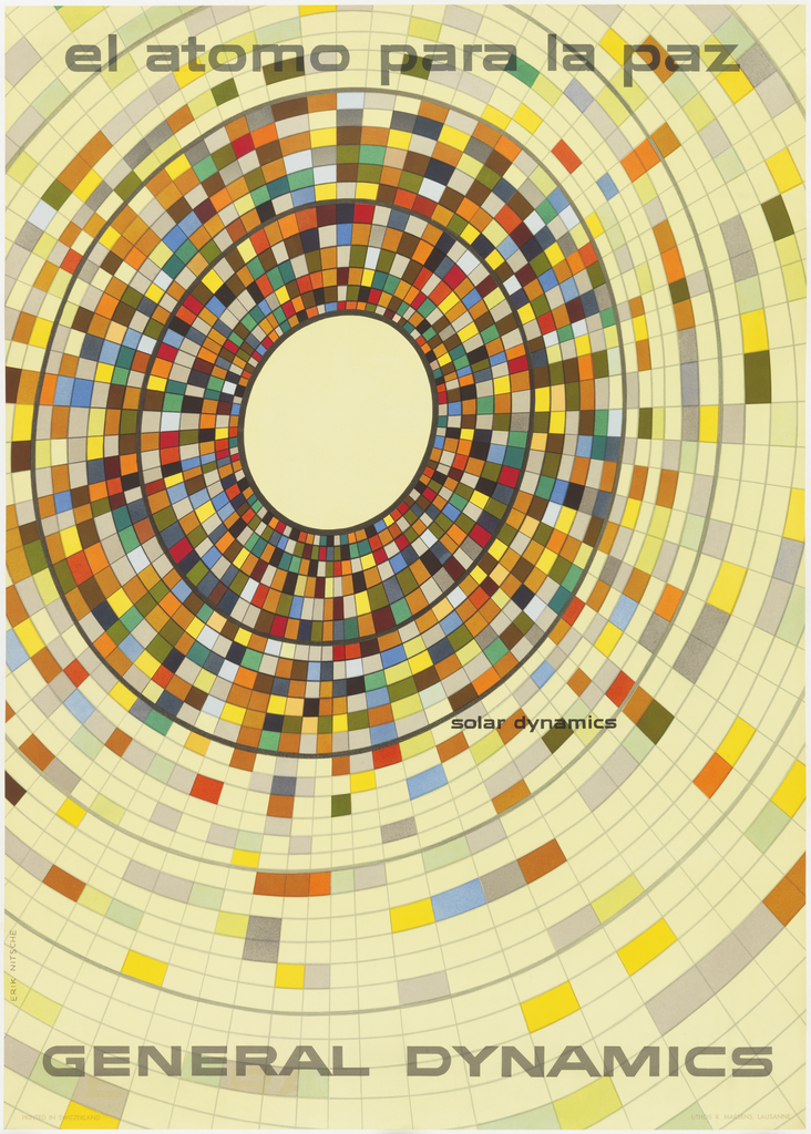
The year is 1955, and Cold War tensions have begun to escalate. General Dynamics is a newly formed parent company overseeing eleven manufacturers, producing cutting edge technology for the defense of the United States. The company is capitalizing on the American policy of nuclear deterrence, but John Jay Hopkins, General Dynamics’ president, wants a graphic...
Years ago, I was out sick the week that my fellow high school students studied the periodic table. I’ve always blamed missing that foundational moment of scientific education for my very poor mastery of some basic chemistry. But there are certain concepts that I have had the opportunity to learn through personal experience. Every day...