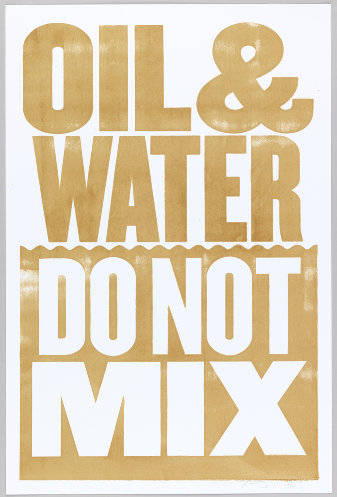
Years ago, I was out sick the week that my fellow high school students studied the periodic table. I’ve always blamed missing that foundational moment of scientific education for my very poor mastery of some basic chemistry. But there are certain concepts that I have had the opportunity to learn through personal experience. Every day when I try to make salad dressing, I am confronted with one of them—oil and water just won’t mix.
Tragically, we were all reminded of the dire consequences of this aspect of chemical polarity three years ago, when the Deepwater Horizon oil spill released millions of barrels of oil into the Gulf of Mexico. In the fall of 2010, as the hard work of the cleanup began, Tom Galle and Cecilia Azcarate Isturiz, the creative team at the innovative communications agency Happiness Brussels, approached the British graphic designer Anthony Burrill. Isturiz and Galle wanted to create a project that would raise money for the restoration efforts. Together they devised the idea of producing a benefit poster that would be printed with oil from the spill. Burrill, whose work often features witty yet commonplace slogans set in bold types and bright colors, was intrigued by the proposal, and felt drawn to the opportunity to produce something positive out of the devastating disaster.
Burrill completed his design within days. Galle and Isturiz then flew to Louisiana, armed with buckets to capture the oil that had leeched into the sandy beaches of the coastline. But when they arrived, they discovered that the entire beach had been cordoned off. Undeterred, the pair decided to stick around, and when the BP security personnel left for lunch, they slipped past the barriers and quickly filled their buckets with the crude saturated sand.

The team brought the oil to Purple Monkey Design, a commercial print shop based in New Orleans. The printers mixed the oil and sand with extender base, which allowed the oil-turned-ink to pass smoothly through a screen that had been stenciled with Burrill’s design. When the oil was pushed through the screen with a squeegee onto the paper, it produced a shimmering, golden color that gave radiance to Burrill’s eloquent design of the straightforward idiom, which transformed into a slogan of protest and a grave warning: “OIL & WATER DO NOT MIX.”
The posters were sold through a website, with all proceeds benefiting the Coalition to Restore Coastal Louisiana (CRCL). Happiness Brussels produced a short film about the making of the posters, which you can watch below.
OIL & WATER DO NOT MIX from Happiness Brussels on Vimeo.
This poster is part of the exhibition Graphic Design: Now in Production, co-organized by Cooper-Hewitt, National Design Museum and Walker Art Center. The exhibition will be traveling to the Contemporary Arts Museum in Houston, Texas, opening this July. You can find the exhibition catalogue at shop.cooperhewitt.org
