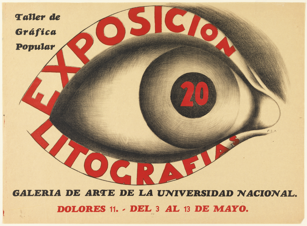
posters

SORT BY:
Pluck ‘Em!
Fearing the Nazis were secretly producing atomic weapons, President Roosevelt collaborated with Canada and Britain to launch the Manhattan Project in 1942, an experimental nuclear weapon initiative.[1] The Manhattan Project was, by morbid standards, “successful”; the only two nuclear attacks in the history of the world were executed by the United States in August of...
HPW_front_cover
Forty Posters in Forty Days
Whether an advertisement or call to action, posters have long been used to grab a viewer’s attention. Spanning over a century of graphic design from the collection, How Posters Work, an exhibition here at the Cooper Hewitt (May 8 – November 29, 2015), celebrates the form by considering how designers turn a creative idea into...
Curator’s Talk: How Posters Work
Cooper Hewitt curator Ellen Lupton and guests talk about how to look at posters as visual language. What does it mean to take graphic design out of context and put it in a museum? How Posters Work uses posters to explore principles of visual thinking and storytelling. Dutch designers Rianne Petter and René Put talk...
Laws of Attraction
American-born E. McKnight Kauffer is perhaps best known for his series of ground-breaking poster designs produced for the London Underground in the 1920s and 1930s. Widely recognized as one of the greatest graphic designers of early twentieth century Europe, Kauffer, who lived for much of his career in London, was influenced heavily by the work...
Image features a color photo of two brides holding hands, and mouths open as though yelling. One woman with a thought bubble that reads: “Not what I had / in mind!” They are standing on a table covered with silver and china. Across the poster, in pink: “Is it worth being / Boring / for a Blender?” Lower margin: “GAY MARRIAGE / You might as well be straight.” Upper left: “Poster sponsored / in part by / HX FOR HER / NEW YORK CITY”. Upper right: “ANOTHER PUBLIC ART PROJECT BROUGHT TO YOU BY / DAM! [DYKE ACTION MACHINE] / dam@echonyc.com.
Gays Against Gay Marriage
This provocative poster was designed in 1997, one year after the US Congress passed the Defense of Marriage Act. Known simply as “DOMA,” the Act barred same-sex married couples from being recognized by federal law. The poster is the work of Dyke Action Machine!, a New York activist duo consisting of photographer Sue Schaffner and...
To The Beat of Their Own Drum
John Rombola (b. 1933 ), a Brooklyn-born artist, has always marched to the beat of his own whimsical rhythm. And fittingly so, when radio station WPaT, which also moved to its own rhythm, commissioned Rombola to provide illustrations for its 1963 advertising campaign “In the Air Everywhere,” to be displayed in subway cars across New...
Weltformat festival poster. Sections resembling torn paper overlap with one another. Each section is printed in one of the following patterns: black with grey dots, blue rectangular stripes, and pink with maroon circle. In the bottom left corner, on a pink section, scrawled text reads: "Welt / format / plakat / festival / 12.-20.10.13 / Luzern!"
All Torn Up
When Swiss graphic designer Felix Pfäffli was asked to design a poster for the 2013 Weltformat Poster Festival held in Lucerne, he grappled with the “strange duplication” of creating a poster to promote a poster exhibition. He turned to the many posters hung on steel poster walls in the streets for his inspiration.  As posters...
A shirtless man sets fire to the monumental figures of the Church, the Tsar, and the Bourgeoisie. These figures in red, with features grotesquely abstracted, appear to be carved from stone. The man is naturalistically rendered by comparison. The title is printed in red Cyrillic on a yellow ground.
Toppling Monumental Foes
The huge figures dominating the composition of this Soviet poster stand as grotesque monuments to Russia’s imperial past. Labeled pedestals identify them as priest, tsar, and bourgeoisie—all cruel oppressors in the eyes of the new regime. Their rough-hewn faces crudely caricature the elegant, ostentatious sculptures of past tsars, and they tower over two naturalistically rendered...
On a white ground of typographic diagrams, four images of a female dancer on Pointe in a black leotard. Across the poster is yellow text that reads: FELD BALLET TECH. In lower margin: APRIL 6 – MAY 9 JOYCECHARGE: 212-242-0800 JOYCE The Joyce Theater / BBAALLLLEETTTTEECCHH.
A Typographic Performance
Inspired by Paula Scher’s work for The Public Theater, the choreographer and dancer Eliot Feld first approached her about designing an identity for his dance company in 1997, when he decided to rename the company Ballet Tech.  Scher designed an identity using a typographic family of slab serifs, overlaying the typography on top of photographs...