James Stalzman of the Manhattan School of Music discusses the musical pieces he paired with particular objects from The Jazz Age: American Style in the 1920s.

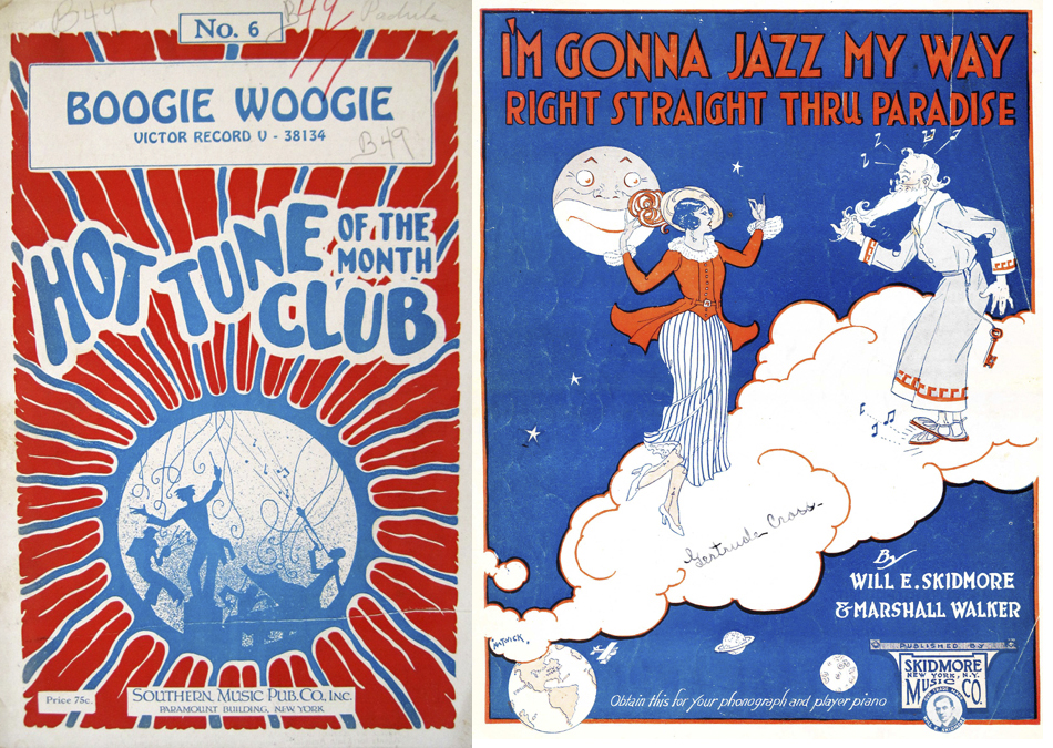
In celebration of Jazz Appreciation Month, Elizabeth Broman discusses selections from the Smithsonian Design Library's collection of jazz sheet music.
Paul Rand was an influential American graphic designer well known for the logos he created for IBM, UPS, ABC and other corporations. His 1947 book Thoughts on Design is considered a seminal text on graphic design. The poster above shows something different from Paul Rand’s oeuvre. It’s not a neat and compact corporate logo; instead...

The initials “MA” in the central cartouche of this iron music stand belong to Marie Antoinette, who married the future Louis XVI of France in May of 1770. Winged putti fly over a musical score carrying banderoles inscribed with the surnames of Baroque French composers, including that of Jean-Baptiste Lully (1632–1687), whose opera Persée was...
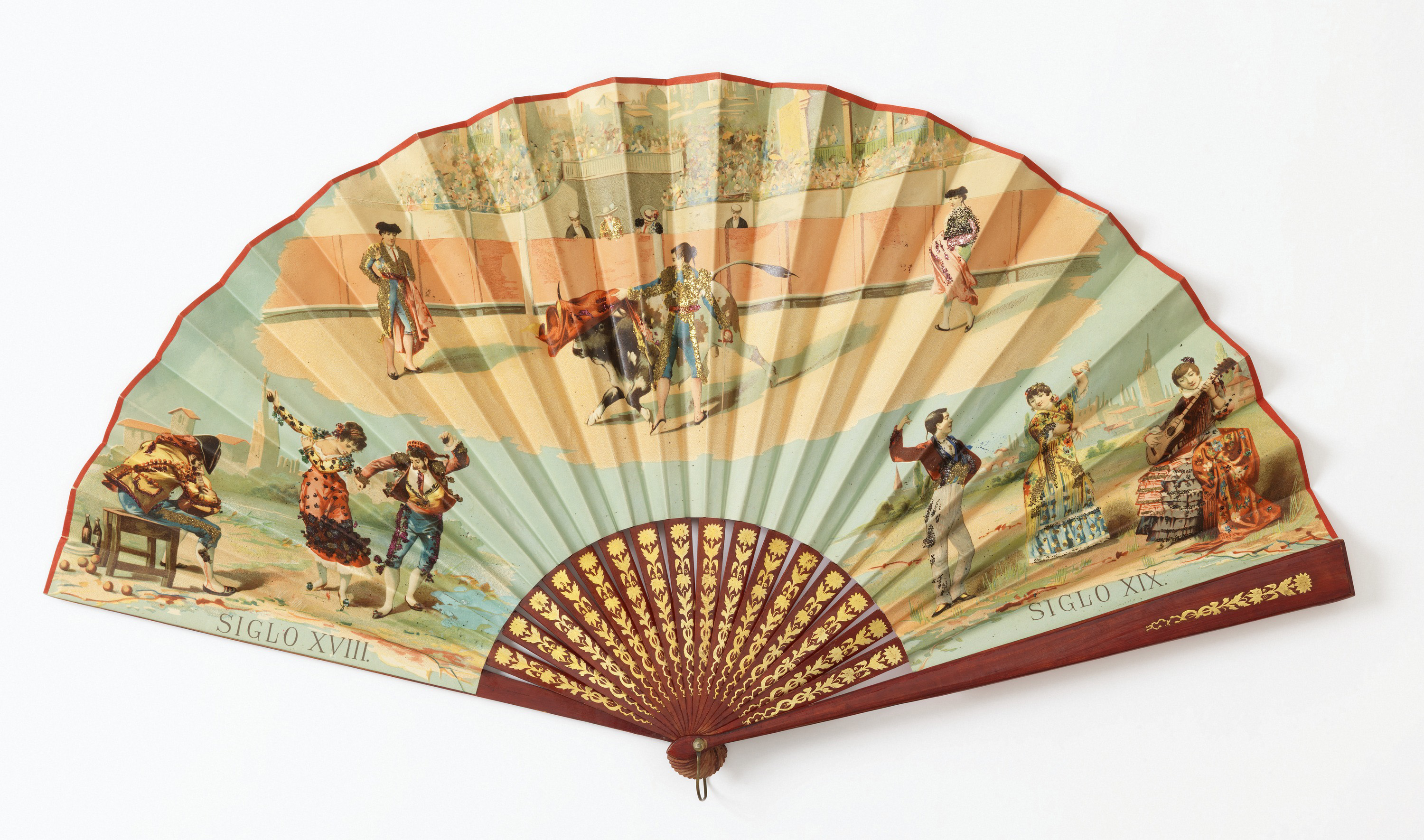
Folding fans, or abanicos, were considered must-have accessories in nineteenth century Spain. For women, they served as important tools in courtship, the ‘language of the fan’ expressing everything from ‘come hither’ to ‘don’t bother’ to hopeful admirers. The imagery painted or printed on fans also carried important messages. Many celebrate national events, such as the...
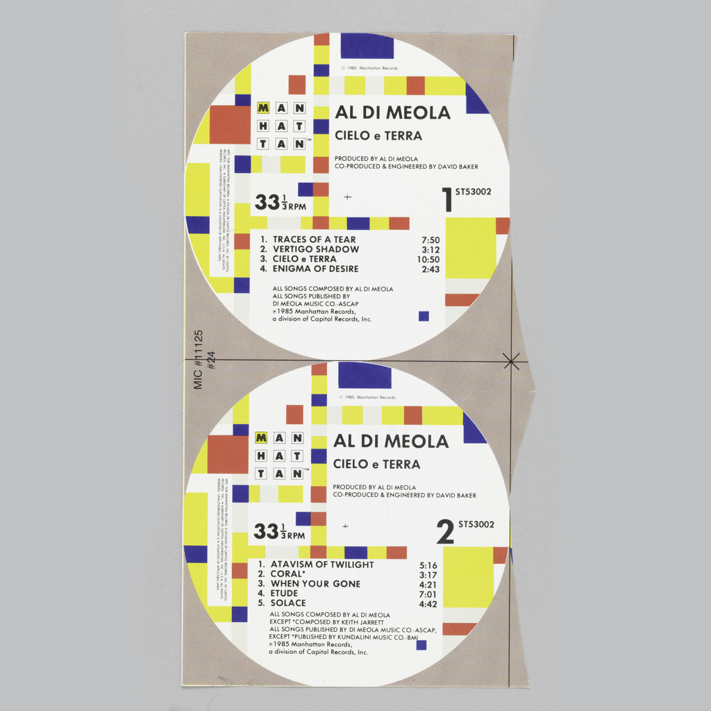
Graphic designer Paula Scher adapted Piet Mondrian’s 1943 painting Broadway Boogie-Woogie when she created the graphic identity for Manhattan Records in 1984. On each LP that Manhattan Records released, the design is printed on the center label of sides A and B. When reflecting on her decision to turn to Mondrian, Scher explained “the strongest...
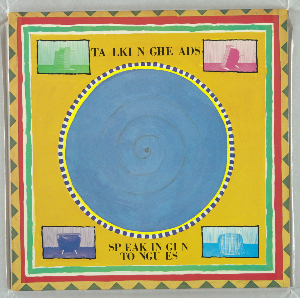
Graphic designer Tibor Kalman made a circle of blue the visual centerpiece of Talking Heads’ 1983 release Speaking in Tongues. The circle is seven inches in diameter, just like a 45 record. But while the graphic might evoke the standard format of singles from the ‘50s, ‘60s and ‘70s, it was actually inspired by the...
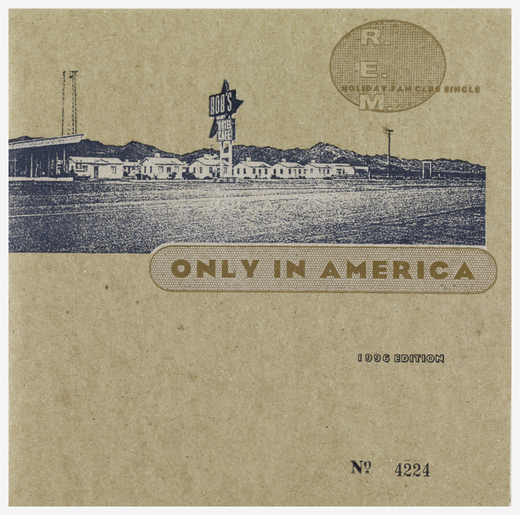
An altered photograph of a roadside motel is printed on a cardboard sleeve for R.E.M.’s 7-inch single “Only in America,” designed by Bruce and Karen Licher. The image of the motel is grainy, which complements the speckled cardboard on which it was printed. Although the grain makes it harder to read the motel sign, the...
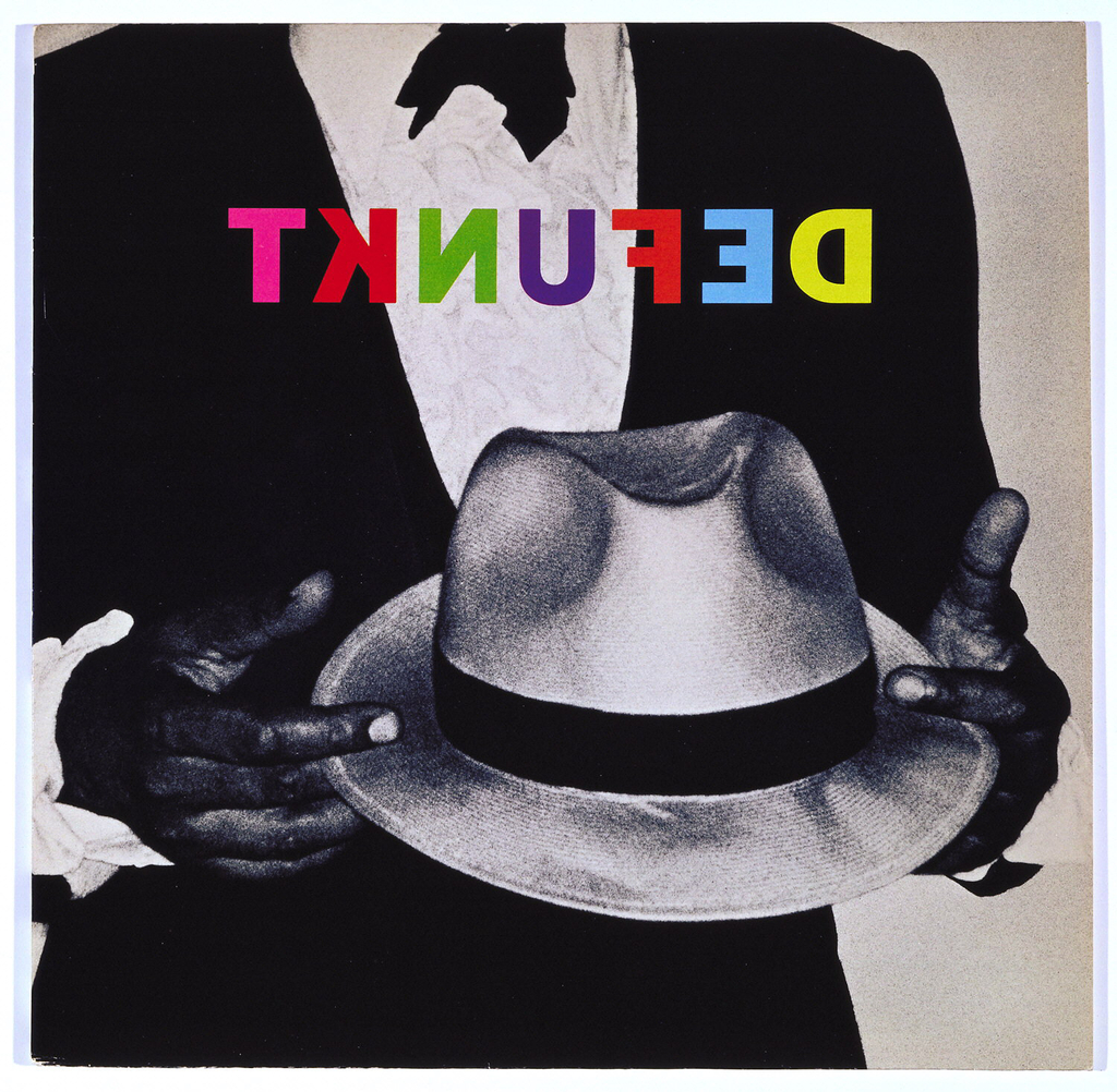
A man in a tuxedo holds a white fedora hat in this Defunkt album cover designed by Tibor Kalman. As in some of his other album designs, Kalman chose to alter the band’s name through reverse lettering. Printed in multicolor, the text is especially striking printed atop the black and white photograph. When reflecting on...

I recently enjoyed a visit to American craftsman Wharton Esherick’s former studio and home, now operating as a museum, on the top of Valley Forge Mountain in Malvern, Pennsylvania. Exteriors and interiors on the site are amusingly playful yet impressively clever and upon closer examination, carefully calculated. There is barely a straight line in the whole design. Instead...
Between 1925 and 1927, the Stehli Silks Corporation produced the Americana Prints, a series of nearly 100 artist-designed dress silks for the modern woman. American artists, designers, celebrities and cartoonists were selected to create the prints, among them photographer Edward Steichen and cartoonist John Held Jr., who produced the piece featured here. Taken together, the...

Researching a work in the collection can lead a curator to some very interesting places other than libraries. I was fortunate to have been in Berlin on May 14, 2015 which was the anniversary of Fanny Mendelssohn Hensel’s death in 1847. I had corresponded previously with Thomas Lackmann, a descendant of Fanny Hensel’s and board...
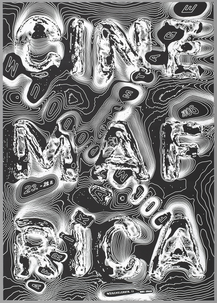
Swiss graphic designer Ralph Schraivogel is known for his astonishing posters for cultural institutions, each one resulting from intensive visual exploration. Schraivogel creates surfaces that boil and undulate with strange energy—in Cinema Afrika (2006), swirling contour lines give rise to colliding texts. from the words “Cinema Afrika” resemble topographic lines on a map. In...
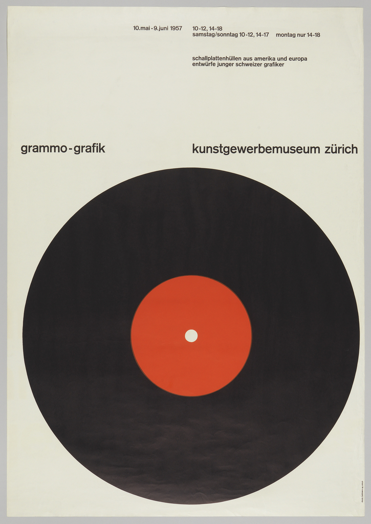
In 1966, Italian designer Bruno Munari poked fun at the commonplace design solution of putting a big circle in the middle of a poster. In his essay “Posters with a Central Image,” Munari wrote, ““The eye is attracted by the dark disc and has no way of escaping.” He may have had this famous poster...
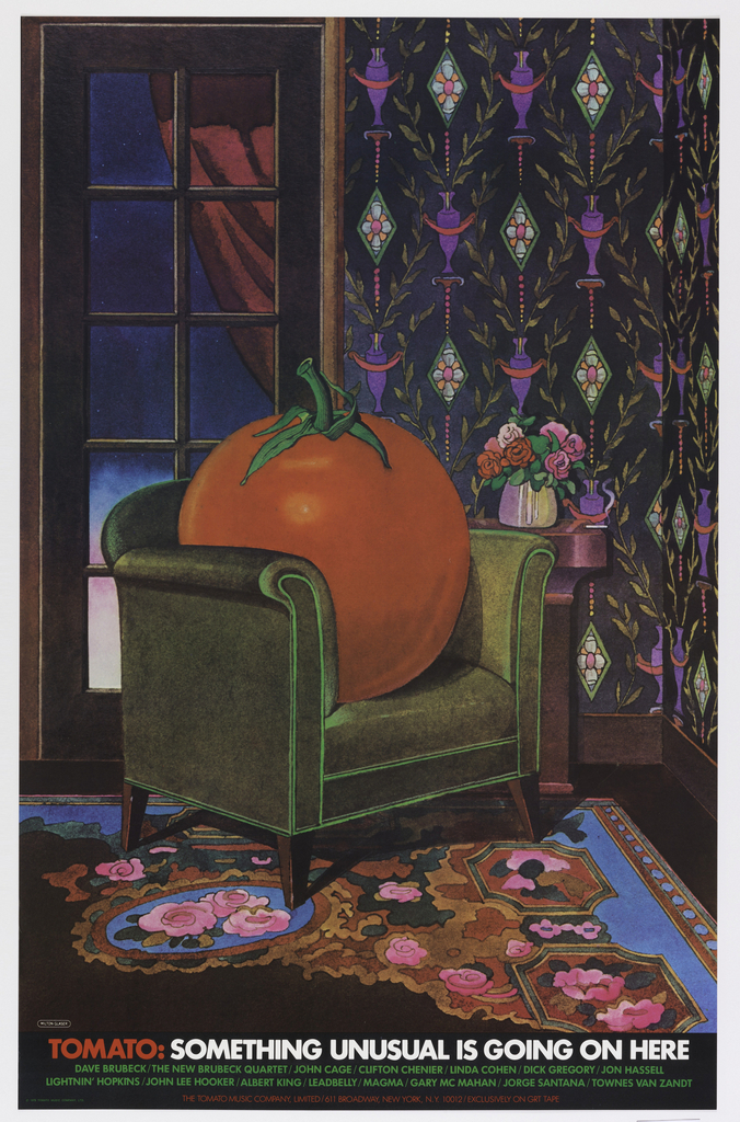
When graphic designer Milton Glaser began designing for Kevin Eggers’ record company in the 1960s, it was called Poppy Records. By 1978, the company had changed names several times, morphing into Utopia, then Atlantic Deluxe, and finally, Tomato Music Company. (It later became known as Tomato Records). The independent label featured an eclectic group of artists,...