
In 1966, Italian designer Bruno Munari poked fun at the commonplace design solution of putting a big circle in the middle of a poster. In his essay “Posters with a Central Image,” Munari wrote, ““The eye is attracted by the dark disc and has no way of escaping.” He may have had this famous poster by Swiss designer Gottlieb Soland in mind when he mentioned “phonograph records” in his snarky essay.
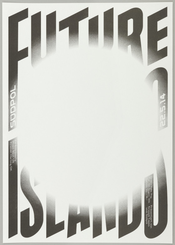
Poster, Future Islands, 2014. Designed by Felix Pfäffli for Südpol (Kriens, Switzerland). Risograph. 42 × 29.4 cm (16 9/16 × 11 9/16 in.). Gift of Felix Pfäffli, 2015-3-4.
Designers today continue to use this compositional device, either as an easy (and effective) design solution or as a point of creative departure. A circular void dominates Felix Pffafli’s poster for a concert by Future Islands. The blurred edges of the poster’s empty center turn the white of the paper into a ravenous, almost destructive source of light and focus.
Ellen Lupton is Senior Curator of Contemporary Design at Cooper Hewitt, Smithsonian Design Museum and Director of the Graphic Design MFA program at Maryland Institute College of Art.
The exhibition How Posters Work is currently on view at Cooper Hewitt through November 15, 2015. You can learn more at the exhibition homepage and find the book How Posters Work at SHOP Cooper Hewitt. #HowPostersWork