For nearly twenty years between the two world wars, E. McKnight Kauffer, an American, was the most celebrated graphic designer in England. He was best known for his eye-catching posters, but his book covers and illustrations, graphic identities, carpets, stage sets, costumes, and ephemera were also among the most arresting of his era. Kauffer believed fervently that modern art should move beyond the walls of museums and galleries to infiltrate all elements of daily life.

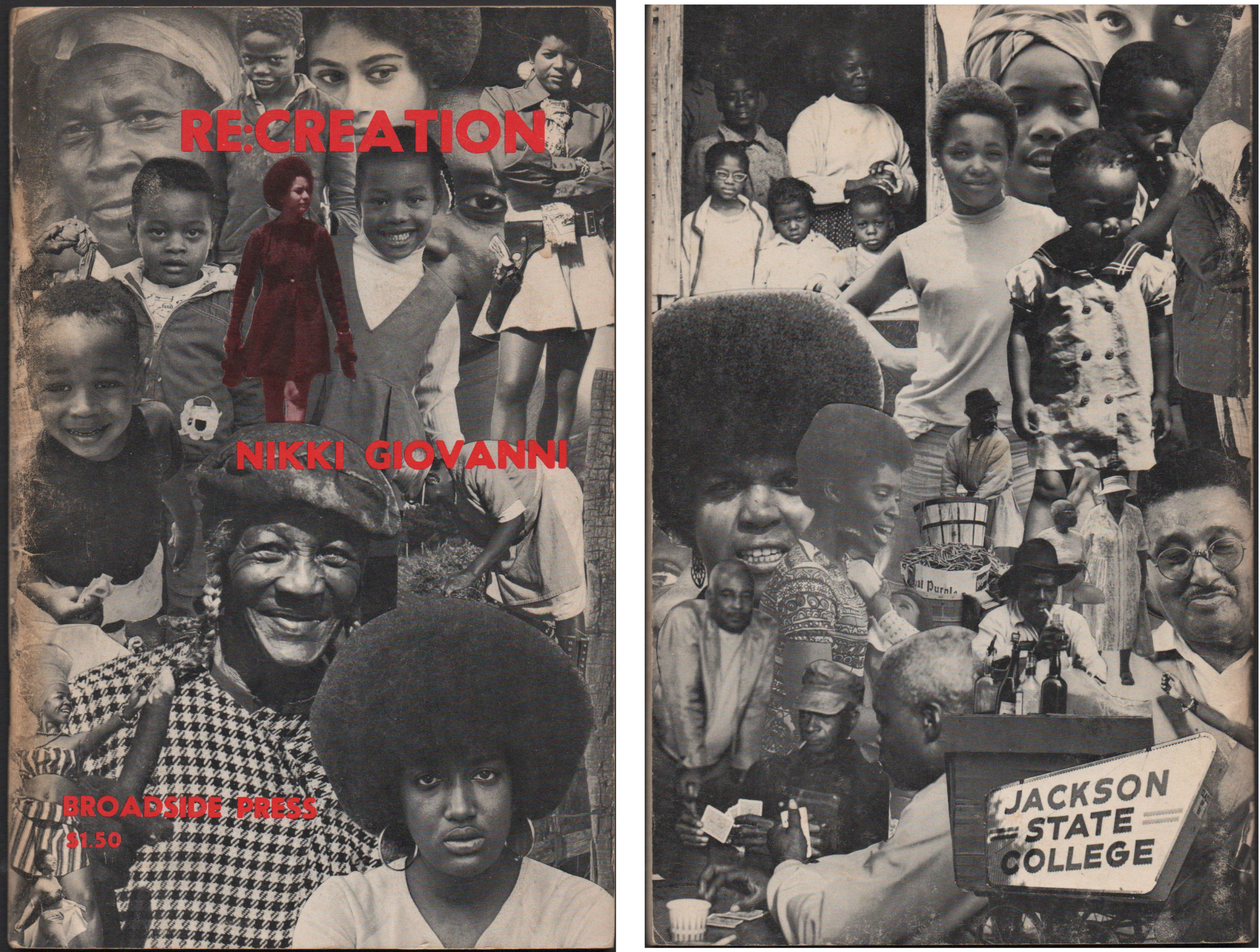
Broadside: A single sheet of paper printed on one side only. For centuries, broadsides were a popular ephemeral format for distributing news, announcements, advertisements, or commentary in the form of ballads. Between 1966 and 1975, Broadside Press in Detroit, Michigan published 81 books and dozens of poetry broadsides written and designed by Black writers and...
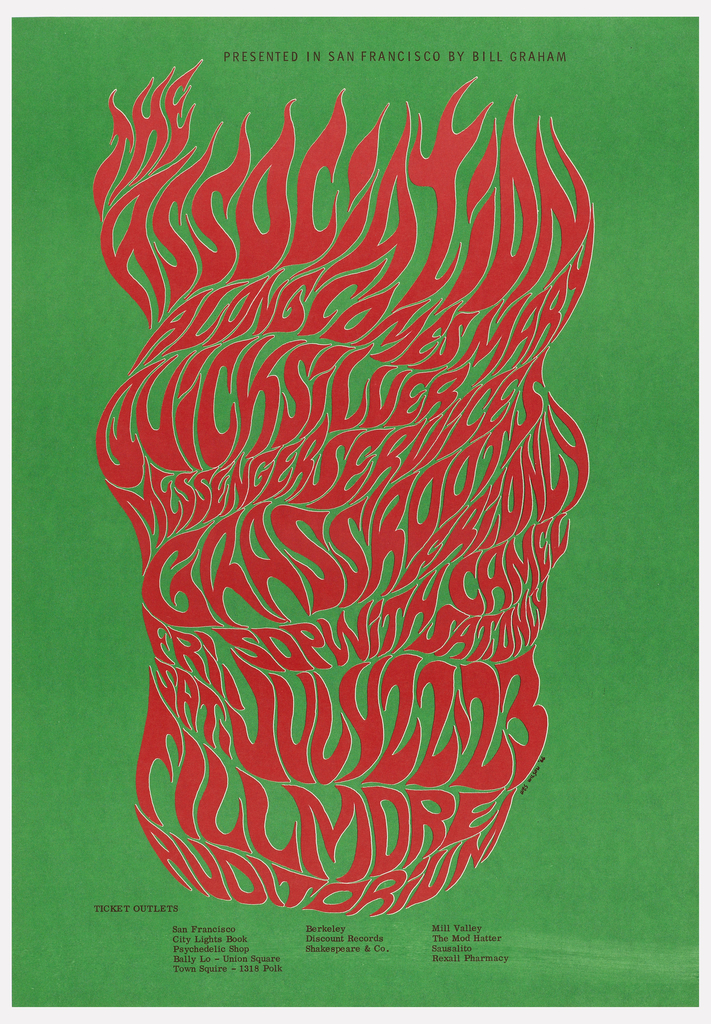
Designer Wes Wilson, who died on January 24, 2020, at age 82, created some of the most memorable posters of the psychedelic era. These wavy-gravy, acid-colored, hand-lettered provocations for the eye accompanied rock shows at San Francisco’s Fillmore Auditorium and Avalon Ballroom. Wilson’s posters for the Grateful Dead, Jefferson Airplane, The Association, and other bands...
![Image features a poster for the New York Subway Advertising Company, encouraging businesses to purchase advertising space in subway stations or on trains. In the foreground, at bottom left, a single train's rail, rendered in perspective extends into a black, spiraling tunnel. At the vanishing point of the tunnel, a cluster of colorful, overlapping rectangles, meant to represent posters. Across the bottom, in black text: [New York Subway Advertising Company logo] RAILS TO SALES / SUBWAY POSTERS [a red line cuts through the center of "subway posters"]. Please scroll down to read the blog post about this object.](https://www.cooperhewitt.org/wp-content/uploads/2020/01/CHSDM-292880_01-000001-scaled.jpg)
This poster, designed for the New York Subway Advertising Company, exemplifies the signature approach of American graphic designers Otis (Shep) Shepard and Dorothy Van Gorder—the poster prioritizes the image as text becomes peripheral to the overall message. It combines reductive, abstracted forms with ample airbrushing to create a dynamic arrangement. The pair met in 1927...
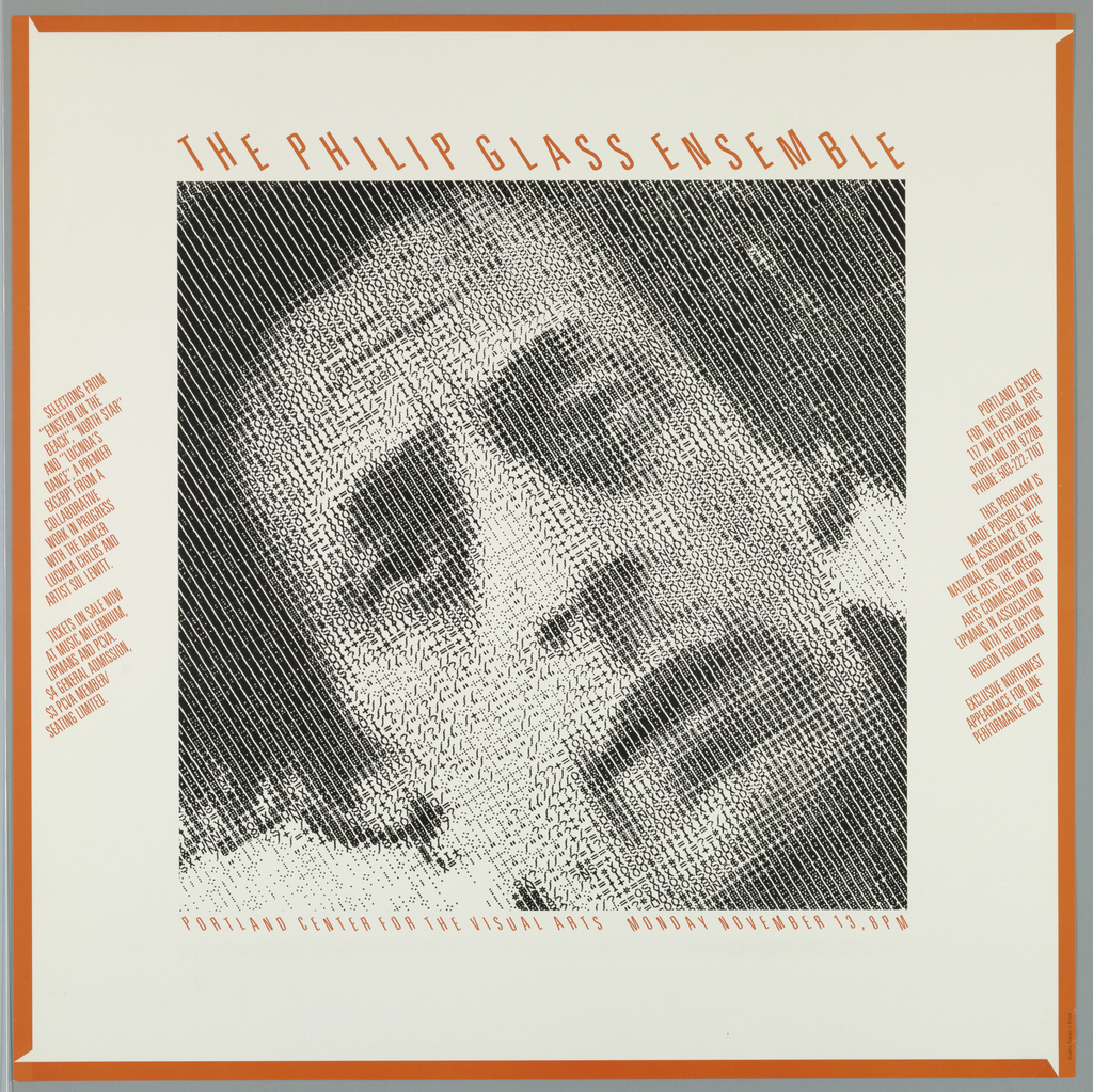
In 1967, the composer and musician Philip Glass formed the Philip Glass ensemble in New York, a group of seven musicians playing keyboards and woodwinds, amplified through a mixer. Glass previously studied at the University of Chicago, Julliard and in Paris with Nadia Boulanger, but found himself frustrated with modern music. This dissatisfaction led him...
To celebrate the opening of Saturated: The Allure and Science of Color (May 11, 2018-January 13, 2019), Object of the Day this month will feature colorful objects from the exhibition. Today’s post was originally published on April 18th, 2013. From the New York Subway system to American Airlines, Massimo Vignelli was responsible for some of the...
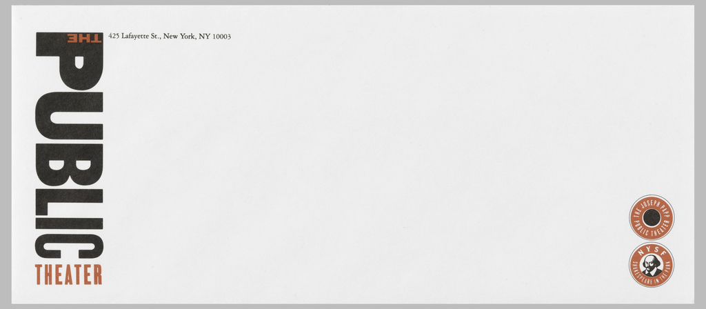
Paula Scher’s identity for New York’s Public Theater has become the ne plus ultra of graphic design. When it was created in 1994, no one had ever seen anything quite like it. With its bold red and black typography, the logo combined letters of different sizes, weights, and spacing, running vertically down the side of...
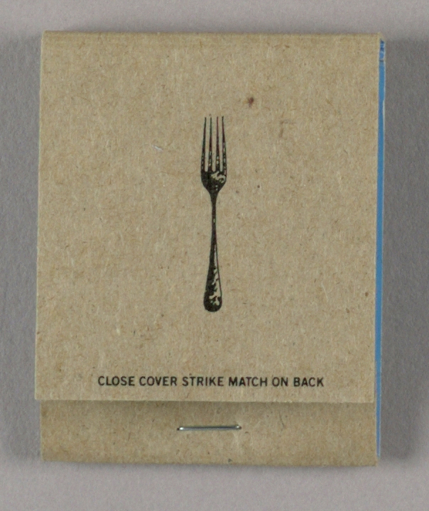
In the hot weeks of June 2008, patrons of New York restaurant Florent stuffed their pockets with matches, postcards and other ephemera emblematic of the 24-hour diner soon to close, “beloved in equal measure by celebrities on the A list and hedonists on the edge.” [1] The matches that were struck by both Calvin Klein...

This 1948 jacket for William Carlos Williams’ book-length poem Paterson was designed by Alvin Lustig for New Directions Publishing’s New Classics series, a collection of reprints of modern literature. Lustig and Williams, a self-expressive graphic designer and a painterly writer, respectively, are a particularly complimentary pair, of the many authors whose work Lustig visually rendered....
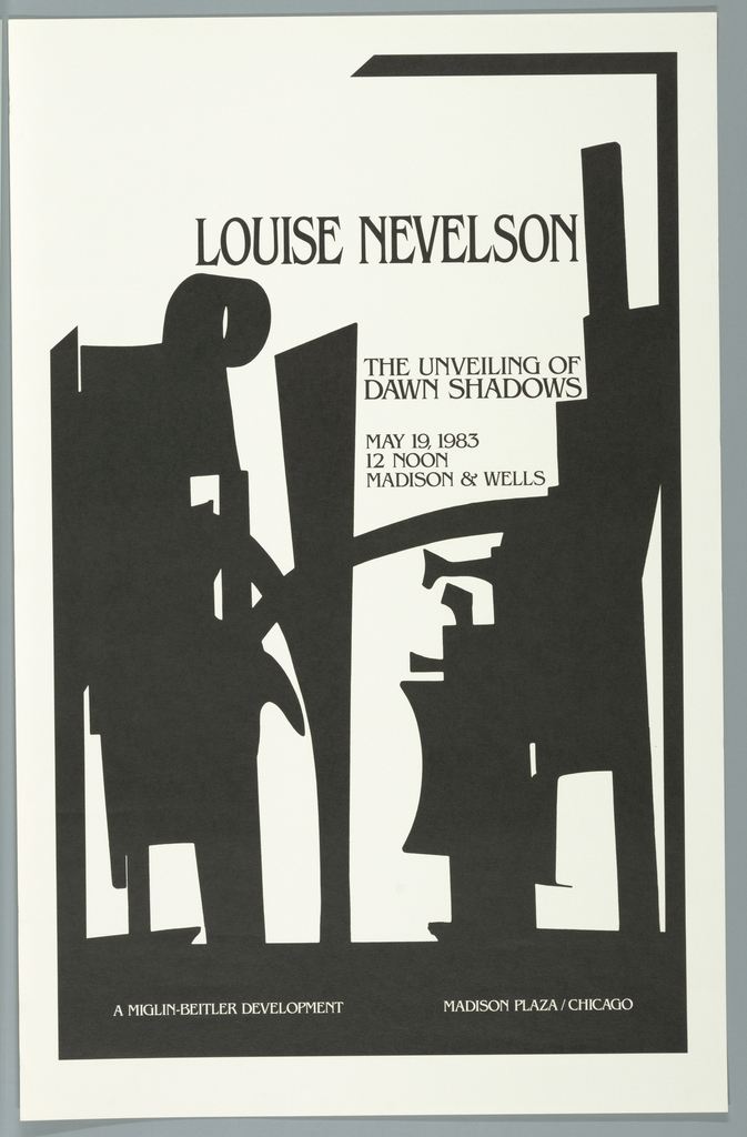
As a young child, Louise Nevelson (1899-1988), born Leah Berliawsky, immigrated to the United States from Kiev, then part of the tumultuous Russian Empire (and the capital of present-day Ukraine). She and her family settled in Maine, where she adopted the more American name, Louise. After her 1920 marriage, Nevelson enmeshed herself in the New...
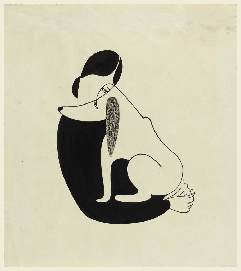
Christina Malman’s 1935 drawing of a woman embracing a dog is both aesthetically magnetic and brimming with affect. Using a brush with black ink and white gouache, Malman masterfully utilizes positive and negative space to create simplified forms that are at once sleekly modern and yet familiar. The figures are depicted in a kind of...
In the forward to Letters from the Avant-Garde, a slim yet unique volume edited by Ellen Lupton and Elaine Lustig Cohen focusing on the stationery of European designers, Cohen discusses her experience as proprietor of Ex Libris, a bookstore specializing in avant-garde print materials. Founded in 1979 by Cohen and her husband, Arthur A. Cohen,...