In the hot weeks of June 2008, patrons of New York restaurant Florent stuffed their pockets with matches, postcards and other ephemera emblematic of the 24-hour diner soon to close, “beloved in equal measure by celebrities on the A list and hedonists on the edge.” [1] The matches that were struck by both Calvin Klein and meatpackers from the factory down the street were designed by M & Co, the graphic and product design consultancy founded by the acclaimed Tibor Kalman.
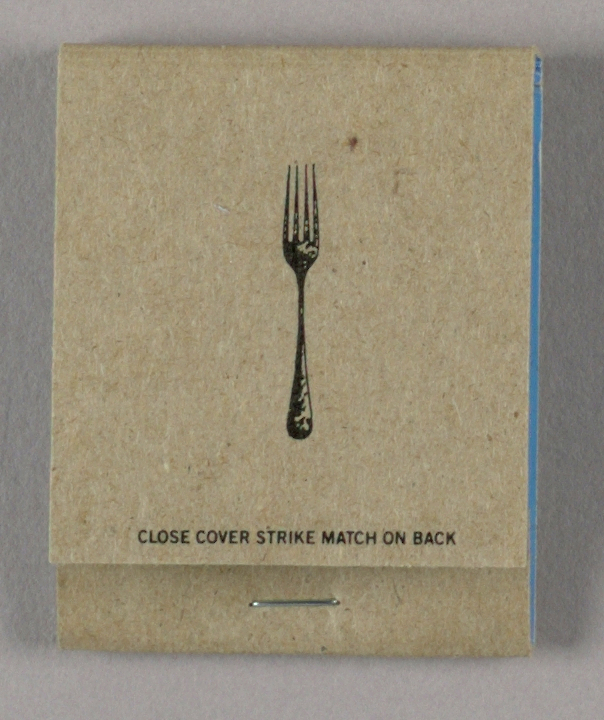
Each of the three Florent matchbooks in Cooper Hewitt’s collection is inked with one simple illustration of a restaurant necessity: a fork, a water glass, and a saltshaker. The black line graphic on dense, speckled brown paper (M & Co wanted the matchbook printed inside out, with the coated paper on the inside and cardboard on the out, vexing every printer they approached) is both inconspicuous and intriguing, like the restaurant itself.
In 1986, Florent Morellet put his first name in the window of an old luncheonette on Gansevoort Street and began serving ‘French bistro meets American classic’ fare, from hamburgers and steak frites to onion soup and chili. Located in the now unrecognizable Meatpacking District, one that predates the upscale shops and the weekender tourists, Florent was the destination for those who tended to work at night: club-goers and artists. Here was where Diane von Furstenberg would dine when downtown. Roy Lichtenstein ate there every day, always in the same back corner seat, where Morellet eventually hung a map of Liechtenstein as designation.[2] Creative types were not foreign to the French expat, whose father was the conceptual painter, sculptor, and light artist François Morellet.
As far as his establishment’s design, Morellet kept much of the décor from the 1950s diner—the stools, the tile, the Formica tables—and left the graphics to Tibor Kalman and M & Co. In exchange for their work, the employees of M & Co were fed by Florent four days a week, from 1985 to 1993.[3]
Kalman’s matchbooks are humble but not reductive, depicting everyday dining ephemera in miniature. They are icons for the essentials; his design is witty for its obviousness and on-brand for a restaurant owner who cursed out (albeit good-naturedly) a reporter after he gave his restaurant press. The romantic idea of discovery by happenstance or insiders’ word of mouth is also embedded in the M & Co matchbook design: when all the matches are pulled—in other words, 20 cigarettes later—the establishment’s address is fully revealed against a smooth, bright primary color background. Other M & Co print campaigns for Florent left out its address and telephone number deliberately.
“I’m always trying to turn things upside down and see if they look any better,” said Kalman. In a shape shifting city like New York, it is inside-out matchbooks and upside-down designs that keep it grounded.
[1] Bruni, Frank. “Genre-Bending Hangout Takes Its Final Bows.” The New York Times, May 21, 2008. Accessed August 11, 2017. http://www.nytimes.com/2008/05/21/dining/21florent.html.
[2] Ibid.
[3] Hall, Peter, and Michael Bierut, eds. Tibor Kalman, Perverse Optimist. Princeton Architectural Press, 2000.
Greta Rainbow is the Peter A. Kreuger intern in the Department of Communications & Marketing at Cooper Hewitt, Smithsonian Design Museum.
