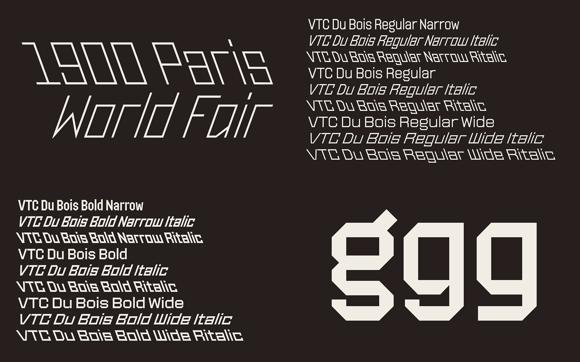
The typography in Du Bois's data visualizations was composed of simple lines for efficient transcription and has inspired contemporary designers.

Presented in collaboration with the Letterform Archive, San Francisco What is Bauhaus typography, and why does it matter? Take a virtual tour of Letterform Archive’s exhibition Bauhaus Typography at 100, and get up close and personal with little-known works from the collection of Cooper Hewitt, Smithsonian Design Museum. Look at key pieces of graphic design...
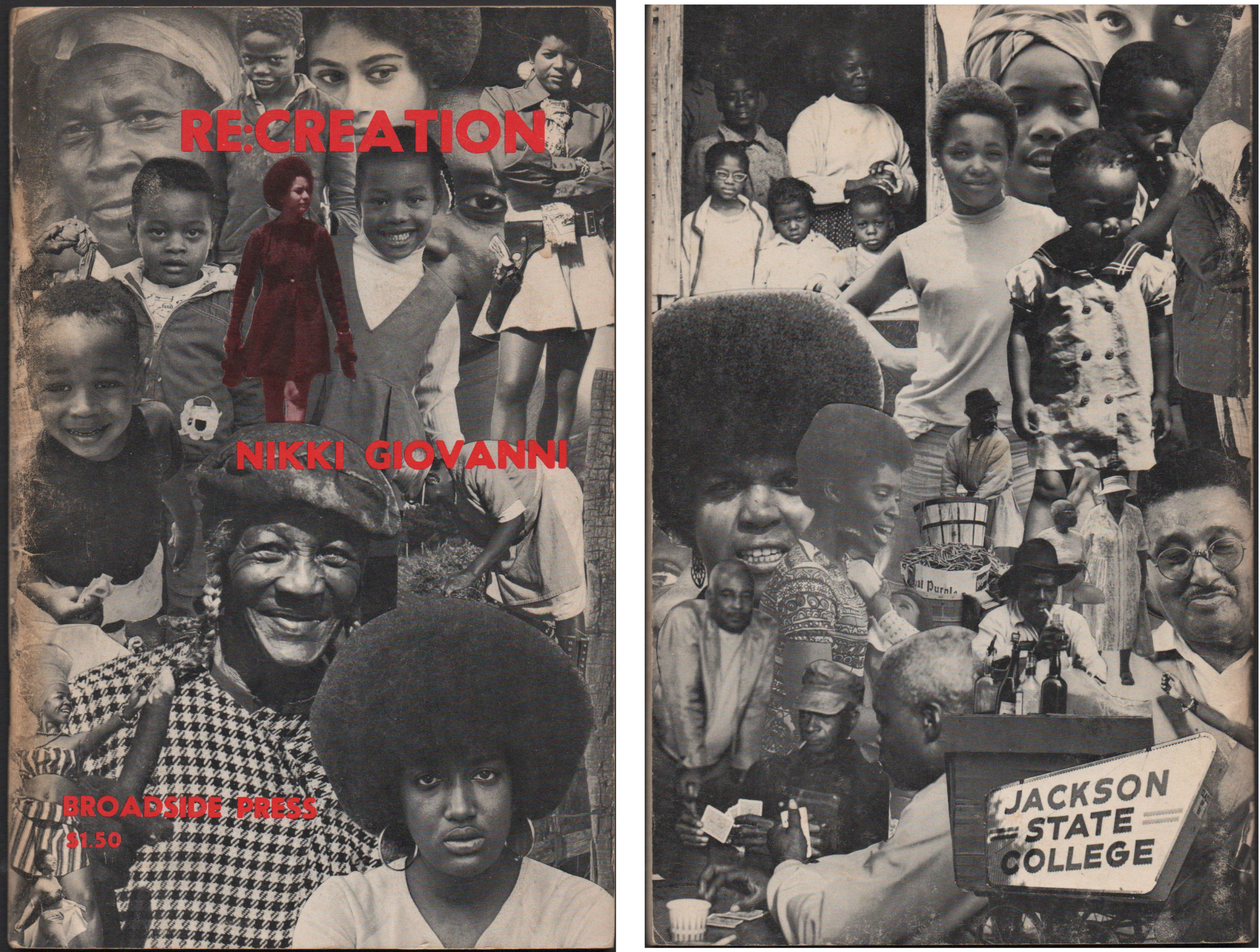
Broadside: A single sheet of paper printed on one side only. For centuries, broadsides were a popular ephemeral format for distributing news, announcements, advertisements, or commentary in the form of ballads. Between 1966 and 1975, Broadside Press in Detroit, Michigan published 81 books and dozens of poetry broadsides written and designed by Black writers and...
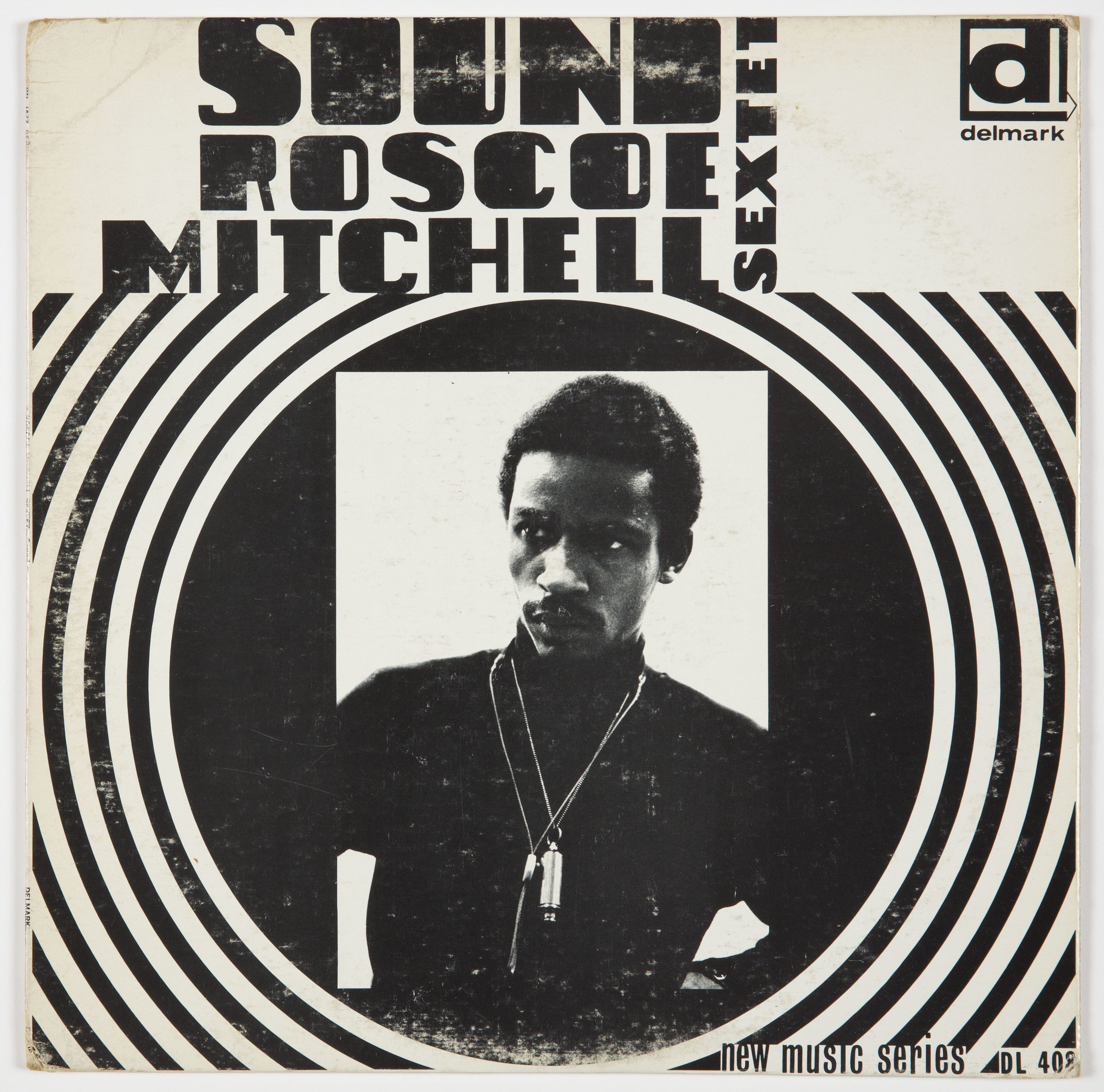
Laini (Sylvia) Abernathy (who died in 2010) was an artist, designer, and activist. Cooper Hewitt is collecting album covers designed by this important designer, who contributed to the Black cultural scene in the late 1960s. Abernathy was part of the Black Arts Movement (BAM) in Chicago. BAM, a national movement founded after the assassination of...
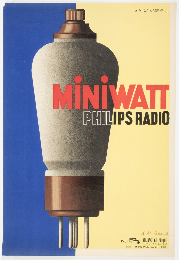
When legendary French graphic designer A.M. Cassandre was hired in 1931 to produce this poster for the Dutch light bulb and radio tube manufacturer Philips, he was at the high point of his career. Together with fellow poster designer Charles Lupton, Cassandre had founded the printing and publishing collective Alliance Graphique in Paris, France.[1] Cassandre...
In celebration of the milestone 20th anniversary of the National Design Awards, this week’s Object of The Day posts honor National Design Award winners. What does “typography” mean to you? Does the word stir up contempt for Comic Sans and Papyrus, or does it conjure a death match between Times New Roman and Helvetica? For...
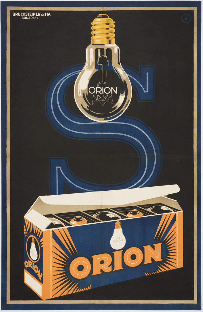
Apart from several months spent at Iparművészeti Iskola, Budapest’s school of applied arts, József Bottlik[1] was a self-taught graphic designer. Bottlik began his career in 1919 and quickly established himself as a designer of eye-catching commercial product and film posters, including a celebrated 1927 design for Universal Film AG (UFA) for the film Metropolis.[2] Bottlik...
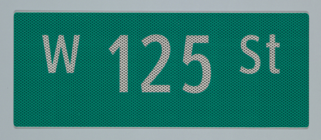
The first street signs in New York City, known as “direction boards,” were posted in 1793 and were largely used on horsecars.[1] They were intended to “rationalize the city’s built environment,” and have undergone many changes over the years. The recognizable rectangular shape of today’s signs, like this one in Cooper Hewitt’s collection, date to...
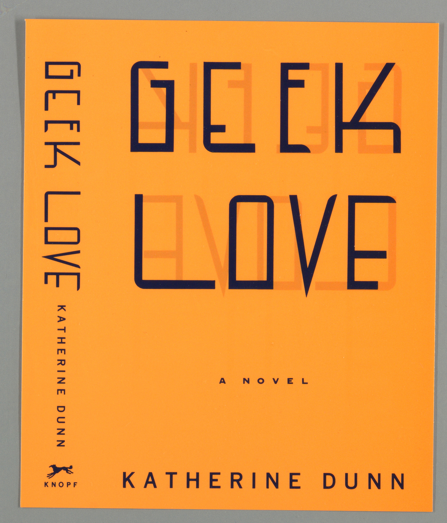
In celebration of World Pride, June Object of the Day posts highlight LGBTQ+ designers and design in the collection. What does it take to design a great book cover? An avid taste for literature surely helps, and so does an eccentric eye for images and type. Chip Kidd (American, b. 1964) has designed some of...
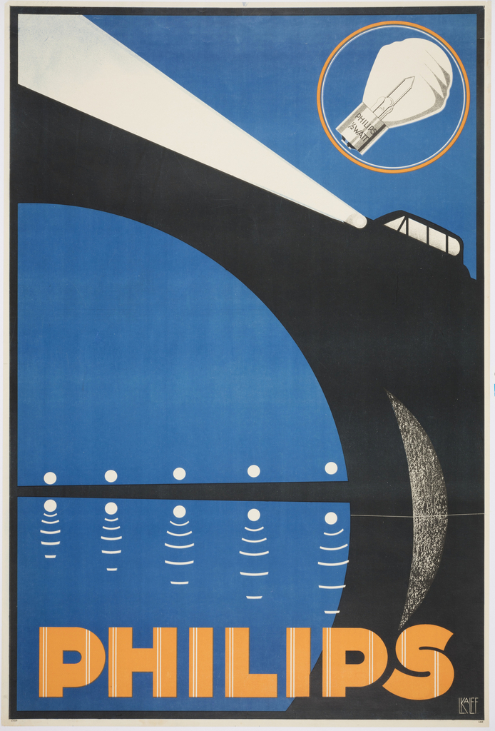
When Louis C. Kalff was hired by Philips in 1925, the company was one of the largest producers of lightbulbs in the world. Kalff created a brand identity for the company, including the iconic logo. For this poster, Kalff illustrated a car whose piercing bright headlights illuminate the scene. The stylized arcs and angles reflect...
Marguerita Mergentime is noted for her innovative use of text as a decorative element, and among her many sources of inspiration were books of calligraphy and penmanship. The “Spencerian” of the title refers to Spencerian script, a cursive writing style developed by Platt Rogers Spencer and promoted through his 1866 book, Spencerian Key to Practical...
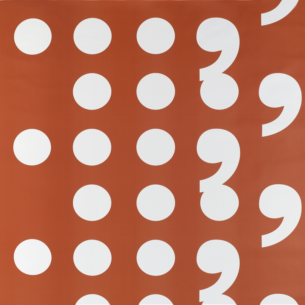
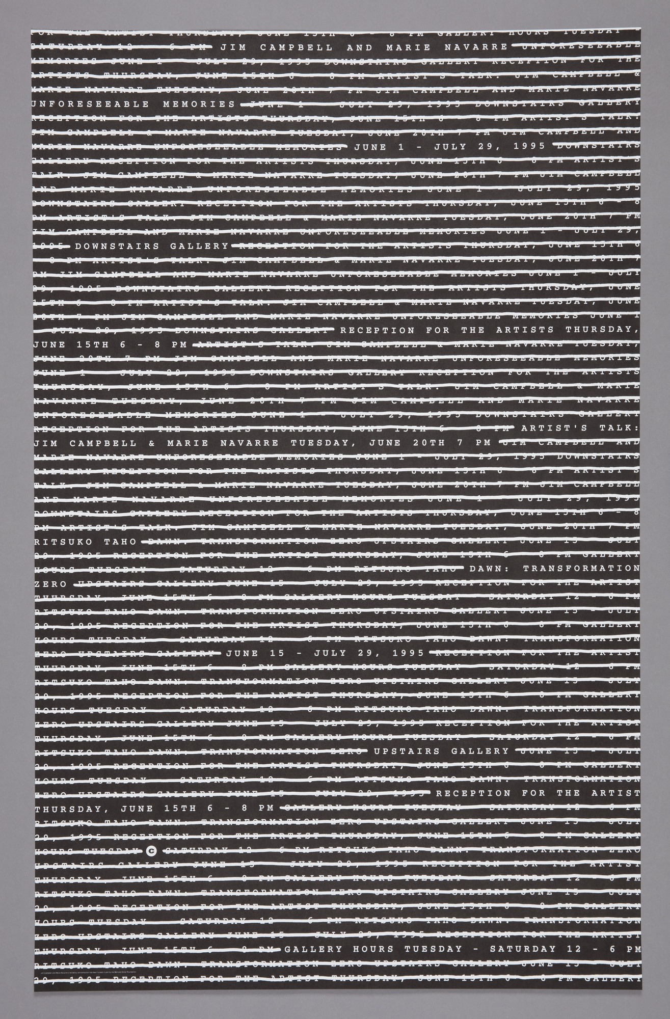
Today’s Object of the Day celebrates the winners of Cooper Hewitt’s National Design Awards. Honoring lasting achievement in American design, the Awards take place annually during National Design Week, with festivities for all ages celebrating design creativity and innovation. Pause is a strong graphic pattern using typographic characters that notify the reader to stop and...
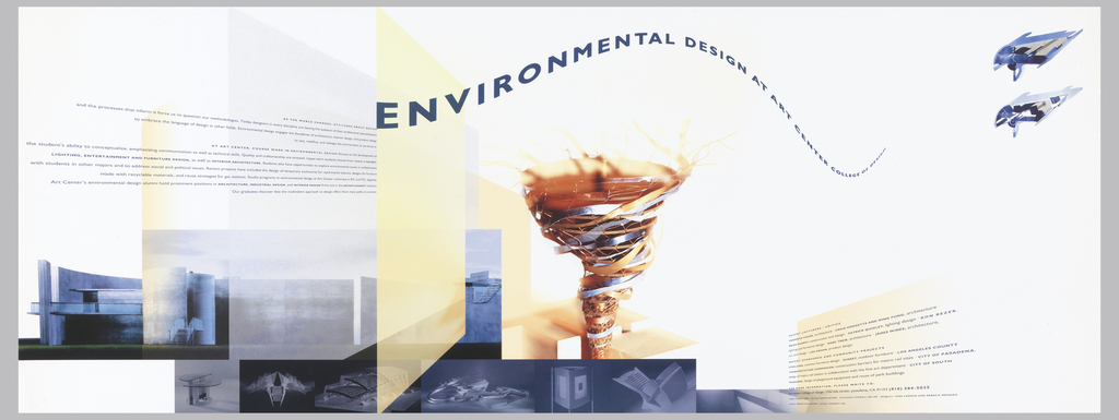
Today’s Object of the Day celebrates the winners of Cooper Hewitt’s National Design Awards. Honoring lasting achievement in American design, the Awards take place annually during National Design Week, with festivities for all ages celebrating design creativity and innovation. Today’s blog post was originally published on March 29, 2018. As design director for her alma mater, Art Center...
In celebration of Women’s History Month, March Object of the Day posts highlight women designers in the collection. As design director for her alma mater, Art Center College of Design in Pasadena, California, from 1991 to 1996, designer and artist Rebeca Méndez (b. 1962, Mexico City; active Los Angeles) played a key role in re-envisioning...
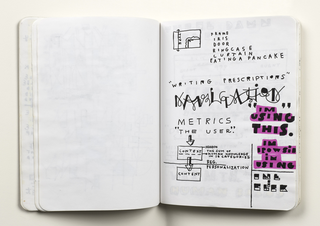
Designers of all varieties—architects, graphic designers, painters—are aware of the importance and utility of sketchbooks in the creative process. The blank canvas of a sketchbook page allows the design process to occur in real time and encourages documentation of ideas that might otherwise be fleeting. The significance of sketchbooks as part of the creative process...