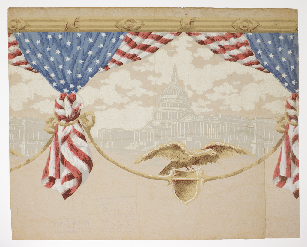
I thought while everyone is in the Fourth of July holiday mode it is a good time to write about a patriotic wallpaper, or rather a border. Since I’ve already written in years past about the firecracker wallpaper created for the American Bicentennial, and a scene from Views of the American War of Independence showing...
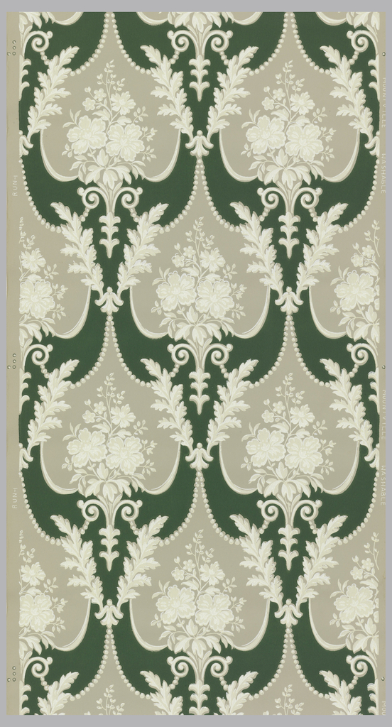
The 1950s produced wallpapers that fell into a number of different design genres, ranging from modern to kitsch to traditional styles. This paper definitely falls under the latter category. If it wasn’t for the word “WASHABLE” printed in the selvedge it could easily be confused with a wallpaper produced around 1900. With its repetition of...
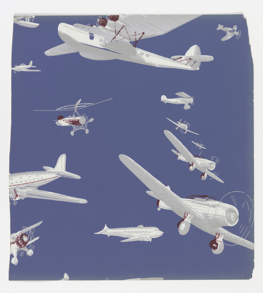
Thought it was time to write about another children’s wallpaper. This is a post-war wallpaper, probably one of the first to be produced following the moratorium on new designs during the war. It took manufacturers about a year to get up to speed and introduce their first collections. This design shows a variety of different...
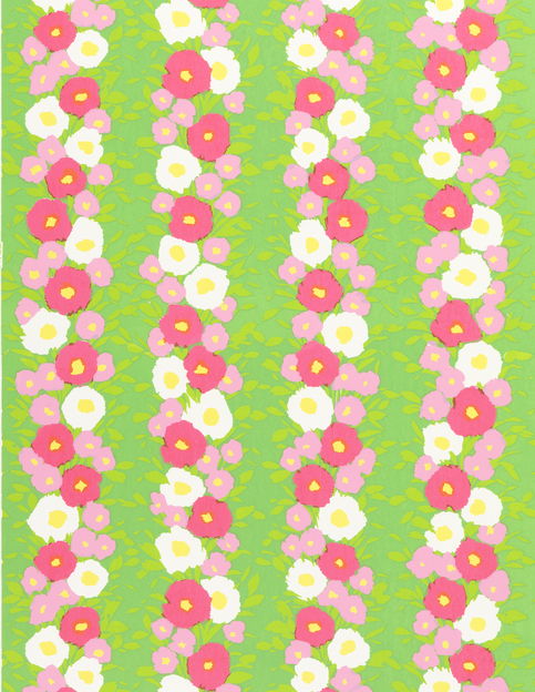
Here is a perky design that seemed appropriate for a summer post. Printed in shades of pink and green this floral stripe pattern is quite striking in its intensity. While this all but screams late 1960s it is a fun design that could work beautifully in a maximalist interior today. Different shades and hues of...
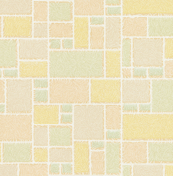
I thought this was a charming pattern, with its pastel-colored geometric background pattern reminiscent of tilework. The scrolling white lines covering the surface give the design a textural look, softening the appearance of all the hard lines. They also remind me of the Sno Ball pastries with the coconut-covered exterior. This was a very inexpensive...
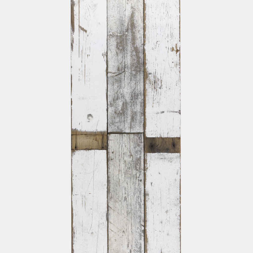
Created by Dutch designer Piet Hein Eek, the Scrapwood collection of wallpapers copy the surfaces he creates on his handmade furniture made of found wood. Digitally printed, each of the patterns perfectly captures the grain and texture of various found wood surfaces. It is nearly impossible to distinguish the printed papers from actual wood. These...
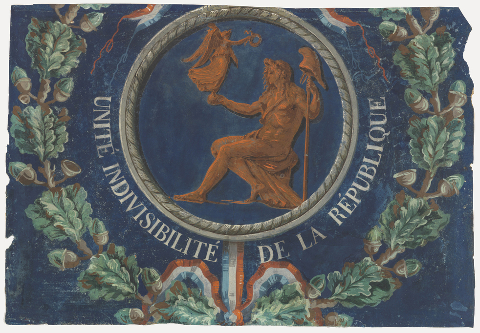
This wallpaper from the French Revolution period was one of the early pieces collected by the museum founders. It took me a while to understand how these papers were used as I can’t imagine hanging a political wallpaper in my home today. But the citizens of France felt differently, they thought that the Revolution could...
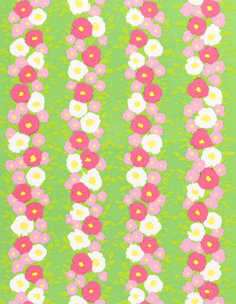
Here is a perky design that seemed appropriate for a summer post. Printed in shades of pink and green this floral stripe pattern is quite striking in its intensity. While this all but screams late 1960s it is a fun design that could work beautifully in a maximalist interior today. Different shades and hues of...
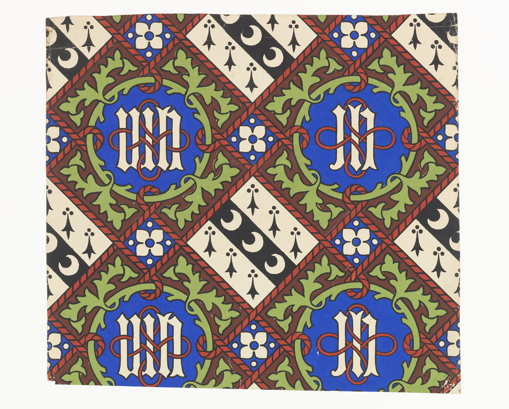
This is one of a number of wallpaper designs by Augustus Welby Northmore Pugin in the museum collection. Pugin began designing wallpapers in the early 1840s, and was probably the most prolific wallpaper designer of the nineteenth century, designing more patterns than even William Morris. He created a number of private commissions for large country...
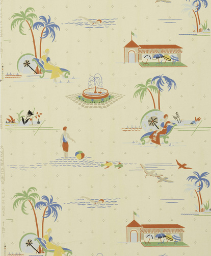
Now that summer is upon us it is easy to envision the season’s warm breezes or the possibility of taking a trip to a tropical getaway. In this wallpaper manufactured by United Wallpapers we can at least have a convincing staycation. Cheerful blues, greens, and yellows adorn this upbeat paper which depicts figures relaxing along...
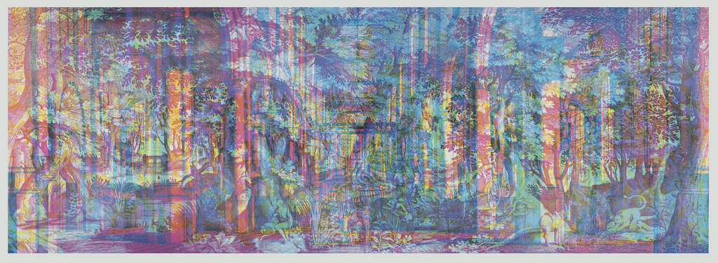
To celebrate the opening of Saturated: The Allure and Science of Color (May 11, 2018-January 13, 2019), Object of the Day this month will feature colorful objects from the exhibition. “Landscape No. 1” is one of the RGB (red, green, blue) wallpapers designed and printed by Carnovsky. RGB is a project about the surface, or skin of...
To celebrate the opening of Saturated: The Allure and Science of Color (May 11, 2018-January 13, 2019), Object of the Day this month will feature colorful objects from the exhibition. This blog originally posted in September 2016. When I first saw this wallpaper I had to stop and do a double-take. It is very unusual for an...
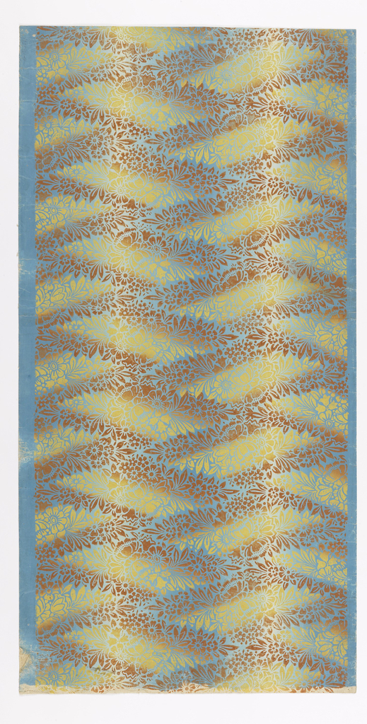
To celebrate the opening of Saturated: The Allure and Science of Color (May 11, 2018-January 13, 2019), Object of the Day this month will feature colorful objects from the exhibition. This style of wallpaper, with its optical effect of reflecting light, is known as an irisé, or iridescent paper. The technique, also known as rainbow method, was...
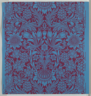
To celebrate the opening of Saturated: The Allure and Science of Color (May 11, 2018-January 13, 2019), Object of the Day this month will feature colorful objects from the exhibition. This wallpaper is a 1970s print of an 1879 design by William Morris, in a color combination he may have found shocking. Morris is often regarded as...
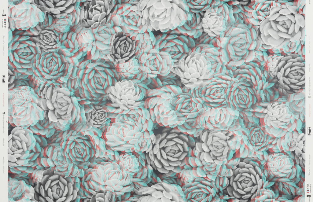
To celebrate the opening of Saturated: The Allure and Science of Color (May 11, 2018-January 13, 2019), Object of the Day this month will feature colorful objects from the exhibition. Bloom is a 3-D or anaglyph wallpaper designed by LuzElena Wood as part of the DEEP 3D Wallpaper Project created by Architect Sarah Strauss in partnership with...