In the forward to Letters from the Avant-Garde, a slim yet unique volume edited by Ellen Lupton and Elaine Lustig Cohen focusing on the stationery of European designers, Cohen discusses her experience as proprietor of Ex Libris, a bookstore specializing in avant-garde print materials. Founded in 1979 by Cohen and her husband, Arthur A. Cohen,...
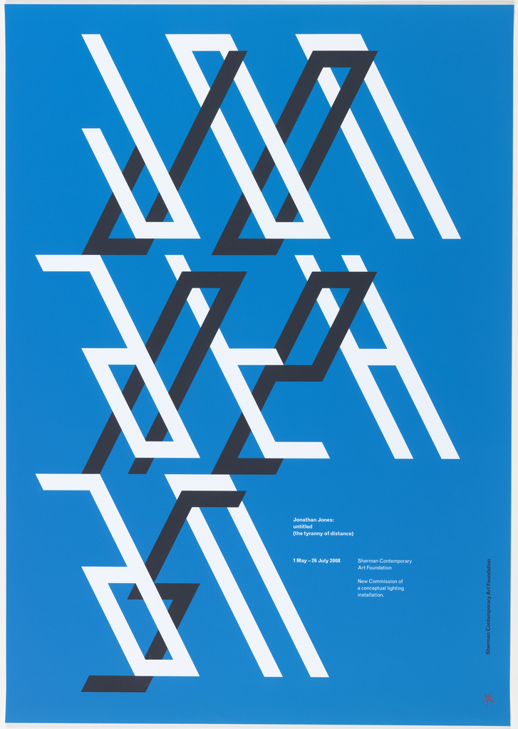
Australian designer Mark Gowing explains that the repeating forms of his country’s minimalist landscape are manifested in his geometric compositions. This poster was designed to advertise a solo exhibition of the work of Jonathan Jones, a Sydney-based Aboriginal artist from the Kamilaroi/Wiradjuri nations located in South Eastern Australia. Jones’s work in sculpture and installation features fluorescent...
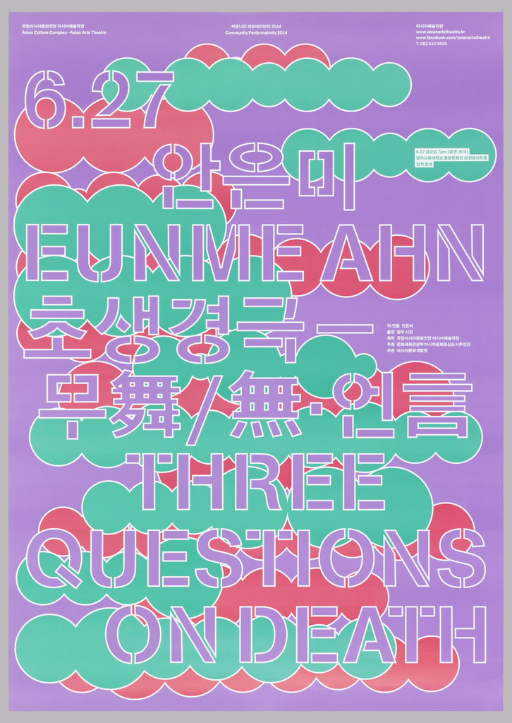
For their poster publicizing dancer Eunme Ahn’s performance of Three Questions on Death, Sulki & Min designed text in a style that recalls stenciled letters, their nod to the impermanence of the performance held before the opening of the Asian Arts Theatre, Asian Culture Complex in Gwangju. Cloudlike bubbles, culled from poster designs advertising earlier...
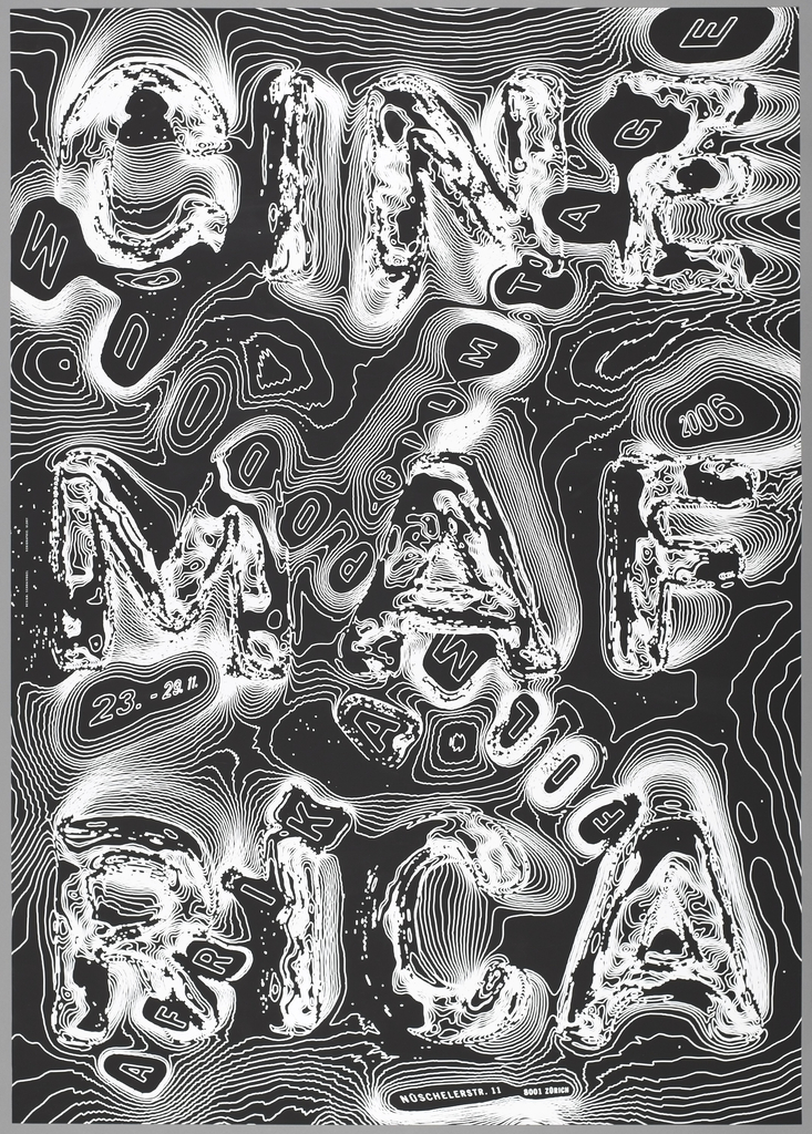
Swiss graphic designer Ralph Schraivogel is known for his astonishing posters for cultural institutions, each one resulting from intensive visual exploration. Schraivogel creates surfaces that boil and undulate with strange energy—in Cinema Afrika (2006), swirling contour lines give rise to colliding texts. from the words “Cinema Afrika” resemble topographic lines on a map. In...
In 1975 Swiss graphic designer Niklaus Troxler founded the Willisau Jazz Festival, which he directed until 2009. His series of posters for the festival represents an ongoing study in design process, as Troxler explored diverse means to create letterforms outside the norms of typography and typefaces. As variations on a theme, the posters reflect on...
While many works of design explore a blunt, diagrammatic simplicity, others challenge the viewer to fill in the blanks. Inspired by cubist collage, E. McKnight Kauffer created images with fluid boundaries. Wolfgang Weingart turned letters into parts of bodies and parts of other letters, playing with text as both language and not-language. In a series...
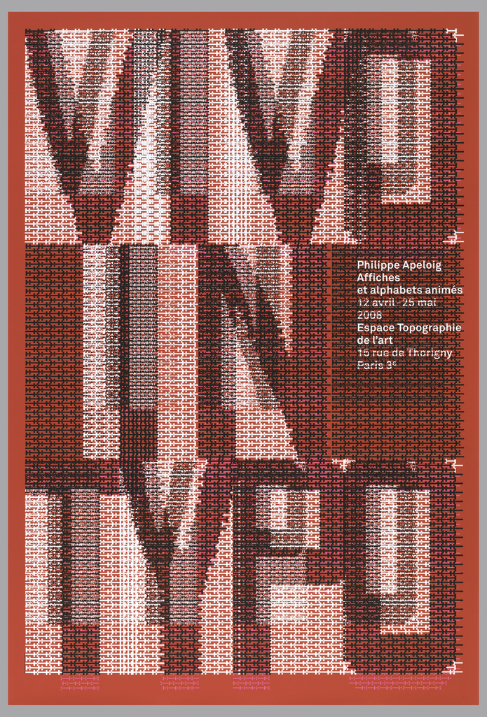
When graphic designer Philippe Apeloig featured his own poster designs at the Espace Topographie de l’art in Paris, he chose the title Vivo in Typo for the exhibition, and decided to make the title the graphic focus of his promotional poster. Apeloig concieved of an image comprised entirely of typography. He began by sketching punctuation marks...
Graphic designer Philippe Apeloig describes the process and thinking behind the VIVO IN TYPO poster. The gigantic poster is part of the Cooper Hewitt permanent collection. You can see it on 12/12 when the museum re-opens, as part of our “Making Design” exhibition. Thanks to Erik Hougen at the Lower East Side Printshop for demonstrating...
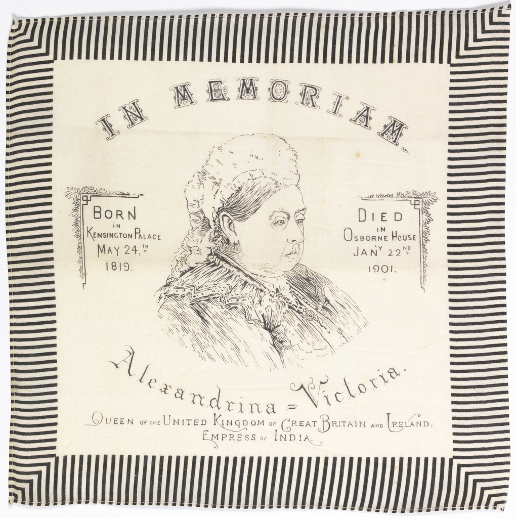
Another sour puss. What is this show? Does it feel more real to pout than to preen? She was devastated when her beloved Albert died. It feels as if she never laughed again. But she had a job to do. It is important to have work. Someone can sell buckets. Someone can be Empress of...
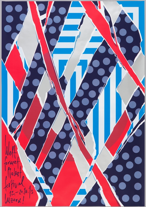
When Swiss graphic designer Felix Pfäffli was asked to design a poster for the 2013 Weltformat Poster Festival held in Lucerne, he grappled with the “strange duplication” of creating a poster to promote a poster exhibition. He turned to the many posters hung on steel poster walls in the streets for his inspiration. As posters...

Inspired by Paula Scher’s work for The Public Theater, the choreographer and dancer Eliot Feld first approached her about designing an identity for his dance company in 1997, when he decided to rename the company Ballet Tech. Scher designed an identity using a typographic family of slab serifs, overlaying the typography on top of photographs...
From a bold new font to a brand new name, hear how Cooper Hewitt is reimagining itself for the 21st century and how the museum’s new identity was conceived and designed. Eddie Opara (Pentagram) and Chester Jenkins (Village) talk with Caroline Baumann, Cooper Hewitt’s director, about the new graphic vision for America’s design museum.

Paula Scher is this year's National Design Award winner for Communication Design. Hear her speak about her first encounter with graphic design, her inspirations, and the unexpected longevity of her images. The National Design Awards were conceived by the Smithsonian's Cooper-Hewitt, National Design Museum to honor lasting achievement in American design. The Awards are bestowed...
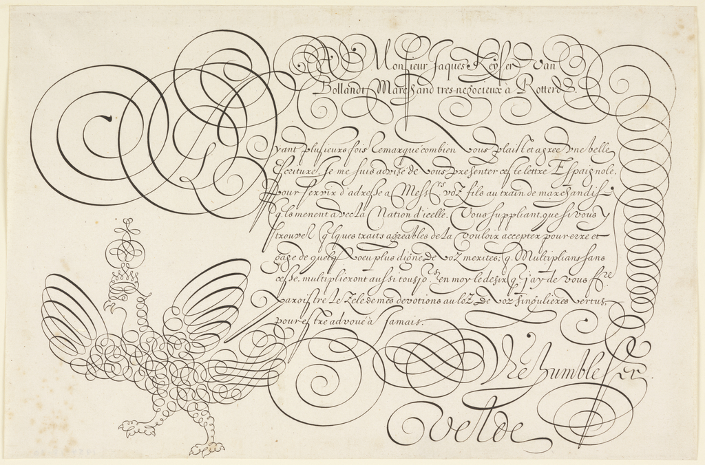
From computers to cellphones, Twitter to Facebook, the typed word dominates our daily life. With the increasing proliferation of digital technologies, access to writing has become almost universal. In the 17th century, however, writing was a skill reserved for an educated subset within the European population. Calligraphy, referred to as the “Tenth Muse,” was considered...
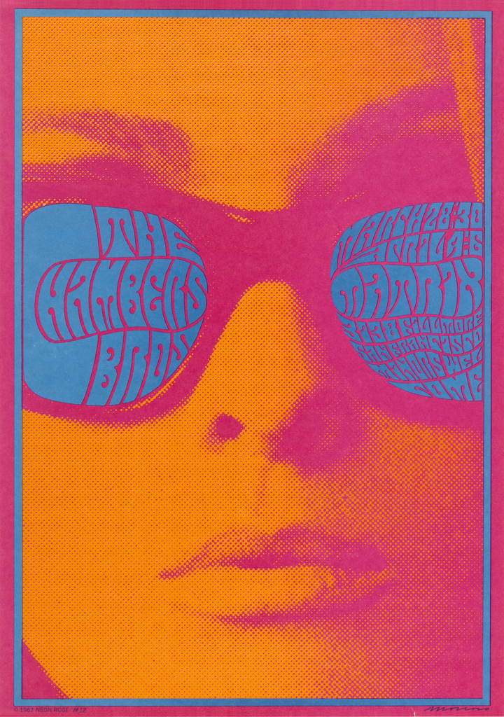
Stare into the electric blue shades of this woman’s sunglasses and what do you see? Even if you know what you are looking for, the blue letterforms come together to form coherent words only with sustained visual focus. If you were to advertise a concert that you wanted people to come to, would you make...