Cooper Hewitt’s exhibition The Senses: Design Beyond Vision (April 13–October 28, 2018) is one of our museum’s early explorations in developing exhibition design that is accessible to all visitors, including people with sensory differences. Many museums do a good job making their facilities wheelchair-accessible and meeting basic ADA requirements, but it’s another matter to offer rewarding exhibition experiences to everyone. As our friend Sina Bahram told us, “Once inside a museum, visitors with disabilities often find that the level of effort, resources, consideration, and study dedicated to providing equal access for all visitors is disappointingly low.” Furthermore, museums tend to focus on looking as the only thing anyone would want to “do” in a museum, while excluding other senses and other ways of being in the world. Creating an accessible and inclusive museum is one of five strategic directions for Cooper Hewitt, today and in the future.
To create The Senses exhibition, we used many tools of accessible design. Perhaps the most pervasive one is verbal description. By describing the content of our exhibition in clear, direct language, we aimed to make our content accessible to visitors with blindness or low vision. Writers, of course, have been doing this for thousands of years. Works of prose or poetry use words to conjure vivid responses within the theater of the mind. Words take us to distant cities, sumptuous banquets, and spaces filled with living people and tangible things.
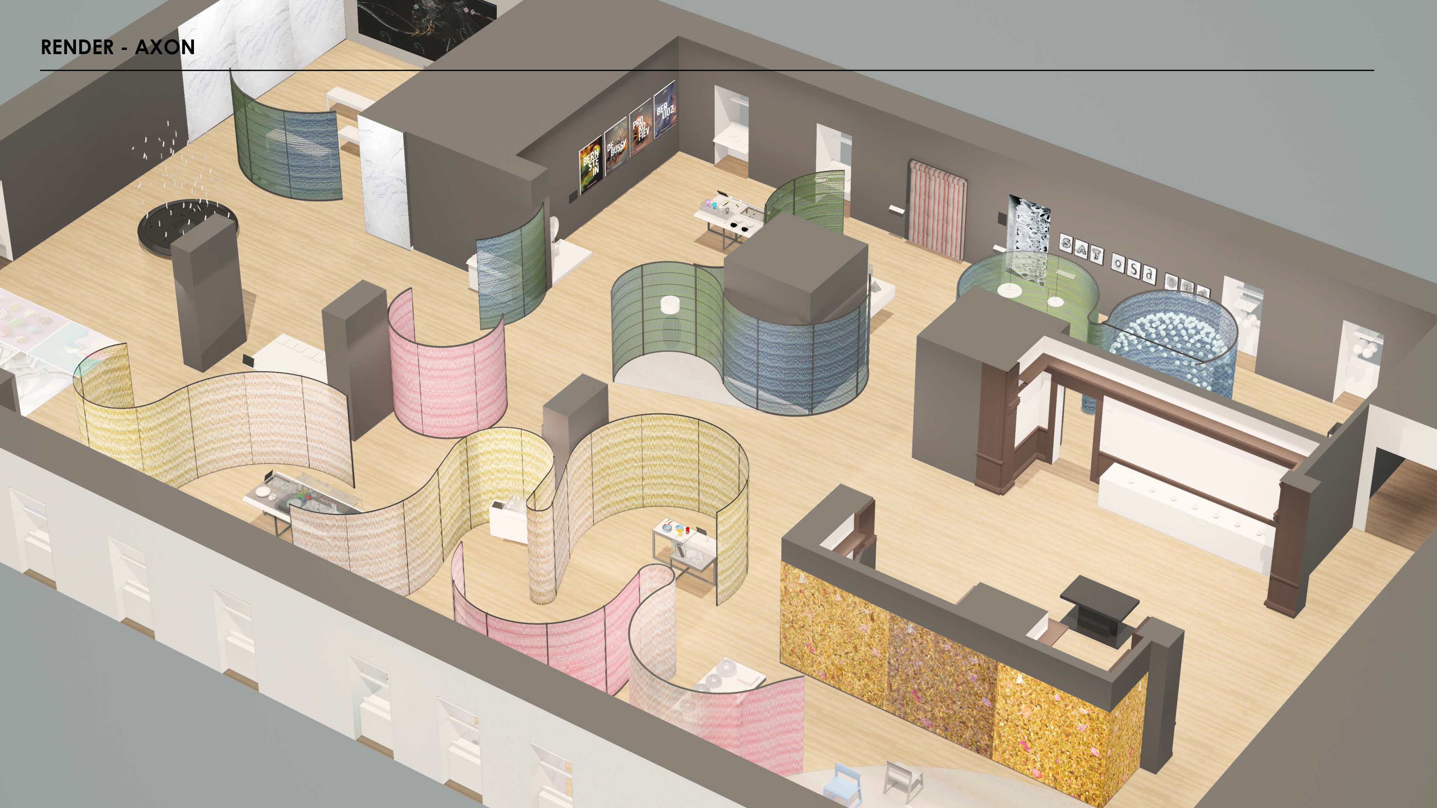
The overall space is about 100 feet deep and 50 feet wide, with dark gray walls. Curving room dividers snake through the space, creating smaller pockets and winding pathways. The dividers consist of metal frames hung with layers of richly colored nylon thread. Exhibition designed by Studio Joseph, 2018.
In 2017, Cooper Hewitt began offering descriptive exhibition tours, in which trained educators describe the spatial context of the room as well as the objects on display. These gallery tours offer intimate, personal experiences to small groups. Many visitors, however, prefer to explore museums at their own pace and at their own convenience. To create The Senses, the Cooper Hewitt content team sought to weave descriptive language into the entire fabric of the exhibition and to make that content available in diverse ways.
How did we do it? Our core technology is simple, cheap, and low-tech: label copy. Every label in the exhibition starts with a basic description of the work on hand. My colleague Andrea Lipps and I (co-curators of The Senses) wrote brief descriptions that flow into the label’s interpretive text. Our traditional museum training has made us accustomed to rattling off ideas and facts while assuming that visitors can see what we are writing about. No more! We now approach our work from an exciting new perspective.
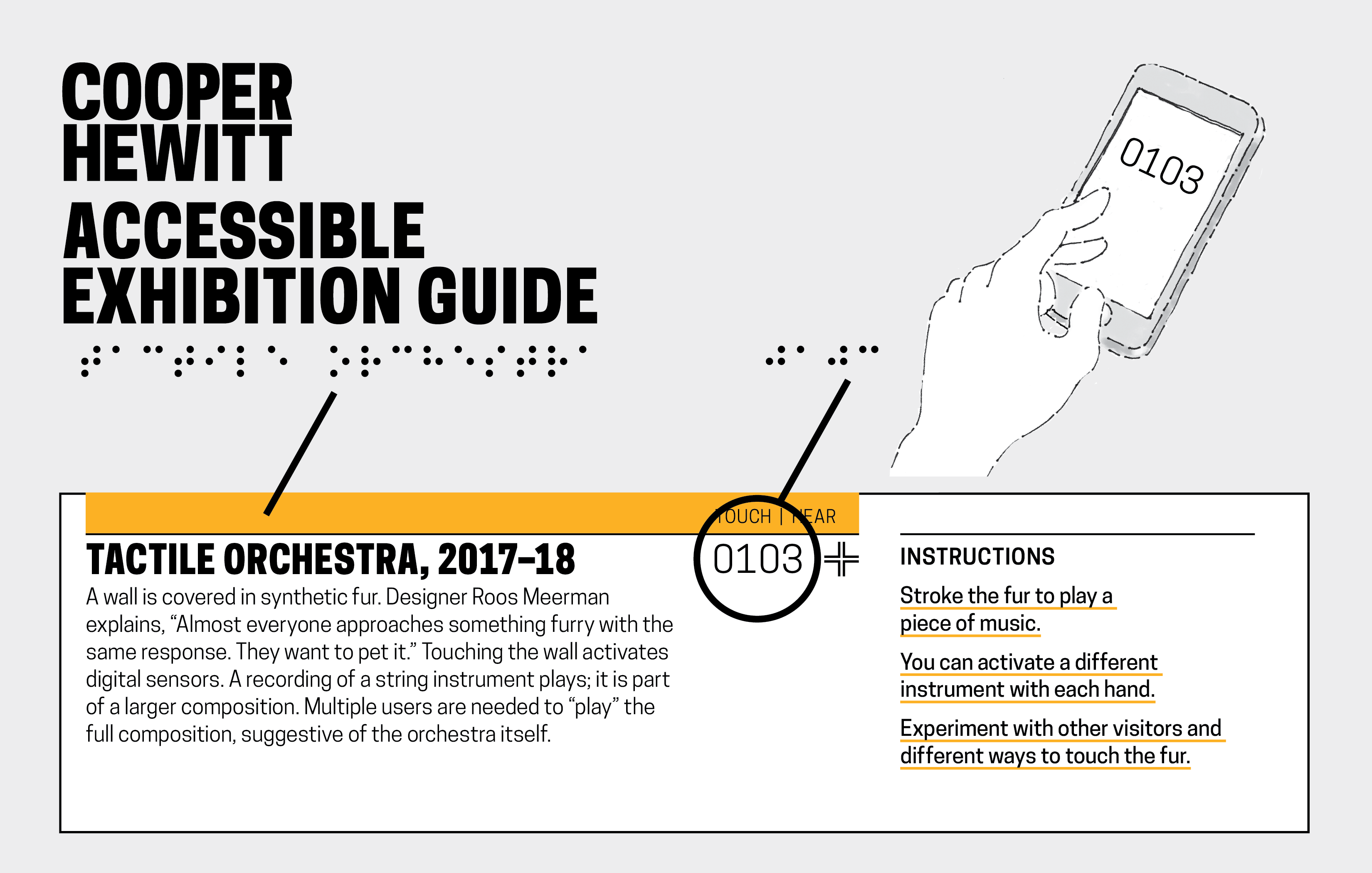
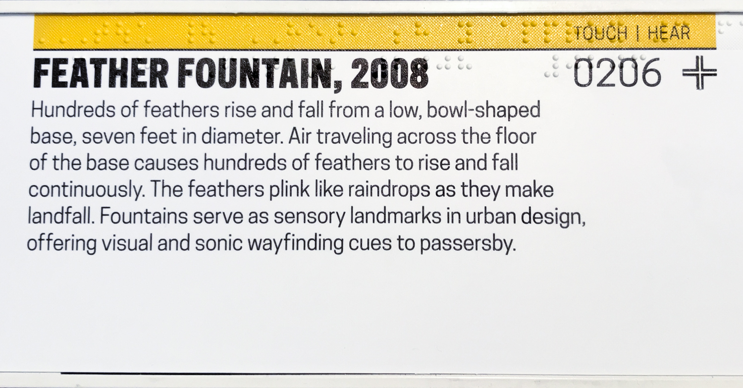
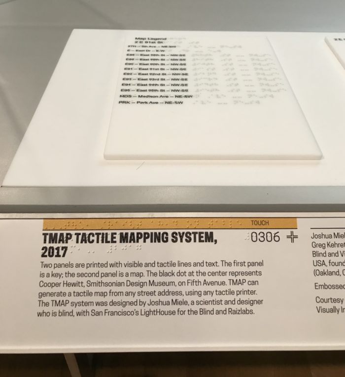
A unique project title and content number appears on each label in both braille and Latin text. An interactive display (which can be touch, heard, or smelled) is identified with a textured yellow band across the top. In braille, directional language indicates where the object is located relative to the label and what interaction is available. Instructions are also printed in braille. To access additional text about the object in text or audio format, visitors enter the content number in the Accessible Exhibition Guide.
How can visitors with low vision or visitors who are blind access these written descriptions? Every label in The Senses features an object title and number, printed in braille and Latin characters. Visitors can enter the number on their smartphones to access the associated content. Labels are installed at a consistent height throughout the exhibition, making them more discoverable than labels placed for reasons of aesthetics or convenience. Pamela Horn, Director of Cross-Platform Publishing, led the effort to create Cooper Hewitt’s first Accessible Exhibition Guide. The guide is available as a native app for iOS and as a web app for Android and other systems. (Download it from the Apple App Store or connect online at www.CooperHewitt.org/channel/senses.) The guide contains the exhibition’s descriptive and interpretive content in both text and audio formats. A visitor can choose to read the text, hear it with a screen reader, or listen to an elegant audio recording.
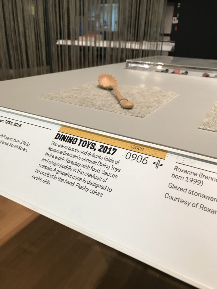
The labels are printed with a special process called dimensional UV printing. A full-color layer of visible ink is printed over white braille dots and raised-line tactile symbols. The visible layer and the tactile layer co-exist for all users. Labels designed by David Genco, Ellen Lupton, and Steven Landau, Touch Graphics.
The app was designed by Sina Bahram, founder of Prime Access Consulting, with Joshua Lerner of Monorail. Sina is a computer scientist, consultant, and researcher. He is the Director of Prime Access Consulting (PAC), which advises museums and other institutions on website and digital accessibility. The tactile labels were produced by Steven Landau, whose company Touch Graphics creates accessible audio and tactile graphics. Steven is a leading innovator in the field of tactile graphics. This vibrant community of designers, artists, cartographers, educators, and computer scientists is revolutionizing non-visual communication.
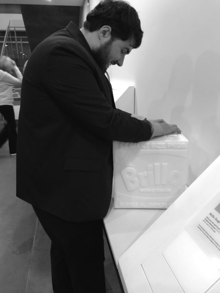
Shown here is a photograph of Sina at the Andy Warhol Museum in Pittsburgh. Sina is a young man with dark hair and a trim beard. He is touching a tactile model of one of Andy Warhol’s famous Brillo Box sculptures. The model is white. It has a raised surface that reproduces the lettering and graphics on Warhol’s sculpture. Sina helped develop this set of models as well an electronic wayfinding system for finding them in the galleries. Photo by Pamela Horn.
The audio component of Cooper Hewitt’s Accessible Exhibition Guide is voiced by Michele Spitz; it was recorded and edited by Cliff Hahn. Michele’s company Woman of Her Word generously provided technical services and vocal talent for the entire exhibition. One of Michele’s passions is audio description for film and video. Audio description, also known as video description or described video, enables an eyes-free experience of moving images by explaining key elements of a scene during natural pauses in the action. Many movie theaters provide visitors a headset and receiver for accessing this additional narration track. Some theatrical productions and conferences provide live AD during performances or lectures. For viewing at home, many film and TV programs have AD tracks that can be switched just like the visible subtitles or captions that transcribe speech.

Michele Spitz is a professional voiceover artist and philanthropist, who has used her vocal talent to create universal access to dozens of feature films, documentaries, performances, children’s programs, and other media that have been experienced by diverse audiences worldwide. Since 2014, she has sponsored and voiced the audio description for select films annually for Superfest: SF International Disability Film Festival; since 2015, she has provided the same annually for ReelAbilities: NY International Disability Film Festival. She has appeared on numerous expert panels devoted to accessible media.
Video caption: Visual Sounds of the Amazon, 2016; Andy Thomas, 2 minutes. Bursts of color, line, shape, and light depict the sounds of birds and insects. The forms and colors moving across the screen appear to be triggered by the sounds.
Michele’s voice provides a delightful audio score unifying The Senses: Design Beyond Vision. In addition to voicing our Accessible Exhibition Guide, Michele provided audio description for a dozen videos appearing throughout the galleries. These include supporting videos that show different products in use, such as the, as well as films and animations presented in our exhibition as works of design in their own right.
These theatrical videos—projected on a large screen in a theater area inside the gallery—are quite abstract. Andy Thomas’s stunning animation Visual Sounds of the Amazon uses state-of-the-art computer graphics to translate the sounds of birds and insects into swirls of color and bursts of pattern and light. For the curators, writing descriptions of these fleeting visual phenomena was a unique—and rewarding—challenge.
For all the videos in The Senses, we chose to make Michele’s descriptions audible to any visitor, rather than segregating her voice on a separate track requiring a separate device. In the theater, each video plays twice: once with description and once without. The act of bringing together people of all abilities for a shared experience is a hallmark of accessible design. At Cooper Hewitt, we believe that exposing all visitors to audio description, descriptive label copy, and braille text highlights the importance of inclusive design, bringing our collective attention to the diversity of human experience and providing everyone with multiple ways to access content. Our current design is a work in progress; it will surely change as we talk with visitors in our galleries. We hope this essay will be valuable to other museum professionals seeking to create accessible design solutions.
Ellen Lupton is the senior curator of contemporary design at Cooper Hewitt, Smithsonian Design Museum, and co-curator of the exhibition The Senses: Design Beyond Vision, on view April 13–October 28, 2018.
One thought on “Cooper Hewitt Takes on Verbal Description”
John on April 15, 2018 at 6:47 pm
Hey, this is really much bigger than anything else so far in my view for the following reasons:
The desegregation, which establishes a common ground -Yay!- rather than separate fields.
Shifting attention away from visual into other senses is truly epic and important at this time, as so many problems -and solutions- are embedded in the field of perception. Shift the field of perception, shift the field of possibilities and solutions.
Wouldn’t it be interesting if it turned out that our world issues have developed as a result of lopsided visual development?