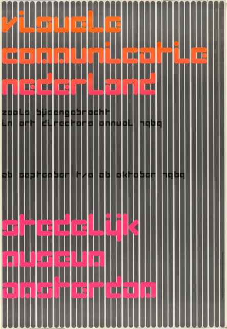
Visuele Communicatie Nederland (Visual Communications in the Netherlands) is one of designer Wim Crouwel’s best posters, created in 1969 for an Art Directors Club Annual exhibition at the Stedelijk Museum, Amsterdam. The Stedelijk Museum has been one of Crouwel's major clients. Trained as a painter at the Minerva Academy in his home town of Groningen, and at the Kunsthijverheids onderwijs in Amsterdam, Crouwel started his professional life working on exhibition design for Bedroeders Enderberg, Amsterdam. He rapidly gravitated to the graphic design field, establishing his own firm in 1954. A turning point in his career came when he met the Swiss trained designers Karl Gerstner, Gerard Ifert, and Ernst Scheidegger, who impressed him with their rationalized design and typography, particularly the sans serif font Akzidenz Grotesk, a forerunner to Helvetica. From the Swiss model, he adopted the practice of the grid as a way of creating visual order: he later acquired from his colleagues the nickname "Gridnik." His big break came in 1956 when Edy de Wilde, then director of the Van Abbemuseum, gave him an initial graphic design commission which resulted in a regular partnership with Crouwel to design all of the museum's printed material. This client/designer relationship continued after de Wilde transferred as director to the Stedelijk Museum in 1963. For Crouwel, de Wilde was an ideal client as he permitted him to experiment with different fonts which he would create for each of his posters. From 1971, Crouwel was also providing graphic materials for the Fodor Museum in Amsterdam.
In the early 60s a series of discussions took place in the Netherlands and England, which included Crouwel and other Dutch designers, about the necessity of creating a multi disciplinary firm in the Netherlands, like those already established in the United States and in England, that could service a variety of commissions including industrial design, interior architecture, graphic design, etc. These dialogues resulted in the creation of the Associatie voor Total Design NV(abbreviated TD),whose members included (other than Crouwel) Friso Kramer, industrial designer; Benno Wissing, graphic and spatial designer; and Paul and Dick Schwarz, covering the business end. The aim of this firm was to develop and execute design ideas in all fields, based on a single vision. Standardization was the key concept, standardization of paper format, restricted choice of typeface (normally sans serif), clear pattern, and close regular spacing of words. This approach easily fit the needs of the corporate world, and clients included the cities of Gronigen and Rotterdam, IBM, many banks all over the Netherlands, as well as cultural institutions. As the partnership in TD began to break up in the late 1960s, Crouwel cut back on his involvement but remained as an advisor, and turned to teaching at the Technical University in Delft, becoming dean of the industrial design department from 1983 to 1985. From 1985 until 1993 he served as director of the Museum Boijmans Van Beuningen in Rotterdam. During this time he also taught at Erasmus University in Rotterdam as associate professor of art and cultural sciences.
It was as a member of TD that Crouwel (working with assistants) designed this poster. This work, like all of Crouwel posters, is based on a grid system (upon close inspection the pre-printed, gridded paper is visible; each line represents 1 cm). The letters of the major text are square, 4.5 x 4.5 cm, while the smaller letters in the subtext are also square, 1.3 x 1.3 cm.
When Crouwel was asked if design was pure problem solving or whether there was also room for personal expression, he responded, "Of course design is about problem solving, but I cannot resist adding something personal. A page should have tension." It is the tension in this work, created by the florescent colors as well as the 3 1 3 spacing of the grey vertical bars, which make this poster unusual and compelling. Also tension-making is the experimental font (all lowercase), which Crouwel developed after considering the technical limitations of the first computer controlled typesetting machines in the early 1960s that only permitted dot matrix printing.

One thought on “Gridnik”
Joel Cahen on June 24, 2016 at 5:35 pm
Great write up but i am almost sure that bedroeders shoul be gebroeders in the first alinea: bravo wim bravo for this site