This blog post was originally published on January 8, 2014. By the 1930s, the vast majority of American urban dwellers had access to electricity in their homes and businesses. But those in impoverished rural areas were often not serviced by private electric companies, who believed that it was not cost-effective for them to invest in...

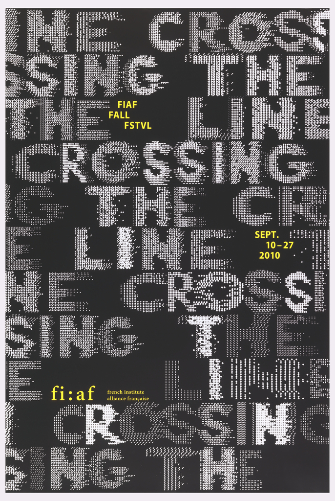
This 2010 poster, designed by the French graphic designer Philippe Apeloig, advertises the annual interdisciplinary fall festival of the French Institute Alliance Française (FIAF) in New York City. Apeloig’s design employs the same fundamental typographic approach that he used in his 2006 poster, Vivo in Typo, whereby he manipulates the spacing of computer-generated punctuation to...
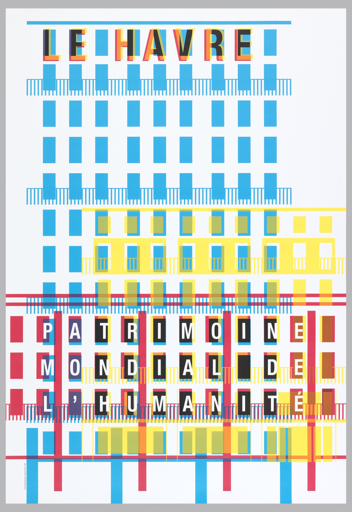
During the second World War, the French city of Le Havre was severely bombed. August Perret, a pioneering French modernist architect, was tasked with rebuilding the city. Perret’s reconstruction is considered exceptional for its seamless integration of the city’s extant historic structures with modern concrete construction and design innovations. Perret’s new buildings for Le Havre...
The Japanese graphic designer Ikko Tanaka is recognized as a pioneer of modern Japanese graphic design. He merged western modernist aesthetics and Japanese tradition to generate a new visual expression for contemporary audiences. Tanaka’s frequent use of geometric forms and a limited color palette is clear evidence of his strong respect for the Bauhaus, the...
A screenprint is produced using a gauzy screen that has been stretched across a rectangular wooden frame. Ink is spread across the top portion of the screen by the printer, who then pulls the ink towards them with a rubber blade commonly known as a squeegee. The pressure forces the ink through the screen and...
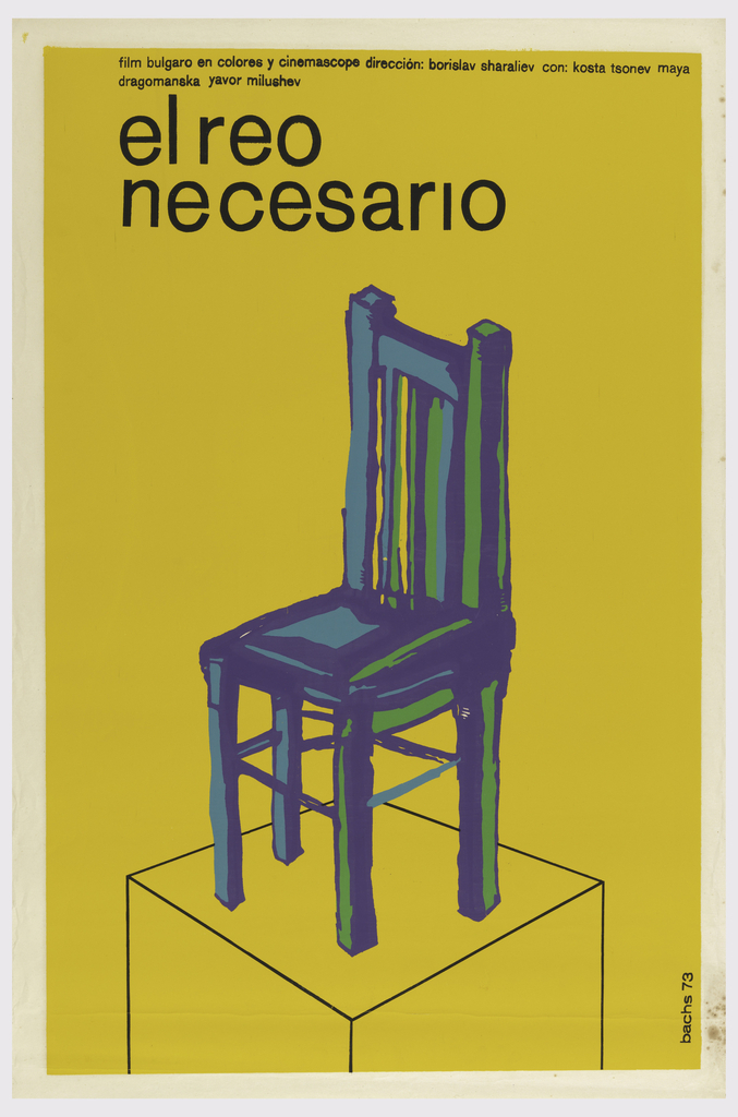
Spanish designer and illustrator Eduardo Muñoz Bachs (1937-2001) first pursued graphic design at the age of 16 without any formal training. As a working professional and animator, Bachs designed an extensive collection of screenprinted film posters for the Cuban Institute of Cinema Art and Industry, an organization centered in distributing advertisements for films made after the...
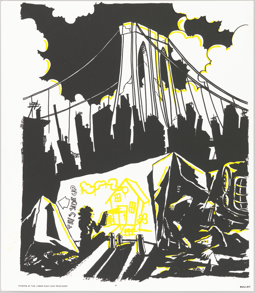
During the 1980s, there was a severe housing crisis in New York City. The building of residential properties had declined during the economic depression of the preceding decade and the limited supply of affordable housing caused a sharp increase in homelessness. In neighbourhoods like the Lower East Side, absentee landlords permitted old buildings to fall...
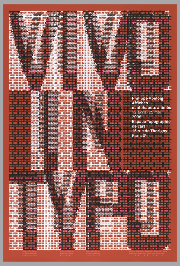
When graphic designer Philippe Apeloig featured his own poster designs at the Espace Topographie de l’art in Paris, he chose the title Vivo in Typo for the exhibition, and decided to make the title the graphic focus of his promotional poster. Apeloig concieved of an image comprised entirely of typography. He began by sketching punctuation marks...
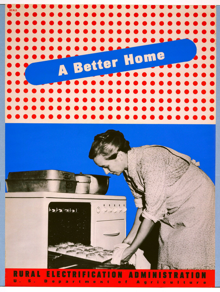
By the 1930s, the vast majority of American urban dwellers had access to electricity in their homes and businesses. But those in impoverished rural areas were often not serviced by private electric companies, who believed that it was not cost-effective for them to invest in extending power lines into areas of the country that would...