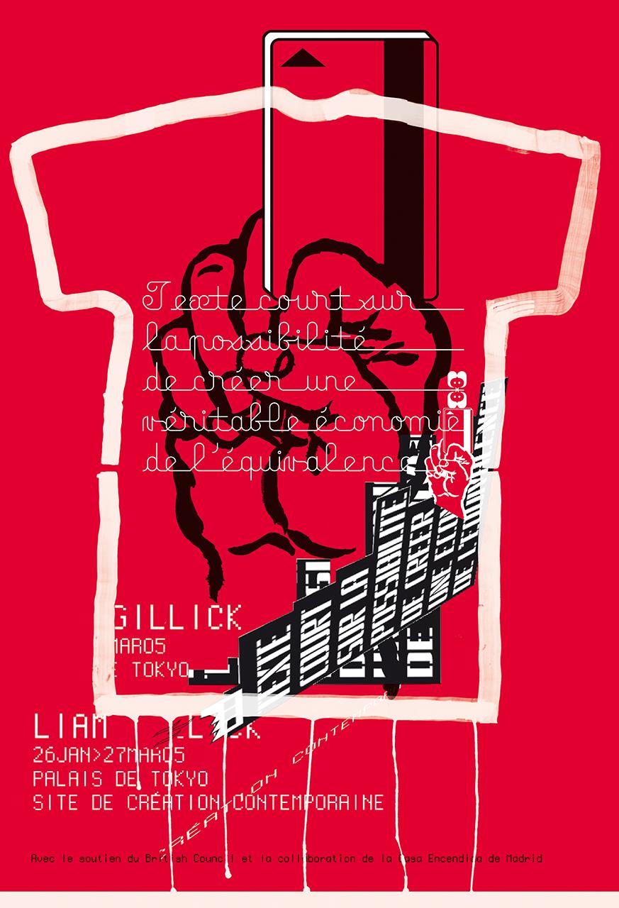
In 2005, artist Liam Gillick was disappointed by the poster originally designed and displayed by Le Palais de Tokyo in Paris on the occasion of his exhibition Texte court sur la possibilité de créer une véritable économie de l’équivalence [Short text on the possibility of creating an equivalence economy]. Gillick personally commissioned M/M (Paris) to...
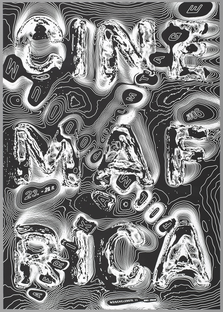
Swiss graphic designer Ralph Schraivogel is known for his astonishing posters for cultural institutions, each one resulting from intensive visual exploration. Schraivogel creates surfaces that boil and undulate with strange energy—in Cinema Afrika (2006), swirling contour lines give rise to colliding texts. from the words “Cinema Afrika” resemble topographic lines on a map. In...
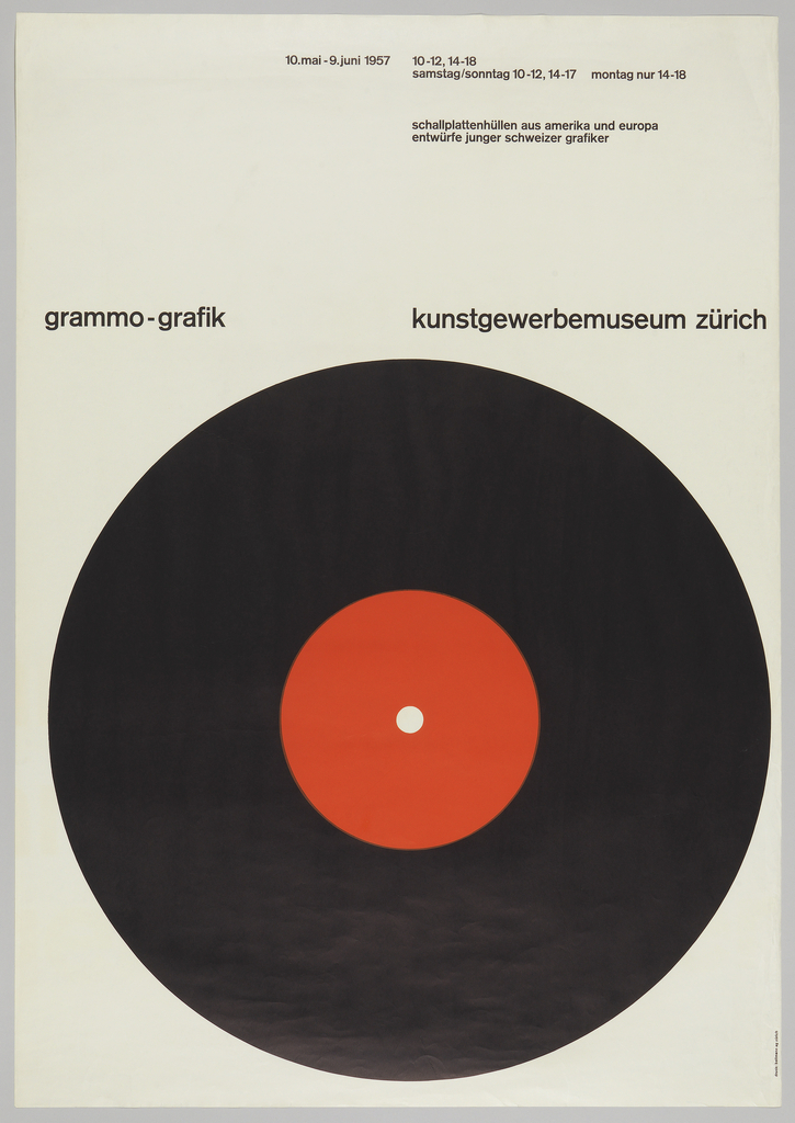
In 1966, Italian designer Bruno Munari poked fun at the commonplace design solution of putting a big circle in the middle of a poster. In his essay “Posters with a Central Image,” Munari wrote, ““The eye is attracted by the dark disc and has no way of escaping.” He may have had this famous poster...
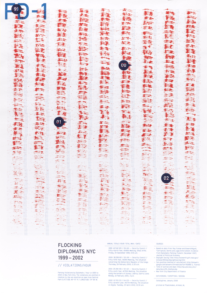
Data visualization is the art and science of creating graphic representations of numerical data. The Flocking Diplomats series consists of multiple visualizations of a rich body of data concerning the parking violations of international diplomats in New York City. This conceptual project employs the poster as a research tool, much as “posters” are used in...
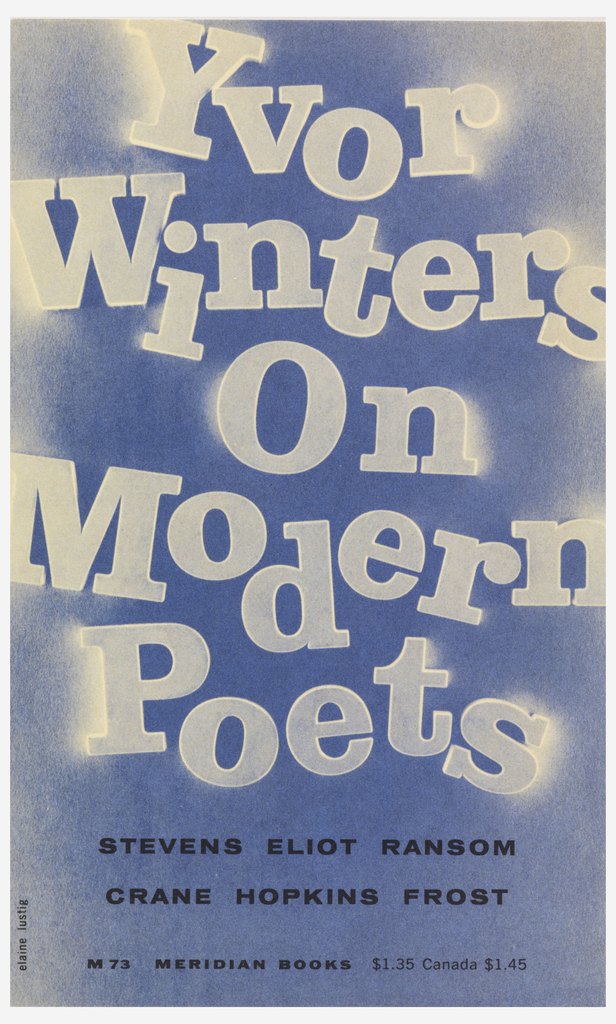
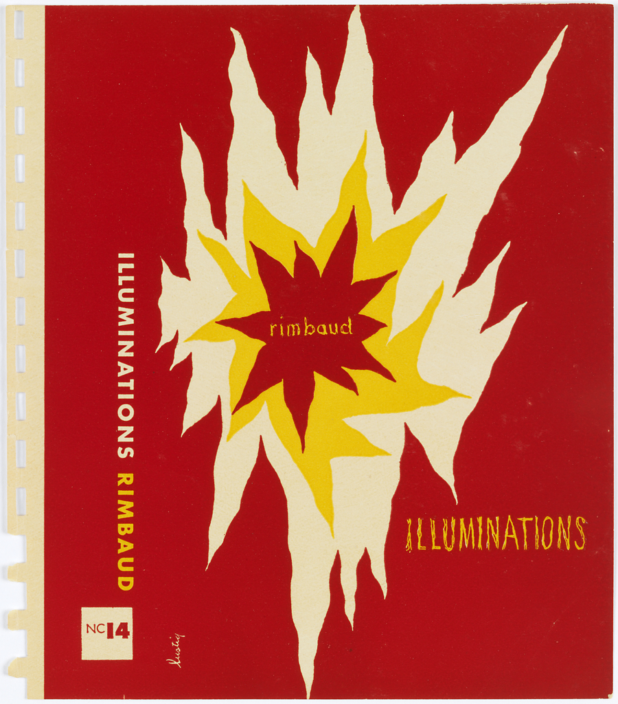
Designer and artist Elaine Lustig Cohen was married to Alvin Lustig from 1948 to 1955. She managed her husband’s studio, serving as a secretary, production assistant, and draftsperson—the “office slave,” as she recalls. As Lustig lost his eyesight to diabetes, he increasingly relied on his wife to execute his concepts. Following Lustig’s death in 1955,...
A book cover must quickly capture a viewer’s attention and provoke curiosity about the content within, contributing an enduring element to the reader’s experience. The covers designed by Alvin Lustig in the 1940s and 1950s employ abstracted iconography and simple typography and lettering to create emotionally compelling representations of a book’s themes. Lustig, who died...
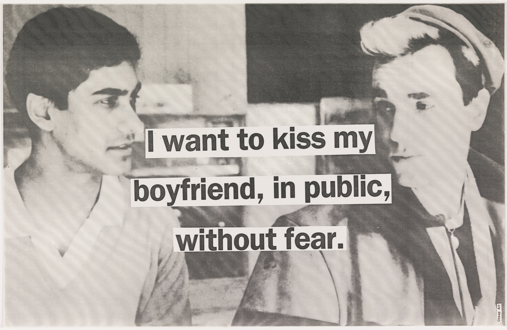
In 1992, Karrie Jacobs and Steven Heller published Angry Graphics, a chronicle of oppositional images created during the presidencies of Ronald Reagan and George H. W. Bush. (An excerpt from Angry Graphics appears in the publication How Posters Work.) These passionate works were born in the heat of that period’s wars, epidemics, and economic upheavals. Jacobs...
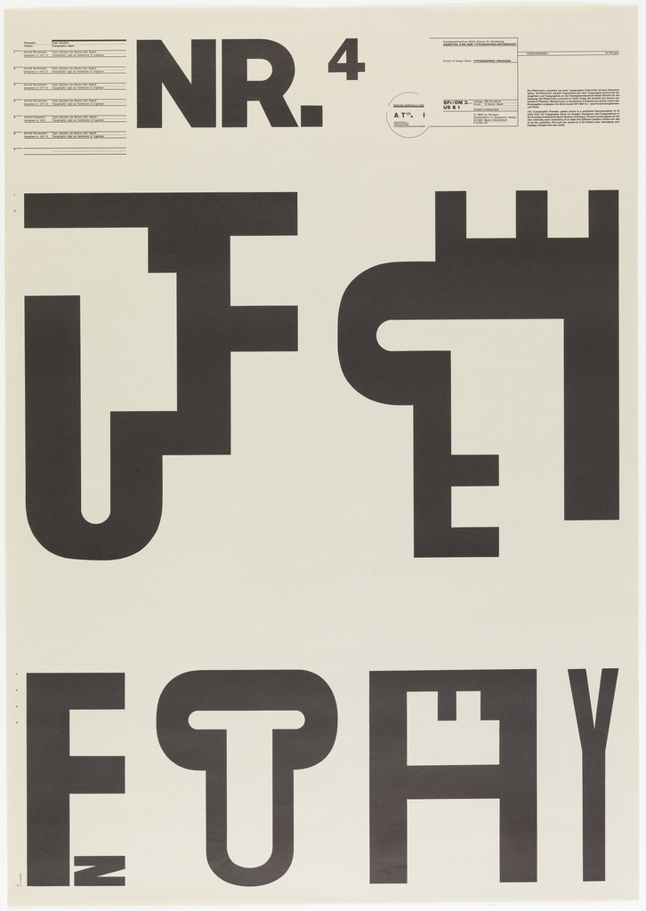
While many works of design explore a blunt, diagrammatic simplicity, others challenge the viewer to fill in the blanks. Inspired by cubist collage, E. McKnight Kauffer created images with fluid boundaries. Wolfgang Weingart turned letters into parts of bodies and parts of other letters, playing with text as both language and not-language. In a series...
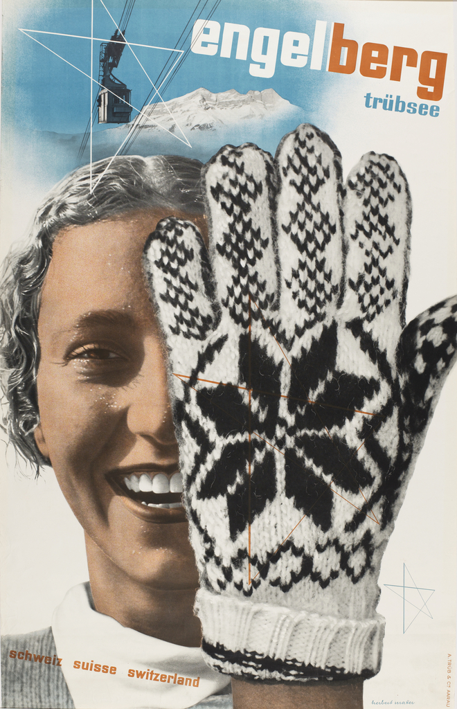
We can feel an image in our bones and muscles. We can also touch it with our skin (almost). The knitted wool glove in Herbert Matter’s Engelberg, Trübsee, Switzerland (1935) is so real we can almost sense it against our skin. Designers speak of “texture” as a basic design element, and yet this quality often...
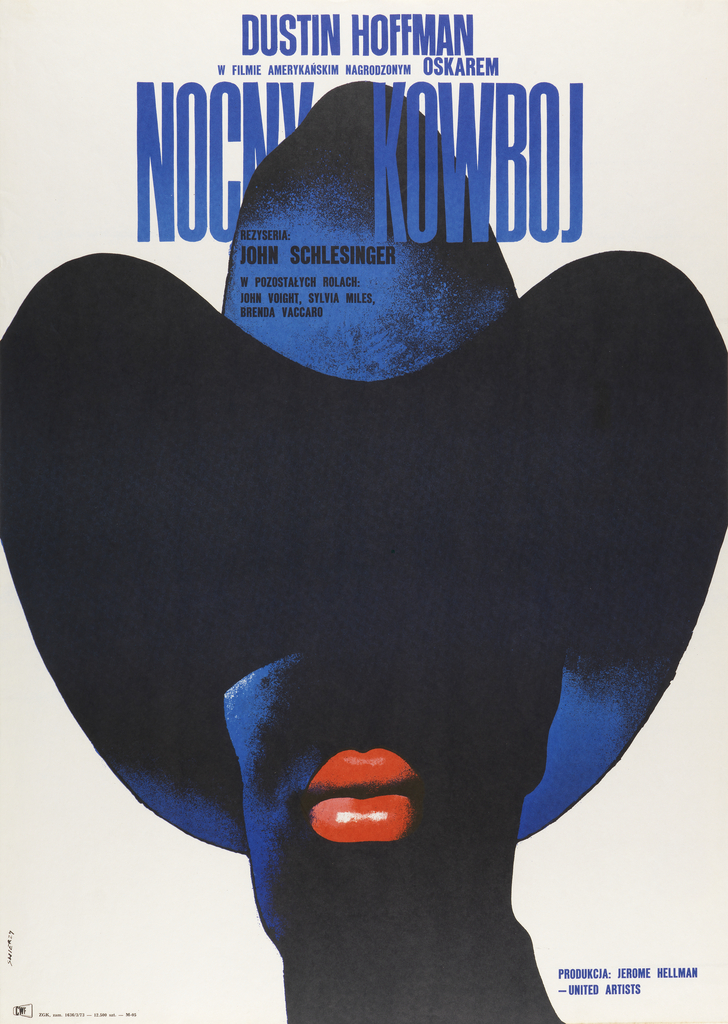
While many film and theater posters entice viewers with direct eye contact and a strong emotional connection, others build tension by denying that basic human satisfaction. The giant brimmed hat featured in Waldemar Swierzy’s 1973 film poster for Midnight Cowboy hides the character’s eyes. The portrait focuses our attention on the man’s full, ripe lips while...
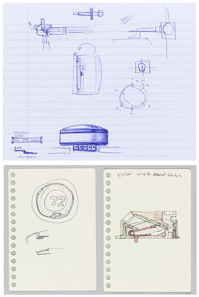
At once casual and precise, these preparatory drawings by Eric Daniels (top) and John Benjamin Filson (bottom) reveal the task of integrating complex components into a unit that sits seamlessly against the wall. The Nest Learning Thermostat brings advanced interaction design to a basic home device. The rotating interface recalls the classic design of Henry...
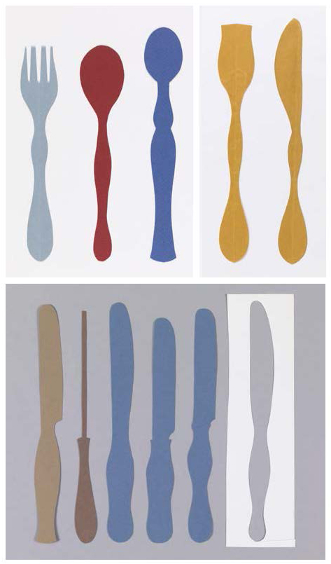
Born in Hungary in 1906, Eva Zeisel endured two world wars and the Soviet revolution. She spent sixteen months in a Russian prison and escaped Nazi persecution before emigrating to the U.S. in 1938. Best known for her ceramics, Zeisel called herself a modernist with a “little m.” She rejected doctrinaire geometries in favor of...
Pioneering industrial designer Henry Dreyfuss believed that products should be fit to people, not the other way around. His 1955 book Designing for People explains his design philosophy to a general audience. Handles, controls, and other points of contact between people and machines should be obvious to use, not artfully hidden away. Below, hear Dreyfuss...
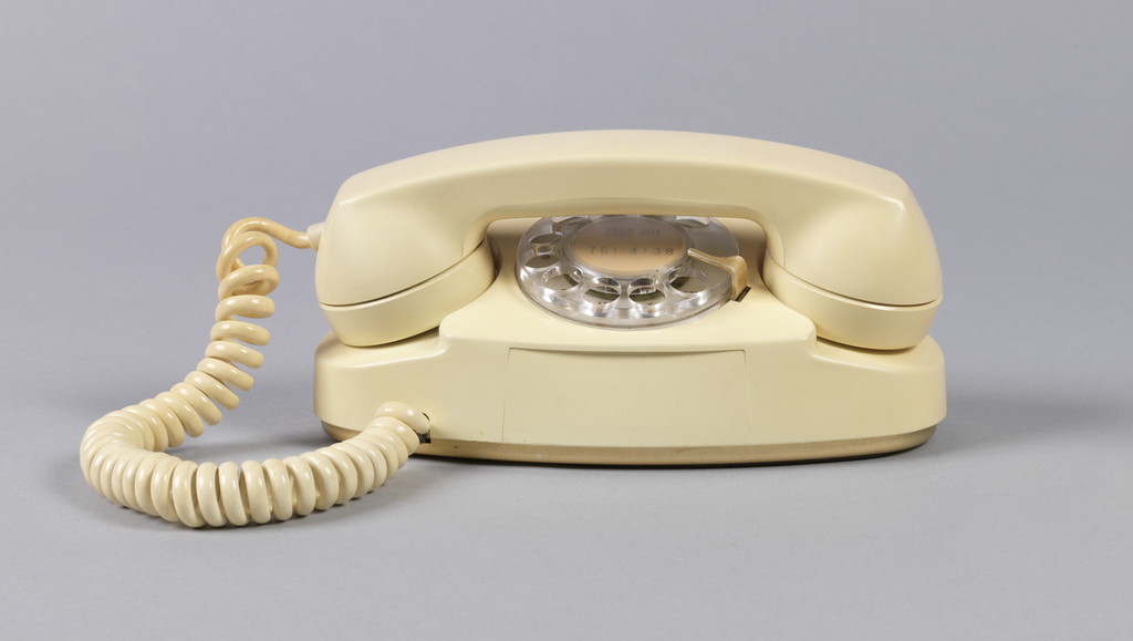
For much of the twentieth century, telephones were standard issue, designed for durability and function rather than consumer appeal. After 1953, color transformed the telephone from a basic technology into an alluring consumer product. AT&T ran ad campaigns encouraging women to see the phone as an element of home decoration. What if new phone models...
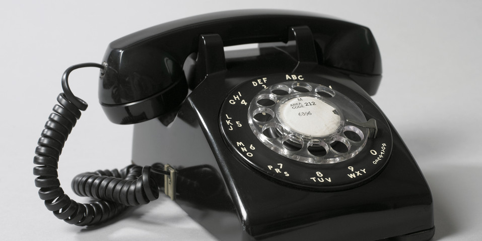
Henry Dreyfuss’s earlier Model 302 was a beautiful sculptural object, but it had usability problems. The triangular profile of the handset caused the device to turn when cradled against the shoulder—the design didn’t account for people’s intuitive desire to talk hands-free. Dreyfuss addressed this issue with the Model 500, introduced in 1949. To create the...
