Written by Dr. Sue Perks
In conjunction with the exhibition Give Me a Sign: The Language of Symbols, designer and researcher Sue Perks offers an expansive look into the Henry Dreyfuss Archive held at Cooper Hewitt. The archive contains detailed documentation on Dreyfuss’s Symbol Sourcebook: An Authoritative Guide to International Graphic Symbols, which serves as the basis for the exhibition.
In publicity material for Symbol Sourcebook: An Authoritative Guide to International Graphic Symbols (published 1972), Henry Dreyfuss (1904–1972) stated, “The skull and crossbones is possibly the most widely recognized symbol. Even if a person cannot read, he is likely to know that this symbol on a container or bottle warns of poison.” But what does the skull and crossbones symbol (Fig. 1) mean to you? Do you associate it with pirates, death, or poison? It served as a memento mori on gravestones in the late medieval period, and it feeds into the childhood narrative for adventure, downplaying the real treachery of piracy where encountering the flag on the high seas really did mean death! The symbol also features on some of the small, cobalt blue, ribbed bottles that contained poison in the 19th century. Warnings on contemporary potentially harmful products appear to have largely abandoned the skull and crossbones and replaced it with a hazard diamond shape containing either an exclamation point or test tubes pouring corrosive liquids onto a hand and log—which is hardly direct (Fig. 2)!
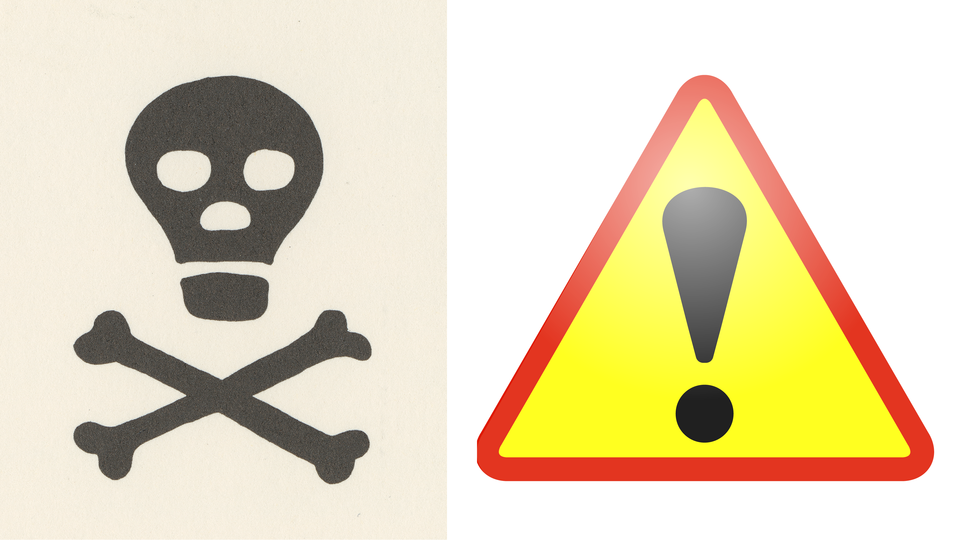
Fig. 1: Poison symbol as featured in the Symbol Sourcebook, 1972; Henry Dreyfuss Archive, Cooper Hewitt, Smithsonian Design Museum; Image © Smithsonian Institution; Fig. 2: Hazard symbol; Public domain
So should the immediacy of the skull and crossbones be revived to indicate that a product is toxic if consumed? Using this symbol as an example, I will demonstrate the depths of inquiry that Dreyfuss and his small team undertook for each of the 3,000 symbols featured in the Symbol Sourcebook to find the most representative symbols for each subject and attribute the right meaning to each one. Dreyfuss sourced many of them from his symbol Data Bank, for which he had been collecting symbols for over two decades, adding to it the wealth of responses he received from the Symbol Questionnaire sent out from 1970 onwards to what amounted to thousands of organizations.
The references to the poison symbol in the Symbol Sourcebook begin in Dreyfuss’s introduction. He explained that we may not recognize the written words for poison in Greek, Japanese, Russian, or Hebrew, but we do recognize the meaning of the skull and crossbones symbol immediately: poison (Fig. 3). Using the index at the back as a guide, if you look up the word “Poisons,” you will find entries on pages 41, 98, and 140 (as well as in the introduction). Page 41 is part of the “Agriculture” section, and the symbols relate to “Fertilizers and Poisons” (Fig. 4). They form some of the many symbols in the book that relate to different professions, not generally understood by the layperson. Page 98 falls in the “Handling of Goods” discipline section (Fig. 5). It forms part of the group of symbols warning of explosives, radioactivity, and inflammable and combustible substances, all appearing within a rhomboid warning shape. The Poison symbol contains the skull and crossbones and the word “Poison” beneath it. On Page 140, in the “Safety” section, the skull and crossbones appears on its own, as an equivalent for a warning triangle with a drinking glass/basket and what looks like a snake (or fumes) rising from it (Fig. 6). This is not immediately understandable!
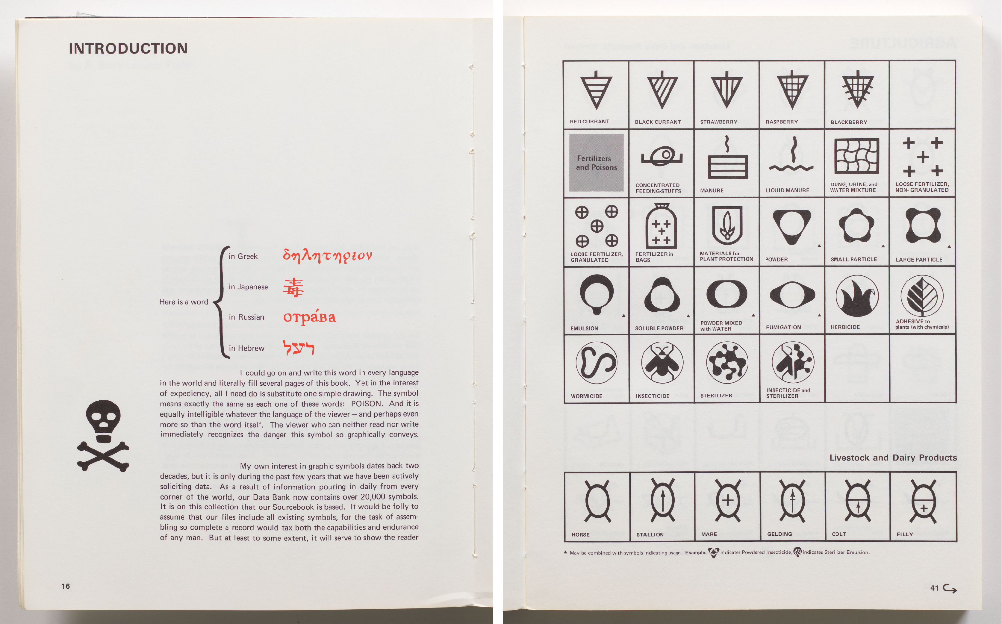
Fig. 3: Introduction, Symbol Sourcebook, 1972; Henry Dreyfuss Archive, Cooper Hewitt, Smithsonian Design Museum; Image © Smithsonian Institution; Fig. 4: Agriculture: Fertilizers and Poisons Section, Symbol Sourcebook, 1972; Henry Dreyfuss Archive, Cooper Hewitt, Smithsonian Design Museum; Image © Smithsonian Institution
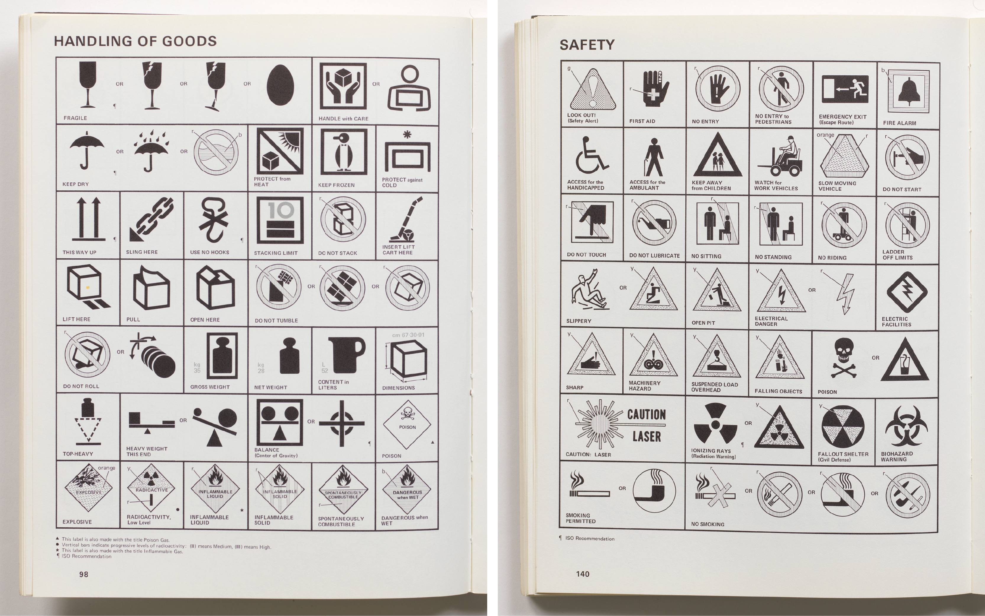
Fig. 5: Handling of Goods Section, Symbol Sourcebook, 1972; Henry Dreyfuss Archive, Cooper Hewitt, Smithsonian Design Museum; Image © Smithsonian Institution; Fig. 6: Safety Section, Symbol Sourcebook, 1972; Henry Dreyfuss Archive, Cooper Hewitt, Smithsonian Design Museum; Image © Smithsonian Institution
Dreyfuss emphasized the importance of context on Page 142, at the end of the “Safety” section, in the filler section “Before ABC’s”: “The importance of symbols in context was never more clearly shown than when we ran a specially designed test at a nursery school. A drawing of the skull and crossbones was displayed to a group of three-year-olds. ‘PIRATES!’ they screamed. But when I drew the outline of a bottle around the symbol, they immediately shouted ‘POISON!’” (Fig. 7)
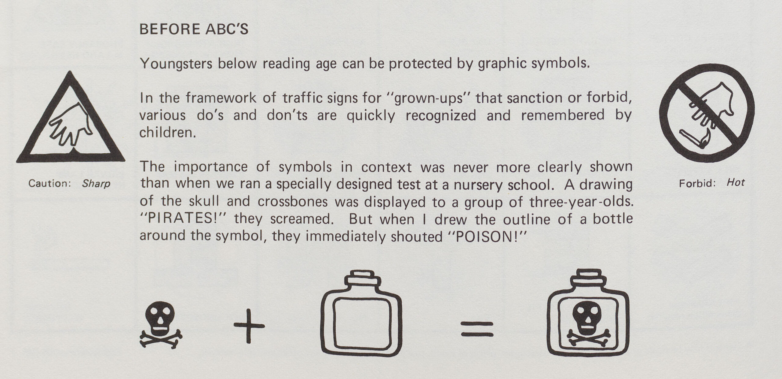
Fig. 7: “Before ABC’s”, Symbol Sourcebook, 1972; Henry Dreyfuss Archive, Cooper Hewitt, Smithsonian Design Museum; Image © Smithsonian Institution
The “Graphic Form” section tells us that the triangular symbol, when used to contain a second symbol, means warning (Fig. 8); on its own, it has a variety of other meanings (in the “Mathematics” and “Geography” Discipline sections, for instance). This section also features the skull and crossbones under the “Human” category. The rhombus has various meanings ranging from priority to warning. When it comes to color, the rhombus has no clear color connotation, but yellow warns for danger when seen in a triangular form.
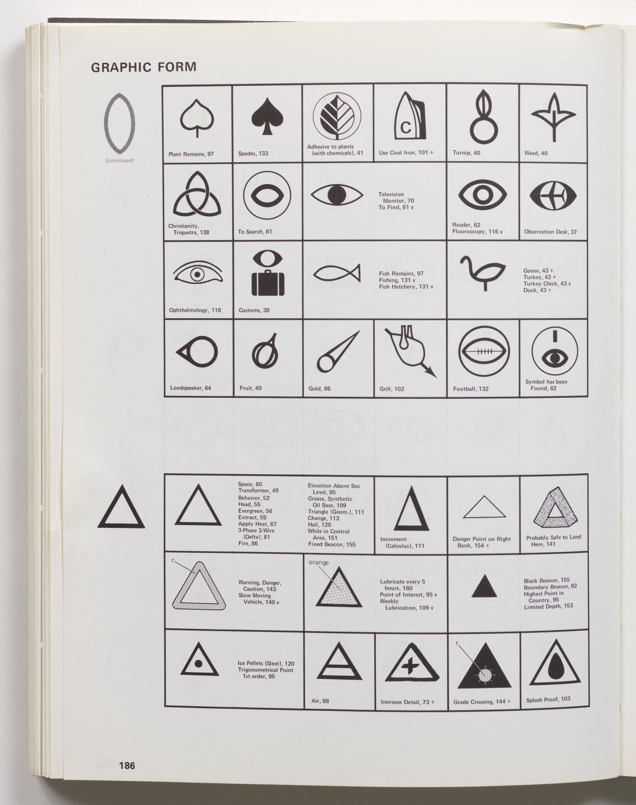
Fig. 8: Triangle Symbols in the Graphic Form Section, Symbol Sourcebook, 1972; Henry Dreyfuss Archive, Cooper Hewitt, Smithsonian Design Museum; Image © Smithsonian Institution
The Henry Dreyfuss Archive contains several references to the skull and crossbones symbol and shows the depth of research and current knowledge that Dreyfuss and his small team put into their work, which continued after the book was published in January 1972. The first one is a newspaper clipping from the New York Times in June 1972 that warned: “Poison Symbol Said to Draw Children” (Fig. 9). The Institute of Education Research studies in Pittsburgh, Pennsylvania, and Fort Lauderdale, Florida, claimed that children between two and five years of age associate poison with the skull and crossbones sign flown from pirate ships in colonial times, which they say was consistently shown in red. Betty Bachman of the Pittsburgh Children’s hospital stated, “Colors in the red-orange group are particularly attractive to kids.” The problem of mis-association was also compounded by confusion with the official emblem of the Pittsburgh Pirates. In response to this muddle, the hospital distributed self-adhesive green labels portraying a “Mr. Yuk,” an ugly character whose tongue hangs out, developed by the Institute of Education Research in the East (Fig. 10). (The labels are still available today and are very similar to emojis.)
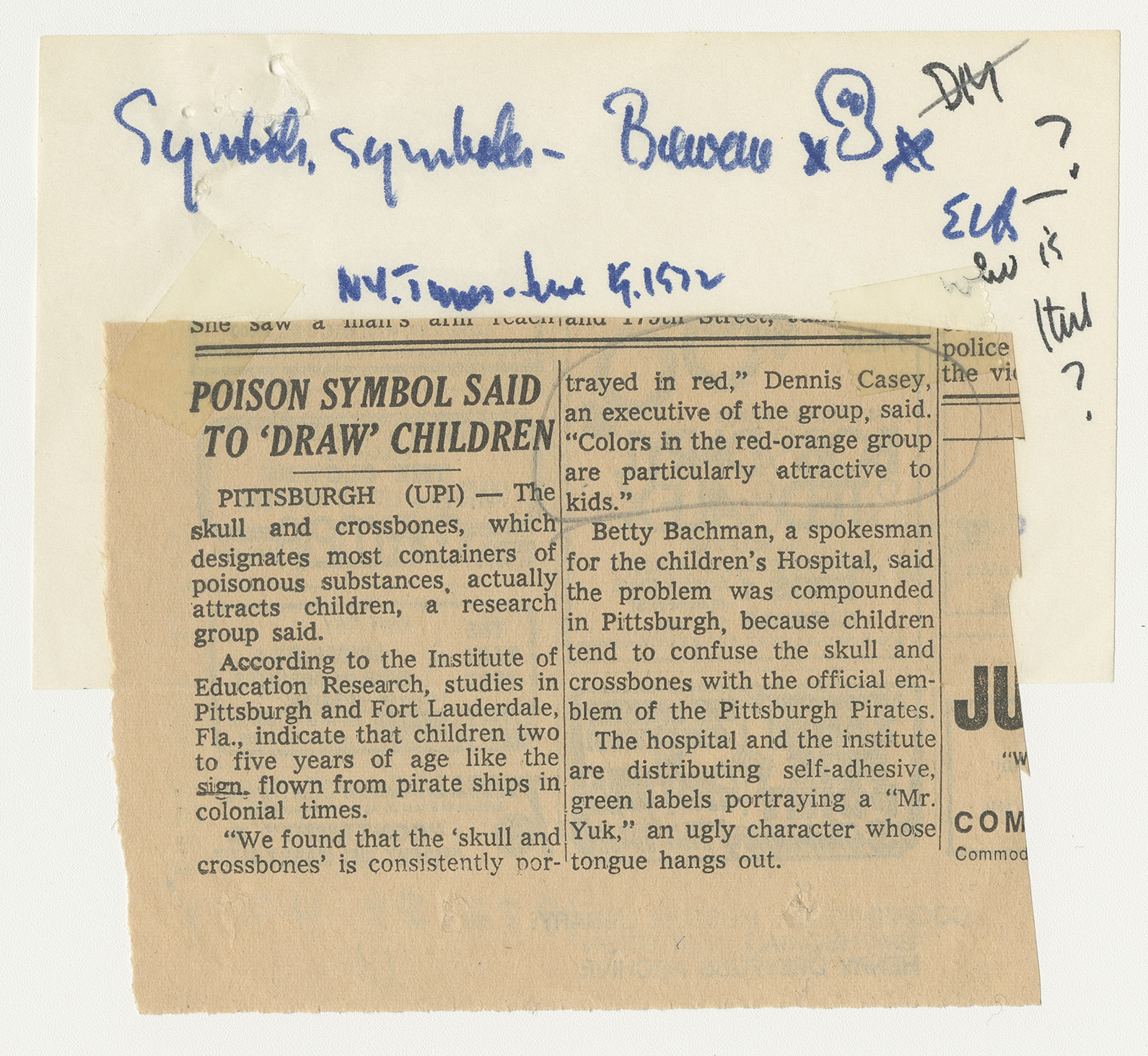
Fig. 9: Newspaper Clipping, “Poison Symbol Said to ‘Draw’ Children,” New York Times, June 1972; Henry Dreyfuss Archive, Cooper Hewitt, Smithsonian Design Museum; Image © Smithsonian Institution
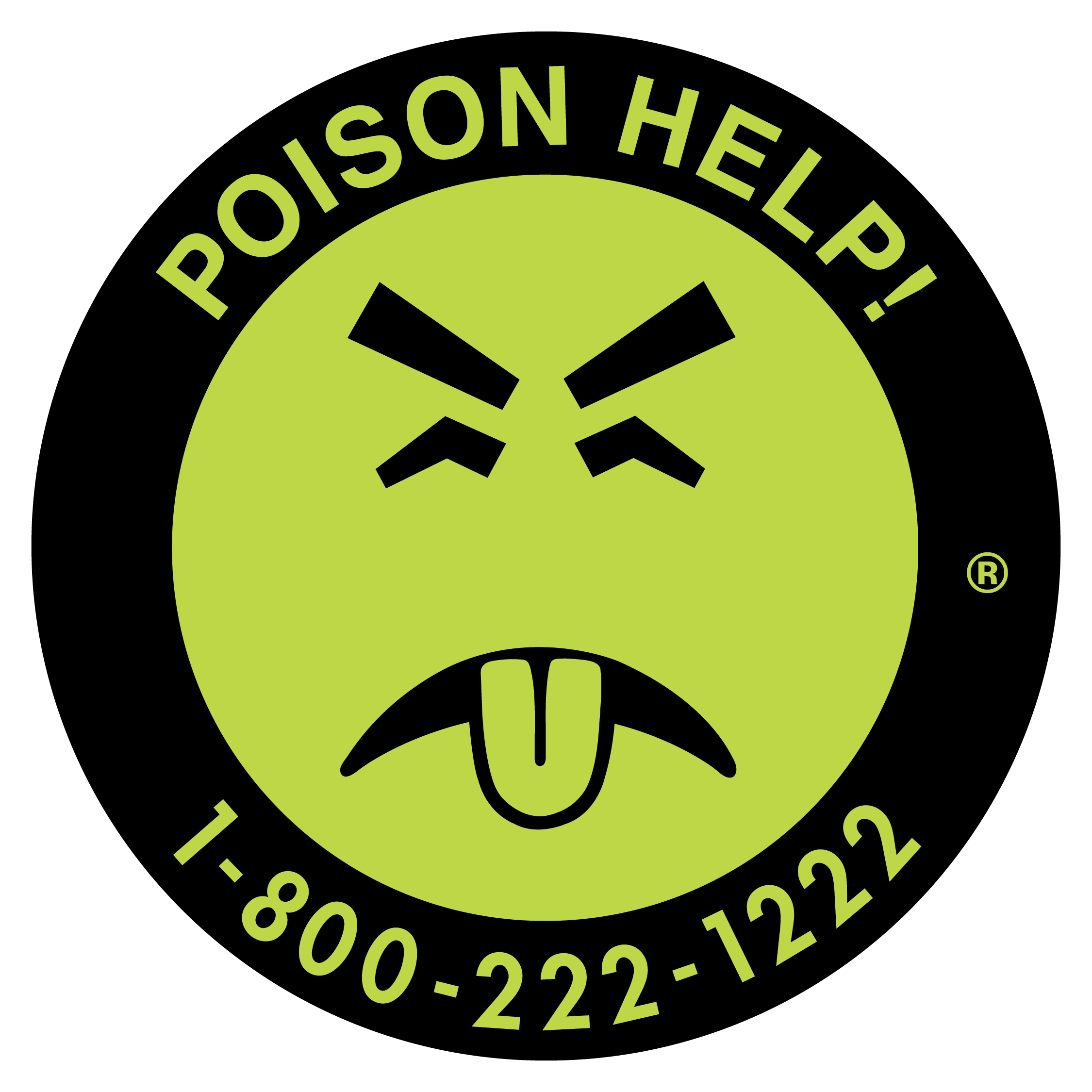
Fig. 10: Mr. Yuk; Courtesy of the Pittsburgh Poison Center of UPMC
On August 16, 1972, Charles R. Gisler, graphic designer to United States Jaycees (or the United States Junior Chamber, a US movement founded in 1920 whose aim was to develop personal and leadership skills in young people through service to others) wrote to the symbol Data Bank asking for advice on how he should go about designing a “poison control” program for young children ages one to six. The new “seal” would need to be “psychologically repelling” to young children, and it would be applied to poison containers in the home. Gisler wanted advice on shape, color, and symbols that would be “unattractive” to young children in efforts to achieve the best possible symbol recognizable as signifying poison; he considered it vital that children learn about it as early as possible.
On August 31, 1972, Dreyfuss replied to Gisler and discussed his distaste for the “new and ugly symbol” for poison (Mr. Yuk) when the skull and crossbones was “pretty much universally accepted.” He stated that if a new symbol were developed strictly for small children, they would have to relearn another symbol later. Dreyfuss referred Gisler to his “Pirates or Poison” anecdote on page 142 of the Symbol Sourcebook (which he uses on several occasions in the publicity interviews for the book launch during 1972). He considered “attractiveness” much less important in a symbol than immediacy and believed that having children learn at an early age what the skull and crossbones means is vital. To further cement his case, Dreyfuss stated that the Weekly Reader, an American Education Press publication widely distributed to elementary school children, showed the poison symbol in its March 8, 1972, edition in one of two issues on symbols, and he enclosed a copy of Betsy McCall’s Symbol Game from the September 1972 issue of McCall’s magazine (Fig. 11).
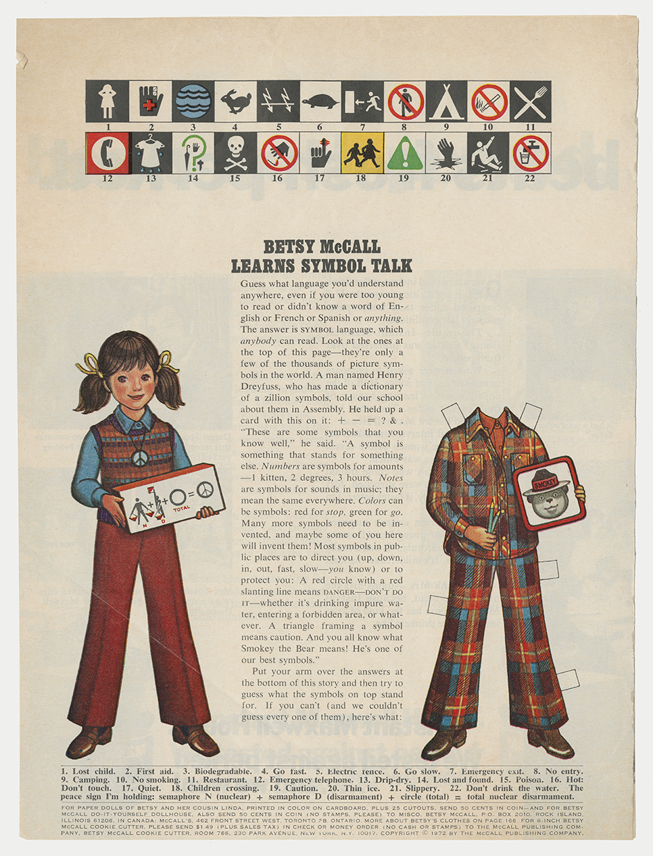
Fig. 11: “Betsy McCall Learns Symbol Talk,” McCall’s, September 1972; Henry Dreyfuss Archive, Cooper Hewitt, Smithsonian Design Museum; Image © Smithsonian Institution
Dreyfuss stated, “I think symbols are a kind of shorthand, they shoot ideas directly into your brain.” This is certainly the case with the skull and crossbones symbol—but context really is everything!
Dr. Sue Perks is a designer, archival researcher, and writer on Isotype, museum design, and Henry Dreyfuss’s work with symbols. She was awarded a PhD from University of Reading in 2013. She regularly presents at international design conferences and co-founded The Symbol Group in 2022.
The exhibition Give Me a Sign: The Language of Symbols is on display at Cooper Hewitt through September 2, 2024.
Acknowledgments
Some funding contributed by the Design History Society Research Publication Grant.
![]()