Broadside: A single sheet of paper printed on one side only. For centuries, broadsides were a popular ephemeral format for distributing news, announcements, advertisements, or commentary in the form of ballads.
Between 1966 and 1975, Broadside Press in Detroit, Michigan published 81 books and dozens of poetry broadsides written and designed by Black writers and artists. The founder of this independent press was poet and librarian Dudley Randall (1914–2000). In the process of publishing Black poetry for Black audiences, Randall collaborated with Detroit artists and became a designer and art director himself. He made decisions about format, paper, typography, color, and cover design that turned his books and broadsides into visual and tactile experiences. He said, “I, in my spare time and in my spare bedroom, do all the work, from sweeping floors, washing windows, licking stamps and envelopes, and packing books, to reading manuscripts, writing ads, and planning and designing books.”[1] Cooper Hewitt is researching key works from Broadside Press that reflect the importance of graphic design to Randall’s publishing process.
Randall founded Broadside Press when a musician adapted his poem “Ballad for Birmingham” as lyrics for a folk song. To protect his copyright, Randall published his poem as a broadside—a single-sheet print—containing the text of the poem and copyright credit. He immediately saw that broadsides could become a medium for distributing poetry. While his first edition of “Ballad for Birmingham” had a plain, functional design, Randall worked with Detroit artist Shirley Woodson to create a second version, illustrated with Woodson’s drawing of mourners. The new edition was folded rather than flat, with the image on the front and the poem inside, like a greeting card or a book with just one spread.
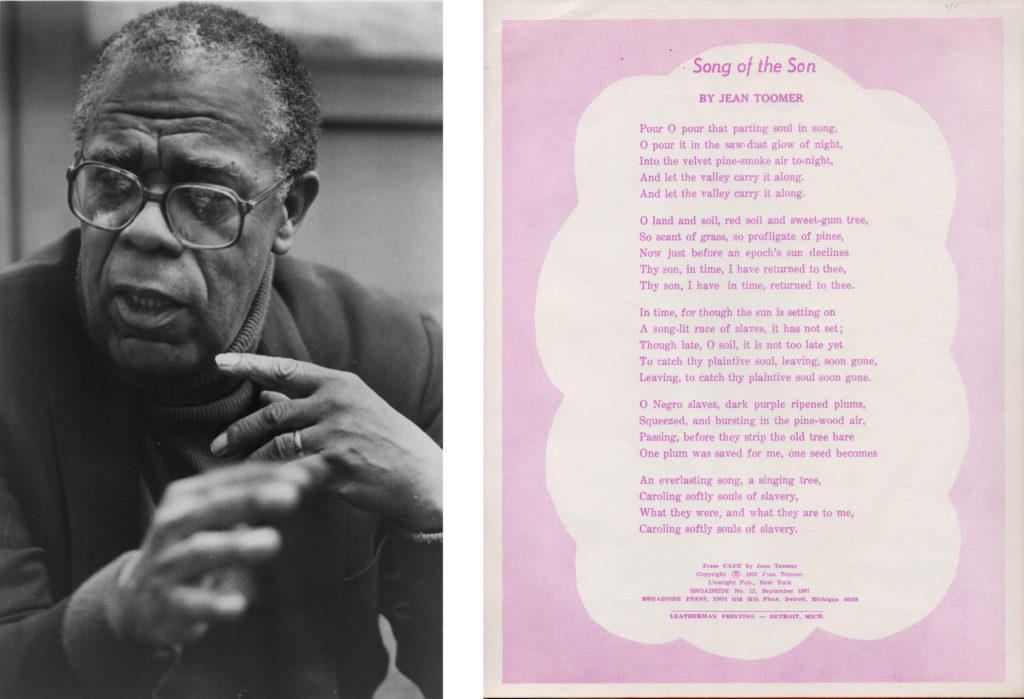
Dudley Randall, photograph by Andrew Sacks. | Broadside; Song of the Son by Jean Toomer; Published by Broadside Press, Detroit, Michigan, 1967; Designer unknown; Offset lithograph, 11 x 8.5 inches.
Randall’s broadsides were everyday art. They could be tacked to a wall for daily inspiration or carried around in a person’s wallet: “I noticed how people would carry tattered clippings of their favorite poems in their billfolds, and I thought it would be a good idea to publish them in an attractive form as broadsides.” Randall started out by reprinting poems by well-known Black writers, including Harlem Renaissance poet Jean Toomer (1894–1967). Printed in lavender ink, Toomer’s poem “Song of the Son” describes slaves harvesting plums from a tree; one plum is saved for the future, becoming the seed of an everlasting song. The soft frame around the poem was cut from a sheet of halftone film to create a paler shade of purple. The printer may have worked with Randall to create this effect; no design credit is given.
To add to his series of broadsides, Randall reached out to poet, author, and teacher, Gwendolyn Brooks (1917–2000), the first Black woman to receive a Pulitzer Prize and someone he knew and admired. Broadside Press transformed Brooks’ poem “We Real Cool” from traditional literary typesetting into a bold work of graphic art. White letters, hand-drawn by Detroit artist Cledie Taylor, resemble text written on a chalkboard or graffiti scrawled on an urban wall.[3] When Brooks saw her work presented in this unique format intended for Black audiences, she decided to abandon her mainstream publisher (Harper) and pursue Broadside’s fresh way of reaching people.
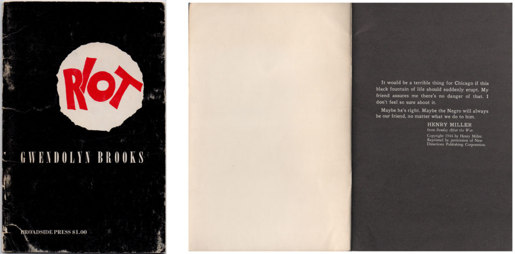
Chapbook, Riot by Gwendolyn Brooks; Published by Broadside Press, Detroit, Michigan, 1970, second printing; copyright 1969; Cover designed by Cledie Taylor; Frontispiece by Jeff Donaldson; Offset lithograph, 5.5 x 8.5 inches (closed).
Broadside Press published Riot with Brooks in 1969. The designer was Cledie Taylor, the same artist who lettered “We Real Cool.” On the cover, the title is hand-lettered in red, framed by a rough white spotlight against a black background. The first page of the book—printed on a black background with white text—features an epigraph by Henry Miller about white fears of racial unrest. Brooks dedicated Riot to Dudley Randall, “a giant of our time.”
Riot was part of a series of Broadside Press books featuring new work by emerging and established poets. Stapled together at the center, books in this format are called chapbooks or pamphlets. Chapbooks have a long tradition in independent publishing, from fine press editions to photocopied zines. Although chapbooks are low cost to manufacture, Randall heightened their impact with thick paper, carefully considered typography, and separately printed covers. The cover price of one dollar made the books affordable. Randall worked closely with Harlo Press, a printer in Detroit, to execute his designs. Harlo Press typeset the poems in hot metal (probably Linotype), provided a set of galleys to Broadside Press for correction, and then printed and bound the books. Some of the earlier books are printed in hot metal while others are offset lithographs.
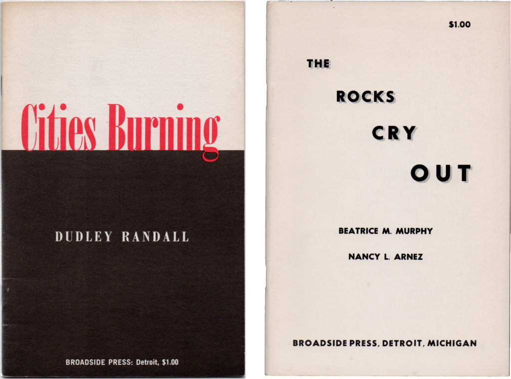
Chapbook, Cities Burning by Dudley Randall; Published by Broadside Press, Detroit, Michigan, 1968, first edition, first printing; Designer unknown (with Dudley Randall); Cover: offset lithograph; interior: letterpress, 8.5 x 5.5 inches (closed). | Chapbook, The Rocks Cry Out by Beatrice M. Murphy and Nancy L. Arnez; Published by Broadside Press, Detroit, Michigan, 1969; Designer unknown (with Dudley Randall); Cover: offset lithograph; interior: letterpress, 8.5 x 5.5 inches (closed).
Some Broadside covers were designed solely with typeset type, standing alone without illustrations or hand lettering. These were likely designed by Dudley Randall himself. Cooper Hewitt spoke with Melba Joyce Boyd, Randall’s literary biographer. Boyd worked as an editor at Broadside Press from 1972 to 1976. She is a poet, filmmaker, and distinguished professor in African American Studies at Wayne State University. She told Cooper Hewitt, “Dudley felt that the book itself was art. And so he was very sensitive to the presentation. During this time, a lot of people were making their own books just with a mimeograph. And he did not want that. He wanted a professionally produced text.”[4] He developed a long, collaborative bond with Harlo Press. On the cover of Cities Burning (1968), the red title blazes against a white sky, perched on a field of darkness. According to Boyd, Randall would have designed this cover himself, with advice from his longtime friends and collaborators Cledie Taylor and Shirley Woodson and Harlo’s production artists.
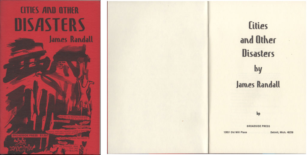
Chapbook, Cities and Other Disasters by James Randall; Published by Broadside Press, Detroit, Michigan, 1973, first edition, first printing; Cover designed by Cledie Taylor; Offset lithograph, 8.5 x 5.5 inches (closed).
Cledie Taylor’s covers for Broadside Press include Cities and Other Disasters (1973), a book of poems by Dudley Randall’s nephew, James Randall. The cover combines an ink wash drawing with collaged type elements, printed on thick red paper. The title is set in Précis Slim, a typeface designed by Arthur L. Rawn. The same font was used for an early version of the Star Wars logo to celebrate high-tech space battles.[5] Here, the tall, vertical strokes and surprising angles of Précis Slim are used to suggest cities in motion.
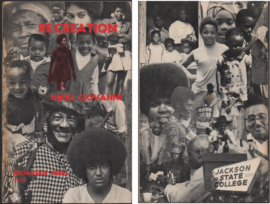
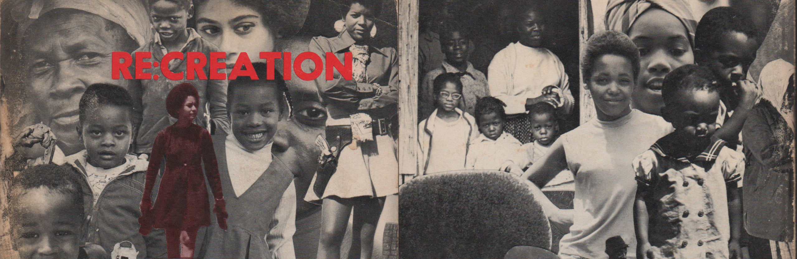
Chapbook, Re:Creation by Nikki Giovanni; Published by Broadside Press, Detroit, Michigan, 1970, first edition, first printing; Cover photos: Chester Higgins, Jr.; designed by Ray Prather, Jr.; Offset lithograph, 8.5 x 5.5 inches (closed).
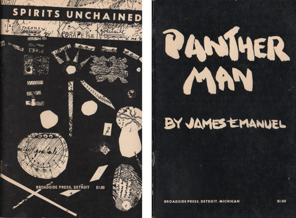
Chapbook, Spirits Unchained by Keorapetse Kgositsile; Published by Broadside Press, Detroit, Michigan, 1969, first edition, first printing; Cover designed by Bruce Heath; Cover: offset lithograph; interior: 8.5 x 5.5 inches (closed). | Chapbook, Panther Man by James Emanuel; Published by Broadside Press, Detroit, Michigan, 1970, first edition, first printing; Designer unknown; Cover: offset lithograph; interior: letterpress; Dimensions: 5.5 x 8.5 inches (closed).
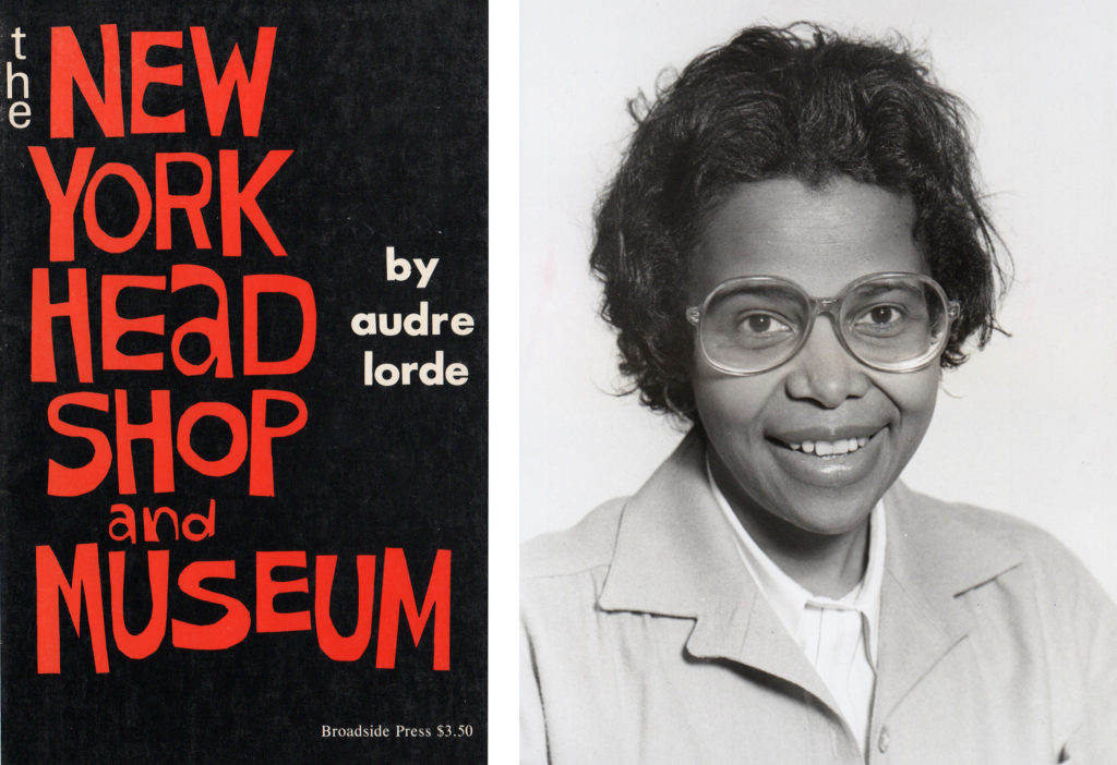
Chapbook, The New York Head Shop and Museum by Audre Lorde; Published by Broadside Press, Detroit, Michigan, 1974, first edition, second printing; Cover designed by Shirley Woodson; Offset lithography, 8.5 x 5.5 inches (closed) | Photograph of Shirley Woodson Reid, Detroit Free Press, 1979.
Many Broadside Press covers feature photographs, drawings, or handlettering. A striking photomontage by designer Ray Prather, Jr. and photographer Chester Higgins, Jr. appears on the cover of Re:Creation (1970) by Nikki Giovanni (b. 1943). Bruce Heath’s graphics for Spirits Unchained (1969), by the exiled South African poet Keorapetse Kgositsile (1938–2018), recall African symbols and writing systems. Shirley Woodson created beautiful lettering and cover typography for The New York Headshop and Museum (1974), a book by Audre Lorde (1934–1992) that marked the growing role of feminists in the Black literary scene (and a higher cover price of $3.50).
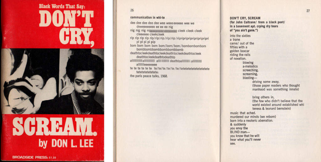
Chapbook, Don’t Cry, Scream by Don L. Lee; Published by Broadside Press, Detroit, Michigan, 1971, seventh printing, copyright 1969; Cover designed by Art McFallan; Offset lithograph, 8.5 x 5.5 inches (closed).
Broadside Press’s best selling author was poet Don. L. Lee (b. 1942). By 1974, the press had produced 100,000 copies of books by Lee (20 percent of Broadside’s total output).[6] The cover design for his book Don’t Cry, Scream (1969) has a more mass-market aesthetic than Broadside’s other publications. The forceful title typography is set in tightly spaced Egyptienne Bold Condensed. Such letterforms were familiar from popular novels and the logo of Playboy Magazine, not the refined world of poetry. On the copyright page, Lee thanks “Art McFallan for the ‘together’ cover.” Inside the book, many of the poems use repeated letterforms and staggered indents to bring sound and movement to the page. Lee established his own publishing house, Third World Press, in 1967, modeled directly on Broadside Press.[7] Working with Randall’s printer, Harlo Press, Lee would drive to Detroit to pick up boxes of books and bring them back to Chicago.[8] He also tapped some of the same designers, including Shirley Woodson. Lee changed his name to Haki R. Madhubuti in 1974.
Broadside Press is an important chapter in design history. Kinohi Nishikawa, associate professor of English and African American studies at Princeton University, is writing a new book, Black Paratext: Reading African American Literature by Design. Nishikawa spoke to Cooper Hewitt about his research: “Randall turned to local artists to help him create an aesthetic for Broadside Press. It started off as a functional enterprise. He just wanted to secure copyright for ‘Ballad of Birmingham.’ He very quickly realized that ornament, paper quality, format, and illustration could help create something magical and something lasting.”[9] Dudley Randall sought to share poetry with Black readers, who were ignored by the white-dominated publishing establishment. Beginning from a utilitarian view of printing as a means to an end, Randall fell in love with print’s tactile beauty and its ability to put poetry into people’s hands.
VISUAL ARTISTS AND DESIGNERS REFERENCED IN THIS ARTICLE
Bruce Heath, biography unknown
Chester Higgins, Jr. (b. 1946) was a staff photographer at the New York Times for over forty years. His work, which focused on people of African descent, has appeared in magazines including Look, Life, Time, Newsweek, and Ebony, as well as on the cover of Re:Creation, published by Broadside Press in 1970.
Art McFallan, biography unknown
Ray Prather, Jr. illustrated many children’s books, including Time-Ago Lost: More Tales of Jahdu (1973). He attended The Cooper Union in New York City and was a designer at Look magazine. He designed the cover of Re:Creation for Broadside Press in 1970.
Dudley Randall (1914–2000) was a poet, librarian, publisher, and book designer. He founded Broadside Press in 1965, which inspired the founding of other independent Black publishing enterprises, including Third World Press. Broadside Press was an important force in the Black Arts Movement of the 1960s and 70s.
Cledie Taylor (b. 1926) is an artist, art collector, gallerist, and educator working in Detroit, Michigan. She designed several book covers and broadsides for Broadside Press in the 1960s. Her broadside for Gwendolyn Brooks’ poem “We Real Cool” is held in the Library of Congress and other collections.
Shirley Woodson (b. 1936) is a painter and educator working in Detroit, Michigan. She designed book covers and broadsides for Broadside Press and Third World Press in the 1960s and 70s. She was a consultant for the Whitney Museum’s 1971 exhibition Contemporary Black Artists in America. She was named the 2021 Kresge Eminent Artist, an honor bestowed on artists contributing to their art form and to the cultural life of Detroit.
[1] Quoted in Melba Joyce Boyd, Wrestling with the Muse: Dudley Randall and the Broadside Press (New York: Columbia University Press, 2003), 230.
[2] Quoted in Boyd, 133.
[3] James D. Sullivan, On the Walls and On the Streets: American Poetry Broadsides from the 1960s (Urbana & Chicago: University of Illinois Press, 1997).
[4] Interview, Melba Joyce Boyd and Ellen Lupton, January, 2021.
[5] Typeface researched by Charles Nix, Monotype.
[6] Boyd, Wrestling with the Muse, p3.
[7] Haki R. Madhubuti, “A New Music Screaming the Sun: Haki R. Madhubuti and the Nationalization/Internationalization of Chicago’s BAM,” interview by Lasana D. Kazembe, Chicago Review.
[8] Boyd, interview.
[9] Interview, Kinohi Nishikawa and Ellen Lupton, February 5, 2021.
5 thoughts on “Broadside Press and Black Graphic Design”
Melba Joyce Boyd on March 2, 2021 at 11:30 am
Dear Ellen:
Thanks for bringing Randall’s work forward. Appreciate the details and the effort you put into this piece.
Melba Joyce Boyd
Martina Oliver on March 7, 2021 at 11:03 am
This is my first time learning about Mr. Randall. I’m new to the arts, so thank you for introducing his work and his efforts to the masses!
Camille Ann Brewer on February 23, 2023 at 3:10 pm
It’s great to see Shirley Woodson-Reid’s work featured in this article!
Elizabeth Youngblood on March 21, 2023 at 9:57 am
Ellen, it’s wonderful to see this work inserted into the archives at the Cooper Hewitt along with specific names and the contributions made. Although I’ve known the work of both Shirley Woodson and Cledie Taylor for decades and am a formally trained graphic designer, your article shed new light on Woodson, Taylor as well as some design history. Thank you!
Ray Stevenson on May 20, 2024 at 10:47 am
Love this!!