TRIBUTE
Author: Ellen Lupton, Senior curator of contemporary Design
Wim Crouwel (Dutch, 1928–2019) was a giant figure in the history of graphic design. This tall, elegant man produced an astonishing body of work that is at once functional and experimental, objective and personal. His contribution has special importance for museums. A pioneer of graphic identity, he defined—and blasted open—the possibilities of visual communication within the unique setting of the art museum. He started his career in 1952 as an exhibition designer and soon began working with the Vanabbe Museum in Eindhoven, where he used grids and consistent typefaces to unify the institution’s publications and posters while illuminating a rich roster of content. As design director of the Stedlijk Museum in Amsterdam from 1963 through 1985, he used modern design to amplify the institution and interpret its content. He was director of Museum Boijmans van Beuningen in Rotterdam from 1985 to 1993.
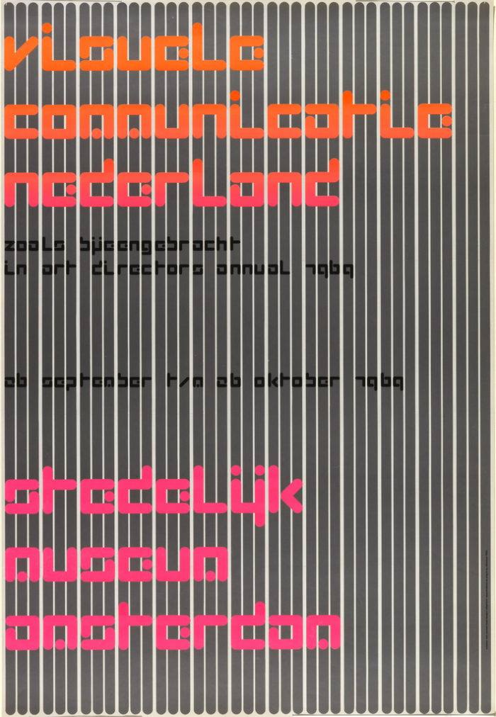
Known as “Mr. Gridnik,” Crouwel embraced the grid as a tool for generating flexible systems and unexpected forms. He loved structure, and he sought to create letters, layouts, publications, and identity systems driven by an internal logic. He used the grid not to suppress creativity or enforce homogeneity but to release the creative mind of the designer with a tool existing outside the individual hand and mind. This viewpoint connected him with the conceptual and constructive art movements of his time as well as with the work of Josef Müller-Brockmann, Max Bill, and other Swiss modernists, whose books and ideas were crucial inspirations. Many of Crouwel’s museum posters are purely typographic, using text and letterforms to interpret a theme or subject. In Crouwel’s 1969 poster Visuele Communicatie Nederland (Visual Communications in the Netherlands), simplified letters are shaped by a vertical grid consisting of wide modules and narrow gaps. This abstract poster reflects Crouwel’s fascination with creating typefaces for low-resolution computer systems and his lifelong interest in generative design methodologies.
In addition to working in the cultural realm, Crouwel was an influential corporate designer. He cofounded the Amsterdam-based company Total Design in 1963, which became an international voice in multidisciplinary design for business. Asked by Design Culture magazine if the results of design should always be useful, he said, “This is wishful thinking. In reality, design is often not useful at all.” He believed in the innate value of human creativity and the freedom to think and make.
OBJECT OF THE DAY
Author: Gail Davidson
Originally published November 26, 2013

Poster, “Visuele Communicatie Nederland, Stedelijk Museum Amsterdam”, 1969. Wim Crouwel. Museum purchase from General Acquisitions Endowment Fund. 2009-13-1.
Visuele Communicatie Nederland (Visual Communications in the Netherlands) is one of designer Wim Crouwel’s best posters, created in 1969 for an Art Directors Club Annual exhibition at the Stedelijk Museum, Amsterdam. The Stedelijk Museum has been one of Crouwel’s major clients. Trained as a painter at the Minerva Academy in his home town of Groningen, and at the Kunsthijverheids onderwijs in Amsterdam, Crouwel started his professional life working on exhibition design for Bedroeders Enderberg, Amsterdam. He rapidly gravitated to the graphic design field, establishing his own firm in 1954. A turning point in his career came when he met the Swiss trained designers Karl Gerstner, Gerard Ifert, and Ernst Scheidegger, who impressed him with their rationalized design and typography, particularly the sans serif font Akzidenz Grotesk, a forerunner to Helvetica. From the Swiss model, he adopted the practice of the grid as a way of creating visual order: he later acquired from his colleagues the nickname “Gridnik.” His big break came in 1956 when Edy de Wilde, then director of the Van Abbemuseum, gave him an initial graphic design commission which resulted in a regular partnership with Crouwel to design all of the museum’s printed material. This client/designer relationship continued after de Wilde transferred as director to the Stedelijk Museum in 1963. For Crouwel, de Wilde was an ideal client as he permitted him to experiment with different fonts which he would create for each of his posters. From 1971, Crouwel was also providing graphic materials for the Fodor Museum in Amsterdam.
In the early 60s a series of discussions took place in the Netherlands and England, which included Crouwel and other Dutch designers, about the necessity of creating a multi disciplinary firm in the Netherlands, like those already established in the United States and in England, that could service a variety of commissions including industrial design, interior architecture, graphic design, etc. These dialogues resulted in the creation of the Associatie voor Total Design NV(abbreviated TD),whose members included (other than Crouwel) Friso Kramer, industrial designer; Benno Wissing, graphic and spatial designer; and Paul and Dick Schwarz, covering the business end. The aim of this firm was to develop and execute design ideas in all fields, based on a single vision. Standardization was the key concept, standardization of paper format, restricted choice of typeface (normally sans serif), clear pattern, and close regular spacing of words. This approach easily fit the needs of the corporate world, and clients included the cities of Gronigen and Rotterdam, IBM, many banks all over the Netherlands, as well as cultural institutions. As the partnership in TD began to break up in the late 1960s, Crouwel cut back on his involvement but remained as an advisor, and turned to teaching at the Technical University in Delft, becoming dean of the industrial design department from 1983 to 1985. From 1985 until 1993 he served as director of the Museum Boijmans Van Beuningen in Rotterdam. During this time he also taught at Erasmus University in Rotterdam as associate professor of art and cultural sciences.
It was as a member of TD that Crouwel (working with assistants) designed this poster. This work, like all of Crouwel posters, is based on a grid system (upon close inspection the pre-printed, gridded paper is visible; each line represents 1 cm). The letters of the major text are square, 4.5 x 4.5 cm, while the smaller letters in the subtext are also square, 1.3 x 1.3 cm.
When Crouwel was asked if design was pure problem solving or whether there was also room for personal expression, he responded, “Of course design is about problem solving, but I cannot resist adding something personal. A page should have tension.” It is the tension in this work, created by the florescent colors as well as the 3 1 3 spacing of the grey vertical bars, which make this poster unusual and compelling. Also tension-making is the experimental font (all lowercase), which Crouwel developed after considering the technical limitations of the first computer controlled typesetting machines in the early 1960s that only permitted dot matrix printing.
Poster Designed in Tribute to Wim Crouwel
Designer: Philippe Apeloig for London Design Museum

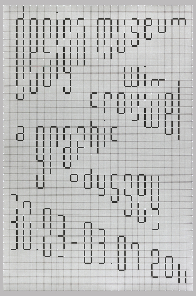
Poster, Wim Crouwel a graphic odyssey, 2011; Designed by Philippe Apeloig (French, b. 1962); France; screenprint on coated paper; 95 x 63.5 cm (37 3/8 in. x 25 in.); Gift of Philippe Apeloig; 2013-16-5
This poster was designed in conjunction with the 2011 exhibition Wim Crouwel: A Graphic Odyssey at the Design Museum, London, England. Philippe Apeloig, along with six other graphic design studios, was commissioned to produce a poster that employed the grid structure Crouwel devised for his now iconic Stedelijk Museum posters.
Apeloig drew from his experience as an intern in the 1980s at Crouwel’s firm, Total Design, to design the poster. He utilizes the framework of the grid itself and a simple color palette to create the text. Both the grid and reduced color palette are a tribute to Crouwel’s signature graphic design style. For this poster, Apeloig uses the grid to create text that appears to glide playfully all over the page, with black text punctuated by white dots emphasizing the diagonal pull of each word against the strict axis of the grid.
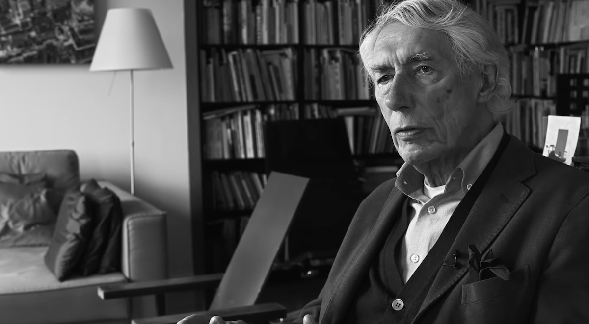
Lead photo: Courtesy Type Directors Club
