The marriage between art and music has always been a richly fabled romance. In the modern era, graphic designers have had a particular knack for fusing these two mediums by imbibing their personal passion for music into their work. Consider for instance Reid Miles typographic album covers for the jazz label Blue Note in the 1950s or Wes Wilson’s psychedelic concert posters for Bill Graham presents in the 1960s. Each designer’s individual taste helped signify the way we see music.
Swiss graphic designer Niklaus Troxler’s first love was jazz. Since the mid 1960s he has produced concerts in his hometown of Willisau. In 1975 he founded the Jazz in Willisau Festival. Since then, Troxler has created close to 100 posters for each show, with a style that is unique and singular to each event, ever fluid and often challenging, like jazz itself. In a 2007 New York Times interview, Troxler described his influences. “I never wanted to look like a typical Swiss graphic designer. My influences come more from Pop Art, different art styles and of course, the music. I always wanted to get sound into my posters, and also movement and rhythm.”
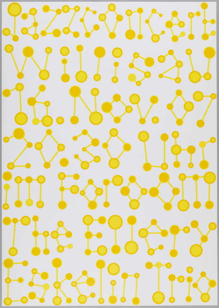
The notion of movement and sound is absolutely apparent in this poster from 2007. To advertise the Ellery Eskelin Trio, Troxler accentuates the corner of each letter with a yellow circle. At first glance this calls to mind an almost crude molecular structure, however with each fuzzed out bip and bop, we begin to hear and see the keys of Eskelin’s chief instrument – the saxophone. The notes pulse and reverberate down the instrument, playing a song while cryptically telling us the message of where to be.
Troxler’s ability to draw the abstract values of music is remarkable throughout his cannon of posters for the Willisau festival. His design’s use of measured space— crescendos and pauses as well as spontaneous line and repetition are truly sensed beyond the visual. His work, whether abstract or literal, reminds us how elemental the relationship between art and music can be.
