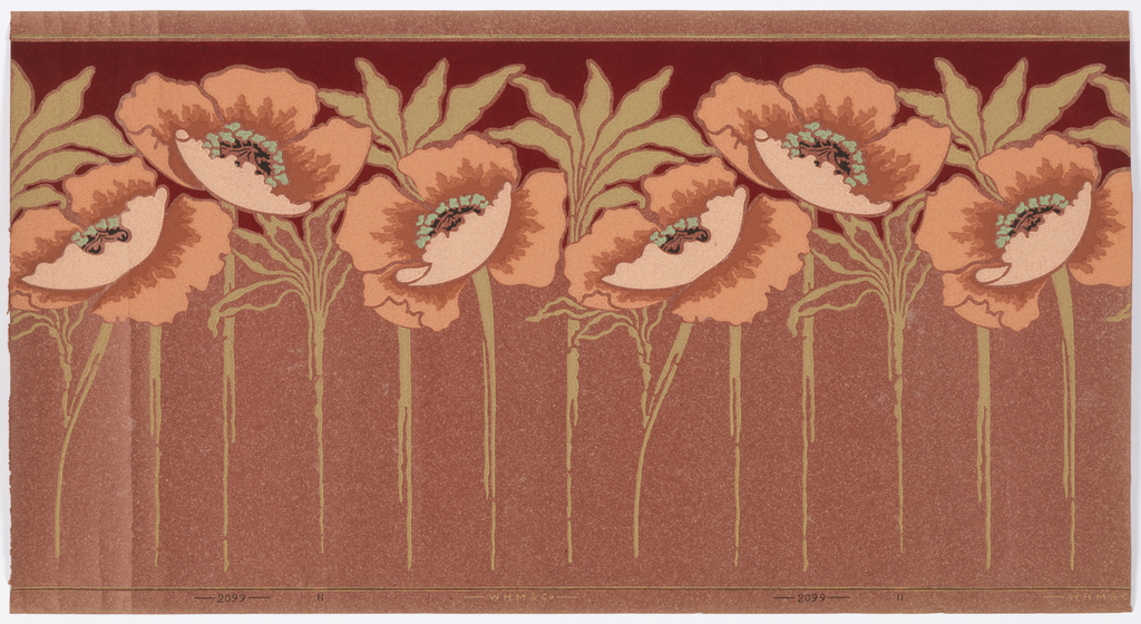
The simplistic styling of the poppies frieze shows the effect of the Mission Style on the American interior. Gone are the embossed surfaces, metallic pigments, scrolling medallions, and other excesses of the Victorian period. The floral motifs have been reduced to their most basic elements while still appearing to have some depth. Traditionally a block-printed design would use about 6 colors to shade each given element, while here the entire design is printed in 7. This is printed on a red ingrain paper meaning the paper is colored in the pulp stage and does not need the application of a ground color. The red background is the actual color of the paper. This paper also has small bits of wood or sawdust added to the pulp and is frequently referred to as an oatmeal paper. Wide friezes were normally hung at the top of the wall below the crown or picture molding. The wall surface below the frieze was usually covered with a coordinating sidewall paper, either a solid color or a tone-on-tone design. The ceiling color was usually dropped down to the top of the frieze. The use of ingrain wallpapers was quite popular in the early years of the 20th century. The slightly irregular or mottled surface of the paper created a much more pleasing wall surface than paint could afford, and was much desired. The major drawback to ingrain papers was that they were prone to fading and it was said that if you hung pictures or had furniture placed against the wall, after a while it was not possible to move them without leaving a silhouette in their place.
Tombstone
Frieze. Manufactured by William H. Mairs & Co. Brooklyn, New York, 1905-15. Machine-printed on ingrain paper. Gift of Victorian Collectibles.
Collection Record
