When it was introduced to London in the 19th century, the first underground railway was revolutionary. Able to provide quick, uninterrupted travel for commuters and easy access to the bustling city from the suburbs, the London Underground promised a better, more efficient future. It would take some convincing, however, to get the general public to hop onboard. People were understandably skeptical of the new technological marvel—after all, the idea of loud, smoky locomotives navigating the dank, dark circuitry of London’s underbelly wasn’t particularly appetizing. In fact, the public was so unwilling to experience this new form of transport that the Underground Group faced bankruptcy at the beginning of the 20th century due to lack of ridership. In order to dispel any doubts about the safety and comfort of the new subway system, the general manager of the Underground, 30-year-old Frank Pick, turned to poster design to get the message across.
The first posters commissioned by Pick touted the convenience, pleasure, and affordability of traveling underground. Aesthetically, these initial posters were largely in line with other advertisements of the time. In addition to featuring an assortment of possible Underground passengers, these posters sought to add glamor to London Transport by illustrating the numerous scenic destinations accessible through mass transit.
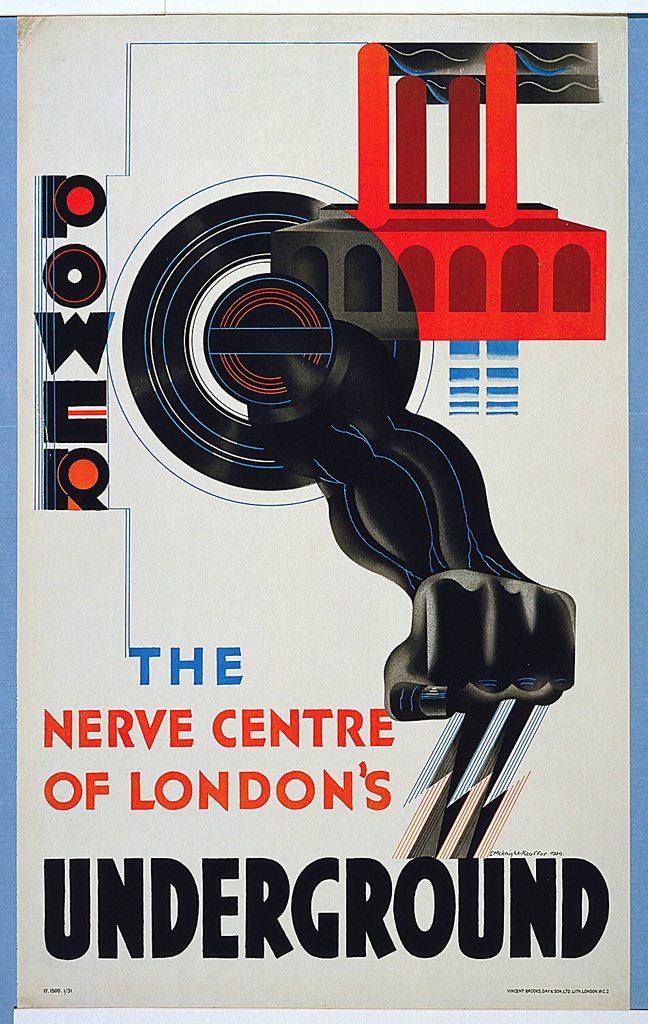
As the century progressed, however, Pick became more adventurous in his choices for poster designers. As the public became accustomed to traveling underground, new posters were commissioned to advertise not only the Underground’s accessibility, but its modernity. This 1930 poster, Power—The Nerve Center of London’s Underground, designed by the esteemed E. McKnight Kauffer, is a stunning example. Taking cues from other Modernist graphic designers, Kauffer communicates the speed and might of London’s Underground with bold, modern typefaces and dynamic illustrations.
With their stunning aesthetic qualities and avant-garde sensibilities, the Underground posters produced during the early to mid-20th century were unusual in that they blurred the line between advertising and art. In addition to graphic designers like Kauffer, Pick commissioned artists such as Man Ray, Lázsló Moholy-Nagy, and Graham Sutherland to produce posters that added beauty and prestige to the Underground brand. Pick’s preference for simple yet aesthetically thrilling designs set a high standard for transit advertising—something that The London Underground has endeavored to continue to this day.
Today is the anniversary of The London Underground, established January 10, 1863.