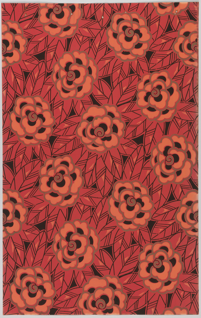
These two designs were among the samples removed from a wallpaper sample book produced by the Grantil Company in 1928. While each of these patterns is boldly styled and colored in itself, they were designed to be used in tandem. A number of samples contained in this book had applied lithographed illustrations showing the manufacturer’s suggestions for using these papers to best effect, which often included the combination of multiple papers on a single wall.
While today’s sensibilities do not readily allow for the use of multiple patterns in a room, historically, few wallpapers were designed to be used alone. From early times, wallpapers were designed to coordinate with other papers and would almost always be used with a border. Depending on the fashion of the period, wallpapers could also coordinate with a dado paper below the chair rail, borders above the chair rail and at the top of the wall, or panel moldings that separated the wall into geometric divisions. Through the 1950s, it was also popular to paper the ceiling, throwing yet another pattern into the mix. Using a single pattern in a room, or papering just one wall, is a late 20th century notion.
When using these two papers in a room, one paper would necessarily dominate—this would be determined by the use of the room. Illustrations show the striped paper running about two-thirds the way up the wall to a height of about six feet. The floral paper would then run from the top of the striped design up to the ceiling, with the two papers separated by a wood or paper molding. Both designs are printed in the same color scheme of black and metallic gold on a reddish-pink ground, and both designs contain the scrolling floral motif, which creates a nice harmony between the two. The floral paper contains an additional salmon color. Neither paper contains colors or motifs that clash with one another, so their use in concert creates a very vibrant energy. The rigidity of the striped pattern plays against the flow and fullness of the floral motif.
