On Friday, September 3, 2010, Cooper-Hewitt opened “Recent Acquisitions: Digital Typography,” an installation of five graphic works exploring the evolution of post-modern type design, organized by curator Gail Davidson. In this series of blog posts, Ellen Lupton continues the conversation with brief commentary on contemporary digital typefaces.
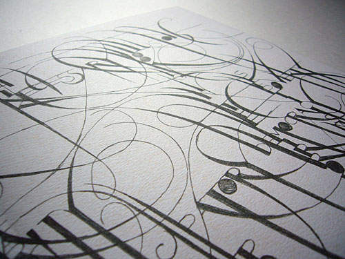
One of the pieces featured in Cooper-Hewitt’s “Digital Typography” installation is a booklet published by Fox River paper company in 2006, showcasing the masterful lettering designs of Marian Bantjes, a designer living off the coast of Vancouver. Bantjes rendered the text shown above by hand, allowing the structural elements of the letterforms to extend and intertwine, creating complex connections among words. While a typeface consists of standardized, repeatable elements, this lettering design relies on one-of-a-kind forms customized to a particular text.
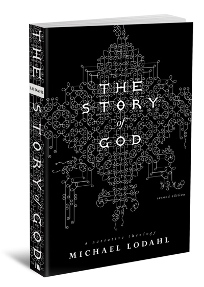
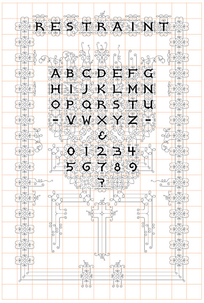
Bantjes has since tried her hand at typeface design. In 2007 she released the Restraint, a typeface that translates her sinuous style into modular units. Restraint features a set of ornamental uppercase letters along with “a whole ton of squiggly bits for making fantastic shapes and borders.” A rigorous rectilinear understructure controls the soft, searching organicism of Restraint. The gridded display below emphasizes the modular logic that pins down the loopy tendrils of this original typeface.
Designers are using Restraint to create headlines, monograms, patterns, and more. The book cover shown below, designed by Arthur Cherry for Beacon Hill Press, picks up on the typeface’s filigreed medievalism.