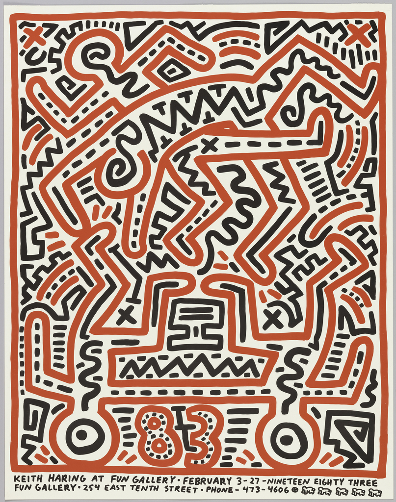
In celebration of World Pride, June Object of the Day posts highlight LGBTQ+ designers and design in the collection. Today’s blog post was originally published February 8th, 2015. A favored hangout among the early 1980s East Village art scene, the Fun Gallery became home to some of the New York City’s most notable artists, including...
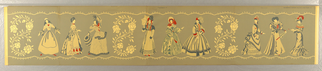
This charming frieze doubles as an overview of women’s fashion from the period 1700-1900. It features nine women grouped into trios separated by a curvilinear motif of a flowering vine. On the far left, a woman in simple colonial dress stands next to a woman in mid-eighteenth-century and a woman in late-eighteenth-century garb. The next...
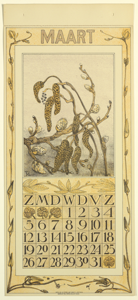
Ragged, curvy and relentless, the pussy willow catkins in this print are symbolic of the battle for spring that marks the month of March. Designed by Theodor van Hoytema (Dutch, 1863-1917) for a 1911 calendar, one can understand the month it represents even without translating the Dutch word at the top: “Maart” or March. Known...
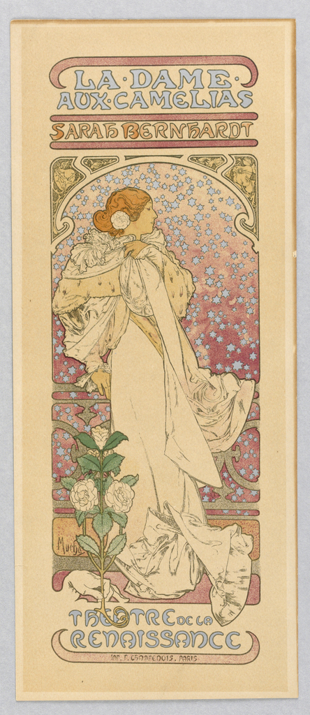
The Belle Époque was an explosion of optimism and cultural innovation and artistic endeavours. The Belle Époque, lasting from the 1870s up to WWI, was at its height in Paris during the 1890s and 1900s. It was a great time for art and theatre, and they converged to great success at the Theatre de la...
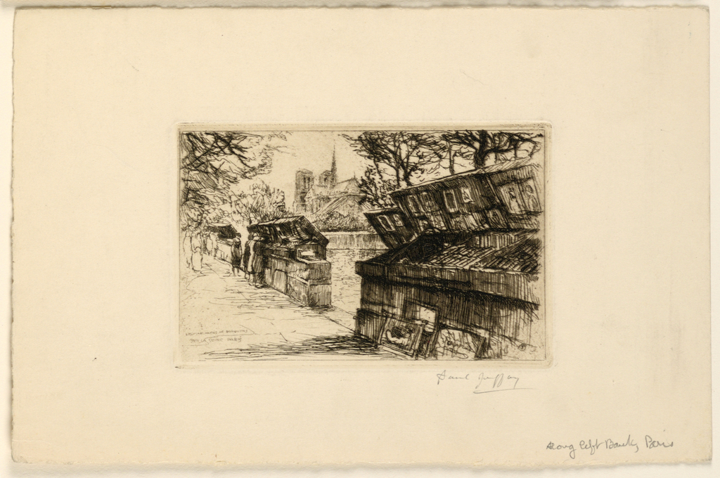
This lithograph, by artist Paul Jeffay (1898-1957) depicts the Left Bank of Paris, France, on what appears to be the Quai de la Tournelle. The main focus of the piece is on the bouquinistes, green boxes that line the Seine in the center of Paris, out of which booksellers sell used and antiquarian books. In...
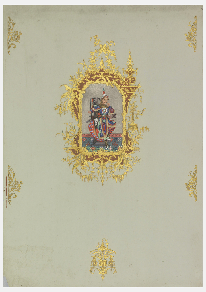
This elaborate Rococo-revival wallpaper incorporates several different techniques. The print is an applied lithograph, the salmon-color framework is woodblock printed, and the gold is a stamped metal foil. The application of the stamped foil embosses the paper as the foil is being applied, creating a much richer and more reflective surface than a printed gold...

Scenic Hudson is a four-part scenic mural which captures a romantic view of the Hudson River. The lithograph printing gives the design a very soft look, almost like a watercolor, which adds to this dreamy vision. The design could be used as a mural to cover a single wall, or could be used in repeat...
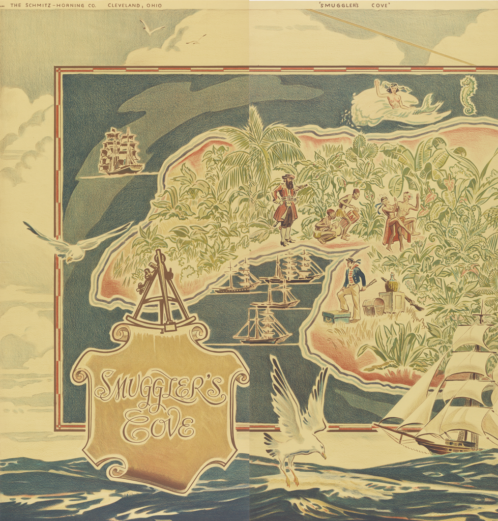
These two panels are part of a large gift of 163 papers by The Wallpaper Council, Inc. The papers were most likely showroom samples as there are no complete sets of murals or maps, each of the designs was given in multiple colorways, and each panel contains a black and white photo on the reverse...
Edward Bawden was a watercolorist, book illustrator, mural painter, and designer. He was inspired to design his first wallpaper after viewing the Daisy pattern by William Morris in an exhibition in 1925. Bawden’s preferred method of printing was the linoleum block at which he became quite adept. Harold Curwen, of the Curwen Press, saw some...
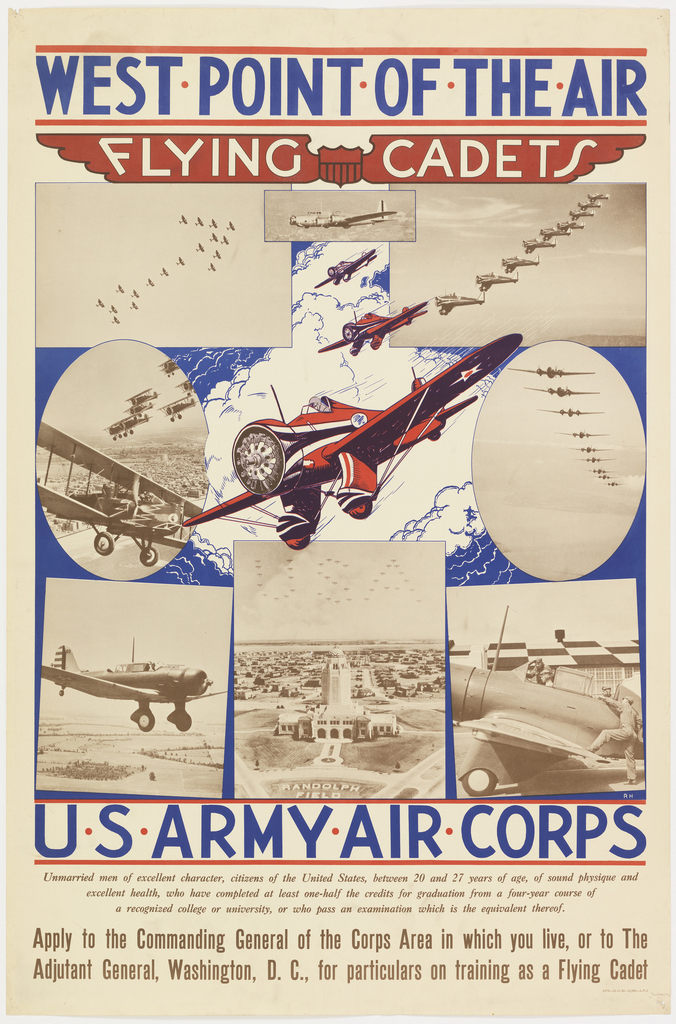
In 1940, with World War II already underway, it seemed inevitable that America would soon be joining the fight against the Axis powers. The U.S. Army Air Corps published this recruitment poster shown above. The imagery utilized by an unknown graphic designer romanticized participation in the academy’s cadet program. The montage of photographs showcase cutting-edge planes...
A favored hangout among the early 1980s East Village art scene, the Fun Gallery became home to some of the New York City’s most notable artists, including Keith Haring, Jean-Michel Basquiat and Kenny Scharf. This poster, designed by Haring in anticipation of his gallery debut in February 1983, exemplifies the artist’s unique ability to turn...
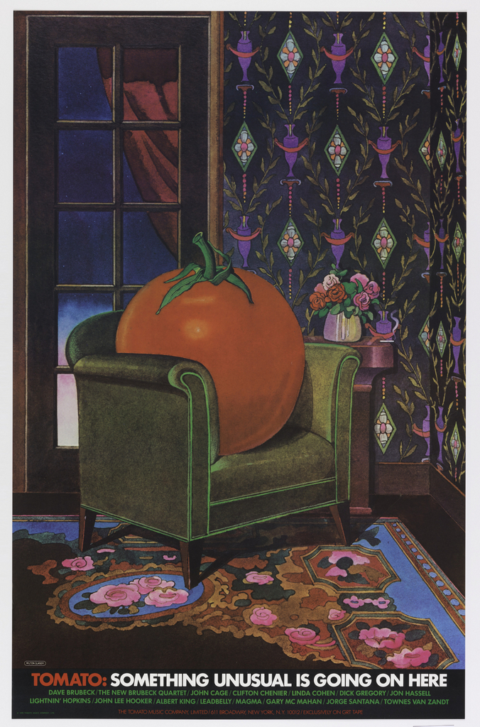
When graphic designer Milton Glaser began designing for Kevin Eggers’ record company in the 1960s, it was called Poppy Records. By 1978, the company had changed names several times, morphing into Utopia, then Atlantic Deluxe, and finally, Tomato Music Company. (It later became known as Tomato Records). The independent label featured an eclectic group of artists,...
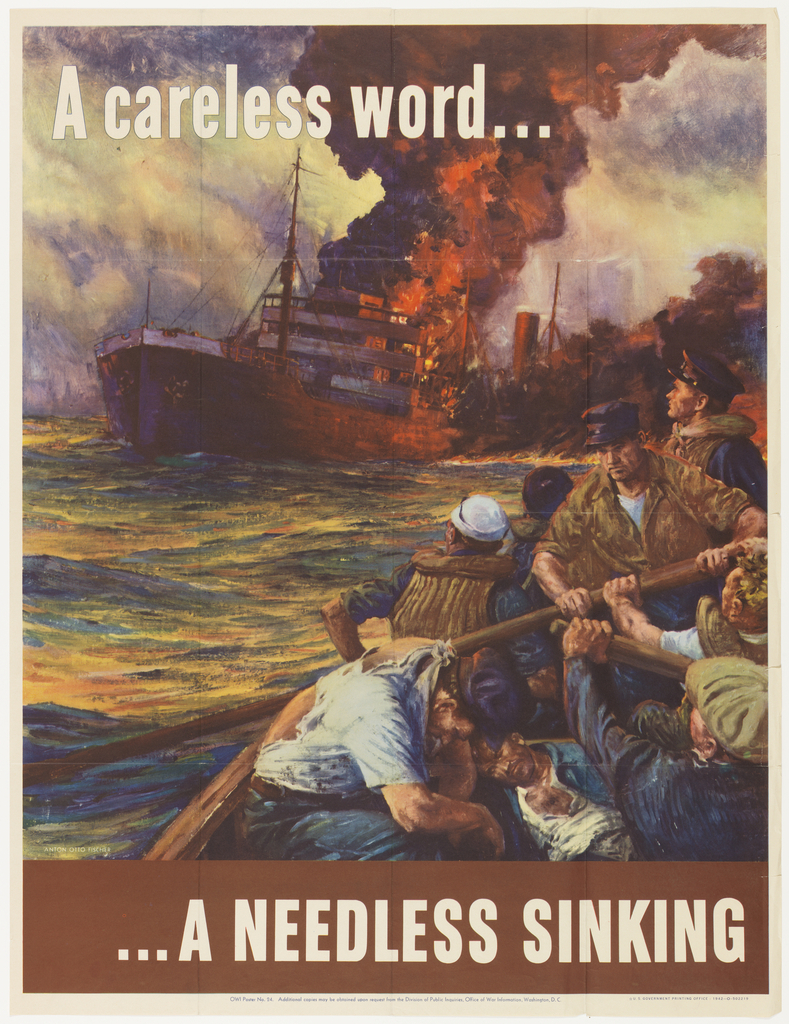
It seems only fitting that Anton Otto Fischer, an artist best known for seascapes, began his career working on merchant vessels and steam ships. After immigrating to New York, Fischer assisted the American illustrator A.B. Frost. This experience led Fischer to pursue an education in Paris, where he developed his personal design aesthetic. Fischer’s 1942...
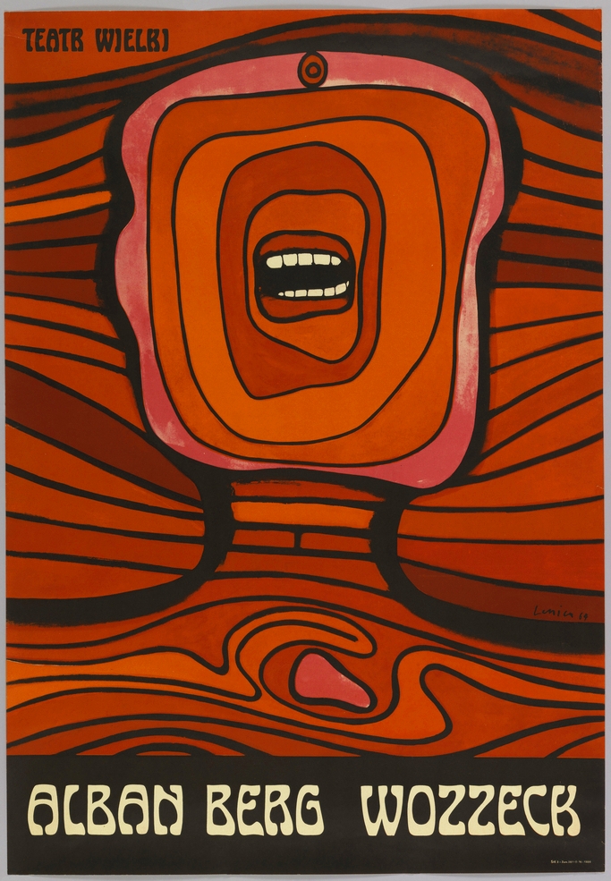
This gut wrenching poster, designed by the Polish graphic designer Jan Lenica, was produced to advertise the Polish National Opera’s 1964 production of Alban Berg’s avant-garde opera Wozzeck in Warsaw. An icon of Polish graphic design, the poster was awarded a Gold Medal at the 1966 Warsaw International Poster Biennale, and is Lenica’s best known...
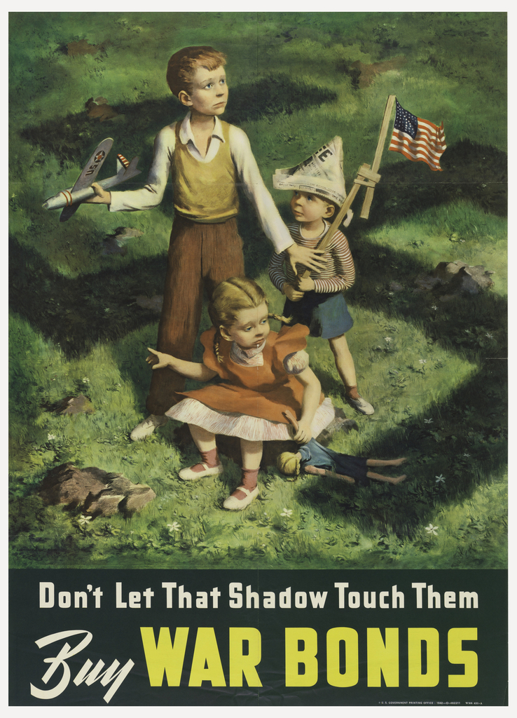
In the midst of World War II, the war effort was reliant upon the purchase of war bonds by the American population. In 1942, the military could not hold off the encroaching armies without the support of Americans. Graphic designer Lawrence Beall Smith dramatically presented the necessity of war bonds to the public by showing...