Previously On View: May 11, 2018 through March 17, 2019

See exhibitions currently on view.

About the exhibition

This exhibition is extended to March 17, 2019.

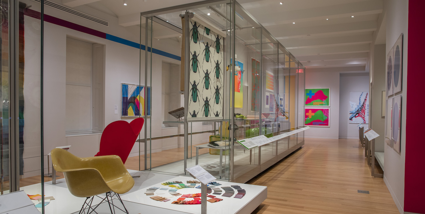
Saturated explores the elusive, complex phenomenon of color perception and how it has captivated artists, designers, scientists, and sages. Featuring over 190 objects spanning antiquity to the present from the extraordinary collections of Smithsonian Libraries and Cooper Hewitt, the exhibition reveals how designers apply the theories of the world’s greatest color thinkers to bring order and excitement to the visual world.

More than three dozen magnificent and rare books from the Smithsonian Libraries are installed throughout the exhibition,  emphasizing the ongoing theoretical and practical discourse on color. Illustrated with spheres, cones, grids, wheels, and other graphic means for organizing color’s hues and harmonies, the works include texts written by designers, naturalists, and chemists, as well as some of the  most important color treatises of the Enlightenment, such as Sir Isaac Newton’s 1704 Opticks and Johann Wolfgang von Goethe’s  1810 Theory of Colors. Also on view, a very rare surviving volume of Jacob Christophe Le Blon’s 1725 Coloritto, the first book to document the mixing of primary colors to create secondary colors that became the foundation of modern color printing.

To show how these findings have been realized and advanced by designers, objects from all four curatorial departments present a globally and stylistically diverse installation of iconic, experimental, and vernacular design.  The works of color innovators, such as Louis Comfort Tiffany, Massimo Vignelli, and Hella Jongerius, demonstrate design’s continuing investigation of new materials, technologies, and techniques, while recent acquisitions for the collection point to future directions. Saturated also investigates color’s relationship with music, camouflage, and advances in color reproduction, highlighting its importance to everything from philosophy to mass communication. Visually and intellectually stimulating, Saturated expands awareness of our deeply personal and rewarding relationship with color.

highlights

A selection of objects in the exhibition. View more objects.

Color Decoded: The Textiles of Richard Landis

In conjunction with Saturated, an exhibition of the recent acquisition of six of the master weaver and colorist’s most important works, installed together with three process drawings and 13 more of Landis’s textiles; all produced between 1967 and 1995. Landis’s double-cloth textiles are complex systems of closely related full-tones and half-tones of color, organized into abstract geometries of endless variation. Learn more about Color Decoded.

Supporters

Saturated: The Allure and Science of Color is made possible in part by support from the August Heckscher Exhibition Fund, Judy Francis Zankel, PeclersParis, and The Josef and Anni Albers Foundation.
The Saturated Blog series

Image features group diamond-shaped glass vases of different heights and colors in overlapping arrangement reminiscent of a cityscape. Please scroll down to read the blog post about this group of objects.
Color Landscaping with Glass Vases
Ruutu, Finnish for diamond or square, is the theme that is carried across the five sizes and seven hues of these modular glass vases. The vessels, created by French designers (and brothers), Ronan and Erwan Bouroullec for the Finnish glass firm, Iittala, share a minimal, rectilinear style. Like other works by the Bouroullecs, the Ruutu...
Image features bowl of inverted cone shape, the thick outer wall of polyester resin in tones of orange, bonded to an inner wall of white porcelain, its inner surface glazed turquoise. Please scroll down the read the blog post about this object.
Dance of Complementary Colors
This bowl sends a colorful optical jolt by balancing complementary hues; the red-orange of the exterior against the turquoise of the interior. The interplay of the warm red-orange and the cool turquoise results in visual excitement as the eye shifts back and forth between the two. Adding to the interplay is the juxtaposition of the two...
Image features red plastic form, circular opening at one side to fit over a door knob, tapering to long handle as hand grip to turn knob. Please scroll down to read the blog post about this object.
Opening the Door for Accessible Design
Since the early 1980s, around the time of this door knob attachment’s production, designers and engineers have been particularly attuned to the physical, psychological, and emotional needs of users during their interactions with everyday things. This design approach has been called “user-centered design” and considers users’ needs at every stage of the design process. Donald...
Image features rectilinear desktop telephone in red and black, with handset at top, black keypad with green, yellow and blue number and function keys on left, rectangular gray panel with logo on right. Please scroll down to read the blog post about this object.
Communicating in Style
Throughout the late 1980s and early 1990s, the design team and one-time couple Gideon Löwy and Lone Lindinger-Löwy created a series of telephones called BeoCom, made for the Danish consumer electronics manufacturer Bang & Olufsen. The prefix “beo” is standard for all of Bang & Olufsen’s major products and the ending references the device’s purpose:...
Woven blanket with a grid of squares of subtly graduated colors.
Careers in Color: Designtex
As research for the exhibition Saturated: The Allure and Science of Color (May 11, 2018–January 13, 2019) curators interviewed color specialists working in diverse industries and fields, from fashion forecasting to early childhood education. Careers in Color invites these specialists to explain what their job entails and how their love of color led to a...
Display of hand-painted papers, ink bottles, and brushes
Careers in Color: Peclers Paris
As research for the exhibition Saturated: The Allure and Science of Color (May 11, 2018–January 13, 2019), the curators interviewed color specialists working in diverse industries and fields, from fashion forecasting to early childhood education. For our Careers in Color blog series, we asked these specialists to tell us about their work and how their...
CAREERS IN COLOR: SHEPHERD COLOR COMPANY
As research for the exhibition Saturated: The Allure and Science of Color (May 11, 2018–January 13, 2019), the curators interviewed color specialists working in diverse industries and fields, from fashion forecasting to early childhood education. For our Careers in Color blog series, we asked these specialists to tell us about their work and how their...
This image features a circular sample plate glazed with squares of various colors around the rim, surrounding the logo of a running buffalo in gold, all on a white background. Please scroll down to read the blog post about this object.
What Color Is Your Buffalo?
Sample plates are produced by manufacturers of ceramic tableware as a means of demonstrating the colors with which items, usually in a particular product line, could be glazed. Sample plates provide insight into the colors—and, in some cases, decorative patterns—that were available and popular at particular moments in time. The Cooper Hewitt collection includes several...
Grid of red and pink color swatches
Careers in Color: Crayola
As research for the exhibition Saturated: The Allure and Science of Color (May 11, 2018–January 13, 2019), the curators interviewed color specialists working in diverse industries and fields, from fashion forecasting to early childhood education. For our Careers in Color blog series, we asked these specialists to tell us about their work and how their love of color...