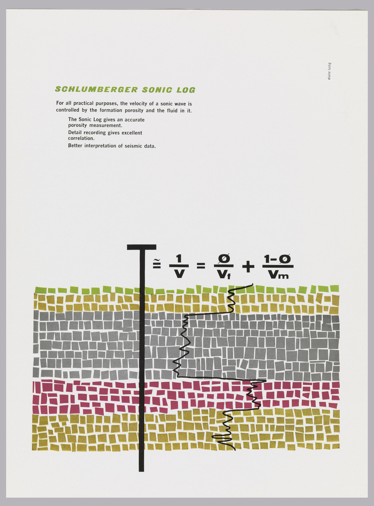
At first glance, this graphic field of squares looks almost like an abstract painting. Although this advertisement targeted scientists, designer Elaine Lustig Cohen captures the attention of laypeople and experts alike. Created in 1958 for the oilfield services company Schulberger, the ad promotes the company’s Sonic Log, a device for the identification of soil properties....
Buy something at Bloomingdale’s, and you’ll likely receive one of three different brown paper bags: little, medium or big, depending on the size of your purchase. Spelled out in iconic sans-serif, these size classifications are the classic bags’ only adornment. This striking, simple design, created by Massimo Vignelli in 1973, has seen huge success as...
When it comes to Japanese graphic design, a certain set of visual elements are conjured in one’s mind. Simplified forms; a minimal color palette, the generous use of negative space; an effective use of black; and unique lettering, are all characteristic elements that draw on the aesthetics of Zen culture, Japanese Buddhism, calligraphy, ukiyo-e woodblock...
In celebration of Women’s History Month, Cooper Hewitt is dedicating select Object of the Day entries to the work of women designers in our collection. “What is that?” If you see this poster displayed on a wall on the other side of the street, that’s likely the first question that comes to mind. Its bright...
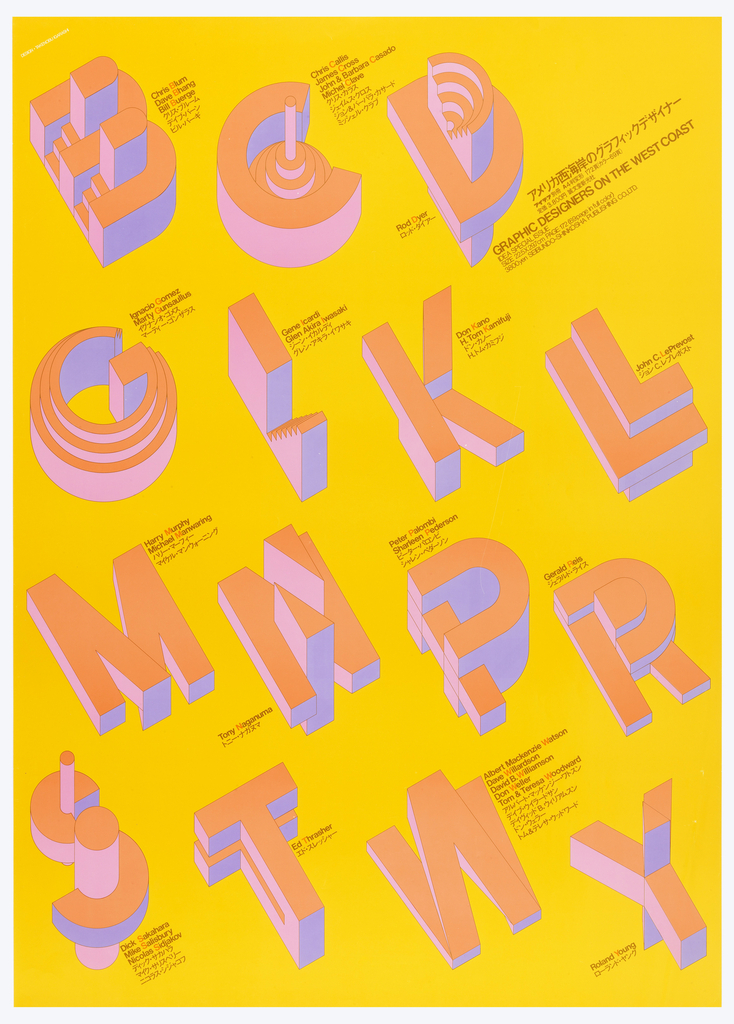
In 1975, Takenobu Igarashi created the poster “Graphic Designers on the West Coast” to promote a publication that introduced American graphic designers from the West Coast to Japanese audiences. Igarashi’s simple composition is enhanced by the sculptural, three dimensional quality of letterforms that playfully refer the initials of the designers’ names featured in the book....
The Japanese graphic designer Ikko Tanaka is recognized as a pioneer of modern Japanese graphic design. He merged western modernist aesthetics and Japanese tradition to generate a new visual expression for contemporary audiences. Tanaka’s frequent use of geometric forms and a limited color palette is clear evidence of his strong respect for the Bauhaus, the...
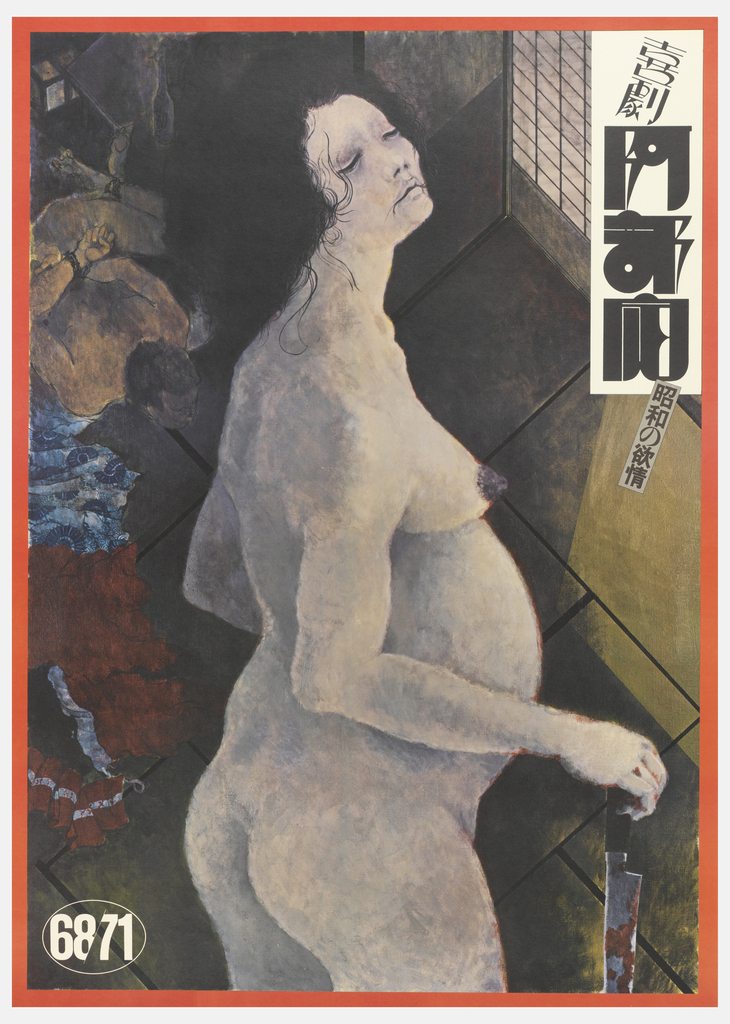
This is a poster for a stage play called Abe Sada (阿部定) performed by a Japanese experimental theatre company called Black Tent Theatre in 1973. The story of the play is based on a true murder case that rocked Japan in 1936, a notorious crime that is the central focus of the poster. At first...