Posters are all around us. We see them on the street, in the subway, tacked to bulletin boards in schools and coffee shops, and hanging on the walls of theaters and concert venues. And we see them online, collected or disseminated on social media. But how are posters made? For the next few days, that’s the question we are going to explore here at Object of the Day.
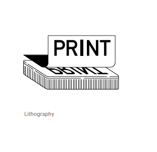
Lithography is based on the chemical principle that oil and water do not mix. To create a lithograph, the printer draws an image on a flat matrix with a greasy medium. The matrix is wiped with a chemical solvent to bond the image to the surface. Water is then used to moisten the areas around the greasy image, after which an oil-based ink is rolled onto the matrix. The ink adheres only to the image, resisting the wet surfaces around it. A sheet of dampened paper is then laid over the matrix, and the two are run together through a printing press. The pressure of the press transfers the ink to the paper. The printed image appears on the paper in the reverse of how it was drawn. Lithography’s ability to reproduce a drawn image enabled designers to work spontaneously to create entirely unique letterforms and integrate them with an image, free from the constraints of wood type and letterpress.
Graphic designer Johan Thorn-Prikker turned to the lithographic firm S. Langhout & Co. in the Netherlands to produce his 1903 poster advertising a Dutch art exhibition. Holländische Kunstausstellung takes its inspiration from the batik textiles of Java, Indonesia, which at the time was part of the Dutch Empire. Working in his distinctive art nouveau style, he framed the rigid letterforms in the center with thick black lines, and then surrounded the text with abstract forms to kaleidoscopic effect. Thorn-Prikker buried graphic references into the abstract design. Tulips, a classic Dutch motif, can be found to the right and left of the large orange circles, which are a nod to Holland’s House of Orange-Nassau. Thorn-Prikker created a design using four colors: black, green, orange and yellow. This demanded the use of four heavy polished limestone matrices printed one after the other. The design cleverly incorporates the white space of the paper, effectively utilizing it as a fifth color. Not only did the design have to be conceived of with four different stones, but all of the text had to be drawn on the stone backward, so that when printed in the reverse it would be legible.
Caitlin Condell is the Assistant Curator in the Department of Drawings, Prints & Graphic Design at Cooper Hewitt, Smithsonian Design Museum.
The exhibition How Posters Work is currently on view at Cooper Hewitt through November 15, 2015. You can learn more at the exhibition homepage and find the book How Posters Work at SHOP Cooper Hewitt. #HowPostersWork

