The reigning composition of theater posters in the 1970s consisted of credit lines for the cast, producers, directors, etc. Because of this, Paul Davis’ relatively simple presentation, though standard for Davis’ early posters, was completely innovative. Paul Davis approached these posters in a way which relayed nearly no information about the play beyond its title and where it was being performed. The designer describes his compositional style stating, “Those early posters didn’t say anything: no Joe Papp; no Shakespeare Festival; no actors. I didn’t even sign them at first (and only self-consciously used my initials when I first began to do so). The only lettering was the title of the play and the name of the theater, though we realized later that is wouldn’t hurt to mention that this was, in fact, a Shakespeare Festival production and began to include a logo.”
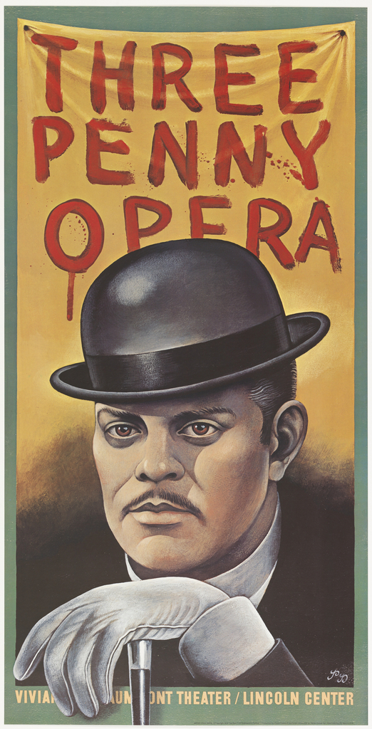
Threepenny Opera’s poster design clearly falls in between Davis’ style evolution. In the lower right hand corner, just above the theater’s name are the designer’s initials, PD, in script. While the designer’s initials are present there remains no mention of the Shakespeare Festival or inclusion of its logo. The design portrays the main character, Mack the Knife, in the likeness of the actor who played him for this particular performance, Raul Julia (better known as Gomez Addams). Even though the actor is physically represented there is no text relating that information to the viewer; there is no credit line given showing a move away from the typical theater posters of the time. This shift in design suggests that the play is no longer about the cast, but the characters and the performance as a whole.
Julia Pelkofsky is a Master’s Fellow in the Department of Drawings, Prints & Graphic Design at Cooper Hewitt, Smithsonian Design Museum. She is currently working on her MA in the History of Decorative Arts and Design at Parsons, the New School for Design.