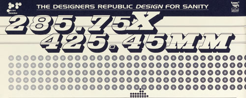
On Friday, Cooper-Hewitt opens “Recent Acquisitions: Digital Typography,” a new installation of five recently acquired graphic works that explore post-modernist trends in typography. On view will be examples of lively and expressive type fonts developed by designers as a counterpoint to modernism’s rigid and impersonal sans serif type. Below, curator Gail Davidson explains the typographical considerations made in presenting the installation.

When it came to selecting the font for the introductory panel, since this was an installation about typography, I wanted to use a typeface that was distinctive from the Cooper-Hewitt house font which is News Gothic. There is an interesting story behind the type chosen. Our contract graphics design firm, TsangSeymour, came up with several fonts that they believed were suitable and especially significant for this project. One choice proposed was Emigre Eight designed around 1984 by Zuzana Licko of Emigre Graphics. This was a reasonable selection because Emigre magazine was displayed in the exhibition. But there was also a connection between this font and Wim Crouwel, whose poster was also in the presentation. Like Wim Crouwel fifteen years earlier Licko recognized that the technological limitations of computer printing at the time could produce a new typographic aesthetic. Because the most advanced dot-matrix printer could only produce low resolution bit-mapped fonts (letters made up of pixels or dots), Licko, using an early program called FontEditor, created the Emigre Eight typeface in which the capital letters were eight pixels high. While this font would be understood by viewers as a reference to digital typography, it clearly looked dated and “old fashioned.”

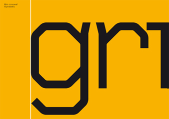
Ultimately, we selected Foundry Gridnik (illustrated above) for the introductory panel because it was easier to read and looked more contemporary. But like the Emigre Eight there was an additional story behind the choice. In 1974, Wim Crouwel designed a single-width type on commission from Olivetti for their new electric typewriter. According to Crouwel, the font that Olivetti called Palitene was inspired by the letters and numbers on the sides of naval ships. However, the typeface never went into production because of the advent of computers, although some of the letters and numbers were developed in a series of postage stamps for the Dutch postal service. With permission from the Dutch designer, David Quay of the London firm The Foundry digitized the typeface, along with other Crouwel fonts, from Crouwel’s original drawings. They called the new typeface Foundry Gridnik after the affectionate nickname “Mr. Gridnik,” Crouwel’s friends called him because of his devotion to the organizing system of the grid. Tsang Seymour recognized that Foundry Gridnik had a connection to the works on display and moreover strongly resembled Cornel Windlin’s Vectrix which works so effectively in the poster Game Over in the installation. And there you have the rest of the story.