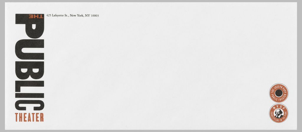
Paula Scher’s identity for New York’s Public Theater has become the ne plus ultra of graphic design. When it was created in 1994, no one had ever seen anything quite like it. With its bold red and black typography, the logo combined letters of different sizes, weights, and spacing, running vertically down the side of...
Six leading and emerging voices in the field of type design talk about problems central to their work. Each speaker will address a burning question concerning the design, use, culture, technology, or business of fonts and typefaces. The moderators are Cara Di Edwardo and Ellen Lupton. The presenters are Philippe Apeloig, William Berkson, Hubert Jocham,...

Six leading and emerging voices in the field of type design talk about problems central to their work. Each speaker will address a burning question concerning the design, use, culture, technology, or business of fonts and typefaces. A slightly cleaner version of this program is found here: http://www.youtube.com/watch?v=z2hhkfUzZtw

Have you ever considered how many fonts there are in the font menu on your computer? Microsoft makes available almost 200 different typefaces. On the Apple machine I have at home there are a similar number. I never would have believed it if I had not counted them myself. Of course these statistics include the...
Have you ever considered how many fonts there are in the font menu on your computer? Microsoft makes available almost 200 different typefaces. On the Apple machine I have at home there are a similar number. I never would have believed it if I had not counted them myself. Of course these statistics include the...
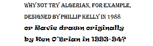
On Friday, Cooper-Hewitt opens “Recent Acquisitions: Digital Typography,” a new installation of five recently acquired graphic works that explore post-modernist trends in typography. On view will be examples of lively and expressive type fonts developed by designers as a counterpoint to modernism’s rigid and impersonal sans serif type. Below, curator Gail Davidson explains the typographical...
The winner and two finalists of the Corporate Achievement category are, together, quite different from the winners of the past. As a whole, they represent what is possible at a smaller scale. The Walker does its amazing work in Minneapolis, Minnesota. Heath Ceramics has been handcrafting tiles and tableware in the same way for over...

One of the themes looked at in the Triennial is the rise of graphic design as a consumer product. It used to be that graphic design was strictly a business-to-business service. Now, everyday citizens have access to professional quality software, fonts, printing services, and more. It’s a whole new world out there. One example of...