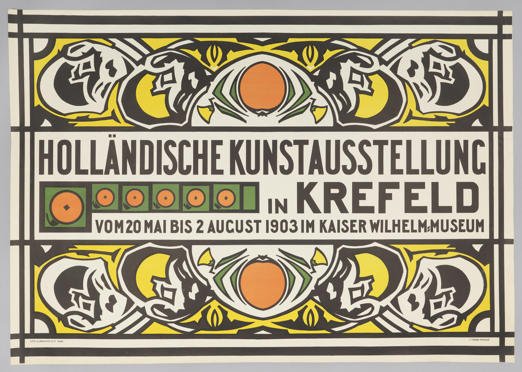
Posters are all around us. We see them on the street, in the subway, tacked to bulletin boards in schools and coffee shops, and hanging on the walls of theaters and concert venues. And we see them online, collected or disseminated on social media. But how are posters made? For the next few days, that’s the...
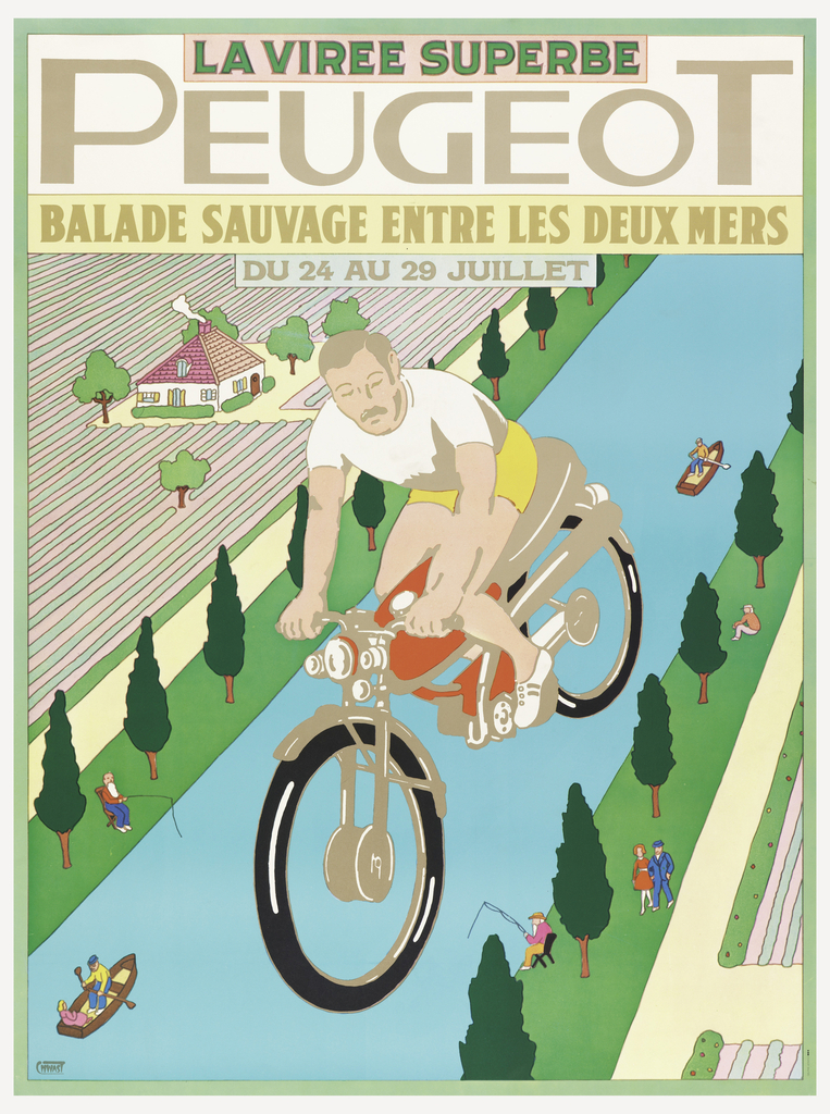
France is known for cycling, hosting the famous – and now infamous – Tour de France bike race each summer. In 1968 Peugeot jumped on board the notion of a Tour de France and promoted a trip by vélometeur (or moped) through various departments of the country. One section, pictured in this poster by American...
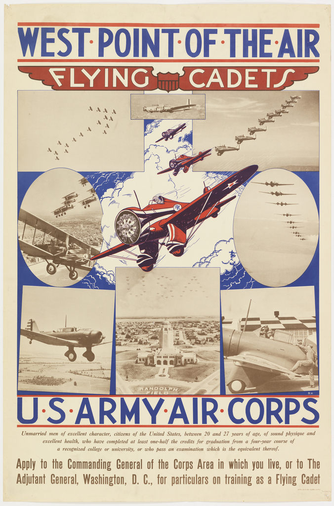
In 1940, with World War II already underway, it seemed inevitable that America would soon be joining the fight against the Axis powers. The U.S. Army Air Corps published this recruitment poster shown above. The imagery utilized by an unknown graphic designer romanticized participation in the academy’s cadet program. The montage of photographs showcase cutting-edge planes...
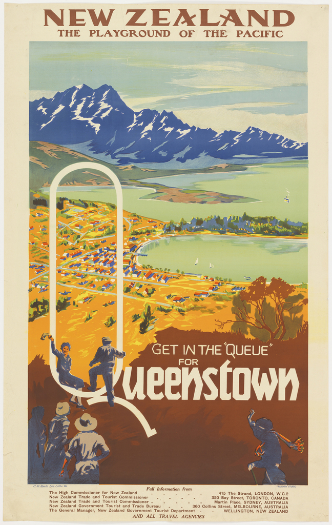
In recent decades, New Zealand and Middle-Earth have become almost inseparable in the popular imagination as Peter Jackson’s The Lord of the Rings and The Hobbit movie trilogies, based on J.R.R. Tolkien’s epic novels, have put the isolated country on the world stage. But while the stories of Middle-Earth may be fantasy, the landscapes certainly...
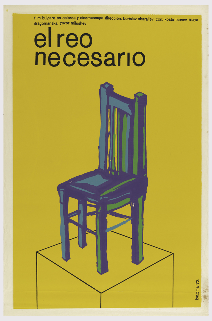
Spanish designer and illustrator Eduardo Muñoz Bachs (1937-2001) first pursued graphic design at the age of 16 without any formal training. As a working professional and animator, Bachs designed an extensive collection of screenprinted film posters for the Cuban Institute of Cinema Art and Industry, an organization centered in distributing advertisements for films made after the...
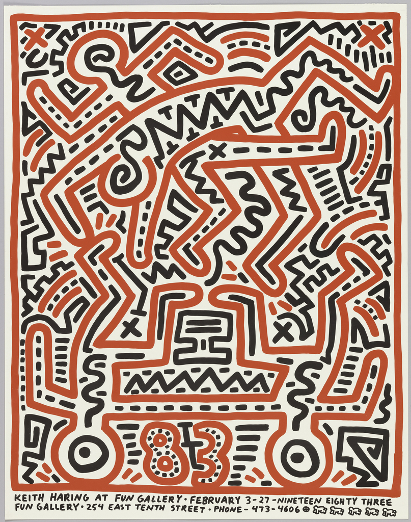
A favored hangout among the early 1980s East Village art scene, the Fun Gallery became home to some of the New York City’s most notable artists, including Keith Haring, Jean-Michel Basquiat and Kenny Scharf. This poster, designed by Haring in anticipation of his gallery debut in February 1983, exemplifies the artist’s unique ability to turn...
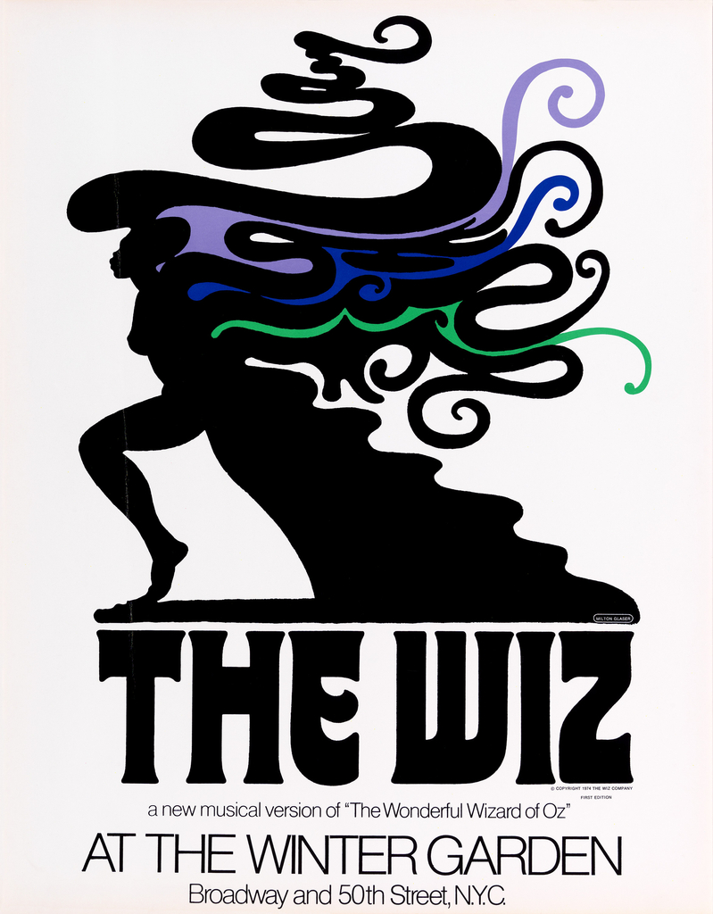
Long before Wicked was the popular alternative to L. Frank Baum’s 1900 novel and the 1939 MGM film The Wizard of Oz, there was The Wiz. Subtitled “The Super Soul Musical ‘Wonderful Wizard of Oz’,” The Wiz, created by Charlie Smalls and William F. Brown, utilized the beloved characters from L. Frank Baum’s original novel,...
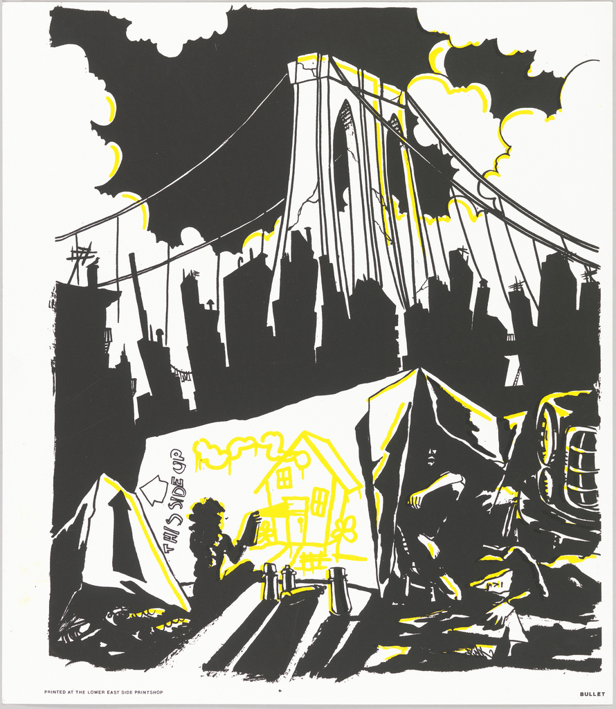
During the 1980s, there was a severe housing crisis in New York City. The building of residential properties had declined during the economic depression of the preceding decade and the limited supply of affordable housing caused a sharp increase in homelessness. In neighbourhoods like the Lower East Side, absentee landlords permitted old buildings to fall...
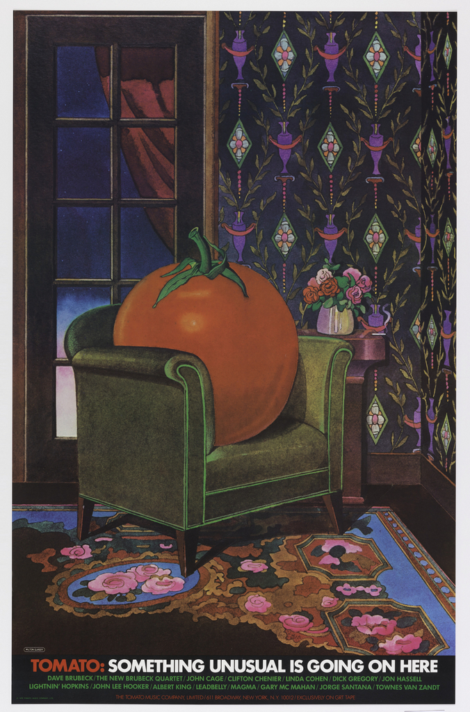
When graphic designer Milton Glaser began designing for Kevin Eggers’ record company in the 1960s, it was called Poppy Records. By 1978, the company had changed names several times, morphing into Utopia, then Atlantic Deluxe, and finally, Tomato Music Company. (It later became known as Tomato Records). The independent label featured an eclectic group of artists,...
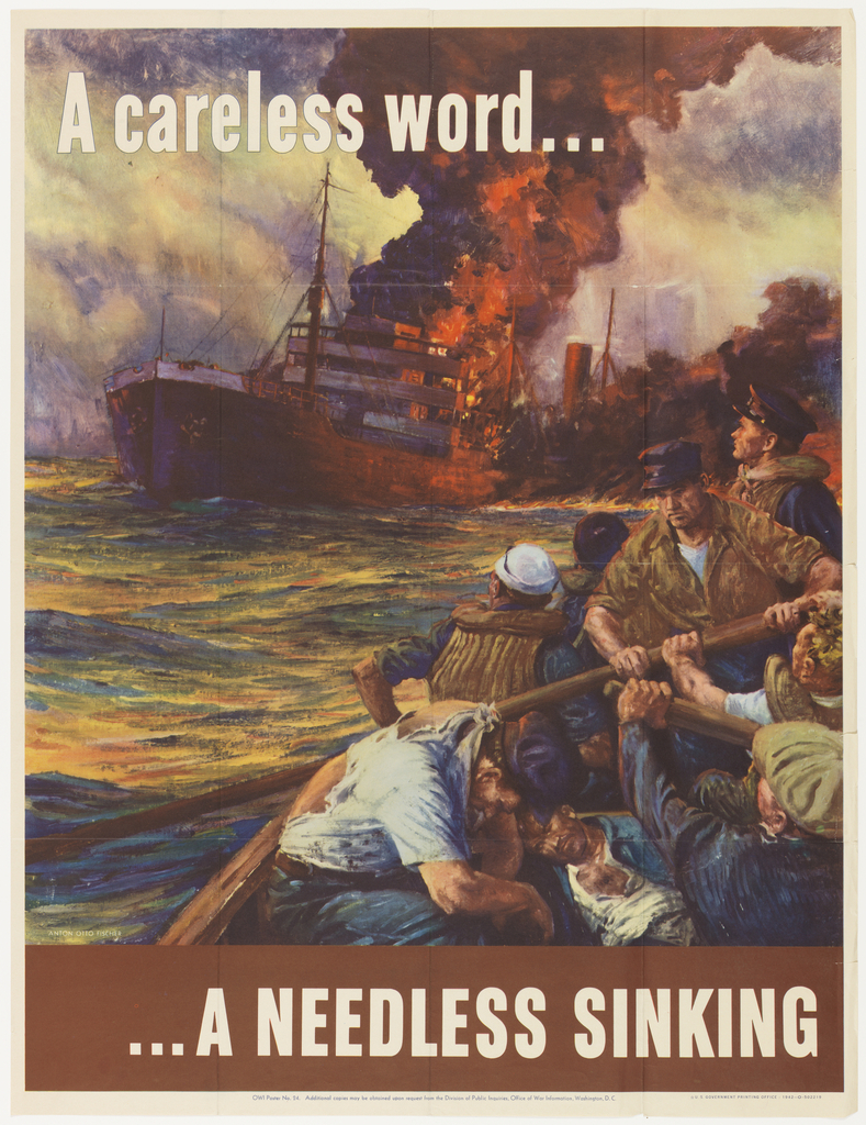
It seems only fitting that Anton Otto Fischer, an artist best known for seascapes, began his career working on merchant vessels and steam ships. After immigrating to New York, Fischer assisted the American illustrator A.B. Frost. This experience led Fischer to pursue an education in Paris, where he developed his personal design aesthetic. Fischer’s 1942...
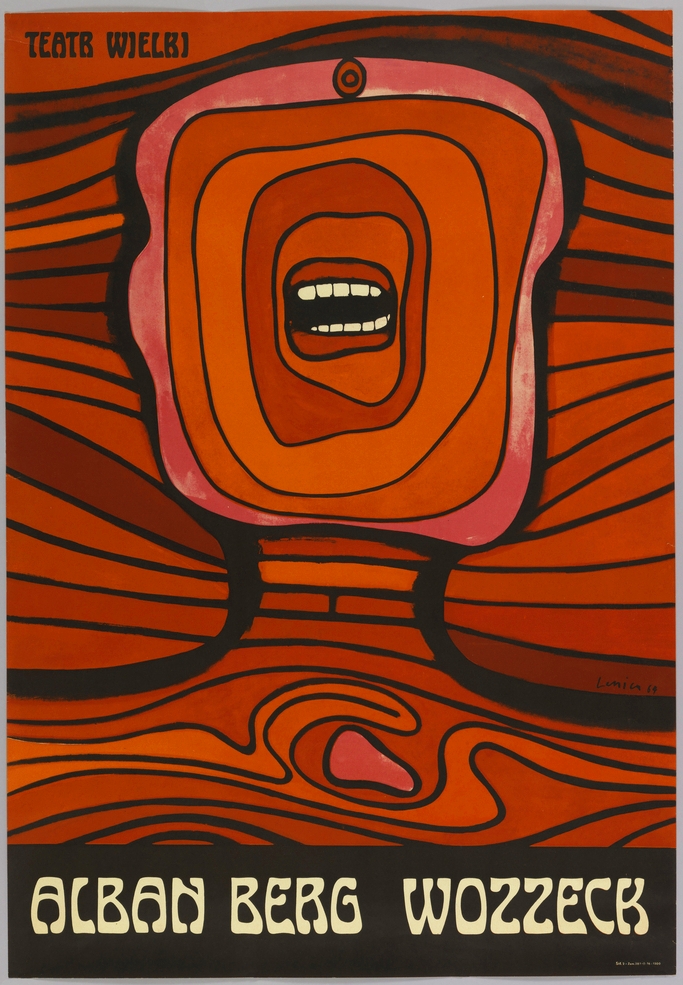
This gut wrenching poster, designed by the Polish graphic designer Jan Lenica, was produced to advertise the Polish National Opera’s 1964 production of Alban Berg’s avant-garde opera Wozzeck in Warsaw. An icon of Polish graphic design, the poster was awarded a Gold Medal at the 1966 Warsaw International Poster Biennale, and is Lenica’s best known...
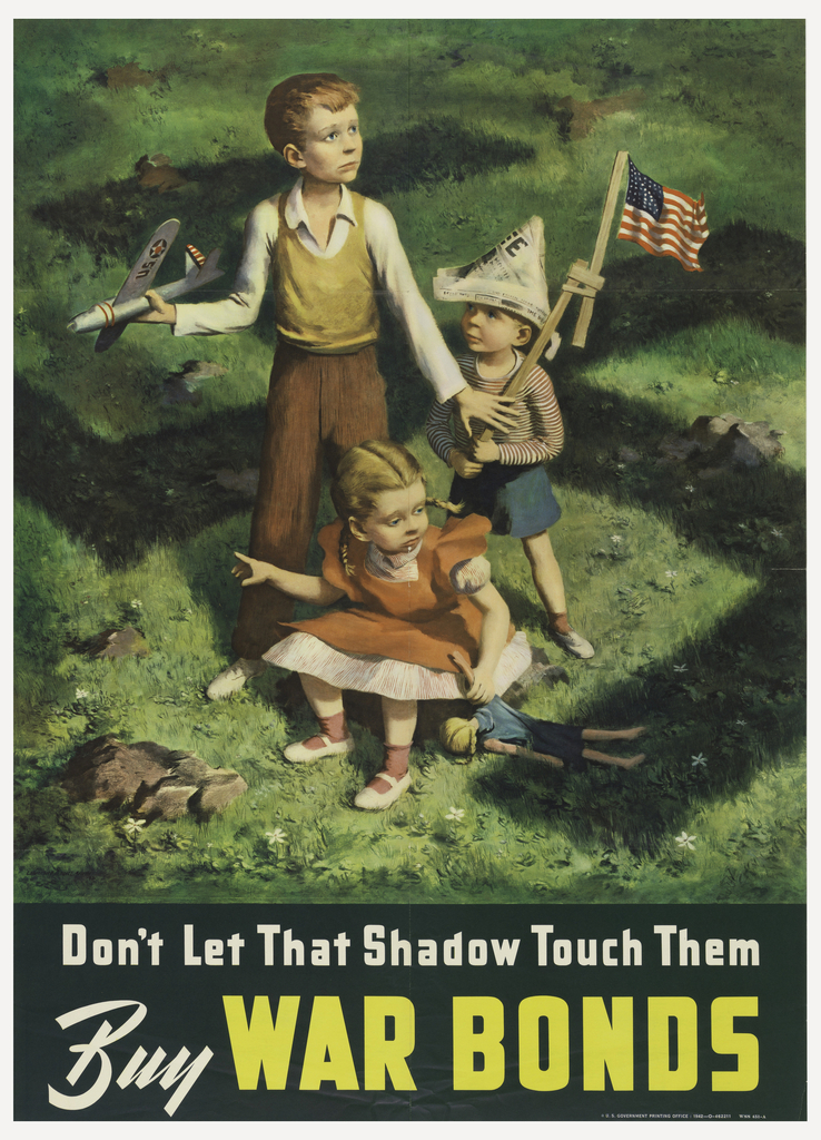
In the midst of World War II, the war effort was reliant upon the purchase of war bonds by the American population. In 1942, the military could not hold off the encroaching armies without the support of Americans. Graphic designer Lawrence Beall Smith dramatically presented the necessity of war bonds to the public by showing...
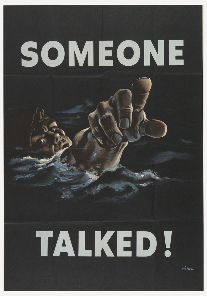
During World War II, poster competitions were held to solicit designs, under particular themes, to assist in the war effort. This poster, designed by Frederick Siebel, was submitted to alert Americans to the urgency of national security. For this contest each poster was subject to the scrutiny of First Lady Eleanor Roosevelt, who acted as...
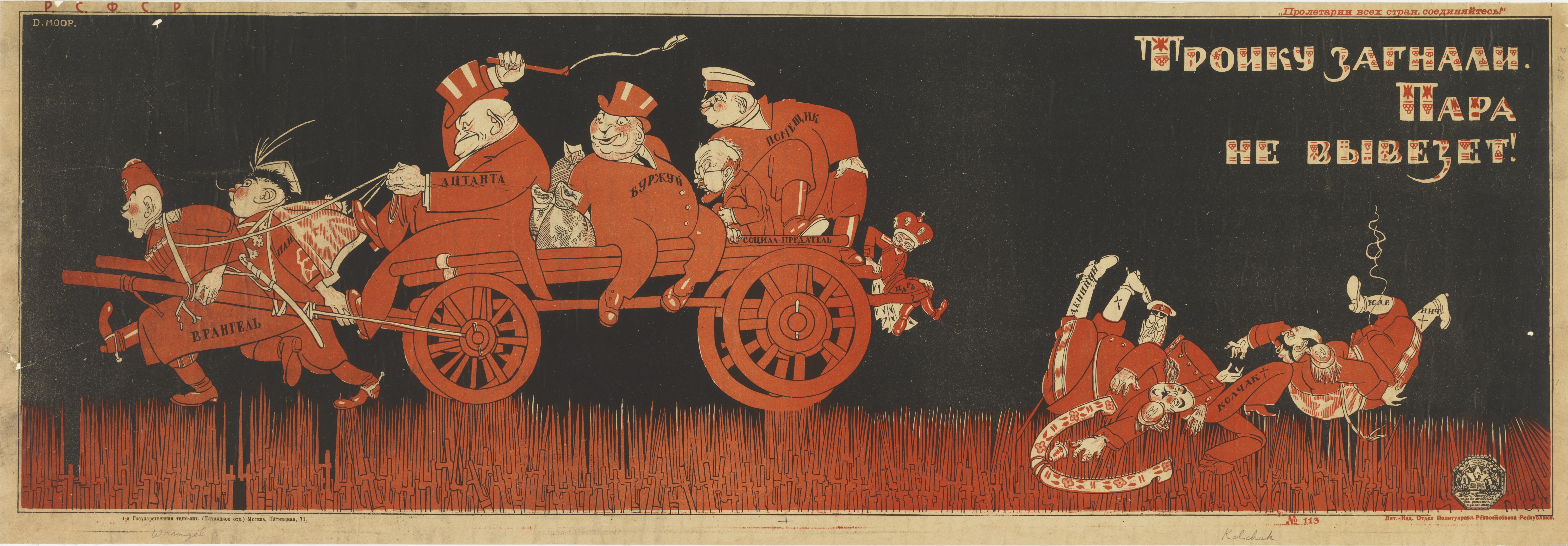
In this Soviet poster designed by Dmitri Moor, cartoonish figures trek across a dark landscape transformed by war. Along the lower border, Moor substitutes bloody bayonets for blades of grass, implying that Soviet land is hostile to these travelers, all of whom are enemies of the Bolshevik cause. The poster satirizes Soviet adversaries in both...
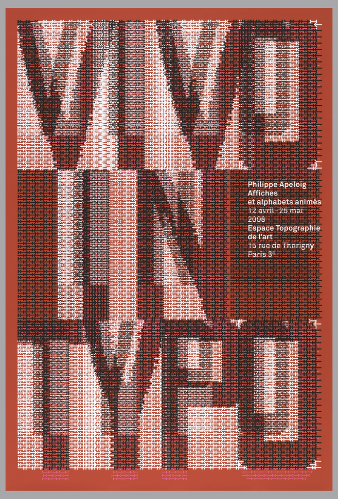
When graphic designer Philippe Apeloig featured his own poster designs at the Espace Topographie de l’art in Paris, he chose the title Vivo in Typo for the exhibition, and decided to make the title the graphic focus of his promotional poster. Apeloig concieved of an image comprised entirely of typography. He began by sketching punctuation marks...