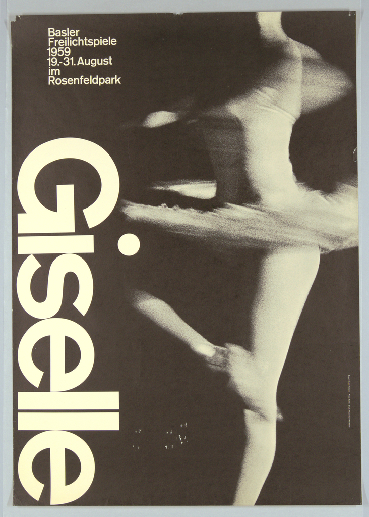
Armin Hofmann (Swiss, b. 1920) is associated with a graphic design movement known as the Swiss Style, which originated in Switzerland in the 1940s and 50s. Also referred to as the International Typographic Style, the Swiss Style is characterized by a recognition of the importance of typography—especially sans-serif fonts—as an essential element of design. The...
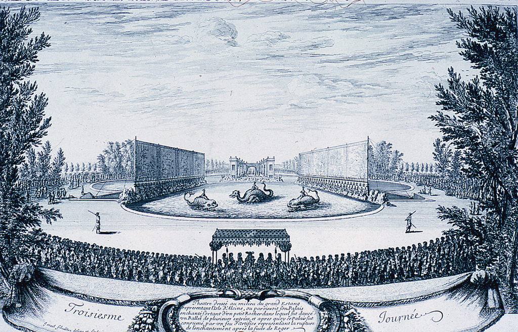
In 1664, Versailles was briefly transformed into a mythical and enchanted fairytale land. From May 7th to 13th, the court of Louis XIV arranged a festival of Les Plaisirs de l’Ile Enchantée (Pleasures of an Enchanted Island) in honor of Anne of Austria, the mother of Louis XIV and the queen Maria Theresa, although the...

Inspired by Paula Scher’s work for The Public Theater, the choreographer and dancer Eliot Feld first approached her about designing an identity for his dance company in 1997, when he decided to rename the company Ballet Tech. Scher designed an identity using a typographic family of slab serifs, overlaying the typography on top of photographs...