Design Across Time In-Gallery Resources
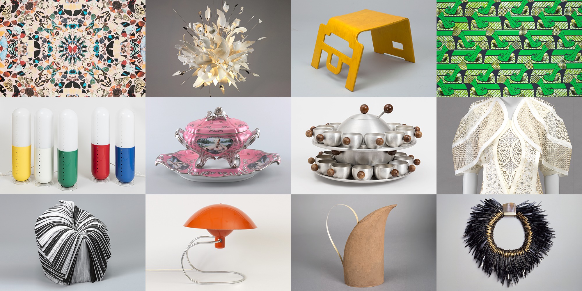
The following resources have been designed to support your visit to the exhibition.
Resources for the Design Across Time exhibition include a sensory map, large print labels, and object descriptions.
Visit Accessibility at Cooper Hewitt to learn more about general accessibility at the museum.
What to Expect
Design Across Time consists of four galleries on the first floor of Cooper Hewitt. This exhibition includes objects from Cooper Hewitt’s collection. These objects rotate every few months, so if you’ve visited us before there may be new objects to explore. Review the exhibition sections below to get a preview of exhibition themes and access audio content organized by section.
There is seating in select exhibition galleries. Refer to the Visitor Guide for specific locations of the seating. Portable gallery stools are available on each floor of the museum. The exhibition is wheelchair accessible.
Some objects are interactive. You may touch and interact with objects whose label has an invitation to interact. Do not touch objects, unless the label says to. Compatible in-gallery digital interactives have screen reader capability.
View the Sensory Map to find the areas of the exhibition where interaction is welcomed, as well as other information about sensory input throughout the museum. Some areas of this exhibition have lowered light levels. Use the printed Large Print Label booklet or digital Large Print Labels below to access a high contrast version of exhibition text and images of objects on view.
Large Print Labels
A screen-reader accessible Large Print version of the exhibition labels is available digitally. This document also has a visual description of each object. Click this link to access.
You can borrow a printed version of the Large Print labels at the museum. The Large Print label booklet is available to the right of the exhibition’s introductory text.
Behind the Scenes Audio content
Listen to designers and experts describe the creative process behind these works. The recordings are organized by exhibition section below. All recordings have transcripts. You can also download the Bloomberg Connects app or visit BloombergConnects.org to access the recordings.
Exhibition Sections
From the dawn of time, people have designed objects and systems to help us navigate and inhabit the world around us. Designing is one of our most defining qualities—a connective tissue that spans time and geographies. How you got here, what you’re wearing, or how this room makes you feel are just some of the designs you’ll interact with today. They were all created by someone for a particular purpose, and they tell stories about who we are, where we’ve been, and where we’re headed. They’re also not neutral: they’re charged with social, economic, political, environmental, and other influences that have effects on us, other species, and the planet we share.
Cooper Hewitt, Smithsonian Design Museum, has been collecting design since its founding in 1897. What design meant then is not what design means now, and as the world changes, so does our collection. The national collection has now more than 215,000 objects spanning six continents and thirty centuries, including product design, architecture, graphic design, fashion and textiles, wallcoverings, and digital and interaction design. From sketches and prototypes to finished products, the collection continues to evolve to represent new areas and ideas of our time, reminding us that design is constantly around us.
Design Across Time draws from the museum’s vast collection and organizes it around thematic clusters to explore some of the many approaches designers use in their creative process. Designers Play and Tweak to experiment and iterate ideas. They Repeat elements to reinforce messages; Transform materials into sustainable solutions; Show Off craftsmanship to create objects of beauty; or Simplify complex shapes and information, all in the search for meaning, functionality, and storytelling.
Cooper Hewitt’s collection is a public resource that belongs to all. We invite you to explore it.
Access the Large Print Labels for this gallery.
Behind the Scenes Audio content
Hi, I’m Maria Nicanor and I’m the Director of Cooper Hewitt, the Smithsonian Design Museum. Today, I want to tell you a little about the National Collection of Design, where all of the objects in these galleries come from. As part of the Smithsonian, the Cooper Hewitt collection is the national collection of design of the country. We care for it, we study it, we add to it, we share it, but it’s not really ours. It belongs and is held in trust for you, which means that it belongs to everyone in a very little sense.It’s also really vast, more than 215,000 objects spanning six continents and 30 centuries. From architecture and textiles to graphics and digital work to name just a few of the design disciplines that we collect. These designs tell stories and serve a purpose. They’re also not neutral and are charged with social, economic, political, environmental, and other influences that have effects on us and the planet we share together. We also collect the whole act of design, not just the polished final result. The sketches, the fail starts, the second tries, all of it is part of the story that our collection tells.Design Across Time is a selection of 125 works from our collection, but it isn’t arranged the way you might expect. Instead of grouping objects by date or by category, we organize them around what designers actually do when they make something. Designers play and tweak as they chase an idea. They repeat an element to drive a message home. They transform raw materials into something more sustainable. They show off craftsmanship and skill. Or take something really complicated and simplify it into something clear.So, take your time in here and enjoy exploring. My hope is that as you get to know these objects and the ideas they represent, you too will see the critical role that design plays in every single aspect of your own everyday life.
I’m Jayden Ali. I’m the director of JA Projects. We’re a studio based in London, but with an office in New York. And we work across the cultural spectrum, sometimes with institutions, but also in public spaces. I suppose we’re interested in architecture which has the capacity to make stories and knowledge visible and support those stories to keep being made.
So the material inspiration of Design Across Time really stems from this ambition to provide a complimentary but also contemporary overlay to the architecture that already exists in the Carnegie Mansion that has such presence. Specifically, we take inspiration from the conservatory and its spatial qualities. There’s a through-line of light that runs through the exhibition, but we also embrace timber finishes, blue and green hues, and reflective surfaces.
The exhibition narrative is really centered around an architectural visibility. It’s about collection objects emerging into view. It starts with this ensemble moment, this central case of 30 centuries of design, and that is connected to the rooms either side via these two sculptural moments that hold narratives around the ways in which designers design and the motifs and the approaches they often deploy, whether it be to tweak or play or repeat or transform or simplify. The solution lies in designing not a single exhibition but a framework for an evolving exhibition and understanding that framework needs to have all of the tools to allow the curators to tell the stories that they need to tell and for objects to go back into the collection and for objects to come from the collection into the museum. That’s really the novel piece of innovation.
Elizabeth Karp-Evans:
I’m Elizabeth Karp-Evans.
Adam Turnbull:
I’m Adam Turnbull.
Elizabeth Karp-Evans:
Pacific is a creative agency and we do all types of design work from branding to just typical graphic design to film, video. We make books. So our process is something that has to address many different formats.
Adam Turnbull:
The visual research for this project started with us pulling together a mood board of every image that existed of an object that was going to be in the exhibition. We looked at all of these images together and we sort of started to think how could we represent such a vast period of design history collectively together. And the more that we played around with it, the more we realized that it was the shapes of the objects that really started to define a graphic language.
So that led us to developing the silhouette design system, where the concept was to condense all of the visuals into one flat graphic language so they could all connect together.
Elizabeth Karp-Evans:
Because you can put something up that was made in the 20th century and another object that was, say, made in the 9th century and together they could be from the same era if you didn’t know any better.
Adam Turnbull:
The sentence that kept coming up in the studio was, let’s literally flatten time here with the visual language. From there we wanted to connect the actual typography to the idea of time. And so, we started to look into typography used on watches, and that led us to the type that we’re using, which is by a type foundry called Pangram and it’s based on the graphic language used on watchfaces.
Repetition is one of the most visually and economically compelling concepts in design. The use of standardized elements makes production and assembly more efficient, cost-effective, and scalable. Users can easily swap modular components to personalize or repair their products. Repetition is also a key aesthetic feature of pattern design in manufacturing techniques such as block, screen, and roller printing. People wear and share recurring symbols of solidarity and activism across screens and social spaces to amplify their visibility and influence.
Access the Large Print Labels for this section.
Behind the Scenes Audio content
My name is Marc Happel. I’m the director of costumes here at New York City Ballet. I’ve been here now for about 20 years. Repeat certainly applies to the red ribbon, as it was a symbol that was created to be repeated, to be worn by many, many, many people. When we originally created it back in the early ’90s, it was something that was a small symbol that we hoped that many people would pin to their lapels, their hats, their bags, whatever. At that time, it was something that was out there that hopefully people would ask what that red ribbon was about.I was driving around a lot upstate with my husband, Harvey Weiss, and a very good friend of ours, Frank Moore, who’s now passed away, who was living with HIV, and we saw all these yellow ribbons on the trees that were, of course, there for the Gulf War. And we thought, yes, okay, but it was a time when the government really didn’t understand that there was a war at home. We got together with a group of people called the Artists Caucus, which was an offshoot of Visual AIDS, and it was a group of artists and visual people that came together and we thought we needed to do something. And so Harvey and Frank and I came back and we thought, what about taking the yellow ribbon and turning it and making it red, and … for blood, obviously, it made sense. And using that as a symbol, just a simple tied ribbon, folded ribbon, safety pinned to a lapel. And we presented this to the group and everybody was just unanimous. They thought it was an amazing idea.And after that, the big moment for us came in the early ’90s with the Tony Awards. And the hosts then was Jeremy Irons and Glenn Close and out they walked with red ribbons on. And to say we went through the roof is an understatement. One by one, more people came out, more people came out, more people came out with these red ribbons, and you looked at the audience, there were red ribbons everywhere. Then it just became this kind of global symbol. I mean, it was on the White House. There’s US postage stamps with the red ribbon. Elizabeth Taylor wore it. Of course, hers was made of rubies, I think, but it was a red ribbon, and it’s something that inspired so many others. Once we created the ribbon, more and more organizations created their own colored ribbons. And that’s okay, as long as it makes people ask and makes people want to know more about why you’re wearing it.
My name is Caitlin Condell. I am the curator and head of the drawings, prints and graphic design department at Cooper Hewitt’s Smithsonian Design Museum. We’re looking at a drawing by Christina Malman, an illustrator who worked in the first half of the 20th century. Malman used repetition frequently in her work. Her signature subjects were women and girls and she often depicted women in groups of three, a subtle reference to the trope of The Three Graces. Malman was very conscious of the way that repetition could be used to create a humorous moment in a single drawing. In the spot illustration, Malman depicts three seated women from behind sitting together in unison. They wear identical bathing suits and identical hats. Here, the repetition of the three women’s positions and their outfits creates the illusion of united form and imbues the image with a sense of playful humor about the bonds of female friendship.Malman was an extraordinary and under-recognized designer working at a time when the majority of professional illustrators were men. Cooper Hewitt is the only museum with drawings by Malman in a public collection. I also hope that visitors are inspired by the way that Malman used repetition to create a unifying rhythm in even a simple black and white drawing.
Transformation drives innovation, adaptability, and resilience in design. Designs made from unexpected materials—particularly consumer and industrial waste—reflect the urgent demand for more sustainable products and practices. By creating new applications for common objects or discarded materials, designers invite users to look closer and rethink utility. Nimble interventions reshape our built environment while helping to protect and conserve natural resources.
Access the Large Print Labels for this section.
Behind the Scenes Audio content
Constantin Boym:
Hello. I’m Constantin Boym. I am founder of our studio, Boym Partners, active in New York City since 1986.
Laurene Leon Boym:
Hi. I’m Laurene Leon Boym. I’ve been with Boym Partners since 1994. I’m trained as an industrial designer. I also have a degree in painting. Constantin and I are both interested in design as a cultural enterprise.
Constantin Boym:
From the very beginning, we were very interested in the objects and icons which exist already in culture, in real life, sometimes throwaway items, ready-mades. It was a desire to look at all these familiar things with new and fresh eyes, kind of a discover strangeness of the familiar.
Laurene Leon Boym:
And a lot of our projects are about this. It’s about this whole idea of taking something very familiar, making it slightly unfamiliar and re-contextualizing it, but still having the semantic power that it had at the beginning or changing its meaning a little bit.
Constantin Boym:
I presume we need to talk about Recycle series. That was, in fact, the very first independent project of the studio. Those simple throwaway plastic containers were encased in frames and presented as some precious objects. And we worked with a Sears style discovering the style and the items from Sears catalog as a cultural asset, which completely passes unnoticed in front of a design public. We created objects based on recycling plates, and throwaway plates and cups and saucers, and creating sumptuous vases out of them.Growing up in the Soviet Union, I was never interested in the ordinary. Quite the opposite. I was attracted to the Western things with all this exoticism. And it’s quite possible that I still saw something exotic in those containers, those plastic containers, those Senior Shapes, bright colors, something that was quite lacking, actually, in the place where I came from. This idea of seeing new in the familiar is something that was quite fascinating to me.It’s a natural curiosity, which I believe a designer should have. The theme of transformation is inexhaustible. You can continue working in this vein for years and centuries perhaps.
Adam Yarinsky:
My name is Adam Yarinsky. I’m a principal at Architecture Research Office.
Stephen Cassell:
And my name’s Stephen Cassell. I’m also a principal at Architecture Research Office. Architecture by nature transforms the environment that it’s in and sometimes it does it subtly, sometimes it does it in more overt ways. So I think that’s the nature of our work is how it can be transformational in people’s lives and how people work within a city or within the buildings we design. But the project that we’re showing in New Urban Ground in some ways was a little bit different than others because it was a speculative project looking into the future to deal with a major issue of climate change in Lower Manhattan. And so it was about transforming the city to address this problem, but it was also really about advocacy and showing people what the problem was and just try to bring these major issues to the fore and start people thinking and talking about it.Lower Manhattan used to be much smaller and it grew over time through landfill. And so when we looked at the impact of a storm surge, if you think of Super storm Sandy, if we were in New York at that time, the areas that flooded were the areas that were added to Manhattan over time. It stopped at the area of the natural original outline. And so you see how the city was transformed in the last 400 years and the problems that came out of that. That was to me really an aha moment when you’re looking at this and then you’re looking at the outline of the non-flooded area and then looking at a historic map and going, “Wait, they’re the same thing.”
Adam Yarinsky:
We’re just at the very beginning of how cities are going to adapt to climate change. And so the work that we did was a small part of a larger understanding and raising of consciousness that people have about not just to think about this as a impending disaster, but also how do we leverage this to enhance our quality of life and create a more beneficial relationship between the city and nature.
To simplify is to distill objects and experiences to their most essential elements. When visual complexity is reduced, objects either stand out clearly or blend into daily life. When form and function are refined, products become intuitive to use, making everyday interactions—like turning on a lamp, sitting in a chair, or reading a poster—seamless. Simplicity also enhances users ’understanding by transforming complex data into digestible visual representations.
Access the Large Print Labels for this section.
Behind the Scenes Audio content
Hi, my name is Taylor.
Che-Wei:
I’m Che-Wei.
Taylor:
We have a studio called CW&T and we like to describe it as a container for our creative practice.
Che-Wei:
In almost everything we make, we’re trying to simplify. Many of the things we make tend to appear minimalist, but we’re actually just trying to simplify things to the point where there’s nothing else to remove.
Taylor:
I equate simplify with this idea of clarity. When a person owns something or has something within their possession, the idea that it’s as clear to them as possible, whoever made it really understands you and respects you, if you can understand and see why the thing is the way it is.
Che-Wei:
The idea came while we were on vacation, which is where lots of ideas tend to show up. My mom growing up, and she still does this, I think, whenever we’d sit down to eat a meal at a restaurant for some reason, I guess her mind is thinking about objects and how objects might fit in our home. She would constantly be measuring the size of the table that we’re sitting at with her hand because she knew the span of her hand. And that kind of sparked a whole thing to be like, oh, we should know everything about our body because then our body can be used as a bigger tool than just our hand. The more you understand the measurements of your body, you’re basically just reinforcing these abstract units that we somehow agreed to use as a civilization become more precise. Yeah, it becomes more of a precise language.
Taylor:
Personal body unit index, it’s never going to be as good as a ruler or precise as a ruler or a caliper for example. But it’s kind of just an offering as a playful, different approach, and that’s kind of the point. It’s an invitation to just think about those ideas differently.
I’m Van Phillips. I have been in prosthetics a very long time. I created the original Flex-Foot, which is a carbon graphite-based energy storage system. The simpler you can make the product, the easier it is to build, the lower cost it, it’ll be. It’ll be lighter weight. It’ll have less moving parts and it’ll probably last longer.When you look at borrowing from nature in terms of its simplistic design, it’s always simplistic. The shapes are always flowing. They’re always simple and they’re meant to be that way because dynamically they work. If you look at the hind quarter, the back legs of a cheetah or any cat, any lion, they have that curve, sinuous shape to it and that’s not by accident. Those tendons that run up on the backside of that leg along and past and connect every single joint on the backside, they all work in harmony and they all stretch and they release energy.So if I emulate that shape into a sprinting foot, I can sense and feel how that foot is flexing, storing energy and how it’s releasing right at toe off.
Over the centuries, craftspeople have shown off their skills by creating objects that appeal to a love of ornament and demonstrate the allure of visual excess. Commissioned by wealthy patrons to adorn their bodies, homes, and places of worship, these decorative objects showcase mastery of technique and are often elaborately worked in precious materials. At other times, designers challenged expectations or critiqued the culture of consumption by creating extravagant objects from humble materials, such as intricately cut paper or hand-carved clay.
Access the Large Print Labels for this section.
Behind the Scenes Audio content
My name is Gabi Asfour. I’m part of threeASFOUR fashion collective. We create things that make you wonder how things should be. There’s another word for show off. It means stand out, which means outstanding, which means stand away from the crowd. That has to do with individuality, authenticity, originality, innovation.We were very interested in the conflict that has produced a numerous amount of endless wars between Islam, Christianity, and Judaism, so we wanted to create something that unites these three religions. These are the three latest religions and mainly they are the ones that rule most of the world, starting with Christianity. We wanted to go into the essence of the meanings of the signs and symbols of these religions, so we decided to go into the tiling in floors of churches, mosques, and cathedrals, and also the window works and the wall works of the geometry that happens, mainly.We discovered something very interesting. Islam is the most proficient in using geometry. It uses all kinds of symmetry, which means different kinds of stars, but mainly it specializes in asymmetry, which is the five-pointed star. Five-pointed star has five different sides, so it’s kind of asymmetric in nature. That’s the one we picked out from Islam, mainly. Judaism, as you know, the Magen David, or the Jewish star, has six sides. We picked the six-sided geometry for Judaism. And Christianity is about the cross. Every church, every basilica has a floor plan of a cross, plus all the tiling in churches is four-sided. Four sided symmetry.We brought all these symmetries that are very typical of these temples or worship houses, and we wanted to bring them together as an act of unity. There’s a system embedded in us. We have an aversion in doing something that exists, so innovation comes in the front for that. But also social consciousness, like collective consciousness, has to back it up as a purpose. We came from very conflicting places, very conflicting cultures. There’s a need to be the example we want to see. By functioning together, coming from different cultures that are conflicting, mainly, means that something can work.
Hello, my name is Yao-Fen You and I am the Senior Curator and Head of Product Design and Decorative Arts here at Cooper Hewitt, Smithsonian Design Museum.
Magnificent in scale, complexity and artistry, this royal duel cabinet demonstrates the heights of technical innovation the Sèvres manufactory achieved in the 1820s under the directorship of Alexandre Brongniart. Sèvres had built its reputation on soft-paste porcelain in the 18th century, but by 1804 it had embraced the technology of hard-paste porcelain. The clay was fired at a higher temperature in the kiln and the new glazes developed to withstand these temperatures resulted in glass-like surfaces as seen in the beautifully painted porcelain plaques fitted into the cabinet.
These large plaques represent years of experimentation and that all those different colors, the intricate painting, this is something that requires the work of at least a dozen artisans.
Few ideas are perfect from the outset. Most designs are the result of tweaks—small iterative changes that improve the form, functionality, or affordability of an object. Designers typically go through multiple rounds of prototyping, testing, and tweaking to arrive at the finished form of a new product. Sketches, models, and prototypes reveal this crucial phase of design development. Alternatively, some designers reinterpret historic styles or ubiquitous corporate logos, tweaking the familiar to express a social critique.
Access the Large Print Labels for this section.
Behind the Scenes Audio content
Hello, my name is Michael Eden. I live in the northwest of England, on the edge of the beautiful Lake District National Park and I’ve been a maker for about 40 years or so.Tweak actually fits really perfectly into the methods I use to design these pieces. It’s central to the process. The process starts in the sketchbook. I write notes when ideas start bubbling to the surface, I write lists of things I want to include, and I start sketching. And it’s really only when the design, the actual idea is pretty fully realized I move over to the CAD software. And once I’m in the software, I know what I’m aiming for and I’ve got to make the software, but make it do what I want it to do. The idea leads the way, not the software. And there are many constraints to be worked around, so there’s a lot of trial and error.It’s a really iterative process of trying something, seeing how that looks. Is it going to work? Maybe I need to just change that a little bit. Maybe I need to even start again. Not quite start again, but I need to be thinking ahead all the time. Because what I’m looking at on the screen is a virtual object and I’ve got to imagine what it’s going to look like when it’s created in three-dimensional materials and it’s sat there in front of me. So tweaking is really important.The Tall Green Bloom urn, the stylized form of a typical generic 18th century vase as it’s a form that you’re already familiar with. It’s something that’s out there you’ll see on your grandmother’s china cabinet or whatever, but then I wanted to give it a twist. Now the title, the word bloom is simply a play on words. It’s bloom as in the flowering of a plant, but it’s also referring to the growth of interest and the use of 3D printing for creative purposes, and boom as in an explosion referring to the effect that 3D printing is having on traditional ways of designing and making objects.The piece was inspired by the ceramics of Josiah Wedgwood, the brilliant and highly innovative 18th century potter and manufacturer who was a genius who developed new materials and new ways of making his beautiful pottery. I don’t think it was necessary for mine to be made from clay. It’s designed to be a provocation, something that I hope will make you think about making, how things are made, about craft and about the materials used when you’re looking at other historical objects in the Cooper Hewitt collection. It’s designed as a piece that will encourage you to reflect.
Hello, my name is Jamie Kwan and I am the assistant curator of drawings, prints, and graphic design at Cooper Hewitt, Smithsonian Design Museum in New York. This is a drawing by the Italian architect, draftsman, and designer Giuseppe Barberi, who was born in 1746 and died in 1809 and spent much of his career in Rome. While many of Barberi’s works were unexecuted, he was a prolific and versatile draftsman. He created hundreds of designs for architect full projects, interior decor, ornament, church paraphernalia, and burnishings such as candlesticks, burns, and chairs.In this drawing, we can see how Barberi was thinking through the design for a chalice or an ornamented footed cup. All of the chalices on this page are quite classicizing in appearance with reference to ancient Roman ornament. In each drawing, Barberi explores a different motif. However, he keeps certain elements the same such as the general shape of the cup and use of an elongated heavily ornamented stem and a rather heavy and tall foot. We can think of this drawing as Barberi’s variations on a theme or a tweak. By executing the drawings on the same sheet, Barberi can compare the different designs while very practically saving on paper.For artists during the early modern period, drawing was seen as key to creating good design, be it for a painting or object, and it was thorough drawing that an artist first captured an initial idea and executed a composition. This drawing by Barberi provides a wonderful example of drawing practice during the late 18th century and highlights how artists work through multiple ideas for their projects.
Many designers encourage play by creating objects that invite user interaction. Some objects assume their intended form only when they are used. Others have no singular form but rather create opportunities for endless variation. Engaging the senses through tactile, optical, or auditory effects is another way to inspire playful interaction. Play can also be subversive, upending expectations and instigating new thinking.
Access the Large Print Labels for this section.
Behind the Scenes Audio content
My name is Virginia San Fratello. I’m based in Oakland, California. I’m a partner in the design practice Rael San Fratello. Play frequently shows up in our work. We like to think of play in our office as a form of serious play. I think we all know that play is a way to learn very quickly. It’s one of the reasons that children learn faster than adults, and they remember skills through play, and I think for us, play is a way of learning and experimenting and keeping the stakes low.The border walls architecture drawings came to be perhaps 20 years ago at this point and they evolved from time that we had spent down in Marfa, Texas, and Presidio, and Ojinaga, and different places, moving back and forth between the border of the United States and Mexico. And we also saw I think a lot of the challenges that people had who lived in that region crossing the border wall every day to go to school or to go to work or to go shopping, and we started to think a little bit about the absurdity of it. And we created this alphabet of ideas or proposals for the wall that might make this incredibly expensive infrastructure have more value, and not just be something that is there to dissuade people from crossing the border.There was an artist who would go and play the border wall like a xylophone, and make music, and we thought that was incredibly beautiful. Or people would play volleyball, and use the border wall as a fence. And so instead of being an infrastructure that would keep people apart, it became an infrastructure that brought people together. And so we started to think about how play perhaps in the form of teeter-totters could dismantle the border wall. And so after about, I think 10 years of living with these drawings and these ideas, we decided to actually fabricate the teeter-totters.The day that we decided to install the pink teeter-totters, we knew that we would have about five to seven minutes to insert them through the wall before the border patrol agents showed up. And we wanted to do as much as possible, and hopefully maybe take some video and photographs during that five to seven minutes, and have the opportunity to play with the children and to do something fun. Mostly I hope that when people see these drawings, it will provoke conversations about social and political issues in ways that are friendly and joyful and open-minded.
My name is Virginia Bayer and I’m a granddaughter of Marguerita. Marguerita was a textile designer, very strikingly colored, beautiful textiles, mostly for a table. The theme of play and joy you see throughout her work, there’s a sense of whimsy about everything that she did. Her designs play to the eye, to the senses because of the color. To the eye, because of the motifs that she used and how she arranged them. And also to the mind because she put fun or challenging ideas onto the cloth. I can give you a couple of examples where she in her own words is really saying that.She said, “I thought all tablecloths a bore, particularly the white. What people needed, I decided, was bold, dashing color on the table, a new kind of design you just couldn’t resist. People commented on the idea of bringing lively and challenging colors to the table and wondered why it hadn’t been done before. It was so logical and simple.”Marguerita, she designed the napkins purposely to be able to be folded in different ways so that each person, it was the same napkin, but it looked different at each place. And with that particular design that’s in the show, it made the table more interesting and more fun. For Marguerita, it’s all about user engagement. When people see all the items in the exhibition and think about design, it should make us realize that we interact with objects and designs every day by the hundreds and the thousands and rarely think about who made them, how they made them, why they made them, who they made them for. And I think that if we think about all the objects that way, we’ll be introduced to richer stories about how they came to be.
Spectral Array textile, 2022
The textile installed on the seat cushions in the Conservatory is part of the Cooper Hewitt collection. You may sit on, touch, and interact with the seating.
Access a Large Print version of the label in this gallery.
Poster
The collection is yours. Please take a free poster.
Exhibition posters are available in the Conservatory, the gallery at the end of the exhibition by the SHOP.
Access a screen-reader accessible version of the poster here.
